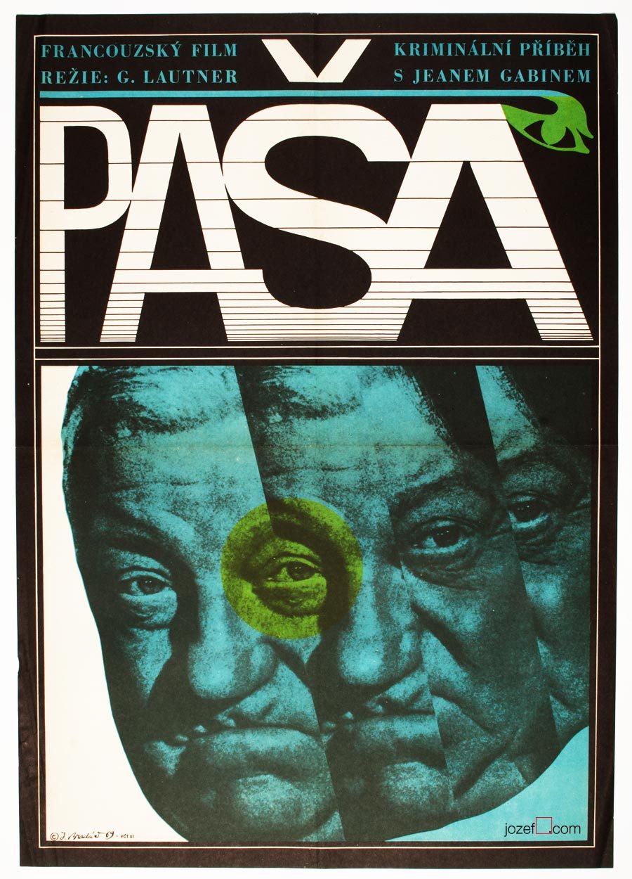
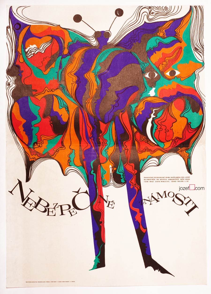
Movie poster shown on the picture above has been seen previously in one of our articles on History of Poster Design in Czechoslovakia. It did not stop us from refreshing the memory as we are strongly effected by its expressiveness. Jean Gabin‘s common impression for every French born was broken into uncertainty. Divided into parallel fields as in the rhythm similar to main theme of that phenomenal soundtrack composed by Serge Gainsbourg. Music moves on as we can see even on the letters, one can hear the most peculiar sounds.
Mysterious poster for Georges Lautner‘s film is hiding one extra mystery and that is the poster designer himself. Jaromír Bradáč remains the one, or at least for now. You can count number of his film posters on your left hand and that’s about everything we could track on this fantastic graphic designer. Hopefully the future will show some more light about him, as we believe five film posters is not everything he did.
***
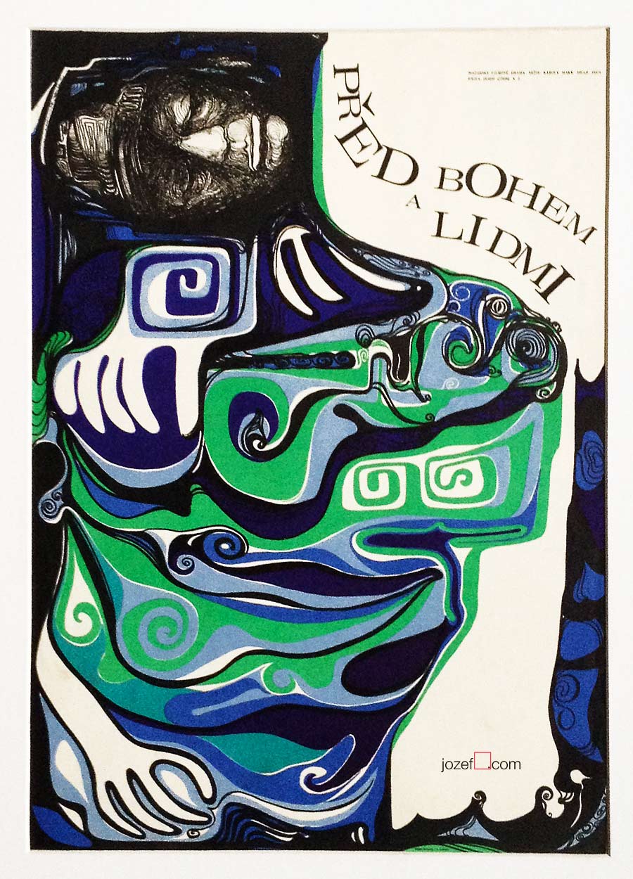
A Study About Women, film poster by Jaromír Bradáč, 1968.
Movie posters in history. Showcase of 1960s poster designs.
Poster Designer / Anonymous Artists
It would be very hard to define a common practice or visual language of Anonymous poster designers in Czechoslovakia. Even harder with Sixties, as the period offered so much surprises and unpredictable twists in both politics and culture. It seems like one can never live without the other (somehow never in successful harmony). Specially politicians were always dependant on cultural demagogy, using visual propaganda to their needs.
***
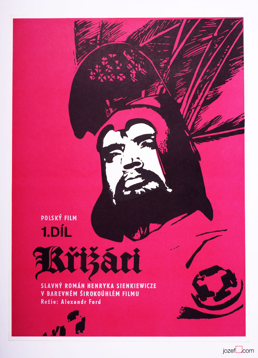
Knights of the Black Cross movie poster by Unknown Artist, 1961.
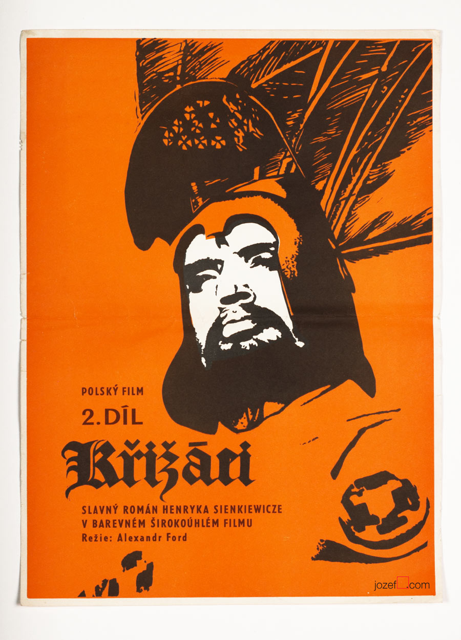
Knights of the Black Cross II movie poster by Unknown Artist, 1961.
Careful and very modern selection of colours was used for both parts of Knights of the Black Cross, 1961.
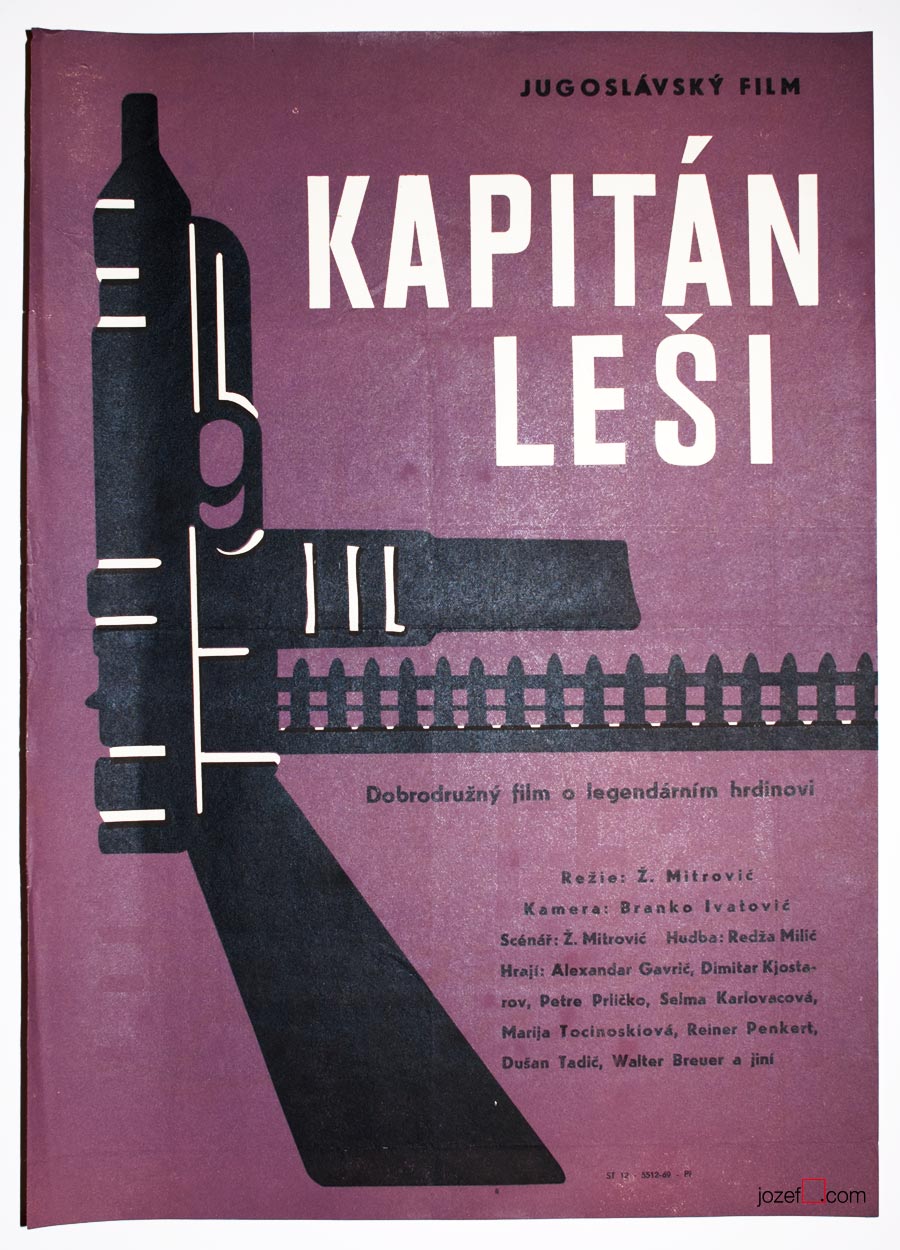
Captain Lechi movie poster by Unknown Artist, 1963.
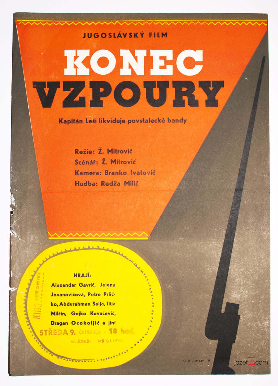
Captain Lechi 2 movie poster Unknown Artist, 1963.
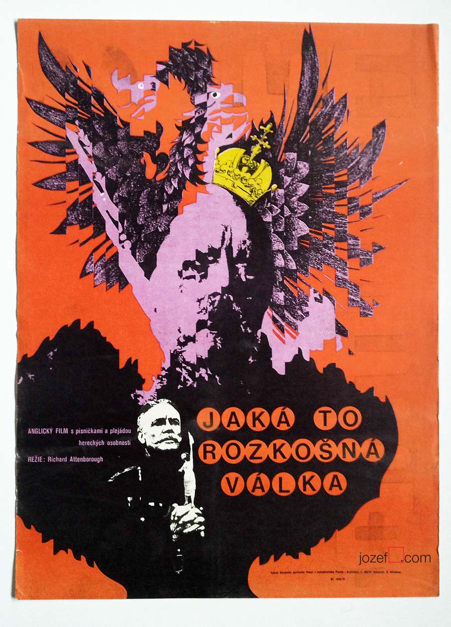
War movies were always highlights, particularly those showing war heroes in Socialist sort of way. Ongoing currency, no matter what’s the weather.
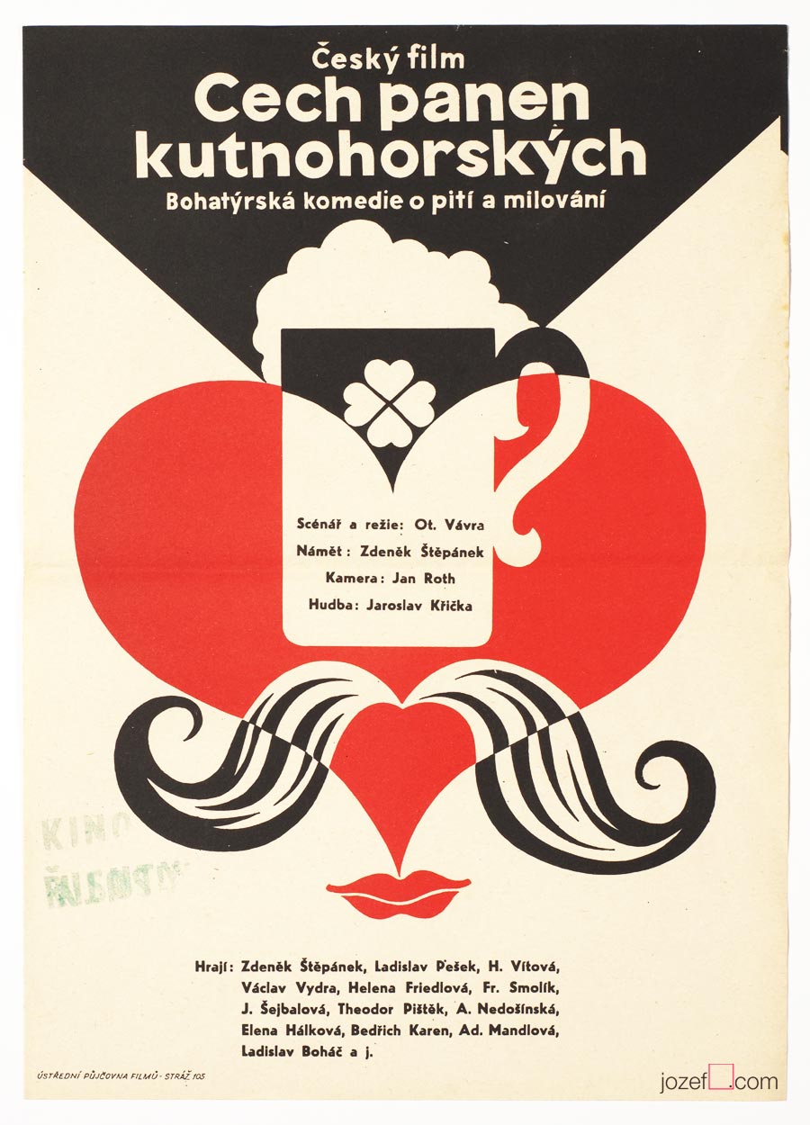
The Guild of the Kutná Hora Virgins movie poster by Unknown Artist, 1964.
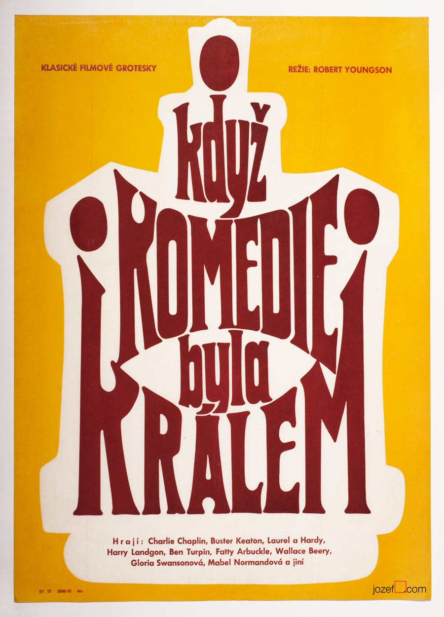
When Comedy Was King movie poster by Unknown Artist, 1965.
Symbols, hints and playful thoughts were always around poster making.
***
There is nothing unusual about Anonymous artists (if own decision), but being unknown artist in the discipline, where displaying signature is relevant/appropriate (n. Karel Vaca, Dobroslav Foll, Karel Teissig and others) raises several questions.
Earlier in the second part of our article on history of poster art in Czechoslovakia we have mentioned censorship as the part / instrument of the Communist doctrine. Communist party was the one and only expert on art, which might sound funny but the reality was not so much, Social Realism did exist, after all. In addition to films ÚPF (Ústřední Půjčovna Filmů/ Formal state distribution 1957 – 1991) was also commissioning movie posters. Both were deciding what could be shown in the cinemas. Were they somehow responsible for hiding artists identity?
***
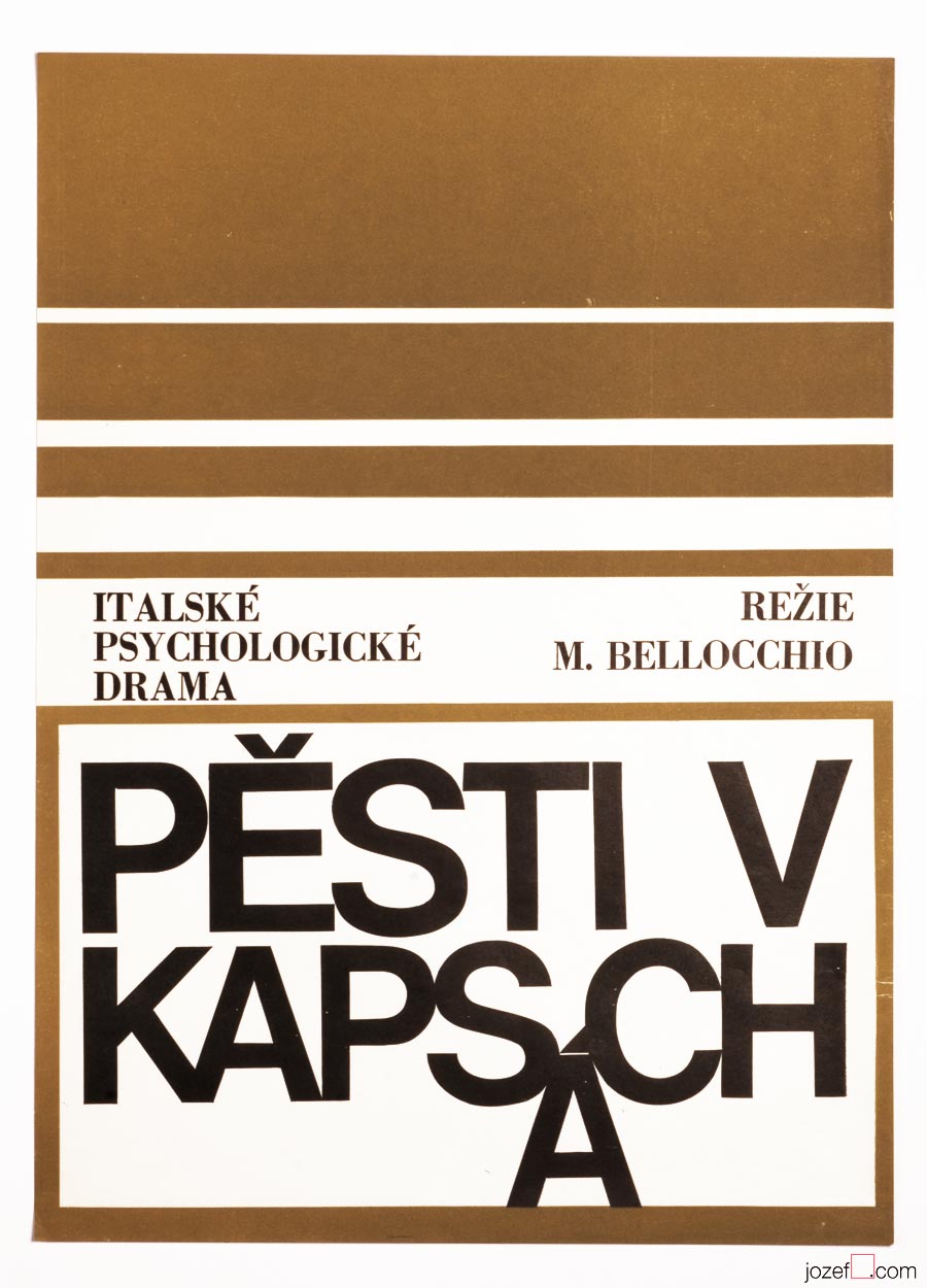
Fists in the Pocket movie poster by Unknown Artist, 1965.
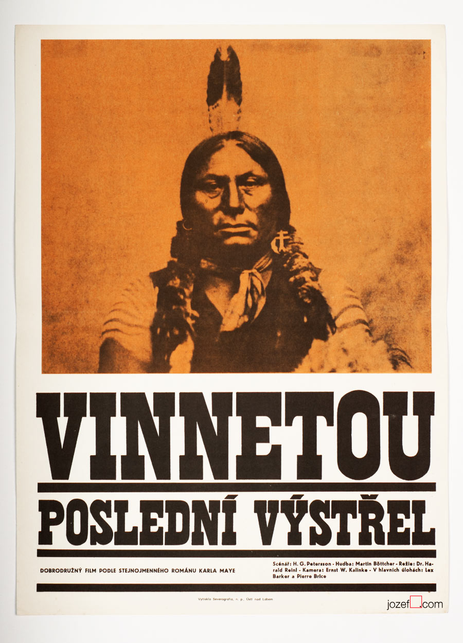
Winnetou, The Last Shot movie poster by Unknown Artist, 1966.
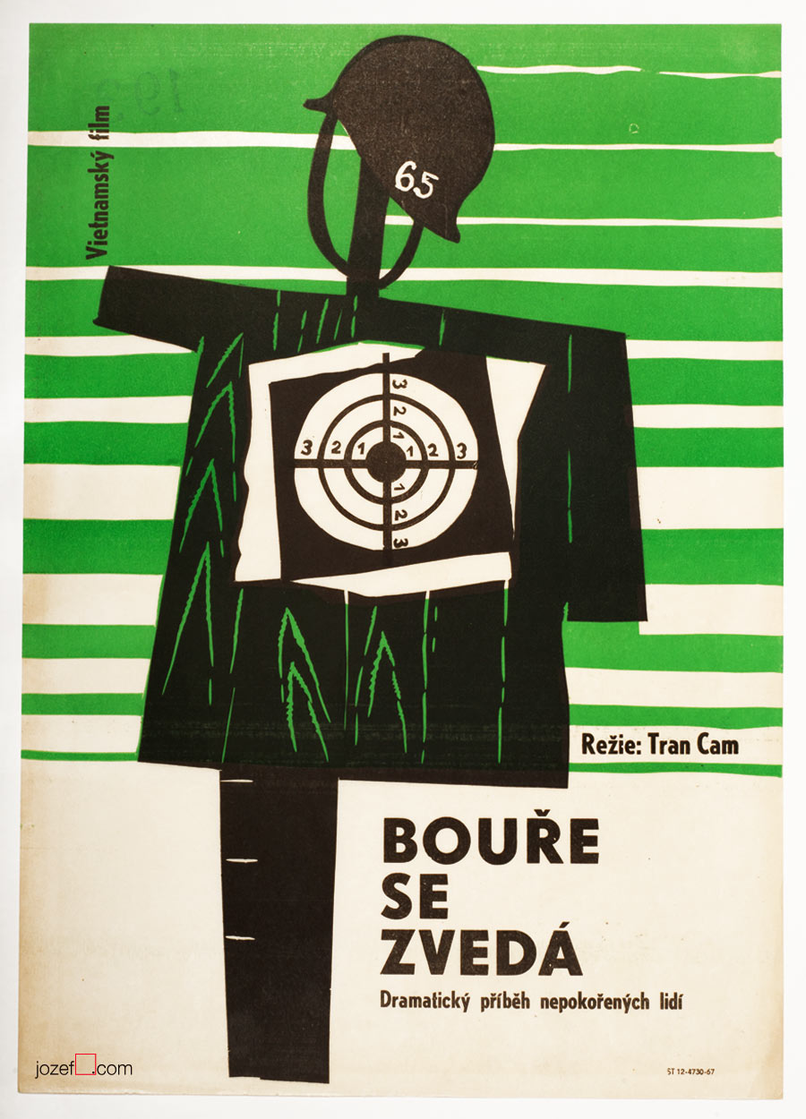
Storm Rises movie poster by Unknown Artist, 1967.
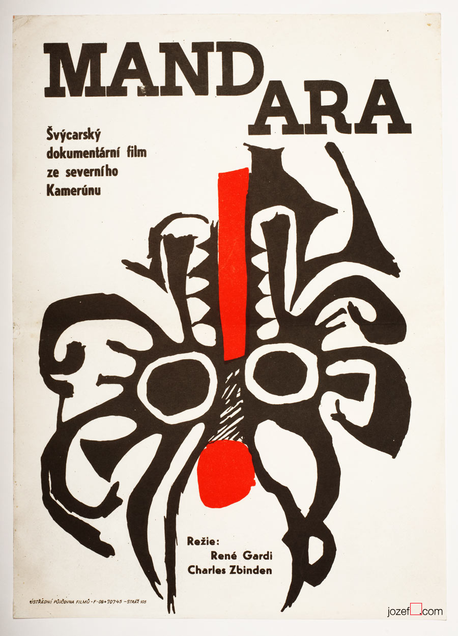
Mandara movie poster by Unknown Artist, 1967.
The Demolition Squad movie poster by Unknown Artist, 1967.
Boarding House for Bachelors movie poster by Unknown Artist, 1968.
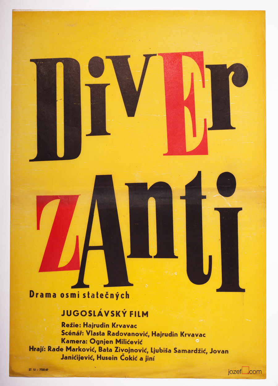
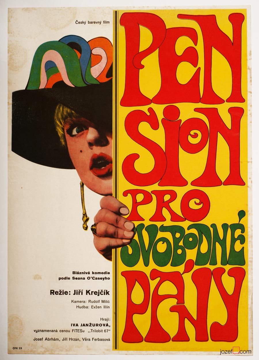
From Switzerland to Vietnam, poster designs made by Unknown Artists covered all sorts of spectacular, if not even controversial movies.
***
We know that the film poster committee always consisted of few graphic artists (2-3). They would constantly try to give green light to the proposed poster designs. Were they also turning the blind eye to help fellow artists (obstacle/potential traitors and pests1) in getting at least some sort of a commission? We believe it could be possible as the demand for the movies was quite high and each movie had to have its own poster. Still, for some reasons several artists had to remain unknown.
***
Riders in the Sky movie poster by Unknown Artist, 1968.
Crime in the Night Club movie poster by Unknown Artist, 1968.
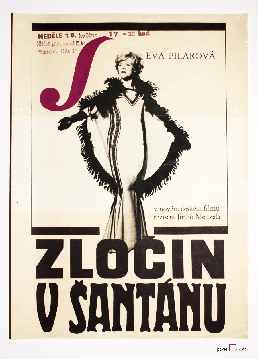
By the end of Sixties photography techniques were commonly used in various poster designs. Above another example of photograph overtaking the space.
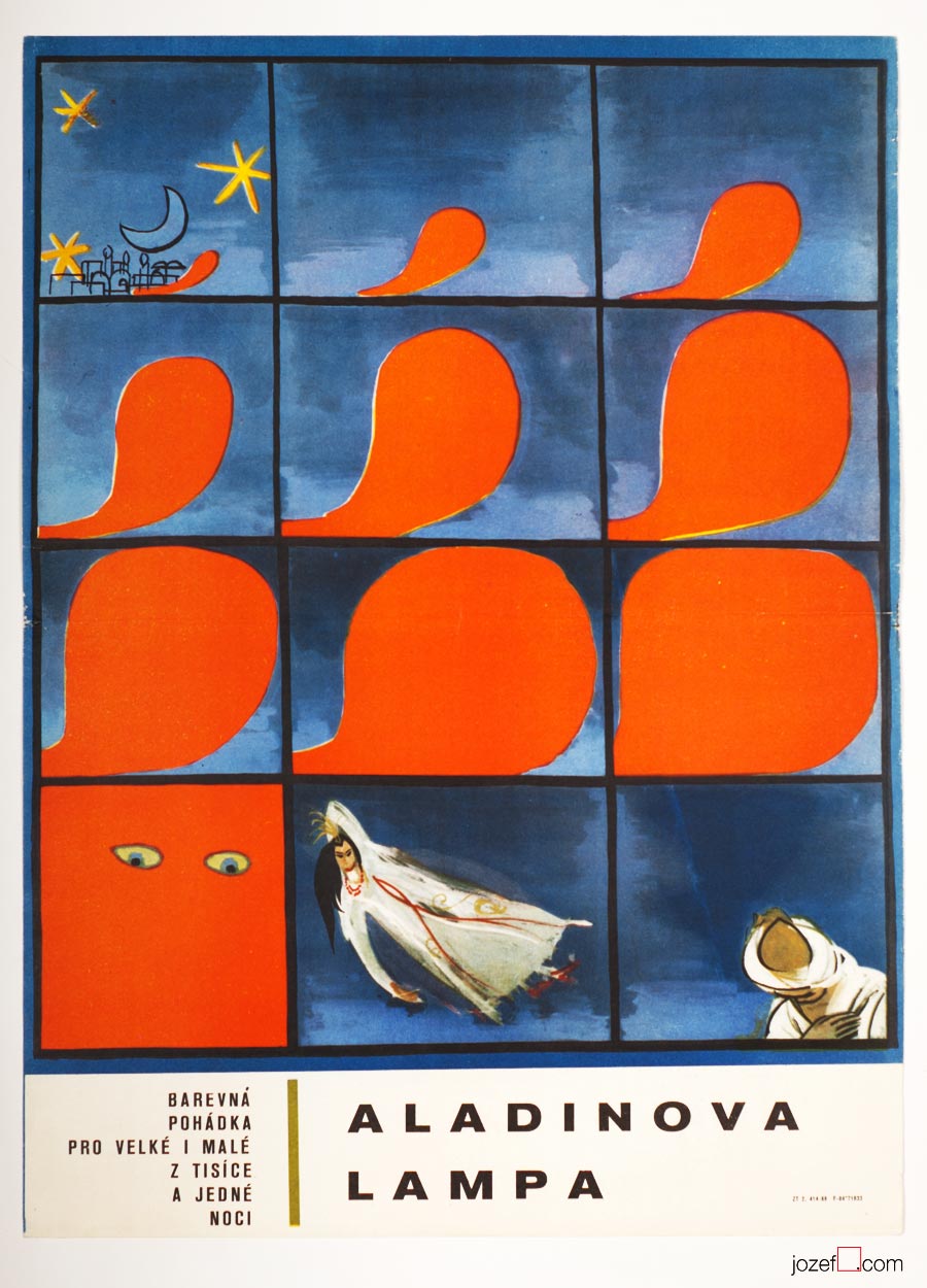
Aladdin and His Magic Lamp movie poster by Unknown Artist, 1968.
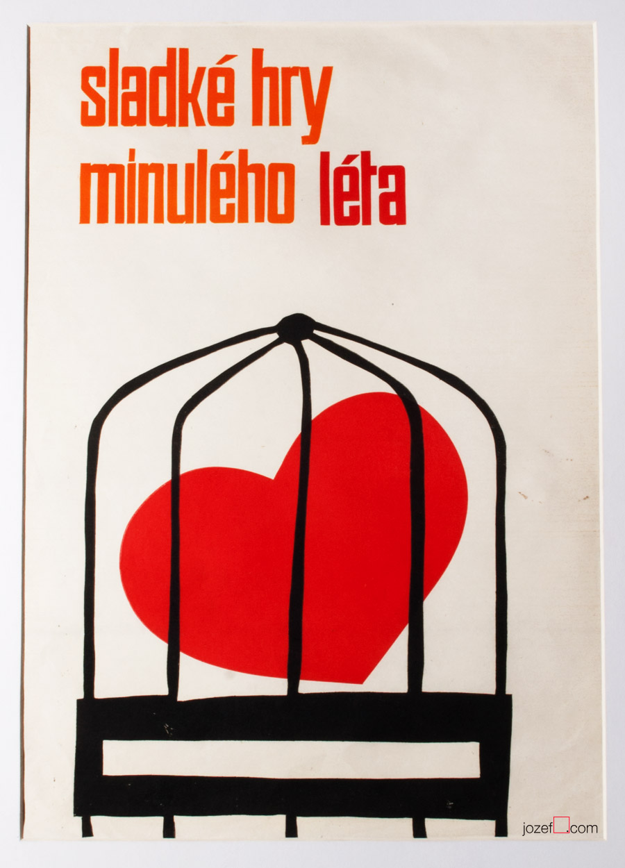
The Sweet Games of Last Summer movie poster by Unknown Artist, 1969.
The Sweet Games of Last Summer (1970), based on Guy de Maupassant’s novel was premiered in Czechoslovakia only once. Film directed by Juraj Herz (The Cremator) came back to distribution again in 19882.
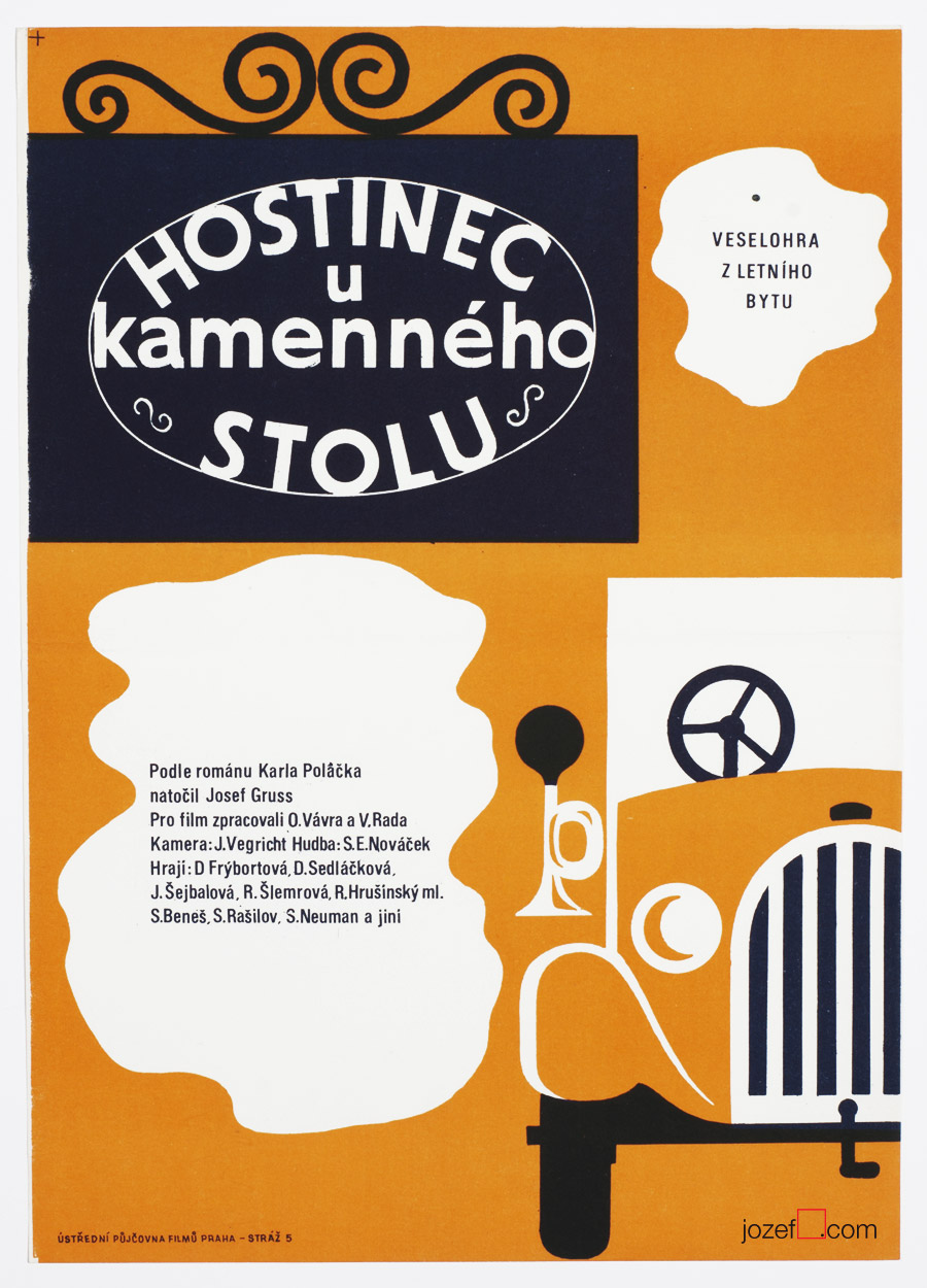
Inn at the Stone Table movie poster by Unknown Artist, 1969.
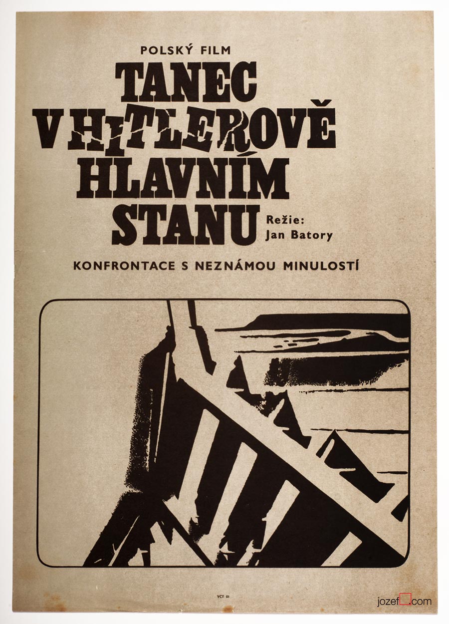
Dancing Party in Hitler’s Headquarters movie poster by Unknown Artist, 1969.
***
Looking at their movie posters many years later, we can observe some fascinating poster designs. They do not lack any of the visual qualities of other Czechoslovak poster artists. The pity is, they could never take part in any of the ongoing poster exhibitions of the time. We will possibly never be able to find out who were the authors of those magnificent movie posters, or how many artists were creating anonymously, but they surely deserve our appreciation. Until 1989 hundreds of poster designs were created by Unknown artists. There was no one to hide from after that.
***
Literature:
1. Toto čudesné 21.Storočie / This peculiar 21st century (unofficial translation), Tomáš Štrauss, Kalligram 2009. (Book is not so much about the movie posters, but Tomáš Štrauss, expert on Totalitarian, art critic/historian, said it to the point)
Poster art by Jaroslav Fišer for Věra Chytilová’s films.
We can hardly hide our excitement about BFI’s wonderful retrospective of one of the most innovative Czech filmmakers Věra Chytilová. It is also a very good opportunity to introduce the work of Jaroslav Fišer, prolific graphic designer and author of several posters for her films.
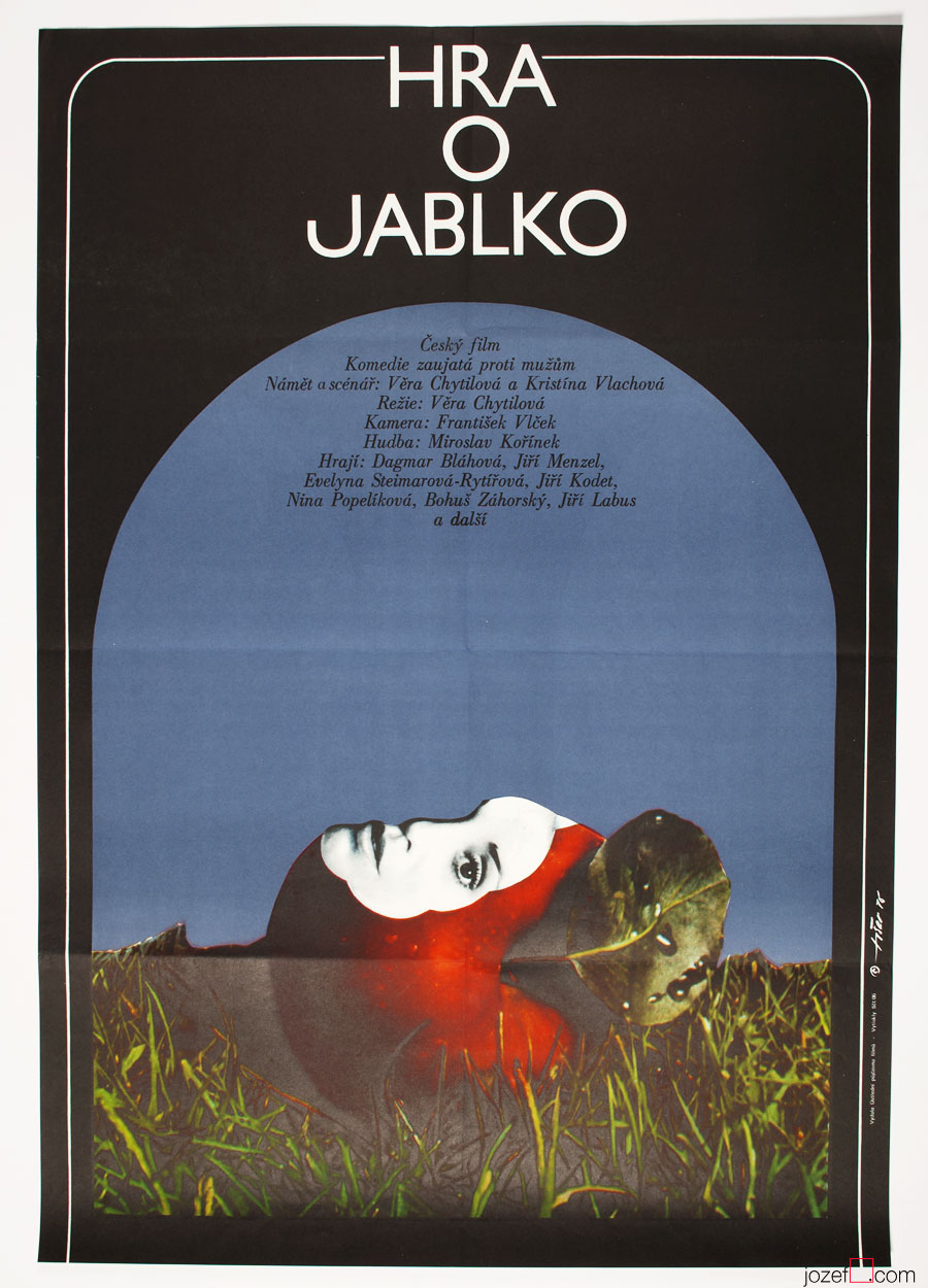
Jaroslav Fišer studied at the Technical University in Prague and at the Academy of Arts, Architecture and Design, Prague, former Czechoslovakia. During 1959 – 1987 Jaroslav Fišer designed 104 movie posters and his poster for film The Apple Game won a Silver Hugo at the International Film Festival in Chicago, USA.
BFI’s tribute to the director is organised in collaboration with Czech Centre, London and Czech National Film Archive and is on from 1st March – 17th March 2015.
Movie posters designed for Věra Chytilová’s films:
The Apple Game movie poster by Jaroslav Fišer, 1976.
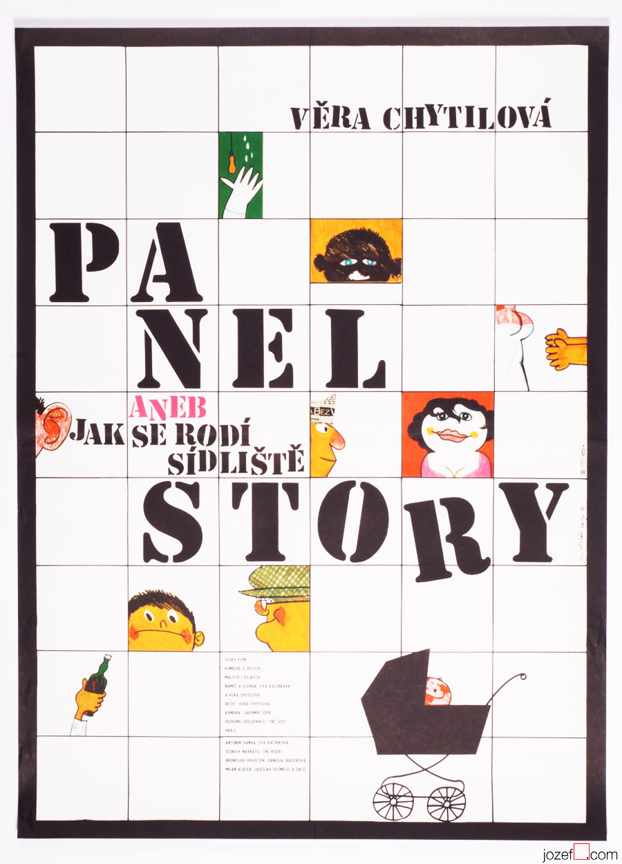
The Panel Story movie poster by Jaroslav Fišer, 1979.
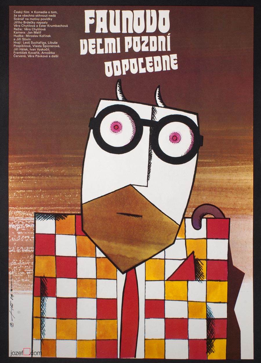
The Very Late Afternoon of a Faun movie poster by Jaroslav Fišer, 1984.
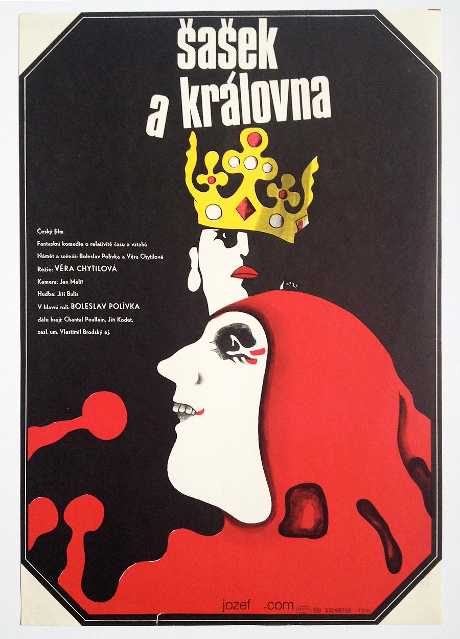
The Jester and The Queen movie poster by Jaroslav Fišer, 1987.
Selection of movie posters by Jaroslav Fišer:
Please don’t wake me up movie poster by Jaroslav Fišer, 1962.
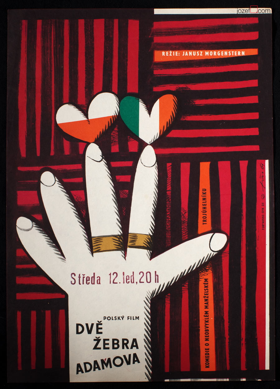
Adam’s Two Ribs movie poster by Jaroslav Fišer, 1964.
Check Passed: No Mines movie poster by Jaroslav Fišer, 1966.
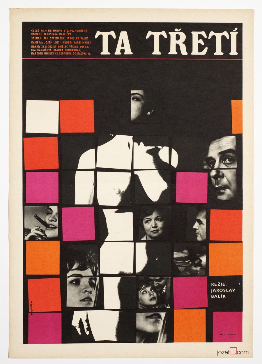
The Third One movie poster by Jaroslav Fišer, 1968.
A Flea in Her Ear movie poster by Jaroslav Fišer, 1969.
Litle Big Man movie poster by Jaroslav Fišer, 1973.
It is fairly interesting when thinking of Rudolf Altrichter’s designs for film posters, that behind all this visual trickery is hidden self-taught artist. Originally trained as a sales man (worked also for Bata / shoemaker company) he became one of the most influential Slovak graphic artist. In his thirties he became one of the establishing members of newly reopen Slovak Art Society (1946) and year later co-founder of Association of Slovak Graphic Artists (1947).
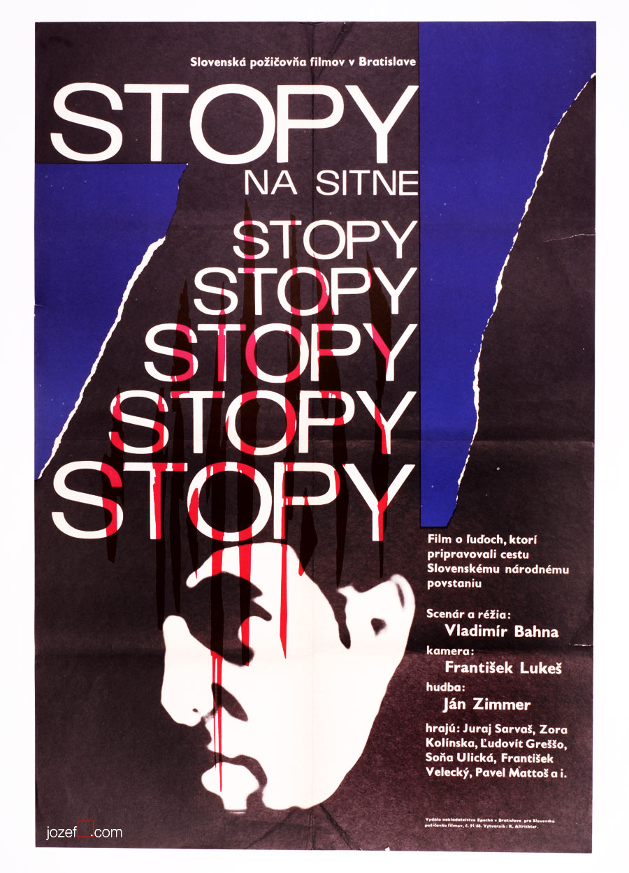
Rudolf Altrichter’s film posters are full of visual harmony, unusually blended by pure abstraction and the hints of reality. Human element appears to be one of his strongest standing point, no matter if it is design for art exhibition, film or political poster. Visual harmony is also represented by the use of elegant thin lines and curvy almost psychedelic shapes. Absurdity of the war, another of his characteristic motifs, can be also seen on several of his film posters. Film poster designed for French drama Dangerous Love Affairs / Dangerous Liaisons (shown bellow, designed in 1969), belongs to the selection of the most significant acquisitions of the Poster and Graphic Design Collection of Slovak National Gallery.
***
Dangerous Love Affairs movie poster by Rudolf Altrichter, 1969.
Talking Caftan movie poster by Rudolf Altrichter, 1969.
Traces on the Sitno movie poster by Rudolf Altrichter, 1968.
What a Lovely War movie poster by Rudolf Altrichter, 1969.
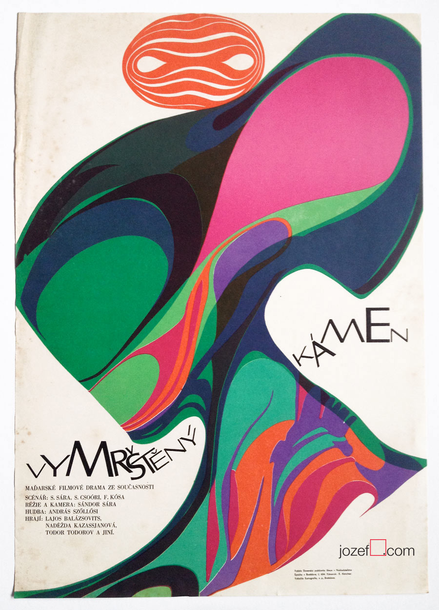
The Upthrown Stone movie poster by Rudolf Altrichter, 1970.
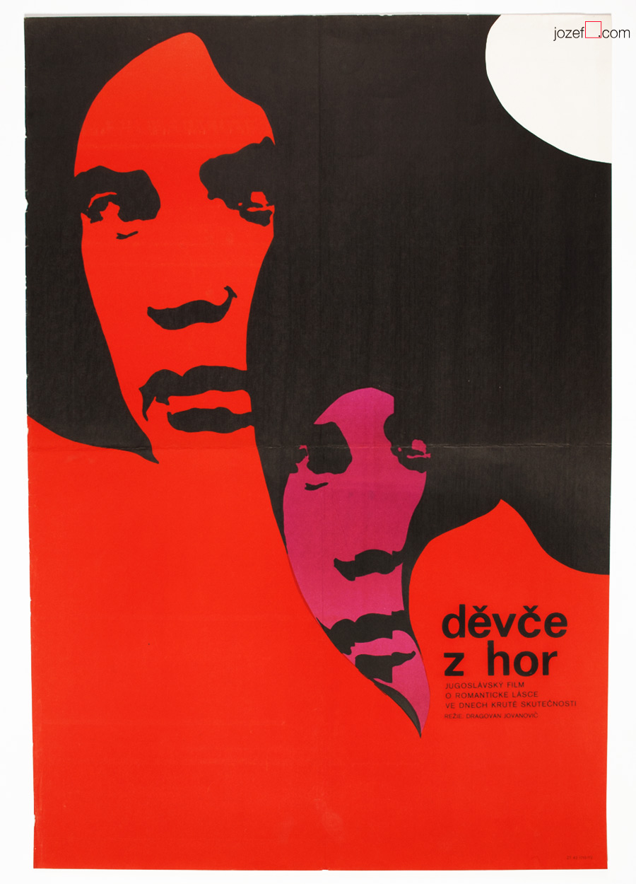
Girl from the Mountains movie poster by Altrichter, 1972.
b. 14th of November 1926, Prague-Hostivice, Czech Republic
Education:
1942−1945, State Graphic School, Prague (Karel Muller)
1945−1950, Academy of Arts, Architecture and Design in Prague (Karel Svolinský)
Awards, Exhibitions:
Exhibition of Czechoslovak Graphic Art, Poland & Soviet Union, 1955
2nd International Exhibition of Film Posters, Versailles, 1961
Honorary Artist, ÚPF (Ústřední Půjčovna Filmů / State Film distribution), 1961
Czechoslovak Poster, Havana, 1962
Biennale Brno 1964, 1966, 1970, 1972 (dated only until 1972)
***
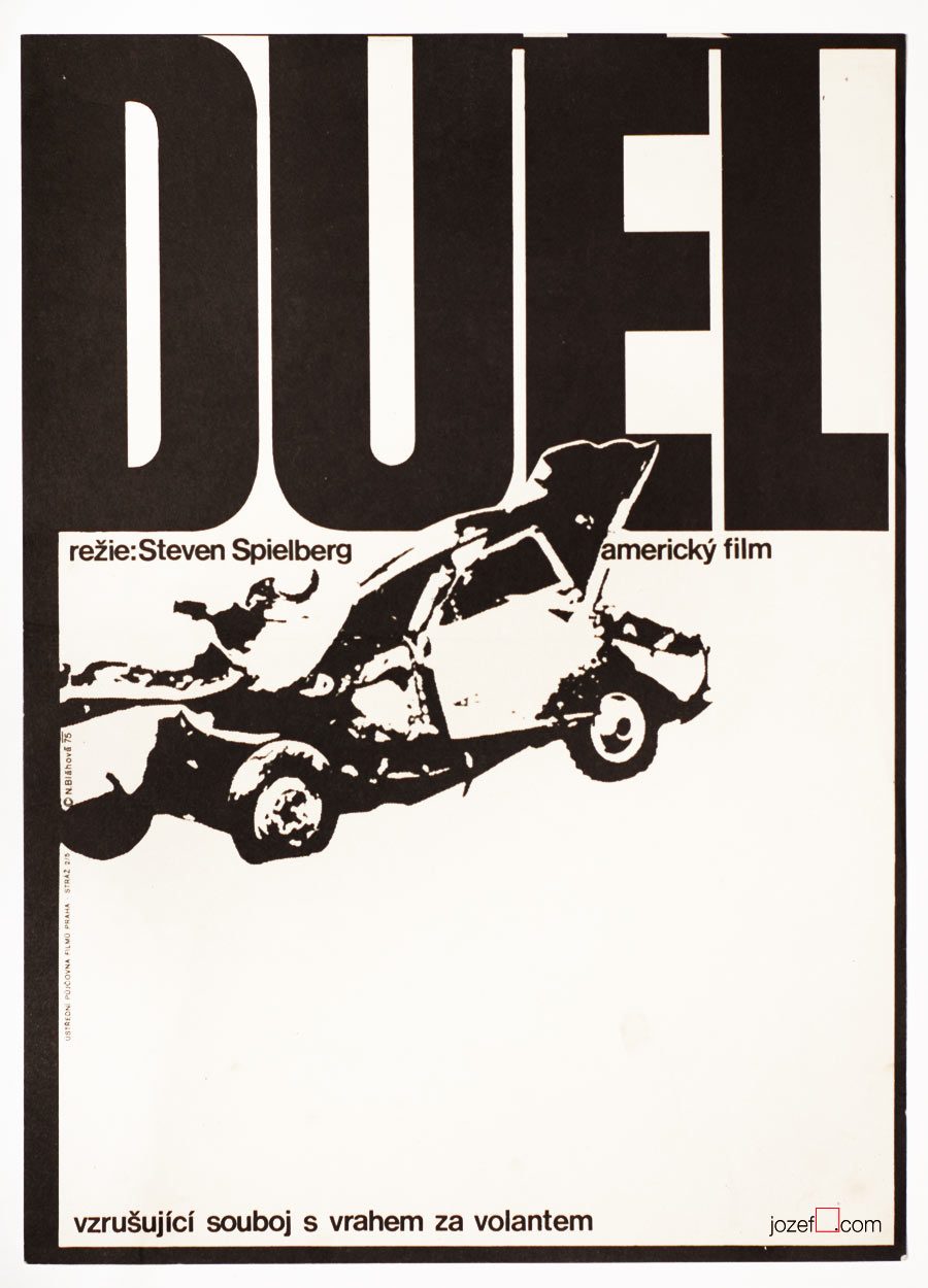
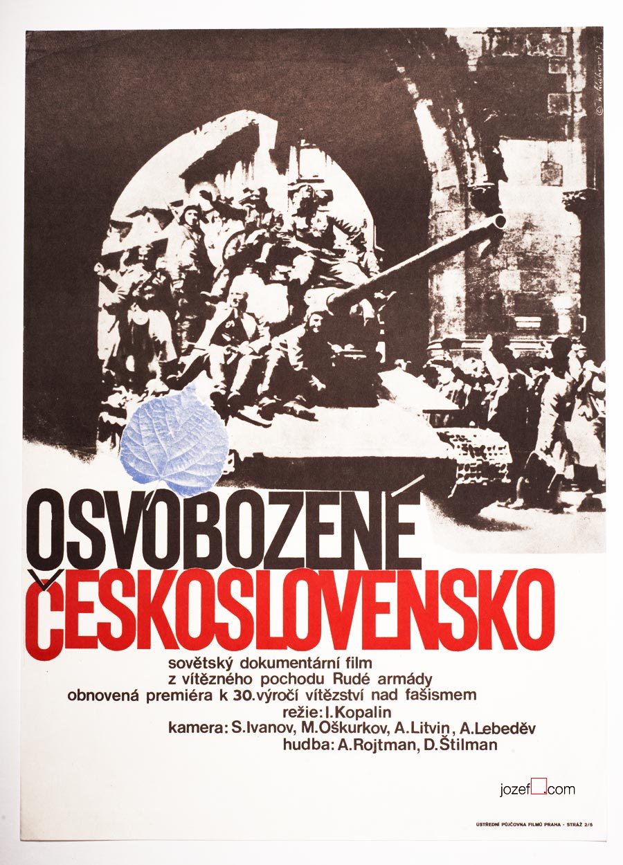
Czechoslovakia Liberated movie poster by Naděžda Bláhová, 1975.
***
Moving ahead in alphabet we would almost missed on one of the very important Czech women graphic artist of the Sixties poster design. Incident could occur easily, there is no evidence of movie poster of Naděžda Bláhová in our poster archive that would point to Sixties. On our research through the history of Czechoslovak film poster we are finding out that we should stop and do a little rewind. Naděžda Bláhová has exhibited since the Fifties!
***
Hold-up movie poster by Naděžda Bláhová, 1975.
***
Small appearance of Naděžda Bláhová’s movie posters in our collection is not accidental. She created possibly not more than thirty movie posters and some of them are real rarities. Editor for publishers of children books for some time, paradoxically to the movie posters shown in this article Naděžda Bláhová was mostly illustrating books for kids.
Her poster designs as can be seen on the images still owe some to illustration, but are evolved into rapid graphics and strong typography. Total opposite to that kid’s story. Minimalist movie posters with excellent lettering overtaking almost one third of the poster. Her beautiful typography layout is also worth noting.
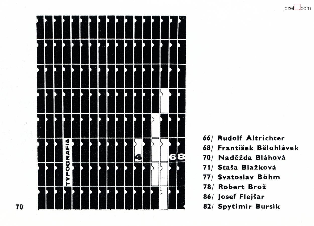
On the image above we can see Naděžda Bláhová talked graphics respectively. It is the snippet of her work from The International Exhibition of Poster and Promotional Graphics 1970’s catalogue1 . It shows the cover of the magazine called Typografia published in 1960’s Czechoslovakia. (You can also see some other Biennale participants from the movie poster section – Rudolf Altrichter, Robert Brož or Josef Flejšar) Cover did not need to be necessarily in black and white, catalogue photographs were usually printed as such. We will leave filling the colours to you.
***
Note: this showcase is part of our ongoing article Film posters / Made in Czechoslovakia. The story of film posters.
II. Bienále Užité Grafiky Brno ’66, Medzinárodní Výstava Knižní Grafiky a Ilustrace, Moravská Galerie v Brně. / 2nd Biennale of Graphic Design Brno ’66, The International Exhibition of Book Graphics and Illustrations, Moravian Gallery Brno, 1966
IV. Bienále Užité Grafiky Brno 1970, Medzinárodní Přehlídka Plakátu a Propagační Grafiky, Moravská Galerie v Brně. / 4th Biennale of Graphic Design Brno 1970, The International Exhibition of Poster and Promotianal Graphics, Moravian Gallery Brno, 1970
V. Bienále Užité Grafiky Brno 1972, Medzinárodní Výstava Ilustrace a Knižní Grafiky, Moravská Galerie v Brně. / 5th Biennale of Graphic Design Brno 1972, The International Exhibition of Illustrations and Book Graphics, Moravian Gallery Brno, 1972
1. Typography, magazine cover, pen drawing, 31 x 23.4, 1969 – IV. Bienále Užité Grafiky Brno 1970, Medzinárodní Přehlídka Plakátu a Propagační Grafiky, Moravská Galerie v Brně. / 4th Biennale of Graphic Design Brno 1970, The International Exhibition of Poster and Promotional Graphics, Moravian Gallery Brno, 1970 (p.138)
***
For shop and blog highlights, please SUBSCRIBE to our newsletter.