Movie Posters for Sale
Movie Posters for Sale, Art Prints for your Home!
Until 5th of July!
Subscribe to our weekly newsletter for shop highlights and special offers.
Note: We offer free shipping on multiple orders.

Until 5th of July!
Subscribe to our weekly newsletter for shop highlights and special offers.
Note: We offer free shipping on multiple orders.
we’ve been beautifully touched when we’ve received your fantastic snapshots. Movie posters look fabulous, to add, black fits perfectly to both. Josef Vyleťal‘s Amarcord looks absolutely impressive, one can study any of his movie posters by millimetres. Only very recently we have learned that he was also designing movie sets for such a great directors as Juraj Jakubisko or Juraj Herz, his abilities were endless. Must say thanks to Communist regime and their ridiculous, believe if they would not be around, mr. Vyleťal is happily painting his surreal paintings and we would not be able to explore those beauties he created, well, who knows.
Different story to movie poster designing of Slovak fine artist Peter Kľúčik. His portfolio unlike that of Josef Vyleťal’s with over hundred posters (1964 – 1979) consists of only 5 illustrated movie posters (late 80’s). His main focus was lying on book illustration (many wonderful children books) and ex-libris that are full of surreal, unpredictable, sometimes even bizarre humour. There is great archive of Peter Kľúčik’s artwork in online archive of National Slovak Gallery.
Thank you for taking such lovely care of them !!
***
Please explore fascinating movie posters of Peter Kľúčik / Josef Vyleťal in chronological order. Or see other interesting curiosities in our Federico Fellini / Italian Cinema archive.
It would be very hard to define a common practice or visual language of Anonymous poster designers in Czechoslovakia. Even harder with Sixties, as the period offered so much surprises and unpredictable twists in both politics and culture. It seems like one can never live without the other (somehow never in successful harmony). Specially politicians were always dependant on cultural demagogy, using visual propaganda to their needs.
***
Careful and very modern selection of colours was used for both parts of Knights of the Black Cross, 1961.
War movies were always highlights, particularly those showing war heroes in Socialist sort of way. Ongoing currency, no matter what’s the weather.
Symbols, hints and playful thoughts were always around poster making.
***
There is nothing unusual about Anonymous artists (if own decision), but being unknown artist in the discipline, where displaying signature is relevant/appropriate (n. Karel Vaca, Dobroslav Foll, Karel Teissig and others) raises several questions.
Earlier in the second part of our article on history of poster art in Czechoslovakia we have mentioned censorship as the part / instrument of the Communist doctrine. Communist party was the one and only expert on art, which might sound funny but the reality was not so much, Social Realism did exist, after all. In addition to films ÚPF (Ústřední Půjčovna Filmů/ Formal state distribution 1957 – 1991) was also commissioning movie posters. Both were deciding what could be shown in the cinemas. Were they somehow responsible for hiding artists identity?
***
From Switzerland to Vietnam, poster designs made by Unknown Artists covered all sorts of spectacular, if not even controversial movies.
***
We know that the film poster committee always consisted of few graphic artists (2-3). They would constantly try to give green light to the proposed poster designs. Were they also turning the blind eye to help fellow artists (obstacle/potential traitors and pests[^1]) in getting at least some sort of a commission? We believe it could be possible as the demand for the movies was quite high and each movie had to have its own poster. Still, for some reasons several artists had to remain unknown.
***
By the end of Sixties photography techniques were commonly used in various poster designs. Above another example of photograph overtaking the space.
The Sweet Games of Last Summer (1970), based on Guy de Maupassant’s novel was premiered in Czechoslovakia only once. Film directed by Juraj Herz (The Cremator) came back to distribution again in 1988[^2].
***
Looking at their movie posters many years later, we can observe some fascinating poster designs. They do not lack any of the visual qualities of other Czechoslovak poster artists. The pity is, they could never take part in any of the ongoing poster exhibitions of the time. We will possibly never be able to find out who were the authors of those magnificent movie posters, or how many artists were creating anonymously, but they surely deserve our appreciation. Until 1989 hundreds of poster designs were created by Unknown artists. There was no one to hide from after that.
***
Literature:
Note on previous articles:
Other posters designs by Unknown artists on jozefSquare.
For shop and blog highlights SUBSCRIBE to our newsletter.
Graphic Art / Painting / Set Design / Typography
***
***
Education:
Exhibitions:
***
In few of our recent articles we have discussed absurdity and inappropriate behaviour of Communist leaders. Terrifying act of those in power and their constant fight towards fictional enemy was very systematical. In country as small as Czechoslovakia it was not impossible to succeed.
***
***
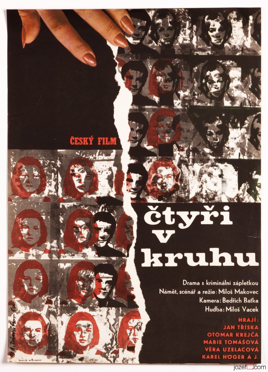
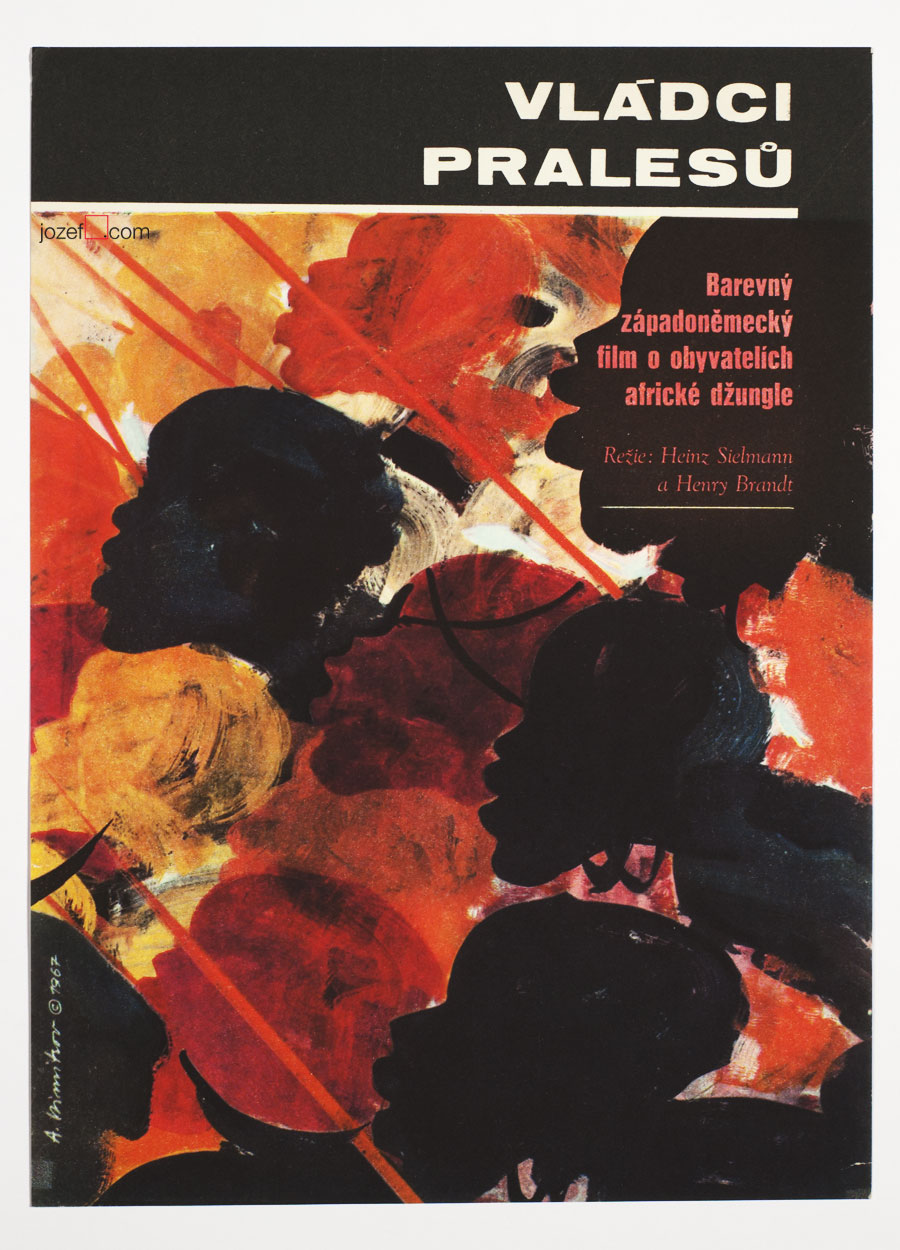
Similarly to Jan Brychta, Antonín Dimitrov’s profile was simply deleted. Second successful attempt of leaving the country in 1968 took Antonín Dimitrov with his wife Olga to Canada. His first try when he and his soul mate swam across the river Danube to neighbouring Austria, just to get caught and handed in to Russian soldiers, cost him several years in prison and forced labor.
Before their disappearance, Antonín Dimitrov and his wife worked professionally as a set and costume designers in various theatres across the country. Antonín’s rebellious nature has been proved several times. Exclusion from the Art Academy for his incorrect political views (note: even the students had to be the members of Communist party. Same applied to parents, if there was a non member in the family, studying at higher education was impossible. Not talking of grand parents.) and his unsuccessful immigration right after that are only few examples of his misbehaviour.
***
***
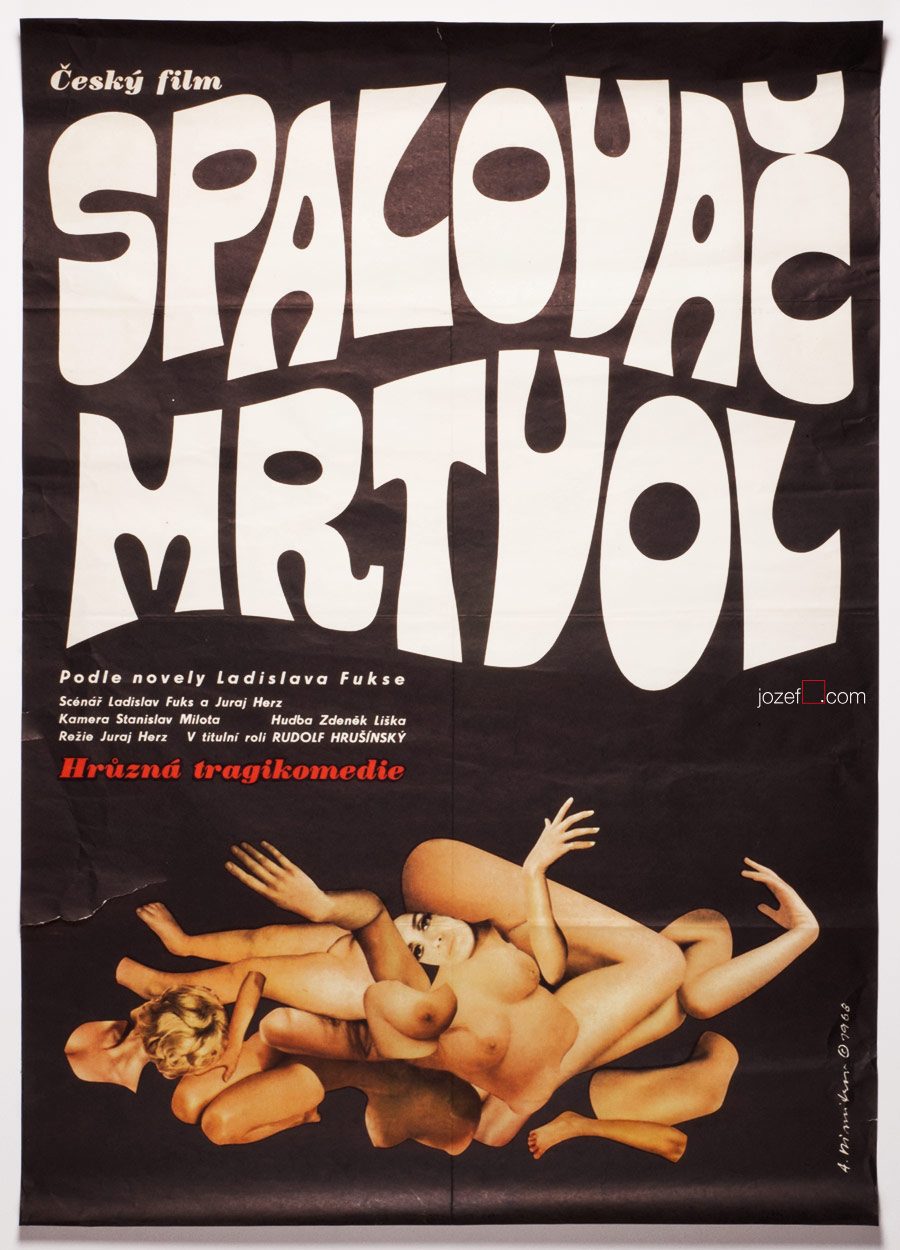
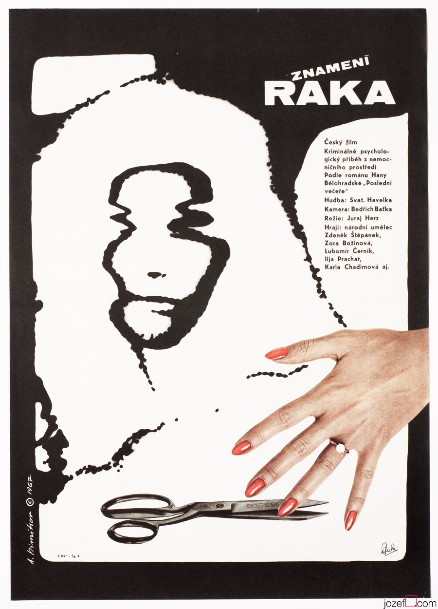
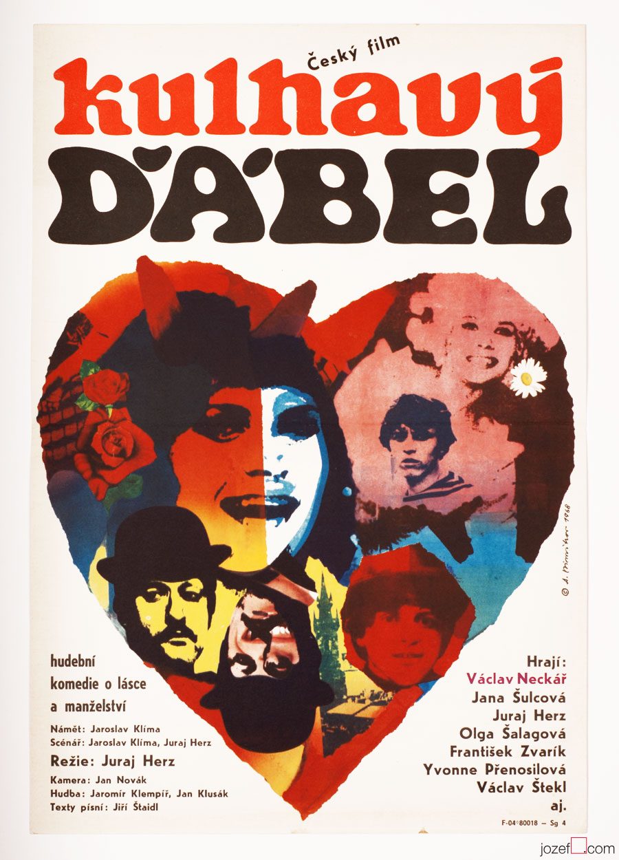
His collaboration with Czechoslovak New Wave directors, specially with Juraj Herz must have also spiced the soup up. Juraj Herz’s Cremator was the movie Communist could not swallow, similarly to other two titles in the showcase. In cases when the Communists decided to ban the movie everything would go off the shelf. Film director, author of the script / writer and the same destiny would meet the film poster.
Movie posters of Antonín Dimitrov are reflecting the times utterly. His posters are incredibly attractive, no matter if he touches the scissors or the paint brush. Excellent typographer and master of the blend, his virtues are sensibly hidden mostly in the collage. His posters are missing on one thing, there are only very few of them. He possibly did not design more than ten movie posters.
***
***
Even though Antonín Dimitrov luckily led succesful life in the exile. As a set designer he and his wife worked on numerous theatre and opera productions. He was also head of the design programme at the prestigious Indiana University School of Music in Bloomington, Indiana[^1] . But for Czechoslovak film poster his departure was a great loss. Many fascinating artists remained and learn how to overcome the situation, while building one of the most impressive poster archive in design history. It would be truly interesting to see what else could Antonín Dimitrov pull out of that hat.
***
***
Note: this showcase is part of our ongoing article Film posters / Made in Czechoslovakia. The story of film posters.
Available posters by artist or other fascinating film posters designed for Czechoslovak New Wave.
***
Resources:
Literature:
Online:
***
For shop and blog highlights, please SUBSCRIBE to our newsletter.