Movie posters in history. Showcase of 1960s poster designs.
Poster Designer / Anonymous Artists
It would be very hard to define a common practice or visual language of Anonymous poster designers in Czechoslovakia. Even harder with Sixties, as the period offered so much surprises and unpredictable twists in both politics and culture. It seems like one can never live without the other (somehow never in successful harmony). Specially politicians were always dependant on cultural demagogy, using visual propaganda to their needs.
***
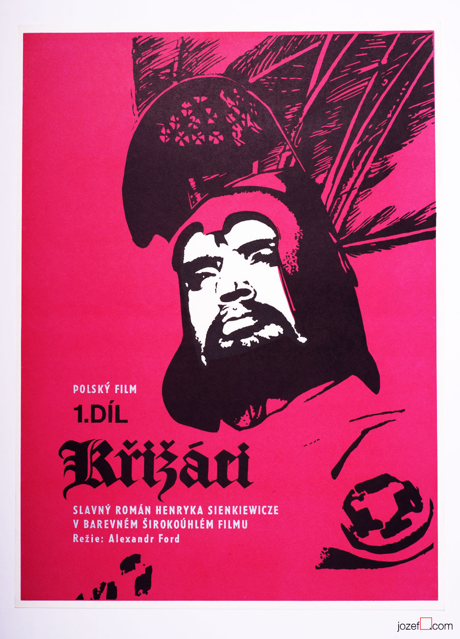
Knights of the Black Cross movie poster by Unknown Artist, 1961.
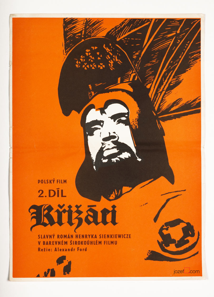
Knights of the Black Cross II movie poster by Unknown Artist, 1961.
Careful and very modern selection of colours was used for both parts of Knights of the Black Cross, 1961.
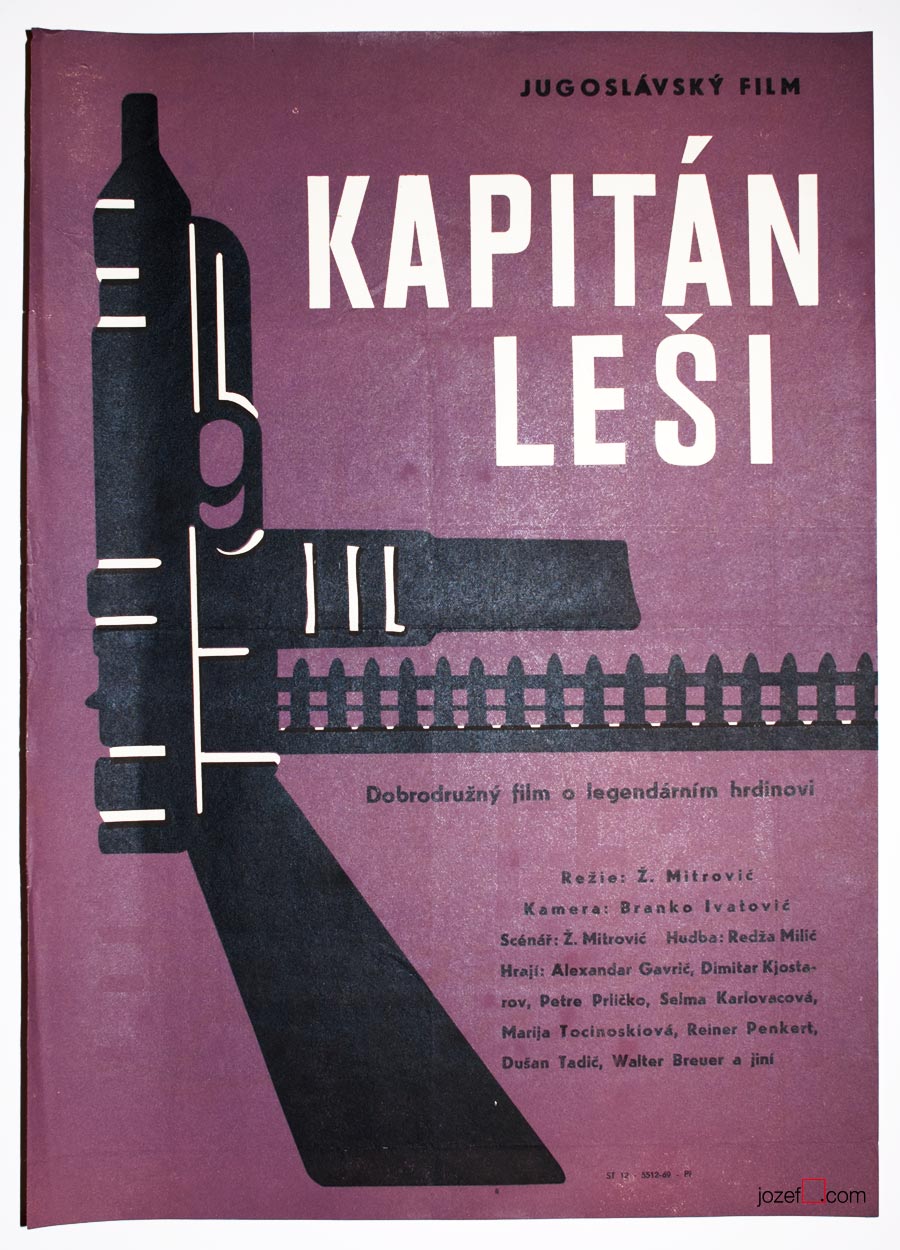
Captain Lechi movie poster by Unknown Artist, 1963.
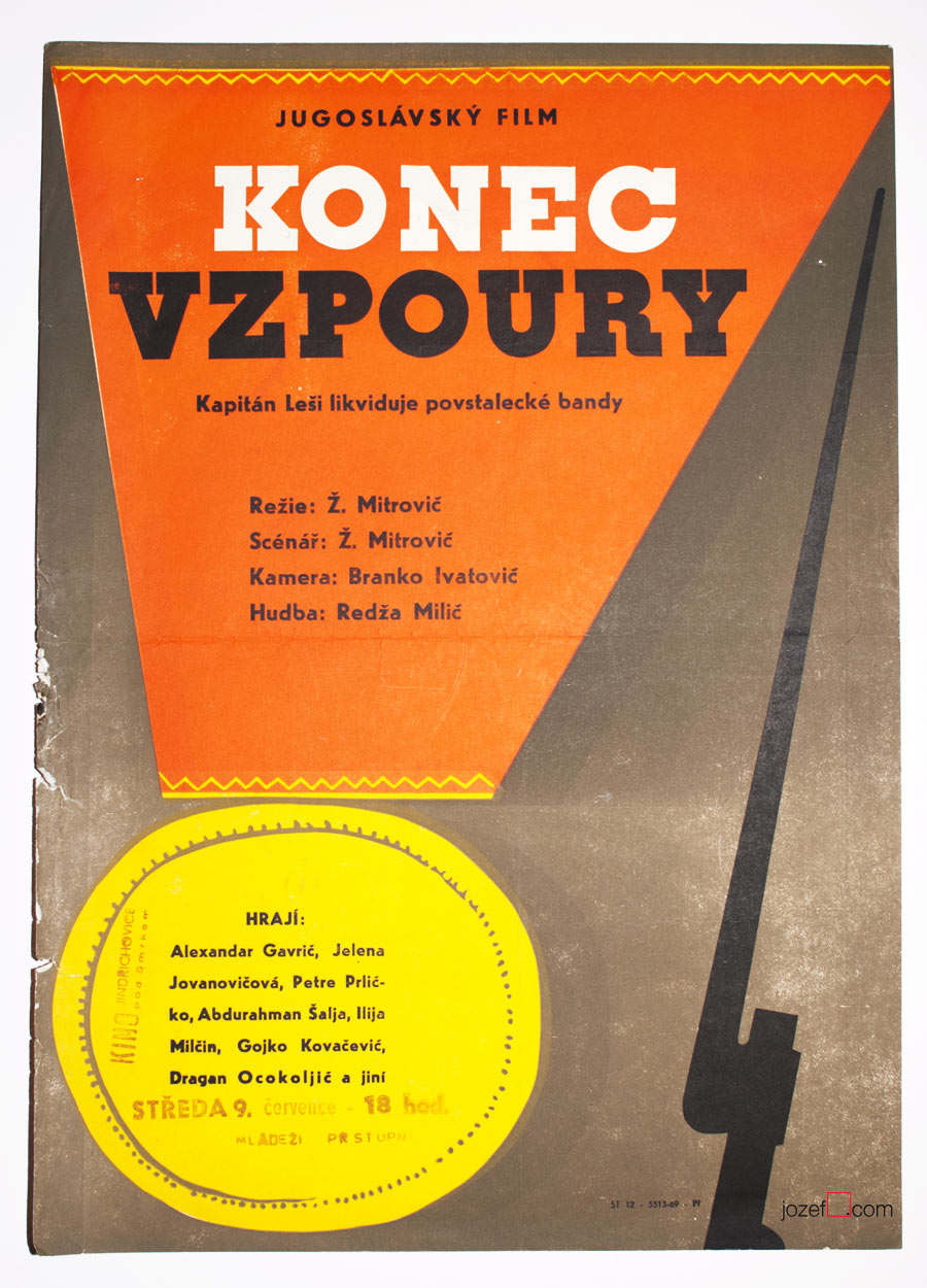
Captain Lechi 2 movie poster Unknown Artist, 1963.
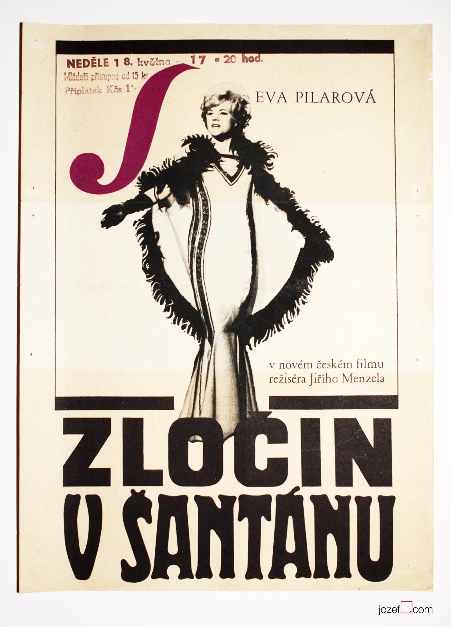
War movies were always highlights, particularly those showing war heroes in Socialist sort of way. Ongoing currency, no matter what’s the weather.
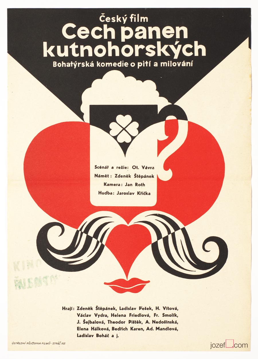
The Guild of the Kutná Hora Virgins movie poster by Unknown Artist, 1964.
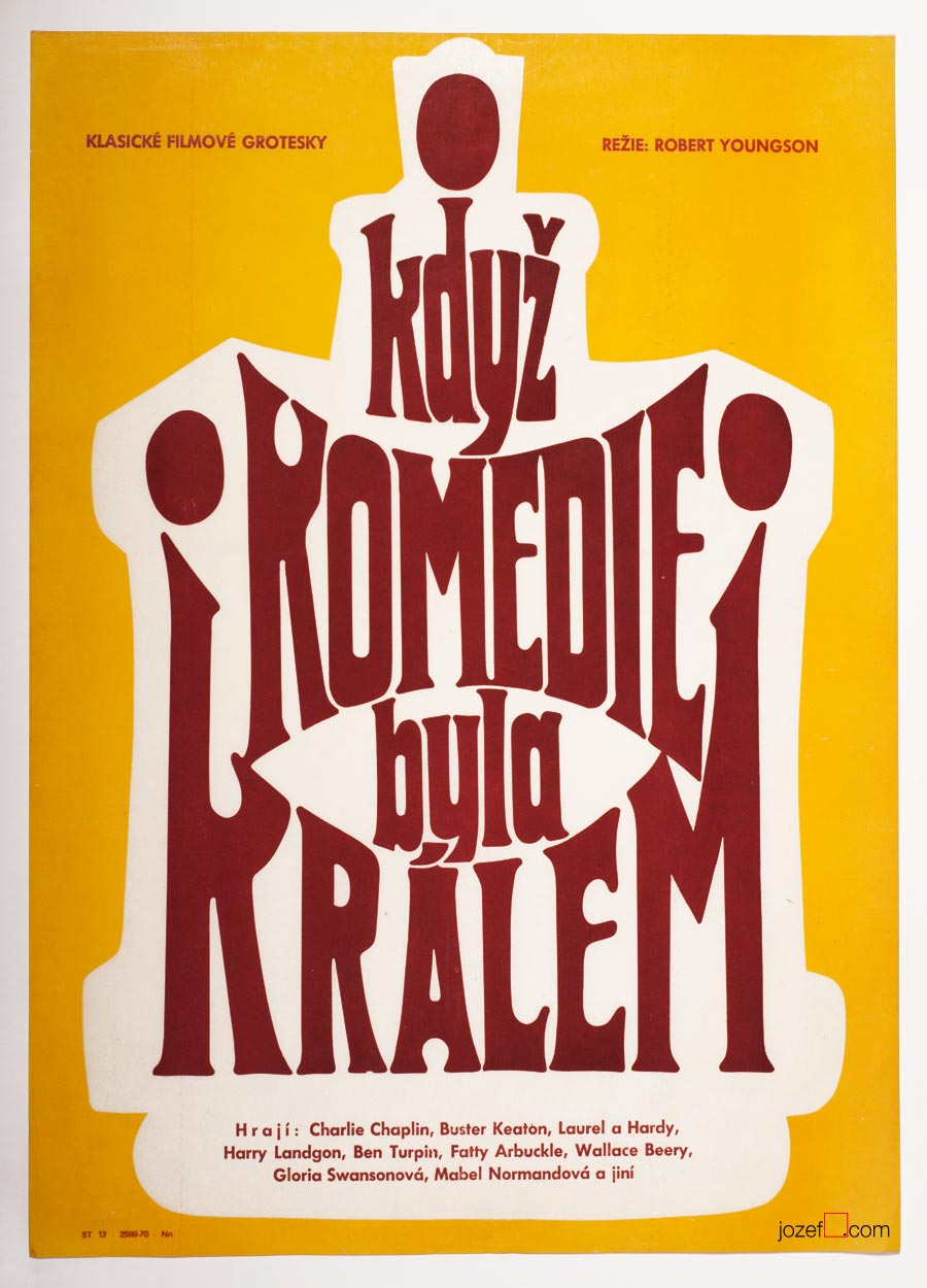
When Comedy Was King movie poster by Unknown Artist, 1965.
Symbols, hints and playful thoughts were always around poster making.
***
There is nothing unusual about Anonymous artists (if own decision), but being unknown artist in the discipline, where displaying signature is relevant/appropriate (n. Karel Vaca, Dobroslav Foll, Karel Teissig and others) raises several questions.
Earlier in the second part of our article on history of poster art in Czechoslovakia we have mentioned censorship as the part / instrument of the Communist doctrine. Communist party was the one and only expert on art, which might sound funny but the reality was not so much, Social Realism did exist, after all. In addition to films ÚPF (Ústřední Půjčovna Filmů/ Formal state distribution 1957 – 1991) was also commissioning movie posters. Both were deciding what could be shown in the cinemas. Were they somehow responsible for hiding artists identity?
***
Fists in the Pocket movie poster by Unknown Artist, 1965.
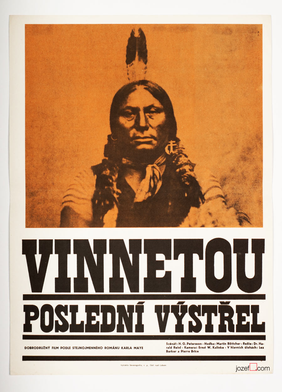
Winnetou, The Last Shot movie poster by Unknown Artist, 1966.
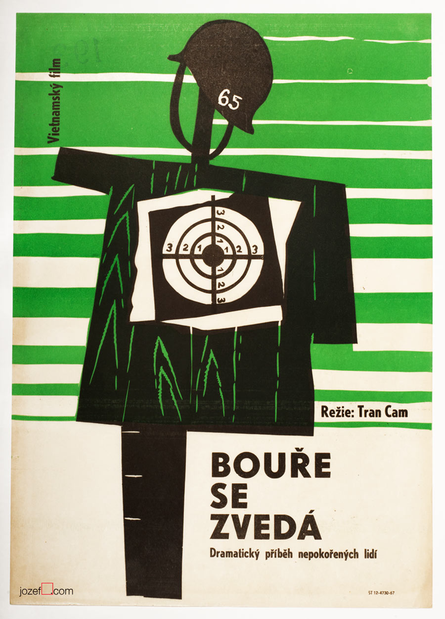
Storm Rises movie poster by Unknown Artist, 1967.
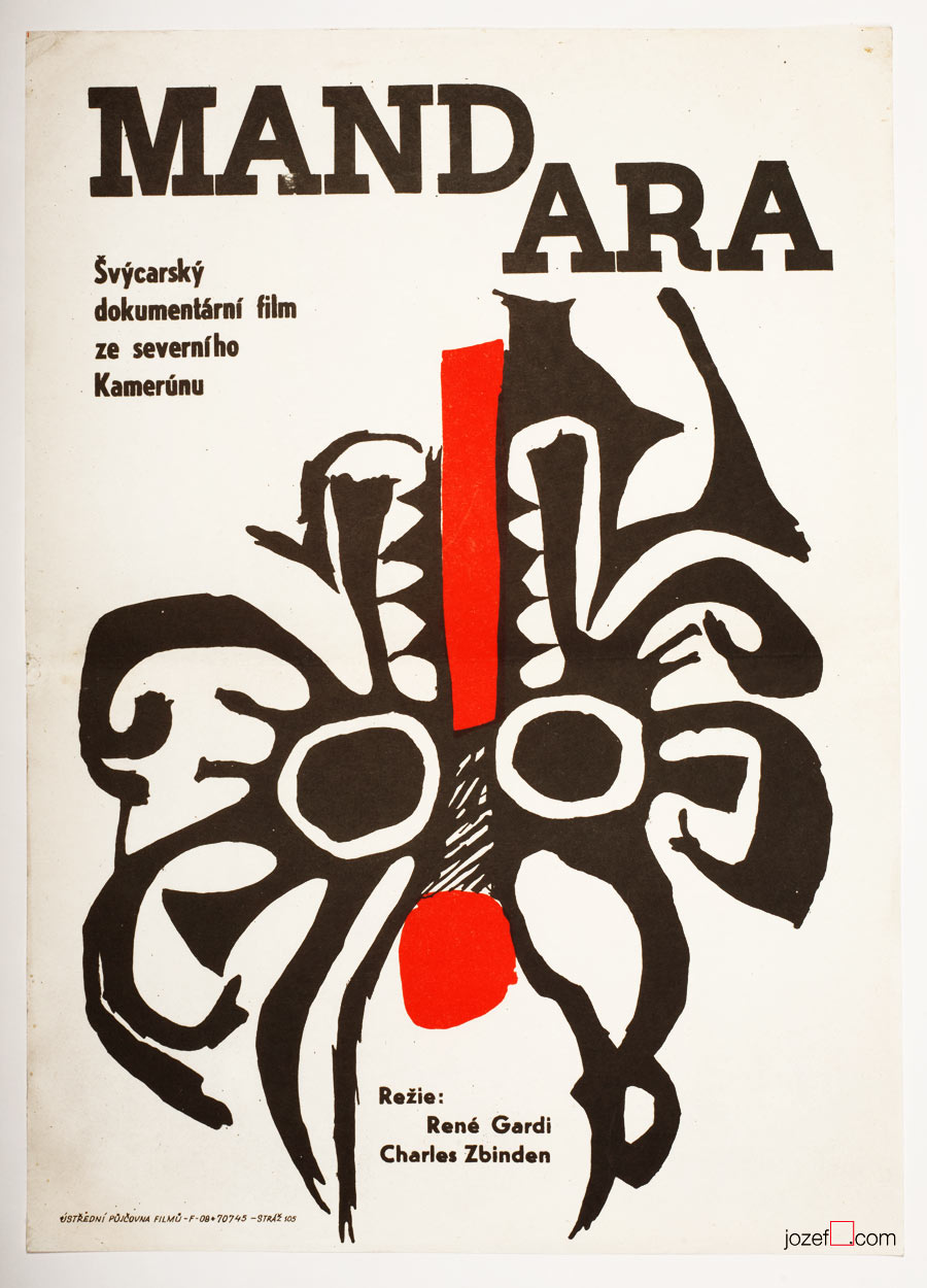
Mandara movie poster by Unknown Artist, 1967.
The Demolition Squad movie poster by Unknown Artist, 1967.
Boarding House for Bachelors movie poster by Unknown Artist, 1968.
From Switzerland to Vietnam, poster designs made by Unknown Artists covered all sorts of spectacular, if not even controversial movies.
***
We know that the film poster committee always consisted of few graphic artists (2-3). They would constantly try to give green light to the proposed poster designs. Were they also turning the blind eye to help fellow artists (obstacle/potential traitors and pests[^1]) in getting at least some sort of a commission? We believe it could be possible as the demand for the movies was quite high and each movie had to have its own poster. Still, for some reasons several artists had to remain unknown.
***
Riders in the Sky movie poster by Unknown Artist, 1968.
Crime in the Night Club movie poster by Unknown Artist, 1968.
By the end of Sixties photography techniques were commonly used in various poster designs. Above another example of photograph overtaking the space.
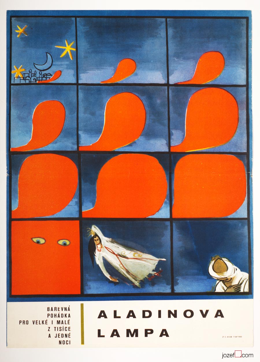
Aladdin and His Magic Lamp movie poster by Unknown Artist, 1968.
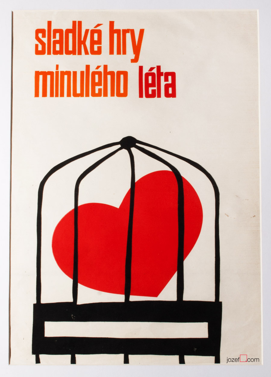
The Sweet Games of Last Summer movie poster by Unknown Artist, 1969.
The Sweet Games of Last Summer (1970), based on Guy de Maupassant’s novel was premiered in Czechoslovakia only once. Film directed by Juraj Herz (The Cremator) came back to distribution again in 1988[^2].
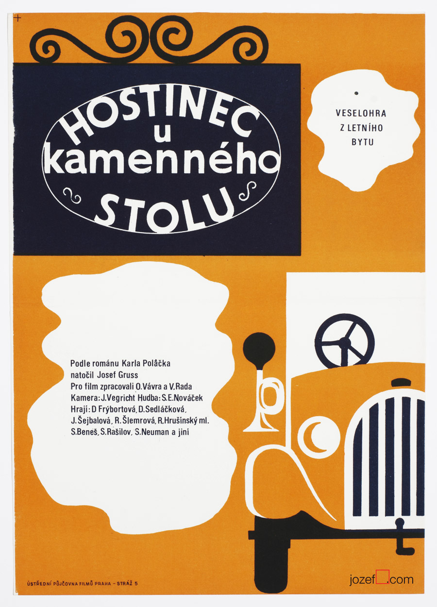
Inn at the Stone Table movie poster by Unknown Artist, 1969.
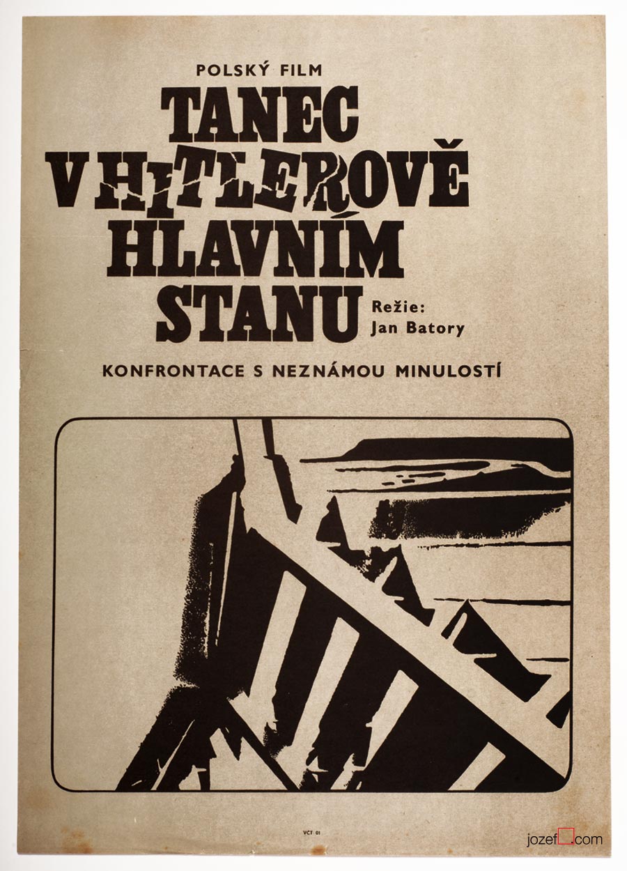
Dancing Party in Hitler’s Headquarters movie poster by Unknown Artist, 1969.
***
Looking at their movie posters many years later, we can observe some fascinating poster designs. They do not lack any of the visual qualities of other Czechoslovak poster artists. The pity is, they could never take part in any of the ongoing poster exhibitions of the time. We will possibly never be able to find out who were the authors of those magnificent movie posters, or how many artists were creating anonymously, but they surely deserve our appreciation. Until 1989 hundreds of poster designs were created by Unknown artists. There was no one to hide from after that.
***
Literature:
[^1]: Toto čudesné 21.Storočie / This peculiar 21st century (unofficial translation), Tomáš Štrauss, Kalligram 2009. (Book is not so much about the movie posters, but Tomáš Štrauss, expert on Totalitarian, art critic/historian, said it to the point)
Book Illustration / Caricature / Film Animation / Painting
***
Jan Brychta’s poster design for movie adaptation of Karel Čapek’s novel, 1964.
***
11th of May 1928, Mladá Boleslav, Czech Republic
14th of November 2013, London (?), United Kingdom
lived in London exile since 1968
Education:
State Graphic School, Prague (Zdeněk Balaš, Josef Vodrážka)
1945 – 19.., Academy of Arts, Architecture and Design in Prague (Josef Kaplický, Antonín Pelc)
Exhibitions:
from late 1950s until 1968 mostly Prague exhibitions
Surrealism Unlimited 1968 – 1978, Camden Arts Centre, London 1978
Awards for Film Animation:
The main prize in the category of animated films, Oberhausen 1966
The prize of the union of cinema owners, Oberhausen 1966
Grand Prix “Bronze Caesar”, Tours 1966
***
In 1968 Jan Brychta vanished off the face of the earth and that is the fact. Russian occupation of Czechoslovakia in 1968 brought in many immediate changes within the state. Political trials were about to return back to fashion and not everyone was waiting for the resume. Or at least Jan Brychta did not.
It would be hard to say what made such a successful artist leave his homeland, as Jan Brychta’s art was everywhere and available to everyone in all possible forms. From beautifully illustrated books, film animations to caricatures in daily newspaper and television graphics / adverts. Simply put 1960s daily life was somehow incomplete without Jan Brychta.
***
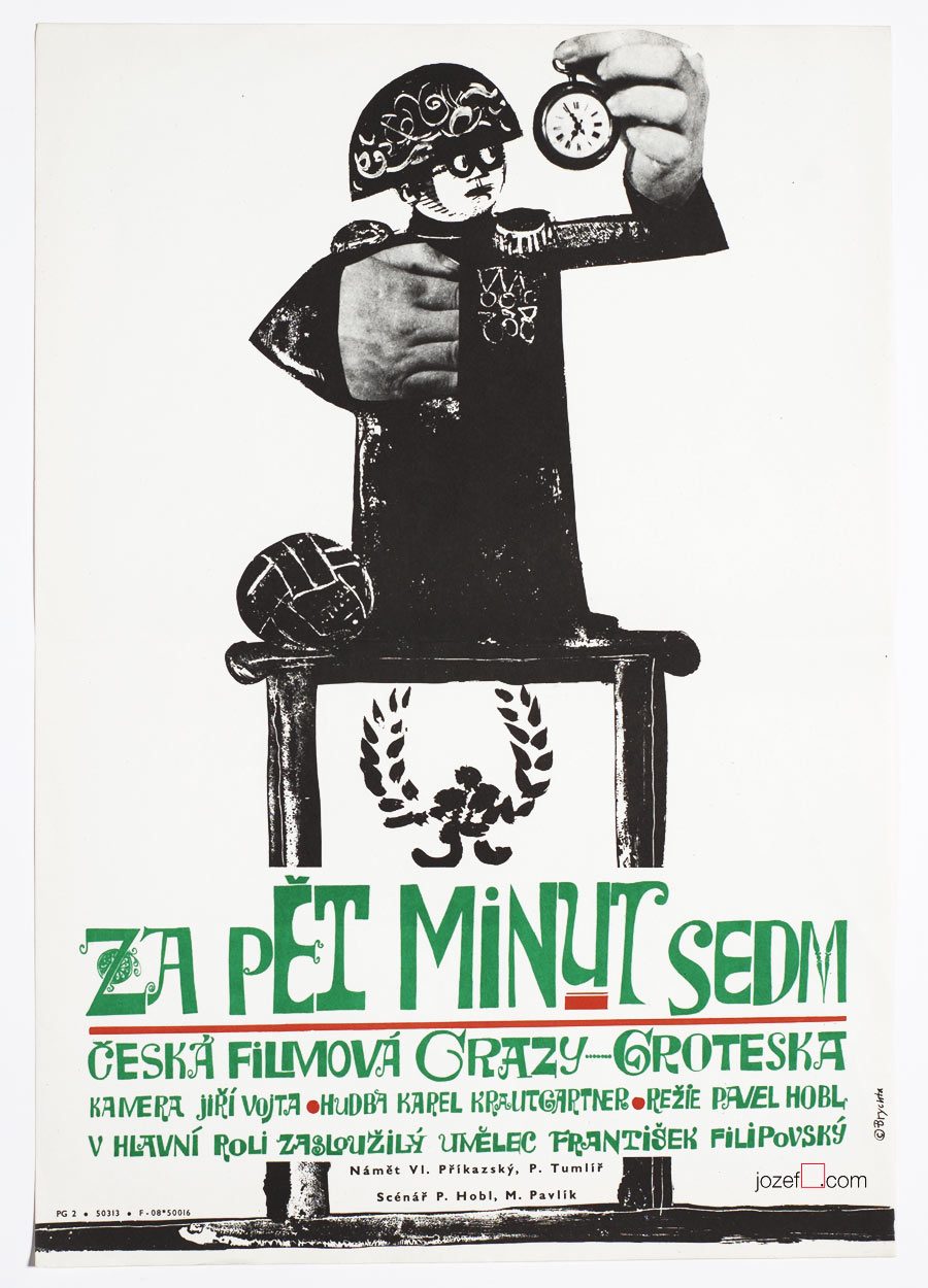
Five Minutes to Seven movie poster by Jan Brychta, 1965.
***
It is fascinating to watch how with short step in time and history someone so publicly pleasing can become persona non grata. Researching many years later it really looks that party members did a great job. There was no Jan Brychta after 1968 in Czechoslovakia and same for his wife Lída Brychtová (artist and book illustrator) as they managed to escape the country together with their children Edita and Aleš.
Through out his Czechoslovak career as a daily caricaturist, film animator and pioneer of television graphics Jan Brychta was never far away from the movie poster. His rapid illustration and excellent story telling could be easily applied to the discipline. As a surreal artist and two dimensional painter use of a collage and illustration was a natural choice. His portfolio ends with his disappearance in late 1960s. Jan Brychta’s posters are absolute pleasure to look at and it is real pity it does not contain more than ten movie posters. The master of many techniques with only one common goal which was to keep everyone amused.
***
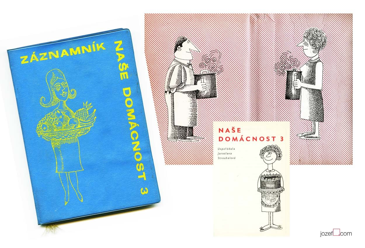
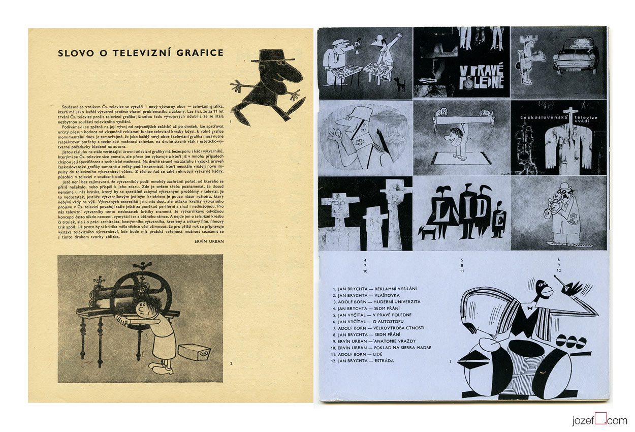
Our Household, third volume of the annual guide for modern family illustrated by Jan Brychta, 1963.
***
British audience could recognise Jan Brychta’s illustration thanks to BBC children’s television series Jackanory.
***
Television graphics by Jan Brychta, Adolf Born and other pioneers of 1960s TV visuals.
Krátky Film, Praha / Short Film, Prague. Archive of Jan Brychta’s 1960s animated films.
Images used:
Collective authors: Záznamník – Naše Domácnost 3 / Family Guide Jotter – Our Household Vol.3. Obchodní Tiskárny, Praha, 1963. Cover and inner pages of the book.
Film a Doba 1 / Film and Times 1 / Bratislava City Gallery, 1965. Magazine spread out.
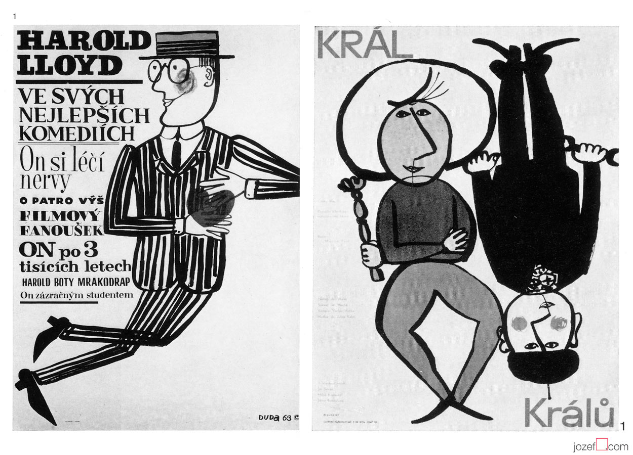
Harold Lloyd in His Best Comedies, 1963 / The King of Kings, 1963. Exhibition catalogue excerpt, Munich, 1965.
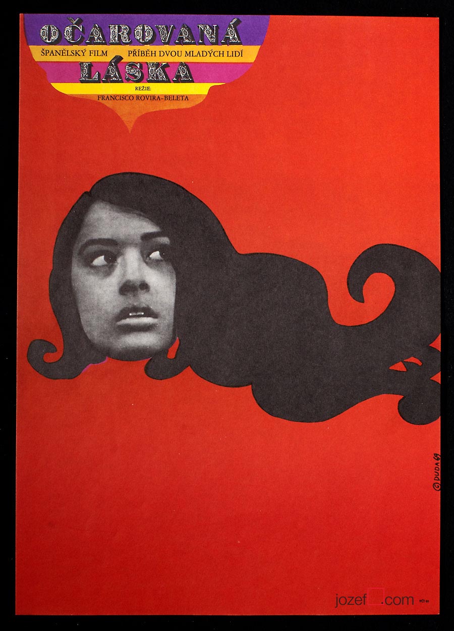
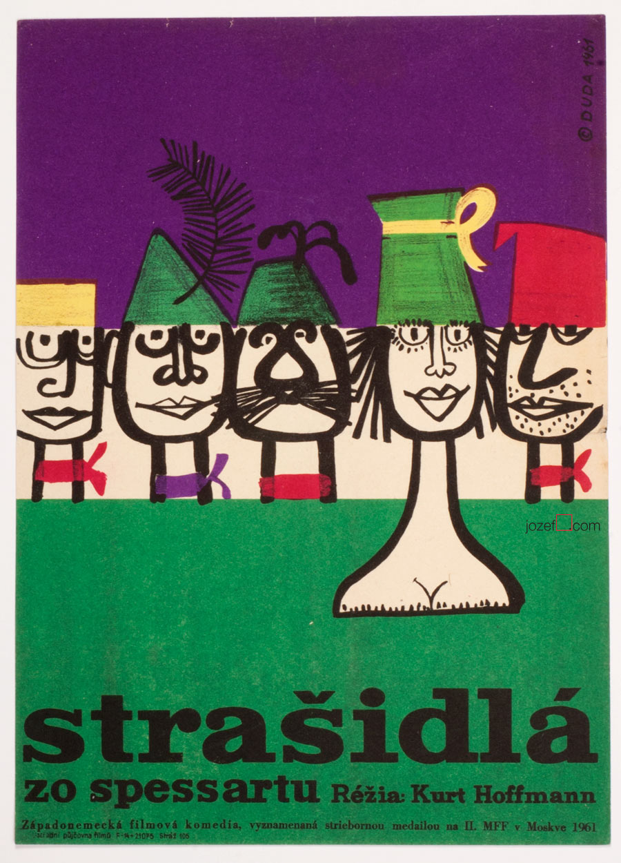
Welcome to the humorous world of Stanislav Duda, possibly one of the longest lasting poster designer Czechoslovakia had on offer. His poster activities are dating to late 40s, where he gained several awards for his commercial poster designs. [^7] Stanislav Duda begins to work professionally right after his graduation as graphic designer in Centrotex company (import / export of mostly textile products) where he stayed until 1953. From then onwards he works on his own as freelancer. He takes part in several group exhibitions representing graphic art from Czechoslovakia and also participates on International Exposition in Brussels (EXPO 58), where Czechoslovakia won prize for the best pavilion.
By the beginning of 1960s when Stanislav Duda started designing movie posters he was already well established graphic artist. Not sure if it was just by mere coincidence or because of his personal character, but it seems that majority of his 1960s movie posters were designed mostly for grotesque comedy (most of the posters shown in the article). Parallel to his illustrated caricatures that could be seen in several popular periodicals or art magazines, one can suggest that circumstances were working in his favour.
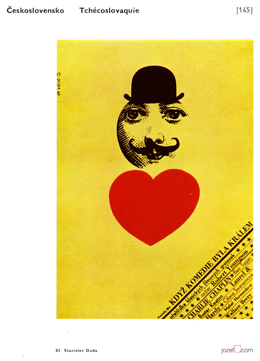
When Comedy Was King / Stanislav Duda, 1965. Brno Biennials catalogue excerpt, 1970.
It is interesting to observe artist’s development through out his career. Stanislav Duda remained faithful to drawing all the way to mid 1980s. Apart of occasional use of very simple collage (Bewitched Love, 1969 (bellow) / Dead Men Don’t Wear Plaid, 1985) or his phenomenal movie poster for Francois Truffaut’s Day for Night (great example of his graphical abilities) he was focused mainly on illustration and experimented a lot with fonts and colour. Eventually he also takes control over typography and masters everything in very unique almost childish quality of naive artist as can be seen in his later poster designs.
Movie poster Bewitched Love / Stanislav Duda, 1969.
Stanislav Duda was author of several animated films and illustrated a good number of books for both children and adults. His work brought him a world recognition in pretty much everything he has touched. He has designed around thirty movie posters all with genuine signature and obtained some important movie poster awards.
Many other magnificent posters by Stanislav Duda can be observed in our movie poster archive.
***
The Haunted Castle movie poster designed by Stanislav Duda, 1961.
***
Resources:
Literature:
II. Bienále Užité Grafiky Brno ’66, Medzinárodní Výstava Knižní Grafiky a Ilustrace, Moravská Galerie v Brně. / 2nd Biennale of Graphic Design Brno ’66, The International Exhibition of Book Graphics and Illustrations, Moravian Gallery Brno, 1966
[^3]:[^5]: IV. Bienále Užité Grafiky Brno 1970, Medzinárodní Přehlídka Plakátu a Propagační Grafiky, Moravská Galerie v Brně. / 4th Biennale of Graphic Design Brno 1970, The International Exhibition of Poster and Promotional Graphics, Moravian Gallery Brno, 1970 (p.41)
V. Bienále Užité Grafiky Brno 1972, Medzinárodní Výstava Ilustrace a Knižní Grafiky, Moravská Galerie v Brně. / 5th Biennale of Graphic Design Brno 1972, The International Exhibition of Illustrations and Book Graphics, Moravian Gallery Brno, 1972
VII. Bienále Užité Grafiky Brno 1976, Mezinárodní výstava ilustrace a knižní grafiky, Moravská Galerie v Brně. / 7th Biennale of Graphic Design Brno 1976, The International Exhibition of Illustrations and Book Graphics, Moravian Gallery Brno, 1976
IX. Bienále Užité Grafiky Brno 1980, Medzinárodní Výstava Ilustrace a Knižní Grafiky, Moravská Galerie v Brně. / 9th Biennale of Graphic Design 1980, The International Exhibition of Illustrations and Book Graphics, Moravian Gallery Brno, 1980
[^6]:Současná světová grafika, Deset brněnských bienále / The World Graphic Design at the Ten Brno Biennials, Jiří Hlušička. Odeon, Praha, 1985 (p.272)
[^7]: 1948, 1949, 1955 – 1st, 2nd & 3rd Prize for commercial poster design. IV. Bienále Užité Grafiky Brno 1970, Medzinárodní Přehlídka Plakátu a Propagační Grafiky, Moravská Galerie v Brně. / 4th Biennale of Graphic Design Brno 1970, The International Exhibition of Poster and Promotional Graphics, Moravian Gallery Brno, 1970 (p.41)
[^4]: Exhibition Catalogue: Plakate aus der Tschechoslowakei / Posters from the Czechoslovakia. Münchner Stadstmuseum, Munich, West Germany, 16.2 − 20.3. 1965. Texts: Alena Adlerová & Johanna von Herzogenberg.
Online:
[^1]: abArt / Stanislav Duda / Most of the biographical details are coming from AbArt’s archive unless otherwise referred.
[^2]: AbArt / Group of Artists and Graphic Designers established in Prague between 1957 − 1968. Main activities were exhibitions of group members in Czechoslovakia and abroad.
Article about exhibition Plakate aus der Tschechoslowakei / Posters from the Czechoslovakia, Munich, West Germany (1965) was printed in Gebrauchsgraphik Magazine, January/1965 and is available thanks to International Advertising & Design DataBase (pages 46-60).
Harold Lloyd in His Best Comedies, 1963 / The King of Kings, 1963. Exhibition Catalogue: Plakate aus der Tschechoslowakei / Posters from the Czechoslovakia. Münchner Stadstmuseum, Munich, West Germany, 16.2 − 20.3. 1965. Texts: Alena Adlerová & Johanna von Herzogenberg
When Comedy Was King / Stanislav Duda, 1965.Exhibition Catalogue: IV. Bienále Užité Grafiky Brno 1970, Medzinárodní Přehlídka Plakátu a Propagační Grafiky, Moravská Galerie v Brně. / 4th Biennale of Graphic Design Brno 1970, The International Exhibition of Poster and Promotional Graphics, Moravian Gallery Brno, 1970 (p. 145)
***
For shop and blog highlights, please SUBSCRIBE to our weekly newsletter.
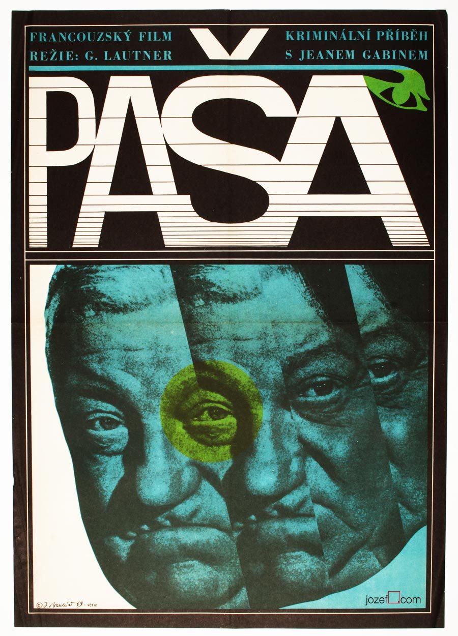
Movie poster shown on the picture above has been seen previously in one of our articles on History of Poster Design in Czechoslovakia. It did not stop us from refreshing the memory as we are strongly effected by its expressiveness. Jean Gabin‘s common impression for every French born was broken into uncertainty. Divided into parallel fields as in the rhythm similar to main theme of that phenomenal soundtrack composed by Serge Gainsbourg. Music moves on as we can see even on the letters, one can hear the most peculiar sounds.
Mysterious poster for Georges Lautner‘s film is hiding one extra mystery and that is the poster designer himself. Jaromír Bradáč remains the one, or at least for now. You can count number of his film posters on your left hand and that’s about everything we could track on this fantastic graphic designer. Hopefully the future will show some more light about him, as we believe five film posters is not everything he did.
***
A Study About Women, film poster by Jaromír Bradáč, 1968.
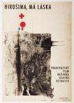
Hiroshima Mon Amour movie poster by Bedřich Dlouhý, 1963.
•••
b. 2nd August 1932, Plzeň (Pilsen), Czech Republic
Education / Pedagogue:
1949 − 1952, Specialised Ceramics school in Prague [^1]
1953 − 1959, Academy of Fine Arts, Prague (Karel Souček, Miroslav Hollý)
1990 – 1995, taught as professor at Academy of Fine Arts, Prague
Exhibitions / Awards:
up to 70s artist exhibited mostly in group shows across the Europe and Czechoslovakia
IV. Biennale de Paris, Musée d’Art Moderne de la Ville de Paris, 1965 (Awarded)
Art Groups:
Palette of Homeland (unofficial trans.) / Paleta vlasti (Hockey team consisting of several of artist’s friends)
Šmídrové (from 1954)
Confrontation / Konfrontace (from 1961, also Jiří Balcar)
Retarded / Zaostalí (from 1987)
Film posters created: 23 (1962-1971) [^2]
•••
[quote]”It may sound slightly disrespectful, but I am aware that I have a huge wide inventiveness and it makes and justifies me to take interest in many sectors of the art form.” [^3][/quote]
We are somewhere in mid fifties, in times of the most absurd terror upon democracy, constant greyness (Stalin’s monument in Prague and similar monsters are being raised across the Czechoslovakia) and bleak vision of existence. At the Academy of Fine Art in Prague the group of three interesting characters are meeting up. In the following words we will try to get closer to one of them.
[quote]”I started out as no one in that field and I was getting jobs for pretty inconsequential films from Romania, Bulgaria and Russia. They were productions of a third or second category. Because of the impressive quality of my work, film poster committee and ÚPF representatives (Formal state film distribution 1957 – 1991) were constantly adding to a momentum. It was reflected in good quality commissions for example for Fellini’s or Visconti’s magnum opus. I had to earn it.” [^4][/quote]
Bedřich Dlouhý was not such a tyro/novice at the beginning of his poster designing career as he explains in the quote above. By the time he started to design movie posters (1962) his portfolio contained already good body of art work, some important exhibitions and possibly something extra to it. To his future colleagues he must have been known as someone incredibly talented, the man without hesitation and very likely also without compromise.
•••
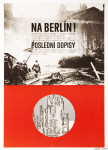
The Fall of Berlin movie poster by Bedřich Dlouhý, 1968.
•••
Neglecting the art
Among Bedřich Dlouhý’s best early pieces was exhibiting with art group Šmídrové. Their first exhibition in 1954 called Malmuzherziáda (varieté of painting, music and act as we understand) was made in the hardest times of Stalinist propaganda and Social Realism. Jan Koblasa (Czech artist and the member of the group) in the documentary made for Czech Television demonstrates the climate of late fifties as “very dark and grey”. Days in art school, as days among communist collaborators (“recommended working class was gaining high school diplomas to get legal access to Universities). Loneliness among them was unbearable.” [^5] No wonder that the three of them had met under such a circumstances. The group itself had very playful character with Neo Dadaist expression, hockey team and brass band.(Traditional folk music was not in favour of communist propaganda either, they had their own songs full of ridiculous slogans.)
[quote]“We loathed to look as an artists. We loathed to do things as an artists. We played hockey as part of our manifest Šmídrové. It may sound unbelievable, but the main thing was not to be an artist.” [^6][/quote]
After their first collaborative exhibition the group was officially established. Show or rather happening in 1957 called “Exhibition for one day” brought in too much controversy. Event had to be cancelled in duration, but it took place elsewhere the following day. On the day one Václav Havel (Czech writer, poet, ex-president) was giving the speech and on the second day he was already taking part with good number of other artists and musicians. Bedřich Dlouhý’s discharge from the Academy followed and lasted for a while.
Poster days and …
As for the film poster Bedřich Dlouhý was testing the new medium so intensely as anything else. His posters might appear visually settled and designed in quite minimalist style. In our examples even his typography might look very basic. Less is more, but not for Bedřich Dlouhý’s movie posters. They are full of hidden symbols and impressions even when they seem so simple.
Please come closer and let’s take a look at his The Fall of Berlin movie poster for instance. Fairly suggestive photograph of burning German capital is taking over the larger part of the poster. Pure catastrophe straight into ones face and quite rightly in monochrome. Message is very simple, anyone could guess what the movie poster offers. Bedřich Dlouhý does not want you to only see the movie but he also wants you to use the rest of your senses.
He takes your attention a bit further by exploring the large circle in the middle of the rich red bottom half of the poster. Red colour could represent the tons of blood and it is possibly also used to say big STOP. Almost like the red colour on traffic light advising one to stop, only the circle here is empty. Negating reality and pointing out that people will never learn. Or take the circle together with rectangularly shaped photograph. Two objects want to look little something like exclamation mark and set the message to following? STOP THIS! ? Similarly to the inner part of the circle that tells how it could all end up if we do not stop the wars. His movie poster for Hiroshima Mon Amour was designed in absolutely different style, but the poster also suggests close catastrophe.
•••
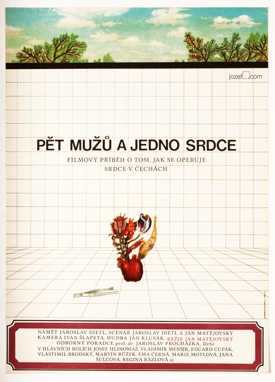
Five Men and One Heart movie poster by Bedřich Dlouhý, 1971.
•••
There are not only serious movie posters author has designed, he does not omit humour and irony (posters designed for The Pink Panther / Blake Edwards in 1966 or In the Woods / Akira Kurosawa in 1970 ) [^8] when necessary. He does not use any particular style either, but instead he approaches each individual poster very differently. The one connecting link we have found is that Bedřich Dlouhý’s curiosity does not like to leave things as they are. He wants to get right into to the core of his subject by bringing out the deepest details and he starts from there. He slips between the most complicated expressive forms (techniques frequently used in his paintings) [^9] to the most simple designs masterly. Visual illusion and yet with fantastically clear almost microscopic explanation.
Even thought Bedřich Dlouhý created some of the most iconic movie posters of the 60s, his unconventional approach to art form did not meet with the official agenda of the following decade. Similarly to many other artists in the beginning of the 70s he was forced to stop exhibiting and discontinued with designing movie posters.
Collective authors: Czech film posters of 20th century / The Moravian Gallery in Brno, Exlibris Prague, 2004.
[^2]: Flashback / Czech and Slovak Film Posters 1959-1989, ed. Libor Gronský, Marek Perůtka, Michal Soukup, Olomouc Museum of Art, 2004. (p.49). 25 movie posters to our knowledge.
Tomáš Vlček: Současný Plakát / Contemporary Poster, Odeon, Prague, 1976.
Československý Plakát / Czechoslovak Poster, exhibition catalogue, Olomouc (Czech Republic), 1967. One of the most important poster exhibition in the history of Czechoslovak poster design. We wish to return back to catalogue and give it a full blog post once we are ready.
Online:
[^1]: abArt / Bedřich Dlouhý / see for the full list of exhibitions. abArt takes always first place and star when it comes to research.
Poster art by Jaroslav Fišer for Věra Chytilová’s films.
We can hardly hide our excitement about BFI’s wonderful retrospective of one of the most innovative Czech filmmakers Věra Chytilová. It is also a very good opportunity to introduce the work of Jaroslav Fišer, prolific graphic designer and author of several posters for her films.
Jaroslav Fišer studied at the Technical University in Prague and at the Academy of Arts, Architecture and Design, Prague, former Czechoslovakia. During 1959 – 1987 Jaroslav Fišer designed 104 movie posters and his poster for film The Apple Game won a Silver Hugo at the International Film Festival in Chicago, USA.
BFI’s tribute to the director is organised in collaboration with Czech Centre, London and Czech National Film Archive and is on from 1st March – 17th March 2015.
Movie posters designed for Věra Chytilová’s films:
The Apple Game movie poster by Jaroslav Fišer, 1976.
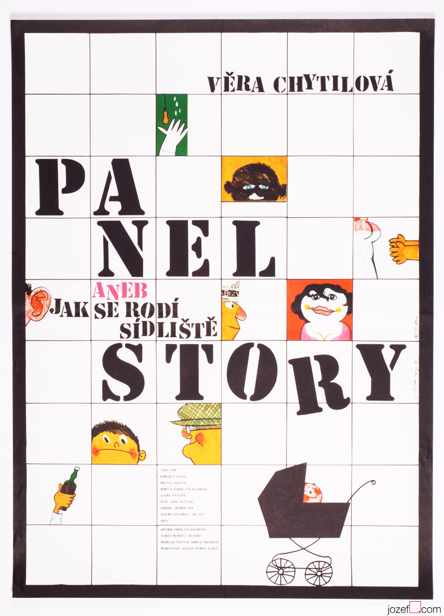
The Panel Story movie poster by Jaroslav Fišer, 1979.
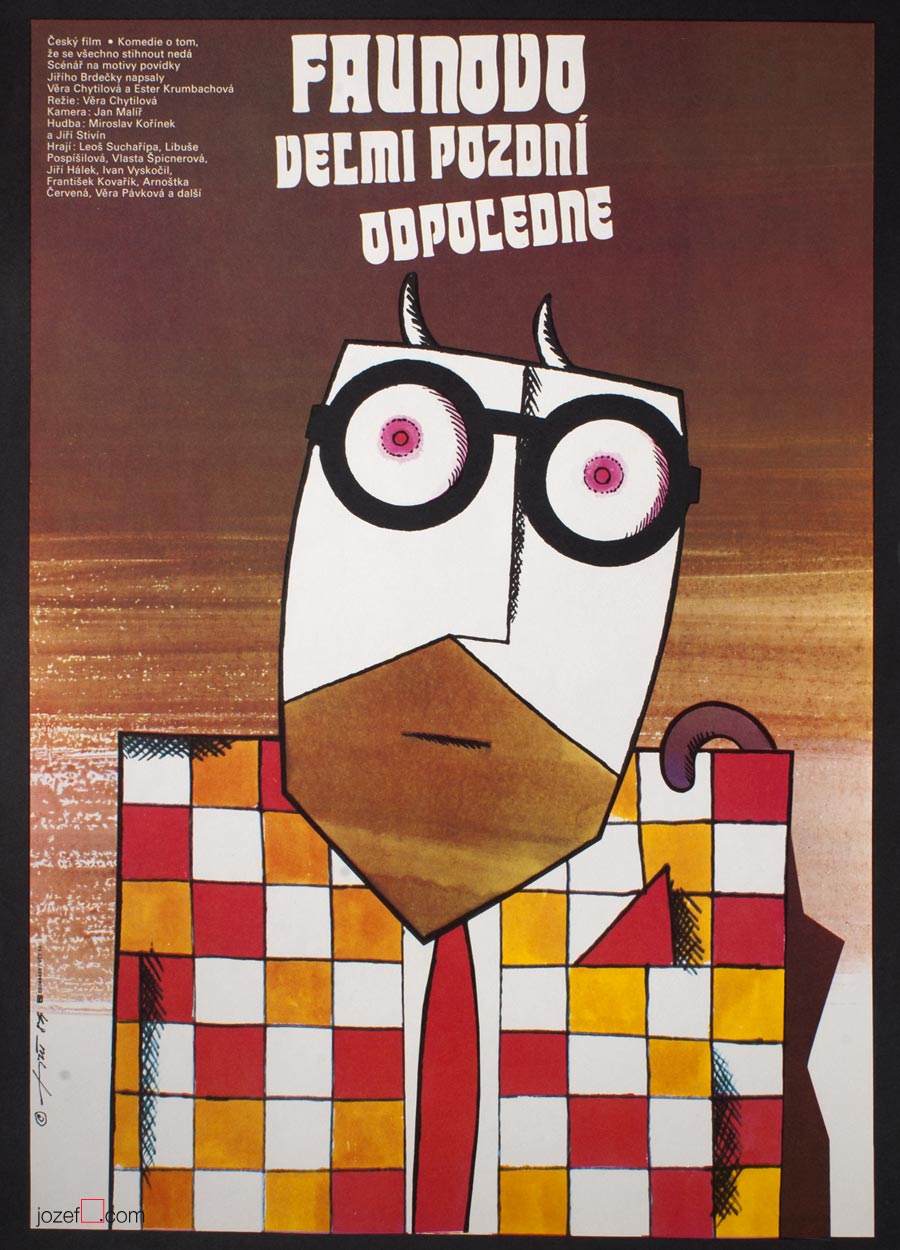
The Very Late Afternoon of a Faun movie poster by Jaroslav Fišer, 1984.
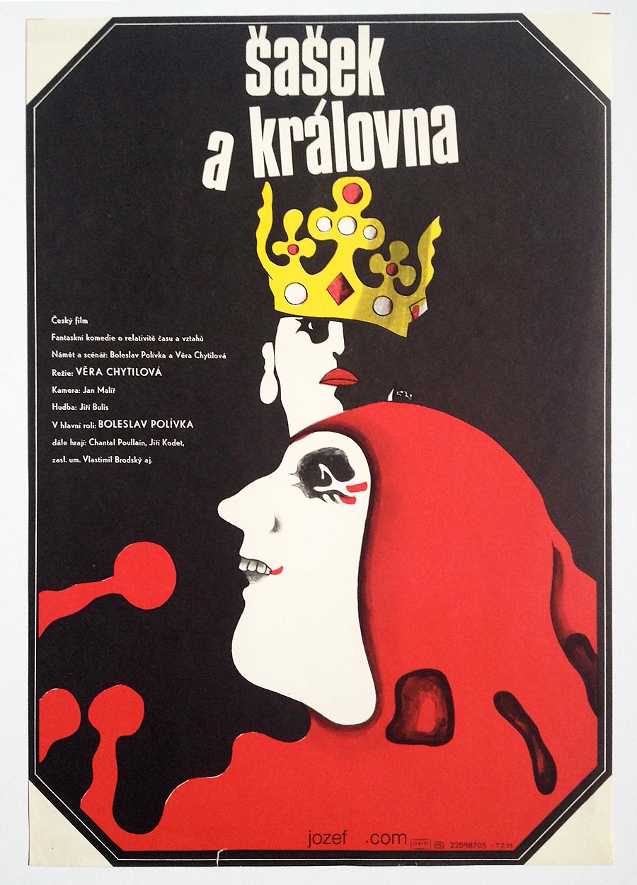
The Jester and The Queen movie poster by Jaroslav Fišer, 1987.
Selection of movie posters by Jaroslav Fišer:
Please don’t wake me up movie poster by Jaroslav Fišer, 1962.
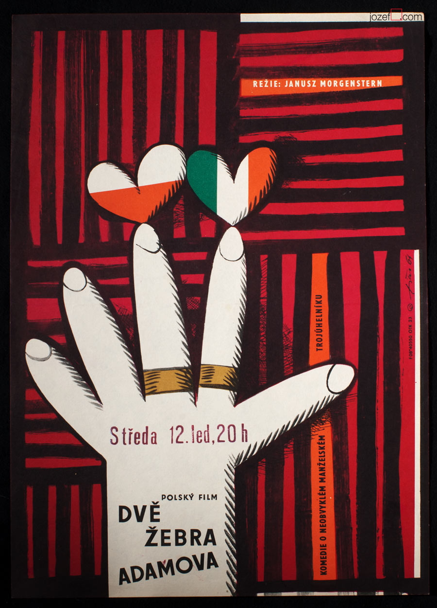
Adam’s Two Ribs movie poster by Jaroslav Fišer, 1964.
Check Passed: No Mines movie poster by Jaroslav Fišer, 1966.
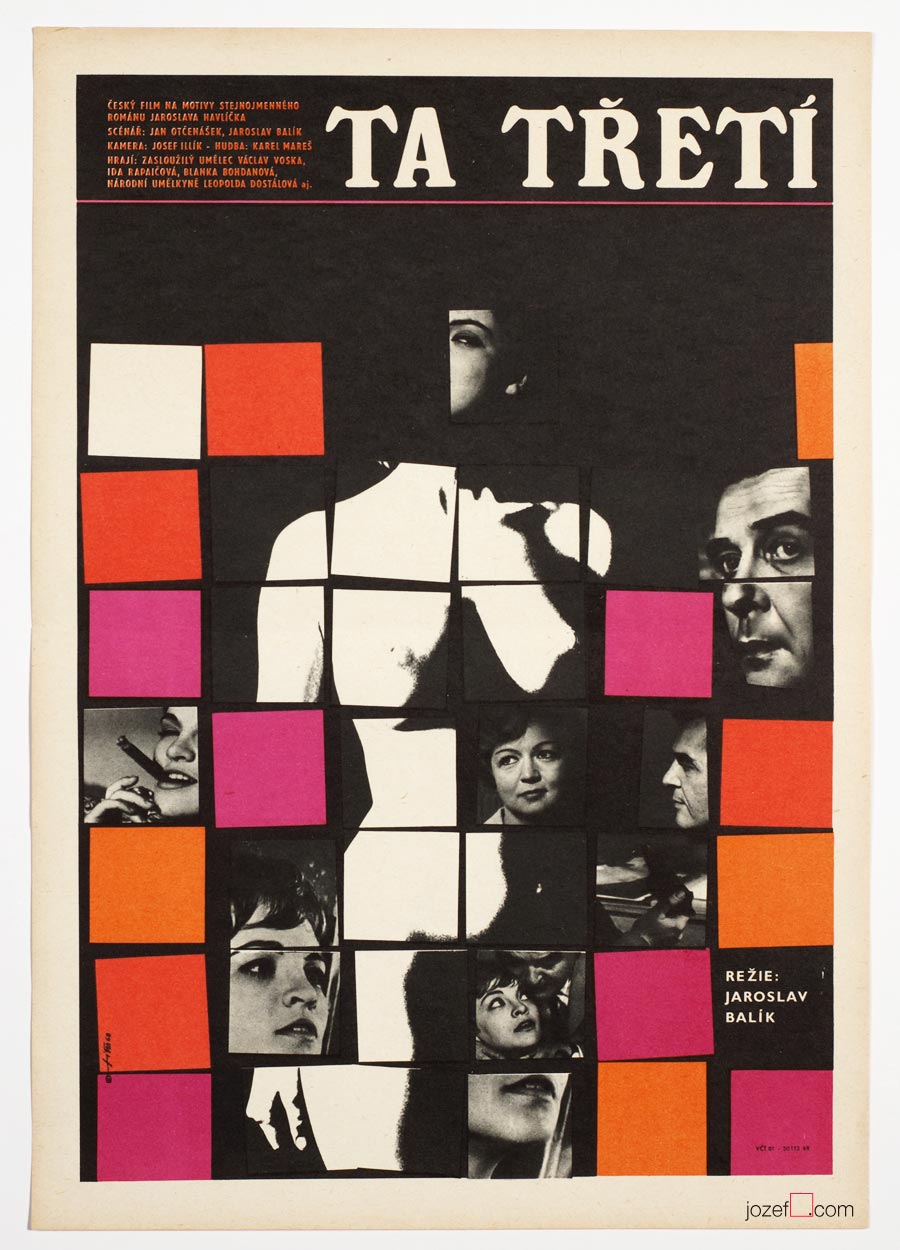
The Third One movie poster by Jaroslav Fišer, 1968.
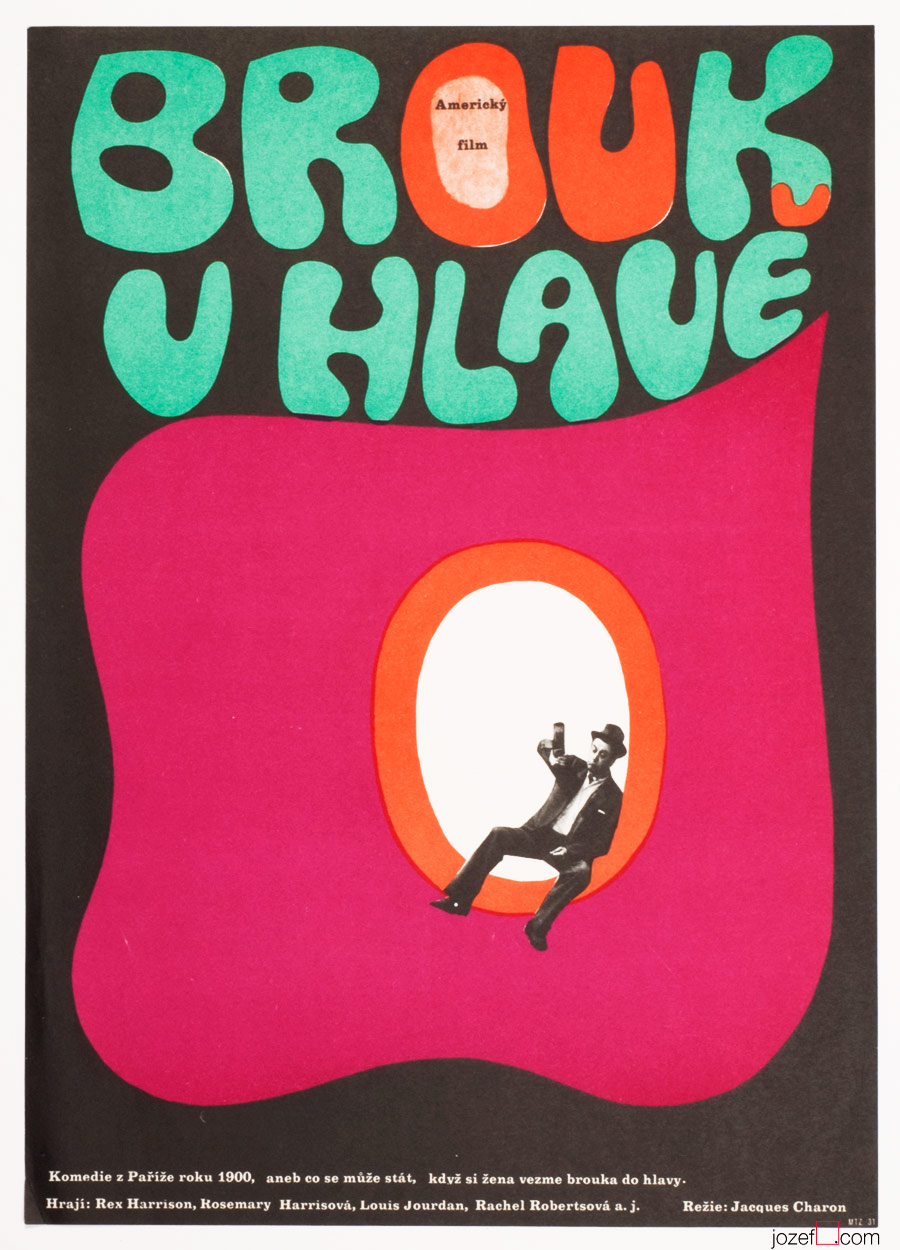
A Flea in Her Ear movie poster by Jaroslav Fišer, 1969.
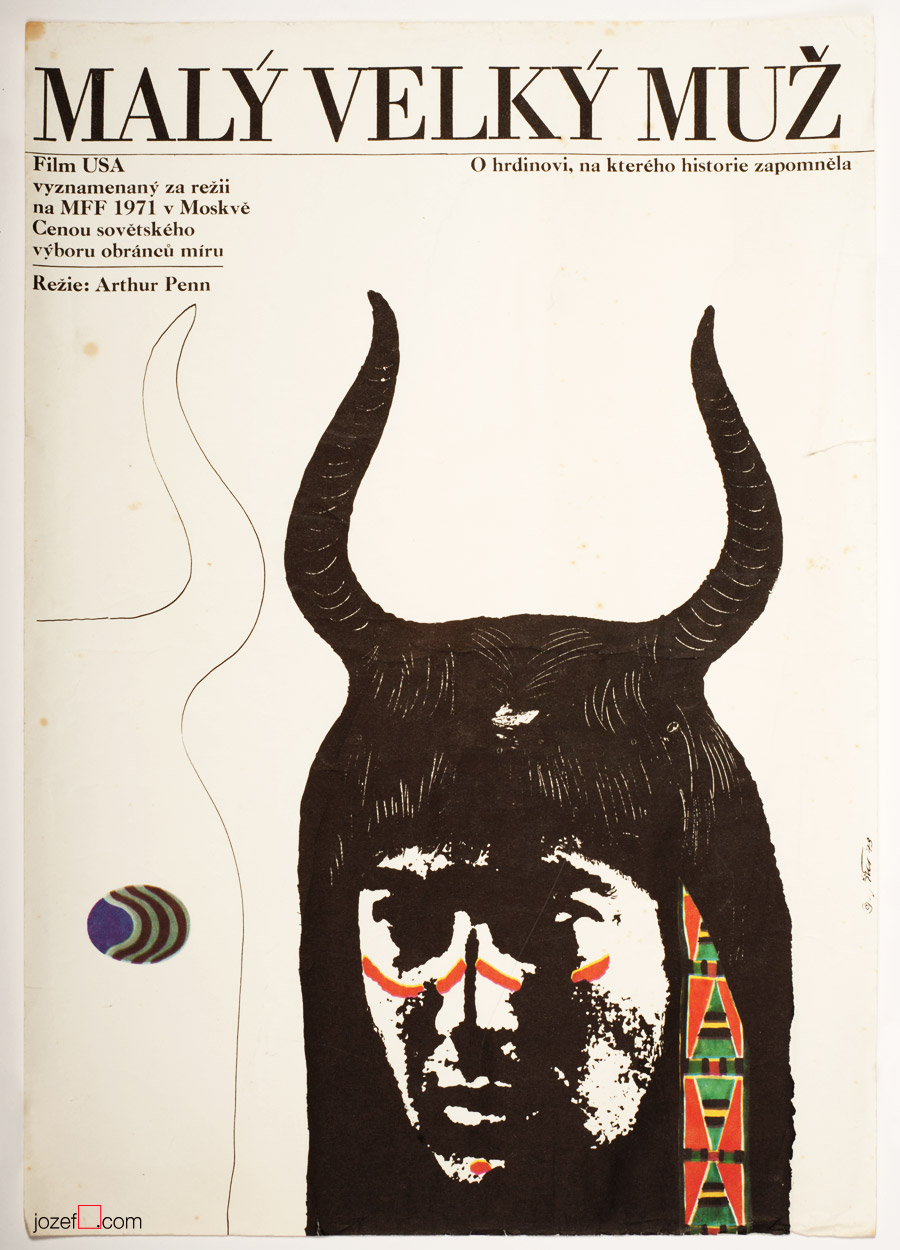
Litle Big Man movie poster by Jaroslav Fišer, 1973.
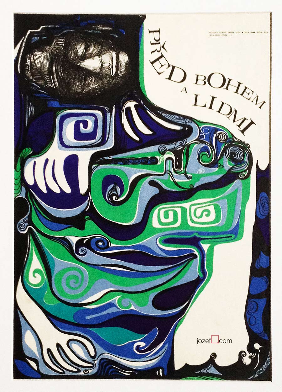
Before God and Man movie poster by Rudolf Altrichter, 1968.
10th of June 1916, Vienna
8th of September 1978, Bratislava
Education:
1938, Business High School, Trenčín
University of Economy, Bratislava
Awards:
1966, Prize for the most beautiful poster of the year.
Film posters created: 32 (1959-1972)[^1]
***
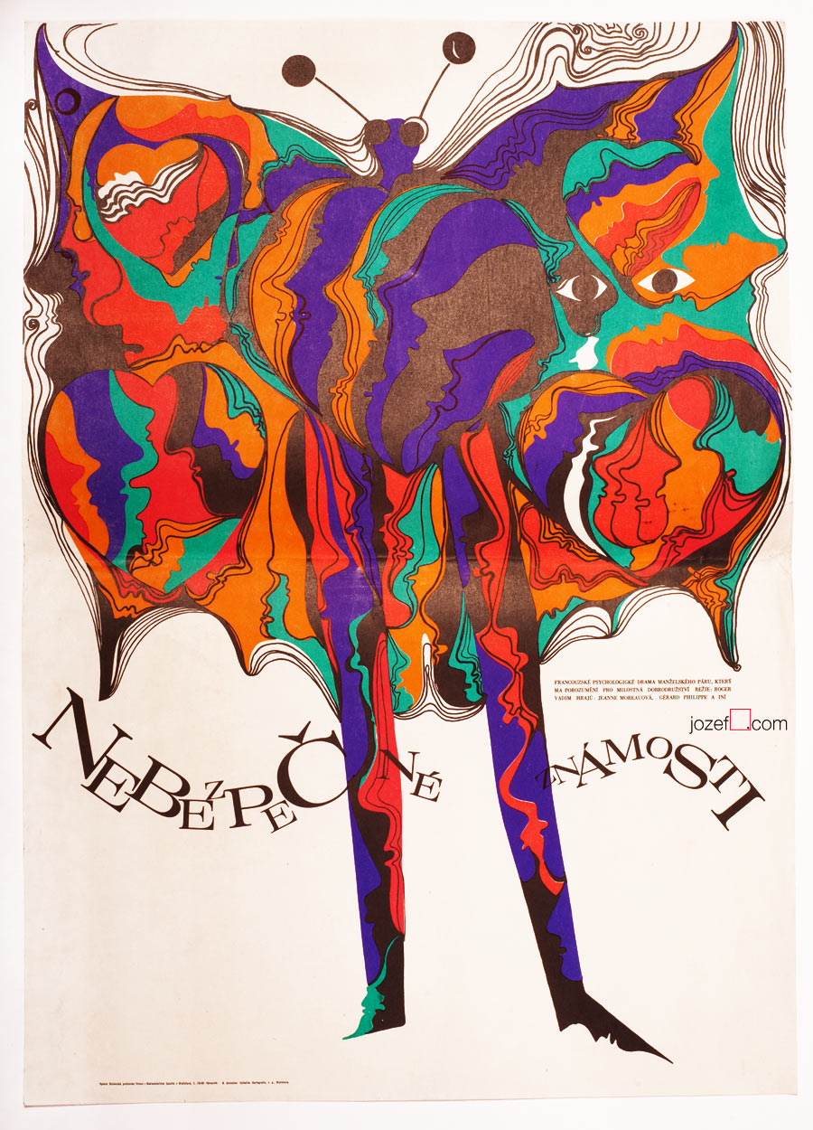
It is fairly interesting when thinking of Rudolf Altrichter’s designs for film posters, that behind all this visual trickery is hidden self-taught artist. Originally trained as a sales man (worked also for Bata / shoemaker company) he became one of the most influential Slovak graphic artist. In his thirties he became one of the establishing members of newly reopen Slovak Art Society (1946) and year later co-founder of Association of Slovak Graphic Artists (1947).
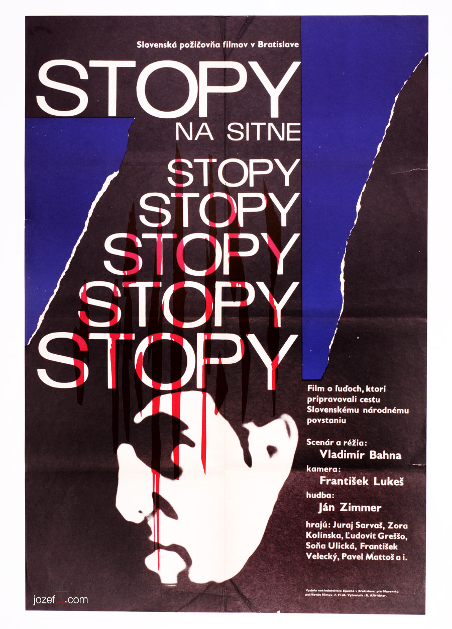
Rudolf Altrichter’s film posters are full of visual harmony, unusually blended by pure abstraction and the hints of reality. Human element appears to be one of his strongest standing point, no matter if it is design for art exhibition, film or political poster. Visual harmony is also represented by the use of elegant thin lines and curvy almost psychedelic shapes. Absurdity of the war, another of his characteristic motifs, can be also seen on several of his film posters. Film poster designed for French drama Dangerous Love Affairs / Dangerous Liaisons (shown bellow, designed in 1969), belongs to the selection of the most significant acquisitions of the Poster and Graphic Design Collection of Slovak National Gallery.
***
Dangerous Love Affairs movie poster by Rudolf Altrichter, 1969.
Talking Caftan movie poster by Rudolf Altrichter, 1969.
Traces on the Sitno movie poster by Rudolf Altrichter, 1968.
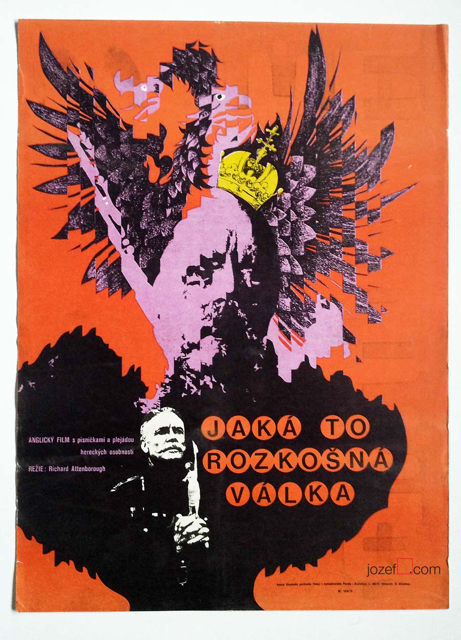
What a Lovely War movie poster by Rudolf Altrichter, 1972.
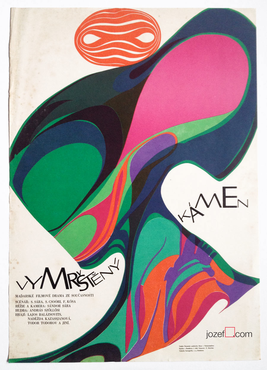
The Upthrown Stone movie poster by Rudolf Altrichter, 1970.
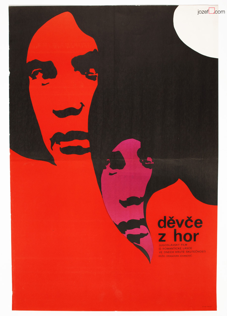
Girl from the Mountains movie poster by Altrichter, 1972.