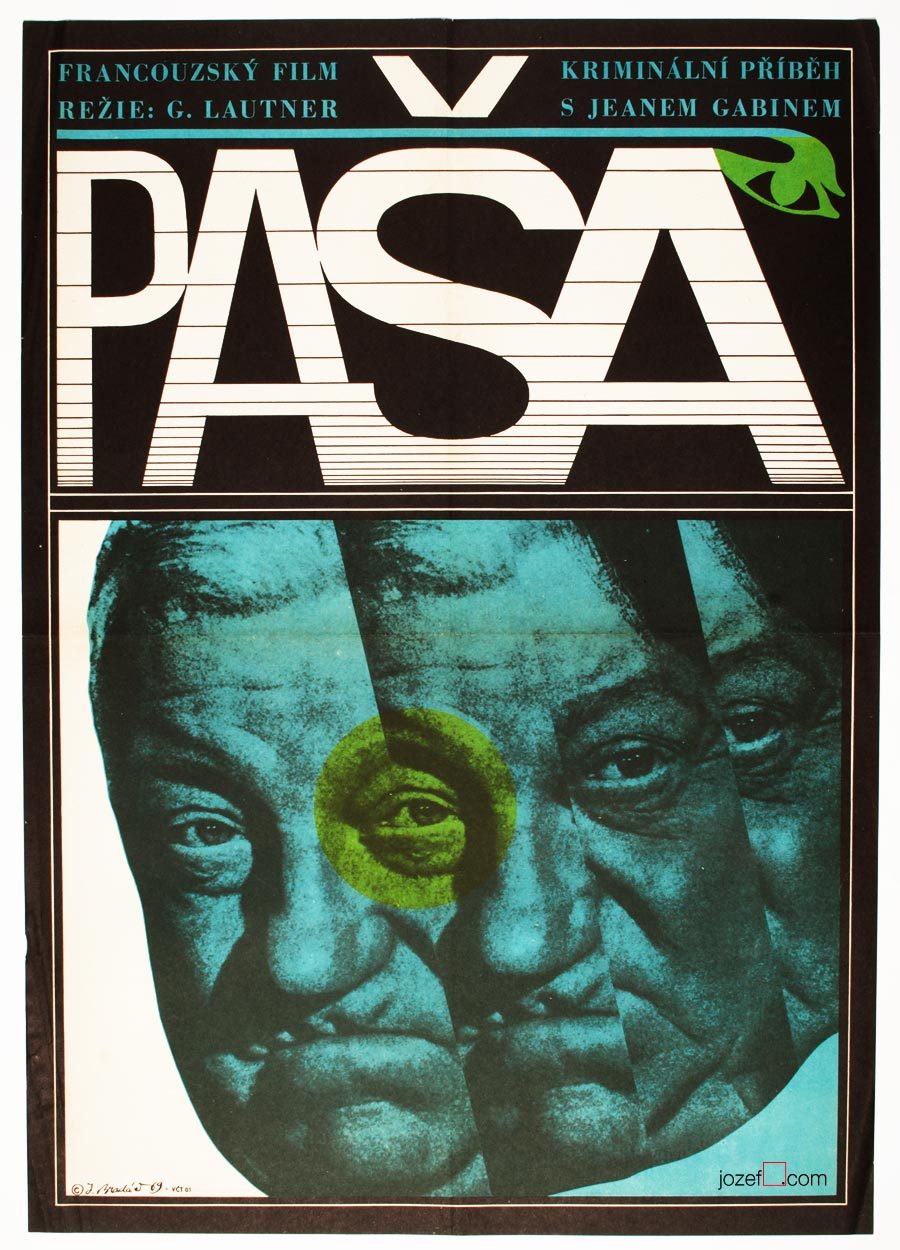
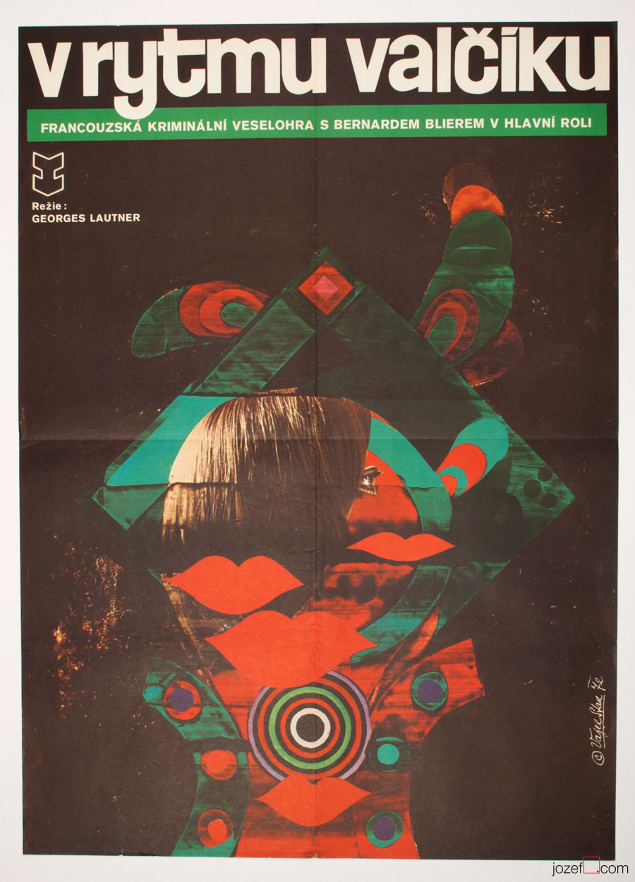
Movie poster shown on the picture above has been seen previously in one of our articles on History of Poster Design in Czechoslovakia. It did not stop us from refreshing the memory as we are strongly effected by its expressiveness. Jean Gabin‘s common impression for every French born was broken into uncertainty. Divided into parallel fields as in the rhythm similar to main theme of that phenomenal soundtrack composed by Serge Gainsbourg. Music moves on as we can see even on the letters, one can hear the most peculiar sounds.
Mysterious poster for Georges Lautner‘s film is hiding one extra mystery and that is the poster designer himself. Jaromír Bradáč remains the one, or at least for now. You can count number of his film posters on your left hand and that’s about everything we could track on this fantastic graphic designer. Hopefully the future will show some more light about him, as we believe five film posters is not everything he did.
***
A Study About Women, film poster by Jaromír Bradáč, 1968.
1982 – Grand Prix for portrait work, Tuzla, Bosnia and Herzegovina
1984 – Prize of the Ministry of Culture of Bosnia and Herzegovina for portrait work at International Biennial of Portrait, Tuzla
•••
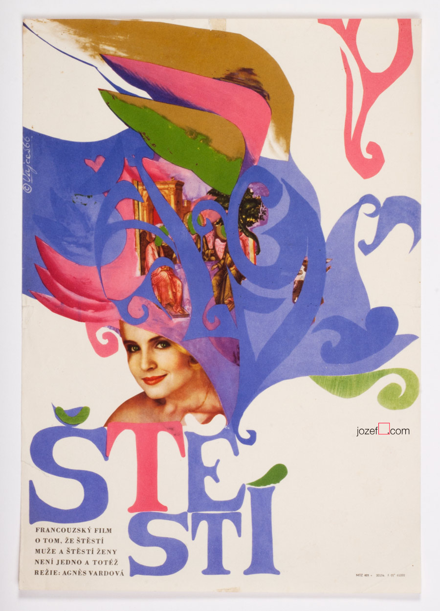
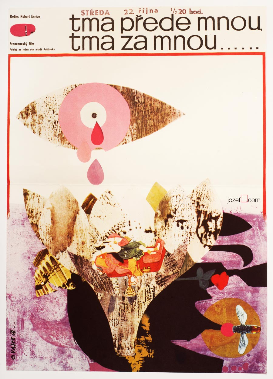
Happiness movie poster by Stanislav Vajce, 1966.
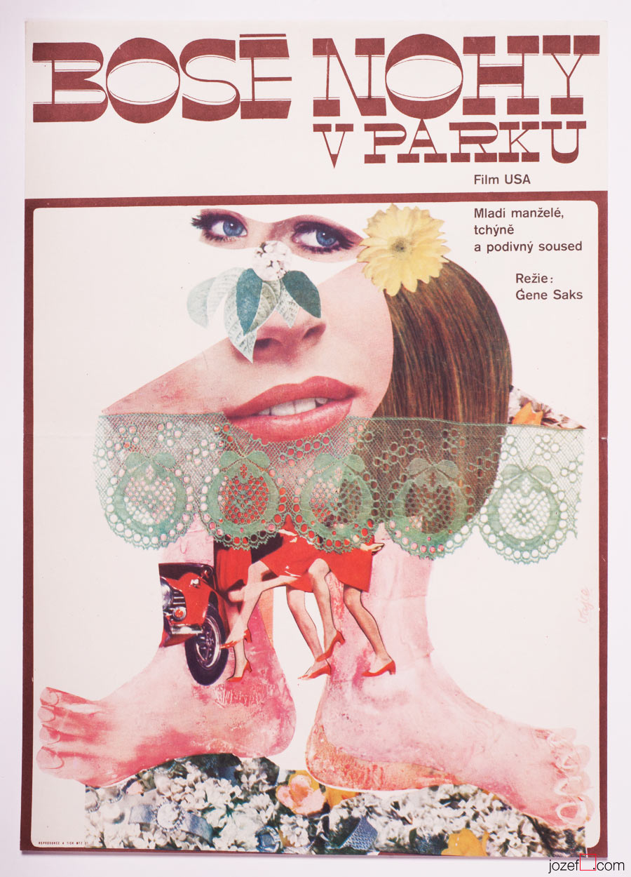
Barefoot in the Park movie poster by Stanislav Vajce, 1967.
•••
[quote]“Stanislav Vajce’s art of painting – if by this we mean the art of masterfully guiding the brush – resolutely rejects the academic approach to painting and replaces it with a sensitive and sweeping painting style.”[^4] [/quote]
It’s almost tradition that many Czechoslovak poster designers were involved in painting or had some sort of fine art study background. 1950s were accumulating incredible potential and vitality among artists, but political climate of totalitarianism was breeding machine-like art and did not allow any personal burst out.[^5] In mid 50s Stalinist era was slowly ceasing to extinction and for the following decade Czechoslovakia was witnessing quite surprising changes. Many artists were meeting up in newly created art groups or were allowed solo exhibitions. However, political apparatus was still in charge as the movie poster commissioner had a good number of contemporary artists circulating on their list.
•••
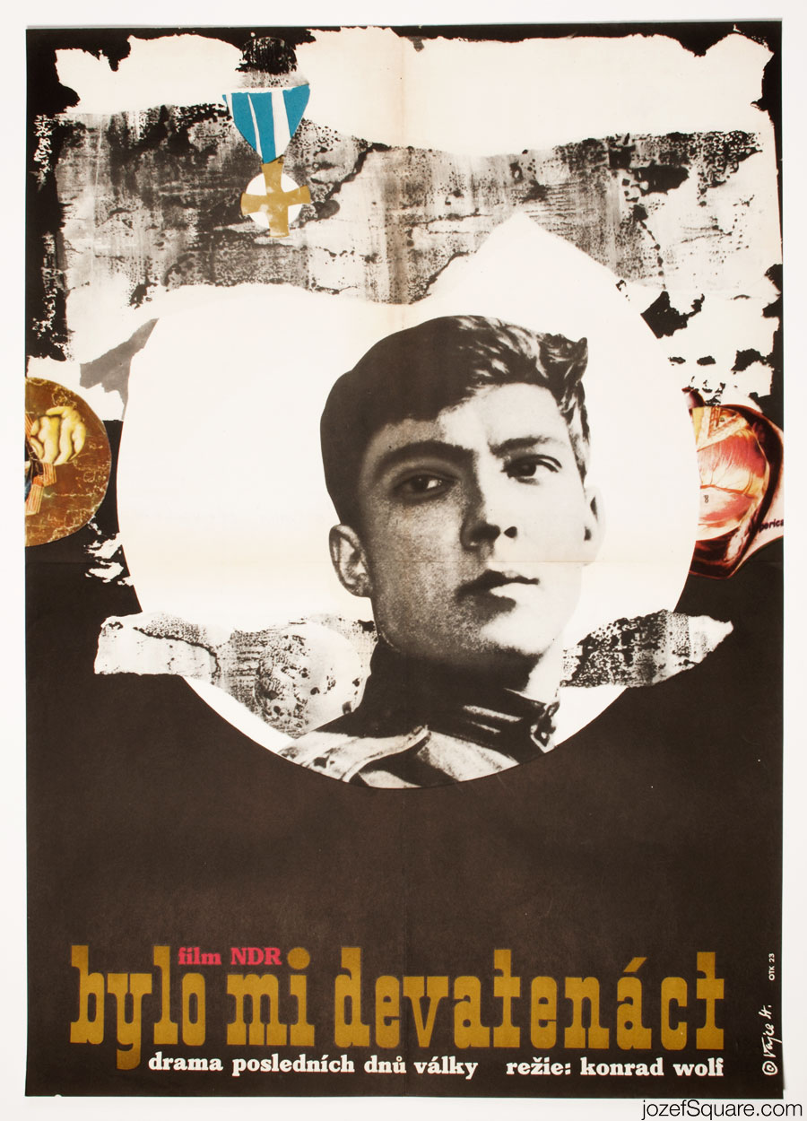
I Was Nineteen movie poster by Stanislav Vajce, 1968.
Tanta Zita movie poster by Stanislav Vajce, 1968.
•••
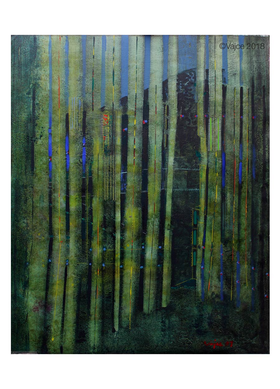
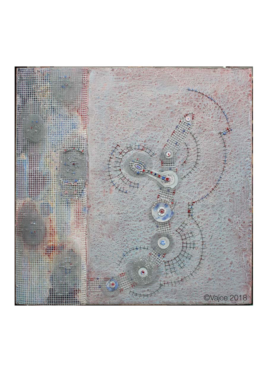
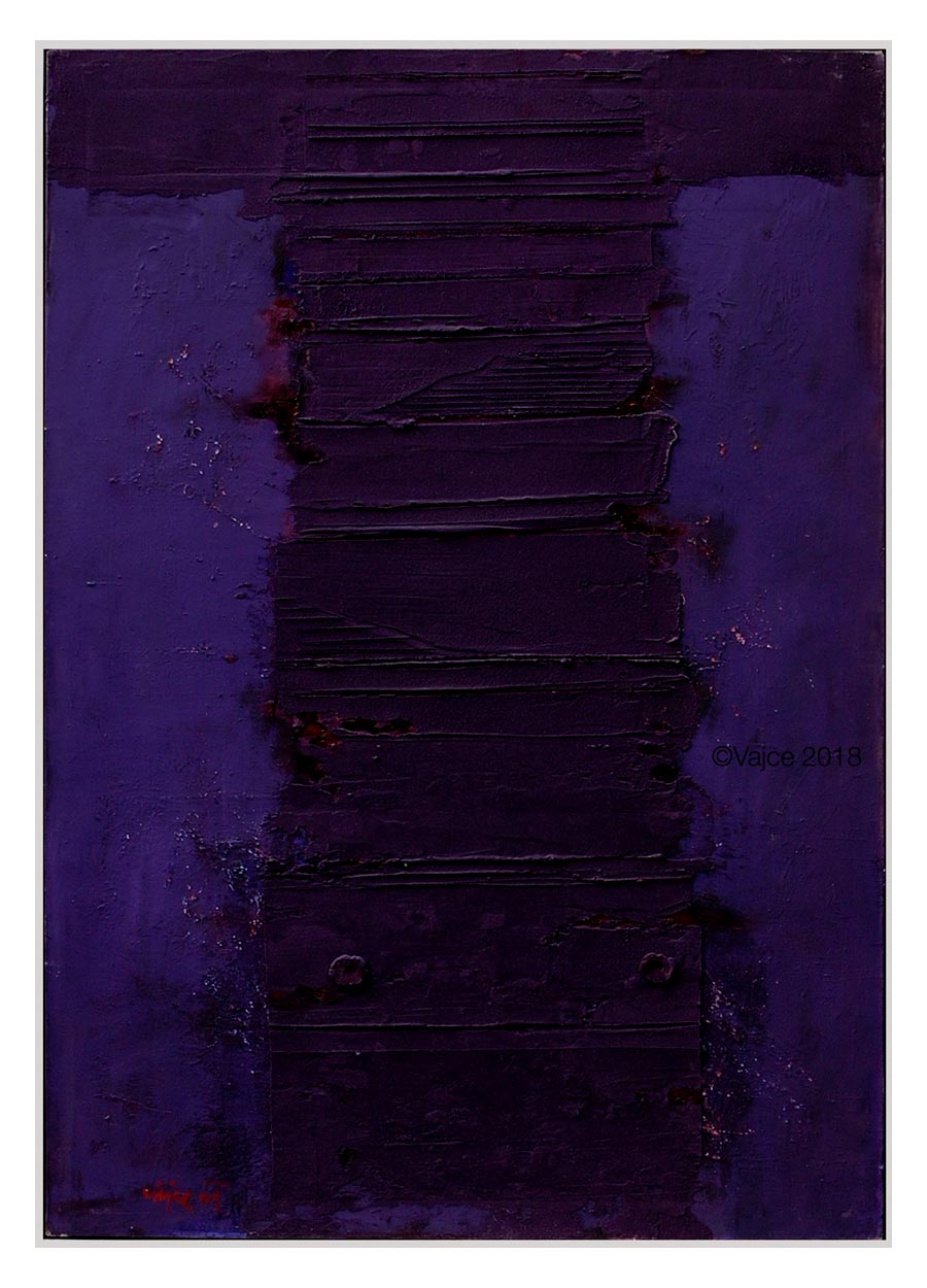
Pure fascination awaits for those who choose to observe movie posters of Stanislav Vajce closely. His inspiration seems endless and same goes to his ability to work with such an infinity. Stanislav Vajce’s devotion to art matter started fairly early in his age. As a 15 year old boy, he traveled daily to Klatovy in order to apprentice as a sign-painter and gilder.[^6] This affection remained with him ever since; in his future art, as well as he was frequently using gold and hand typing in his poster work.
•••
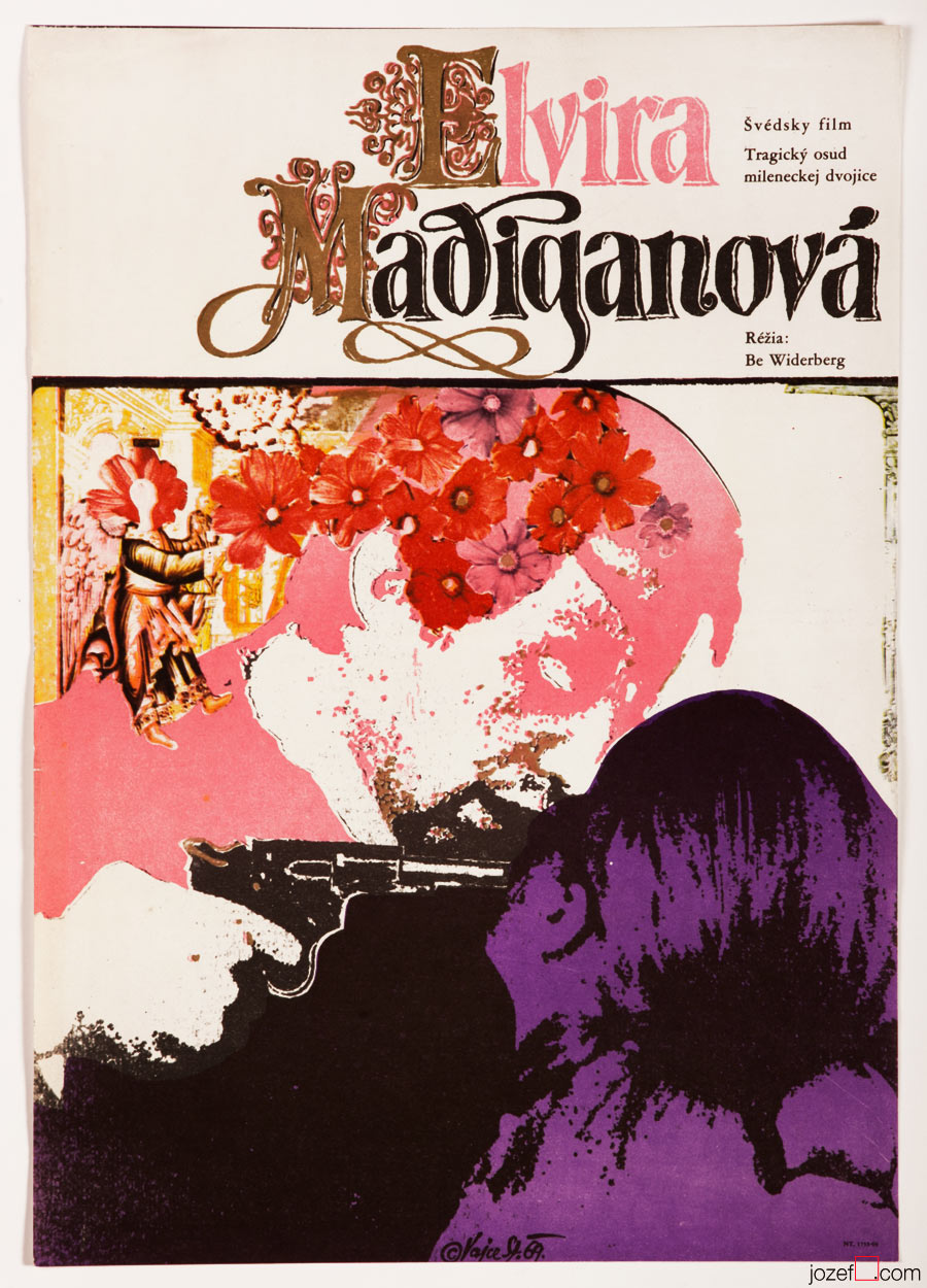
Elvira Madigan movie poster by Stanislav Vajce, 1969.
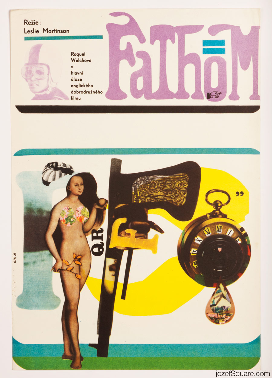
Fathom movie poster by Stanislav Vajce, 1969.
[quote]“Vajce is also in habit of listening to music while painting when he is alone in his studio. ”[^7] [/quote]
Watch out for Susie! movie poster by Stanislav Vajce, 1970.
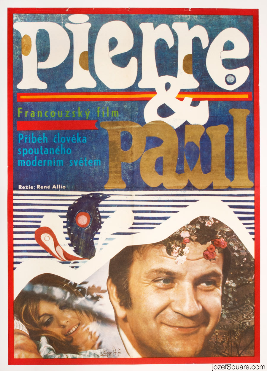
Pierre and Paul movie poster by Stanislav Vajce, 1970.
•••
Stanislav Vajce’s movie posters are real joy to look at, he blends many different techniques that are meeting in very amusing results. There is no limitation to his designing approach. He likes to play with the surface and texture, mixing montage, collage and obviously the brush stroke. The use of every day objects and body parts are repeatedly reoccurring. His use of eye cutouts is almost as striking as the famous scene’s from Luis Buñuel’s and Salvador Dalí’s Un Chien Andalou, eye element keeps returning in several of his posters. Stanislav Vajce’s poster designs are only a step away from his paintings, but unlike in his fascinating assemblages, he likes to employ that cinematic touch in his posters and that is the use of the photograph. Breaking boundaries (in design) seems the most natural to him. His movie posters are pure visual poetry with certain tenderness and delicacy.
•••
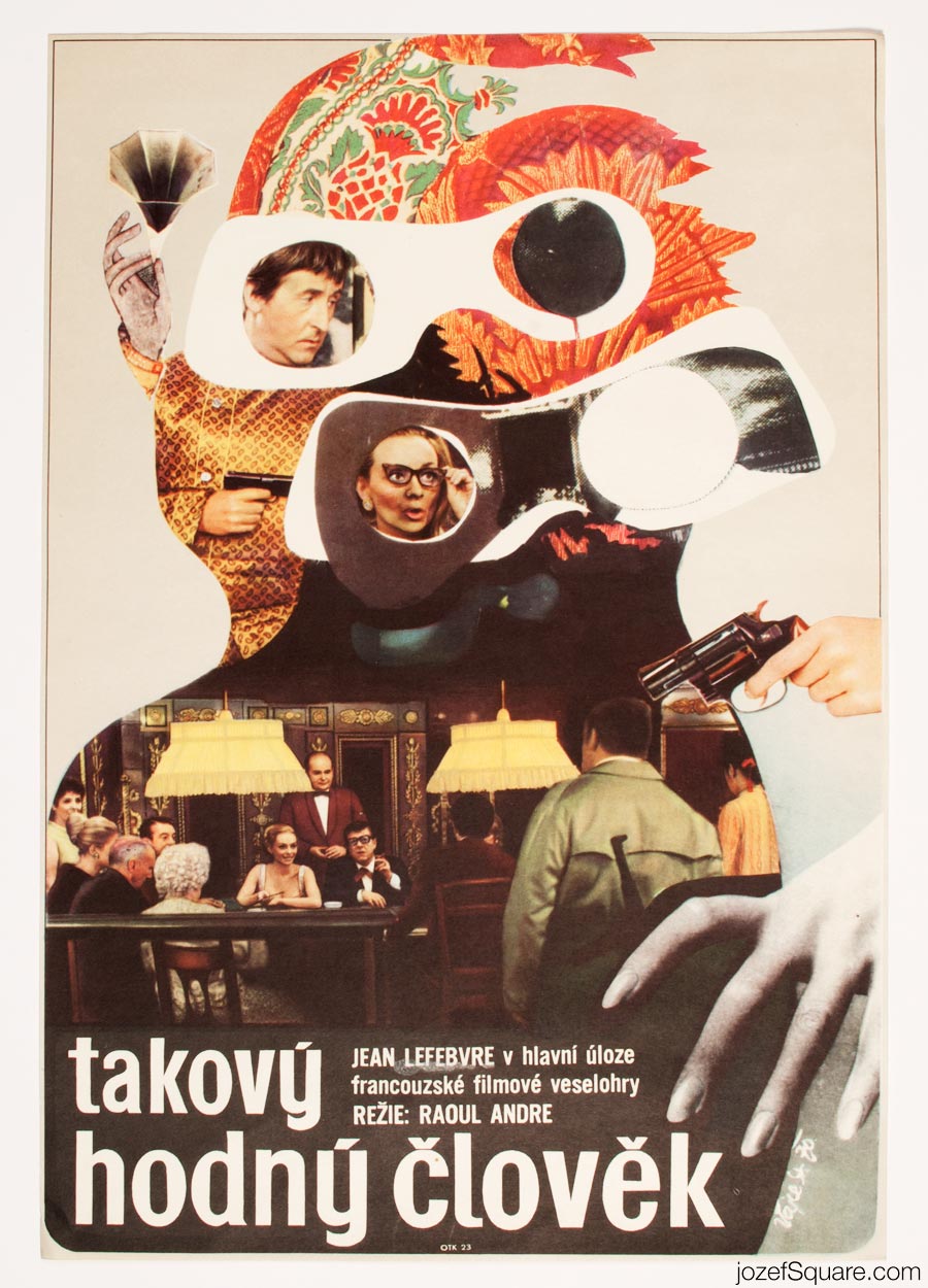
The Nice Bourgeois Guy movie poster by Stanislav Vajce, 1970.
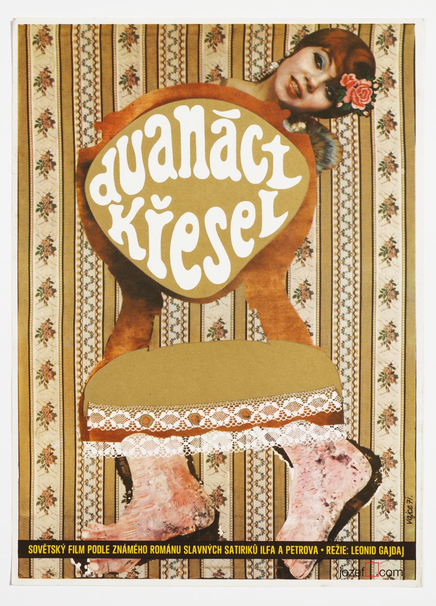
Twelve chairs movie posters by Stanislav Vajce, 1971.
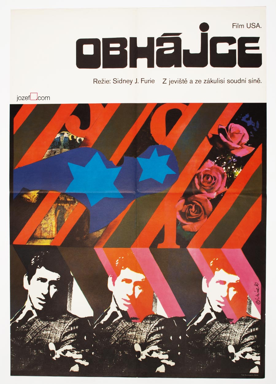
The Lawyer movie poster by Stanislav Vajce, 1971.
Troubleshooters movie poster by Stanislav Vajce, 1972.
•••
Between 1964 − 1972 Stanislav Vajce designed 24 movie posters. He emigrated together with his family to West Germany in 1987 where they live ever since.
•••
Interview with Stanislav Vajce’s wife Eva:
We felt very privileged and lucky at the same time when we’ve heard from Stanislav Vajce’s daughter in law Kirsten. We are willing to make an interview with exile poster artist for so long and are constantly trying to find those “channels”, but we were never as close. It did not take long and we were granted with the reply from Stanislav’s wife Eva Vajce[^8][^9] . We were very happy to find out that she would try to answer some of our questions. Unfortunately Stanislav Vajce’s health does not allow him to participate in this interview. Several questions regarding actual poster designing processes had to be deleted, but we believe Mrs. Eva’s fascinating replies are telling more than we could ever ask for.
[quote]“At the beginning I have to let you know that my husband is seriously ill and unfortunately he will not be able to give answers to your questions. In regards to your effort in trying to approach Stanislav, I would love to try to answer some of them, at least briefly, according to my knowledge.”[/quote]
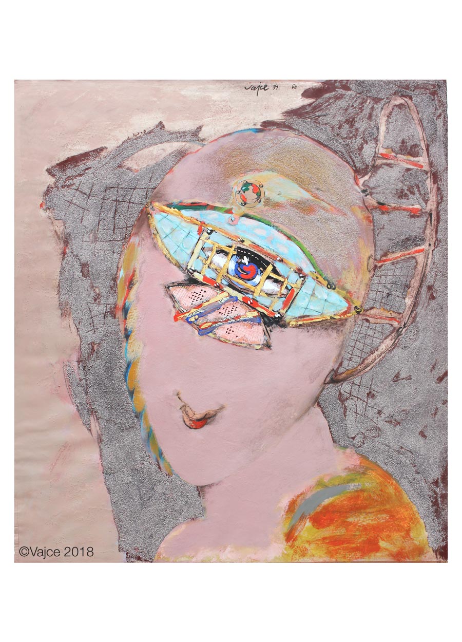
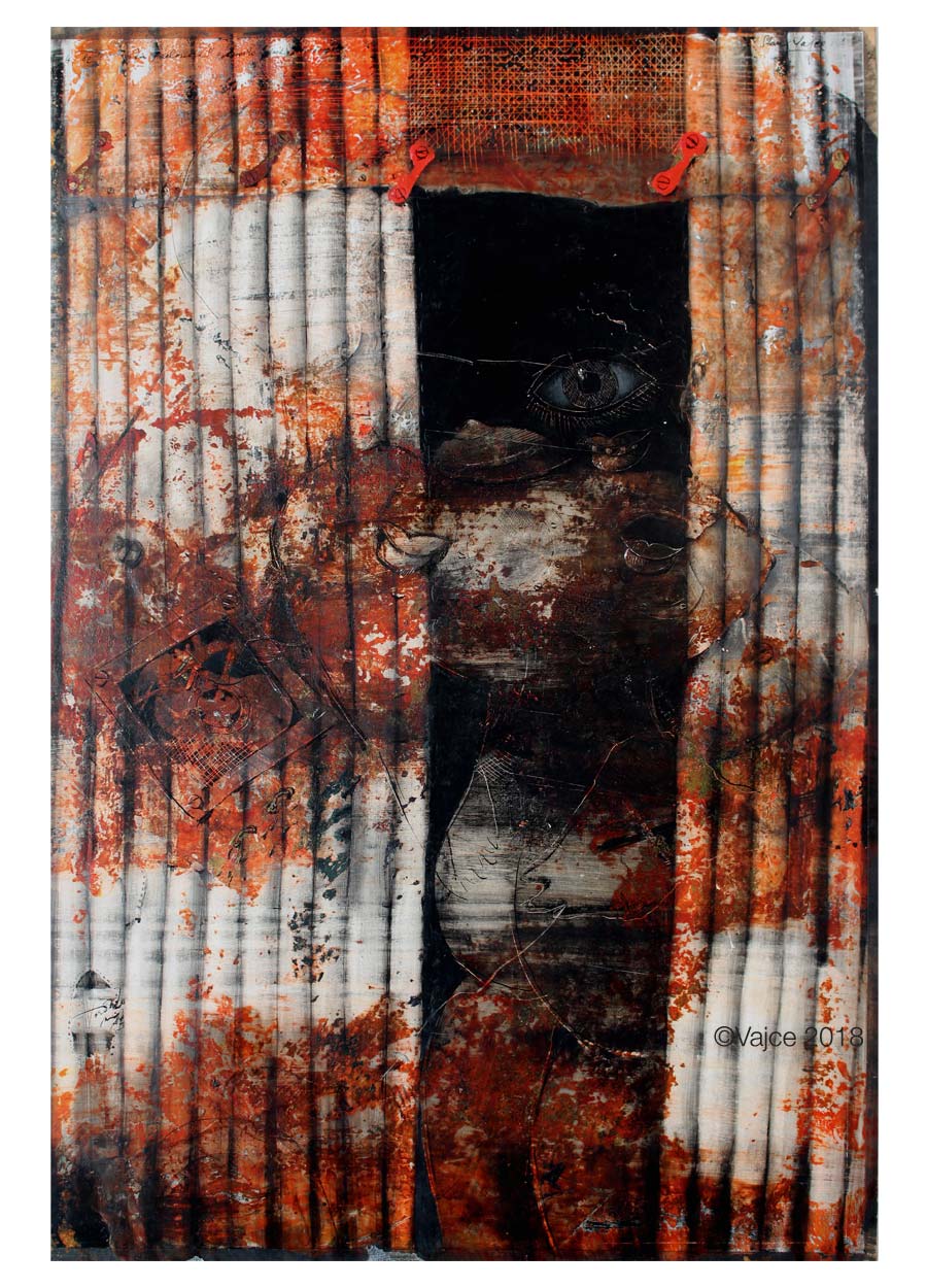
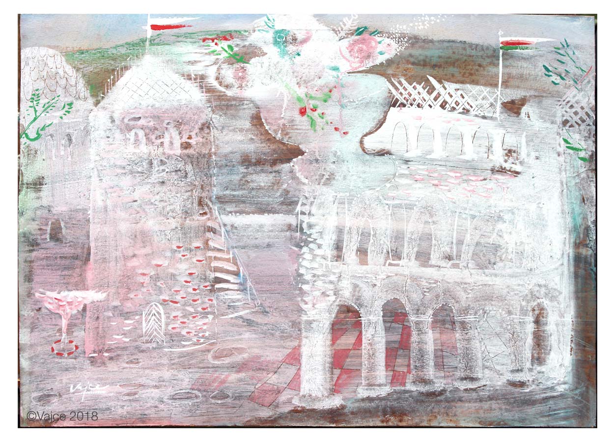
Angel Messenger, 1991
Smile, 1991
Gentle Girl, 1991
Coquette, 1991
We’ve learned that after your studies at Secondary School of Applied Arts in Uherské Hradiště (1954 – 58) you graduated from Academy of Arts, Architecture and Design in Prague (1959 – 63). What were the possibilities for a young graduate of the art school in the mid 1960s in the totalitarian state, in embrace of Communist propaganda and social realism?
[quote]“My husband studied at the Academy of Arts, Architecture and Design in Prague a monumental painting under the supervision of professor Fišárek. Since he was not in the Communist Party, he did not expect to be able to live of painting, or to get any sort of architectural commissions and began to devote himself to book graphics. He discovered the art of gramophone record covers was not efficient enough. Record company Artia[^10] had business success around the world with top-class recordings of classical music, but had sales difficulties due to the appearance of the product. Records with his packaging were the attraction for foreign buyers. Along with that, he started to design posters, illustrations, etc.”[/quote]
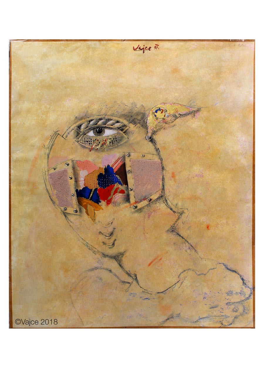
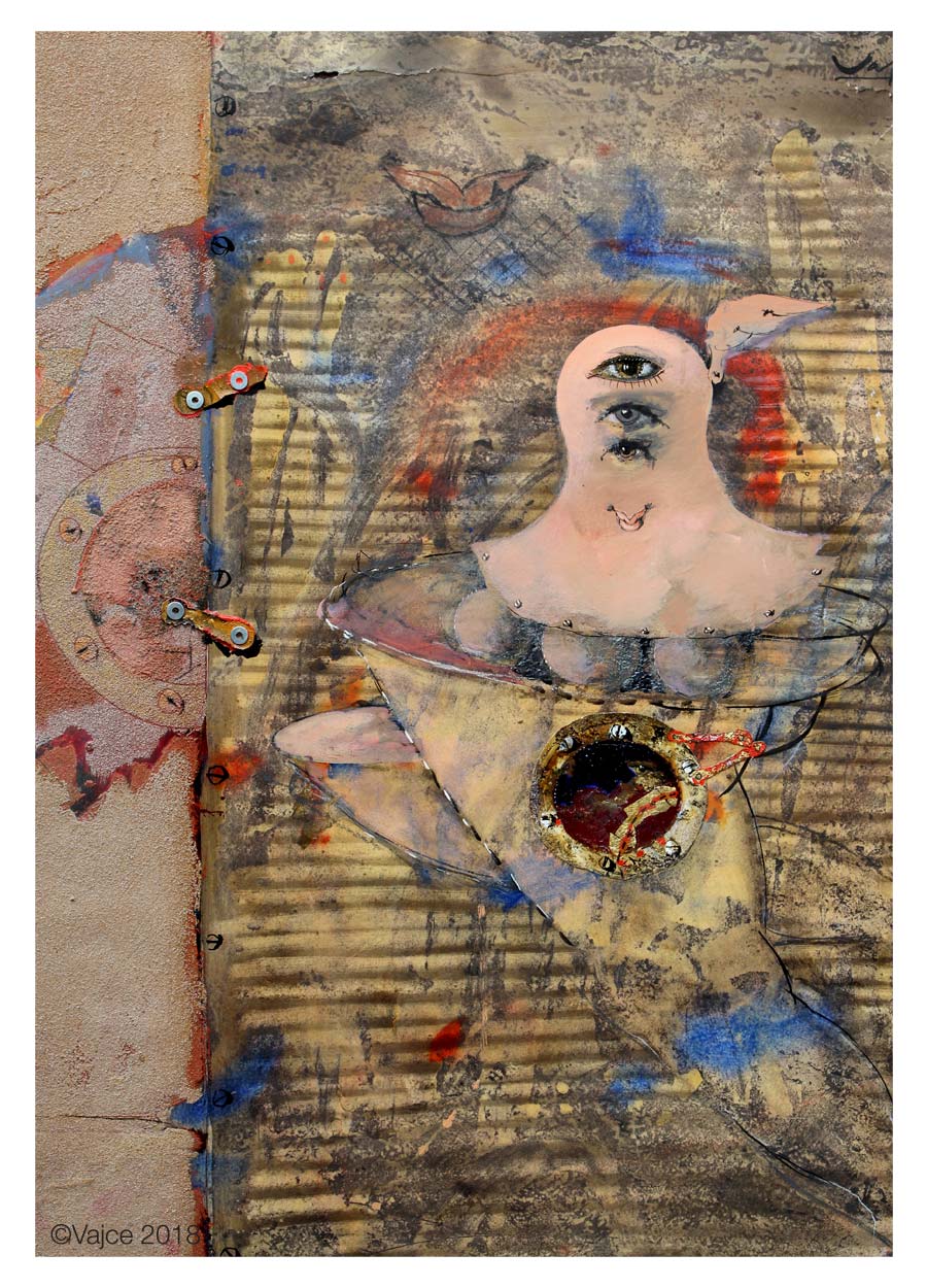
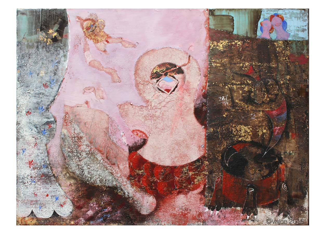
Harlequin, 1989
Behind the Curtain, 1988-89
I Had a Dream, 1994
Antique Landscape, 1999
Between 1964 – 1972 you’ve been working on movie posters, similarly as many other contemporary artists. Why was the poster making so popular among artists and what brought you to designing?
[quote]“Poster designs were relatively well paid at that time, thus quite a fight/competition among the graphic artists, it was simply a question of existence. Otherwise, my husband did not belong to these typical “graphic artists”, which is why, as I suppose, he was not represented on poster exhibitions, even though the quality of his work deserved it. On the contrary he did not care about the appreciation, it was indifferent and unfamiliar to him. The commissions for the posters were coming from Mrs. XX, I do not remember her name anymore, because Stanislav was sympathetic and did not ask for any. There was the so-called art committee made out of artists such as Vaca, etc., similarly as with all art commissions. The members of such a committee were nominated by the Union of Fine Artists and they were politically engaged to the party, in many times it did not matter how good their art was. The most of the contracts were distributed among themselves. If Stanislav occasionally passed, it was always because of the high quality of his artwork, he was always aside of art groups or unions. Graphic artists were holding together quite strongly. Perhaps, in my opinion, they had complex from “painters”.[/quote]
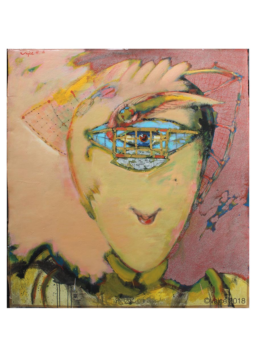
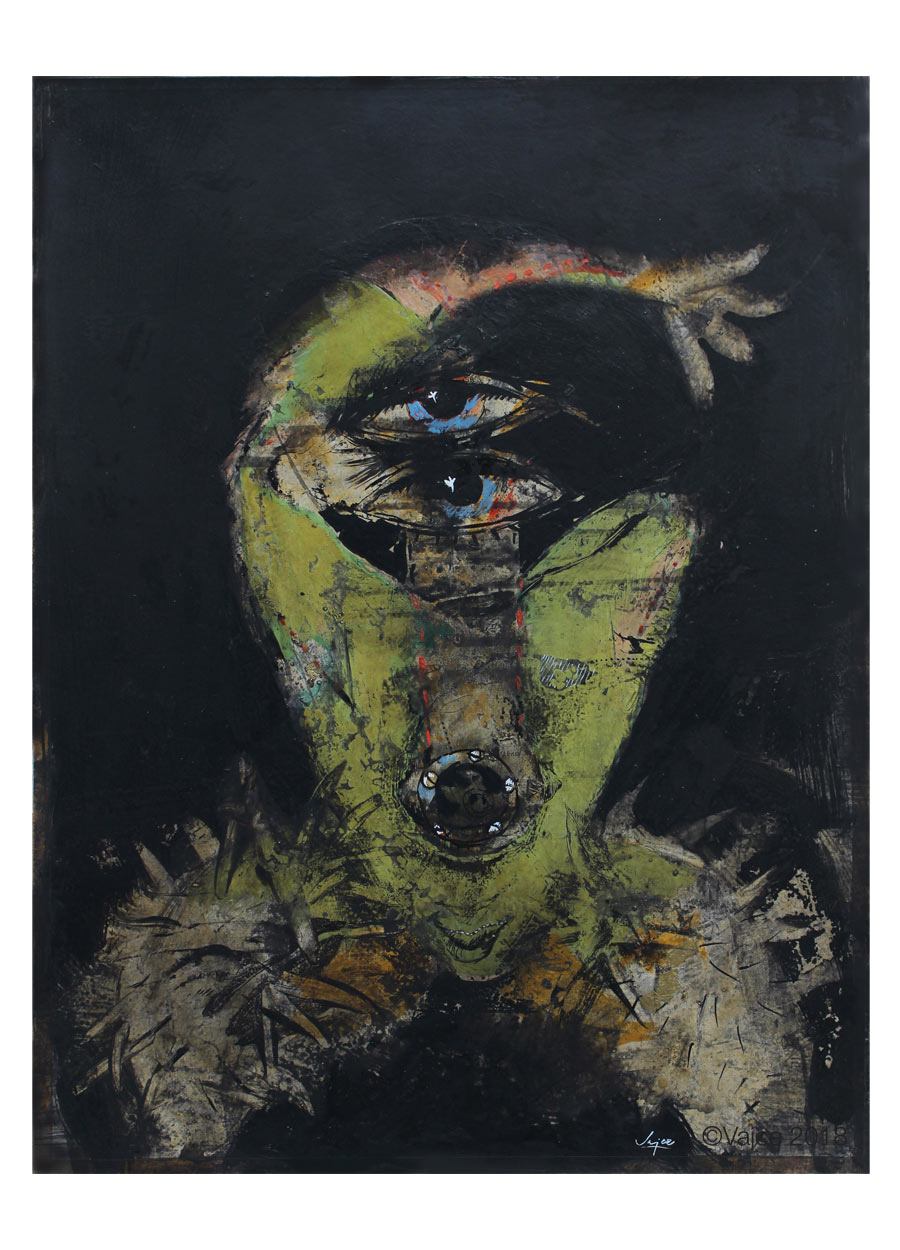
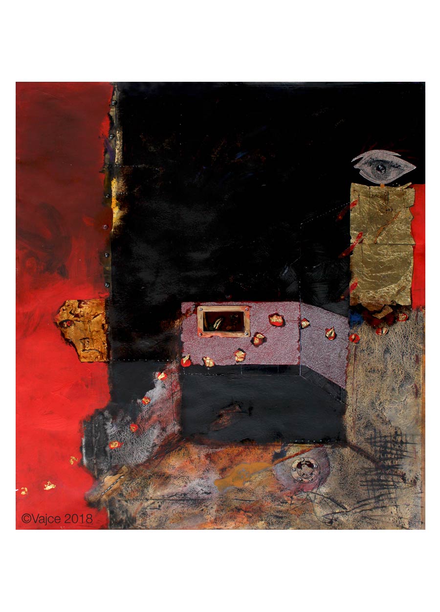
Metamorphosis, 1990
An Evening Alone, 1982
1960s have brought considerable liberalisation to countries such as Czechoslovakia. Changes have been evident in literature, film and art as such. State borders ceased to be as much guarded and few artists at that time managed to present their work also abroad. The films of the Czechoslovak New Wave won several awards at major film festivals and Czechoslovakia reappeared on the map of the world. Film posters took place in international competitions and many artists have been featured in such prestigious magazines as Graphis or Gebrauchsgrafik. However occupation of Czechoslovakia by the associated states of the Warsaw Pact at the end of August 1968 made early end to all of this. Normalisation has prevented many artists from continuing to work, some have been forced to emigrate, and many names have disappeared from poster scene. How did the situation after August 68 reflected on your work?
Somewhere in Italy, 1968
[quote]“In 1966, we managed to travel to Italy and my husband fell in love with Italian countryside. After our return, he began to paint pictures inspired by this journey and by chance, the head of one of Dílo’s galleries (“Artwork” Gallery – which was the sales section of the Union of Fine Artists) who saw them in the studio persuaded my husband to put them on sale. Since all the works of art had to go through the committees consisting of artists with party and political commitment and approval, the matter was rather disgusting. Still, here and then they had been forced to approve some of his work, so he devoted himself much more to painting.”[/quote]
[quote]“The most important for Stanislav was that his paintings had a great response and many were sold. Directors of Dílo Galleries had to show revenue, so they were trying to commission husband’s paintings by personal agreement with agents, etc. The secretary of the Union of Fine Artists Dr. Lhota was also admirer of husband’s work and if there was any show cancellation and exhibition gallery became vacant, he literally sneaked my husband in within very short notice.”[/quote]
[quote]“Another one of his admirer was the poet Karel Sýs, a convinced communist, to whom my husband illustrated poems. Karel Sýs had a great literary interest in husband’s art and because he was the editor of Rudé Právo[^11], he enforced publishing. On one hand, we were spied on, because of our religious foreign ecumenical engagement and political dubiousness, on the other hand my husband had influential advocates who tried to make his work available to the public. It was all due to the fact that his paintings were irresistible for the large audience, art collectors and exhibitors had great success with them.”[/quote]
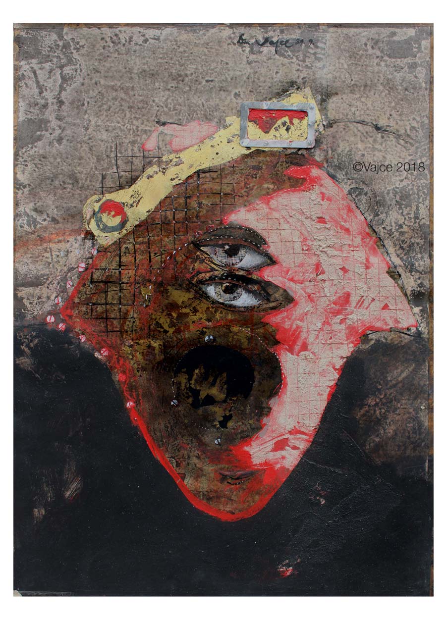
Dream, 1978
[quote]“Such a system was censoring all of the artistic activities, not only for graphic art and that was the biggest dirt (not to be called otherwise). The system allowed to distribute contracts among artists not by the quality of their work, but because of the political engagement. Simply said.”[/quote]
[quote]“From my own experience in 1986, when committee openly said to the architect and investor: Vajce does not get an approval stamp on her proposal, she had guzzled enough already, she will never get a bite again, literally in exactly same words. (I previously won an anonymous competition where members of the government committee and architects mistakenly assumed I was in the party, and because they liked my proposal the most, they overpowered the Union of Fine Artists (fiasco). This is just to illustrate the situation, I’m writing to you openly, as it was.”[/quote]
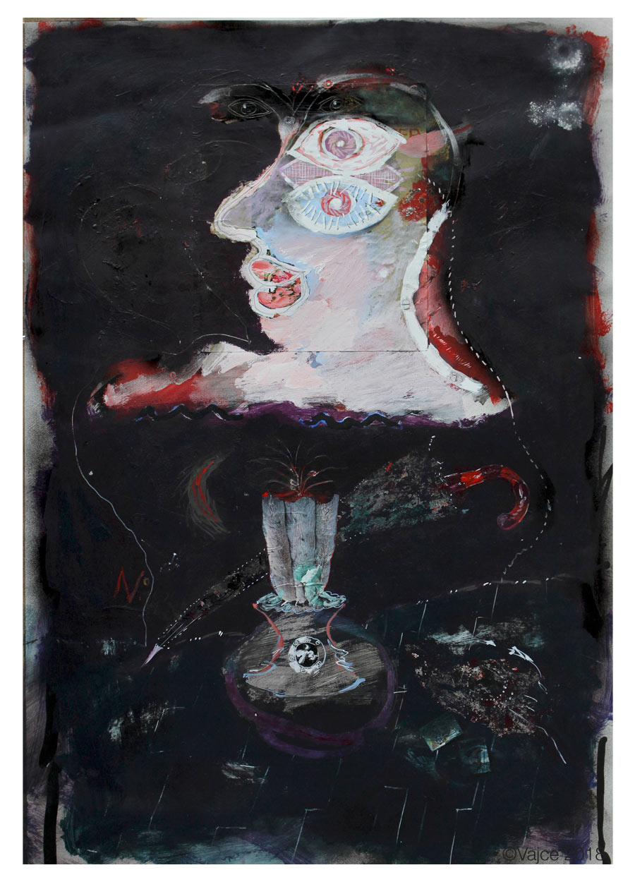
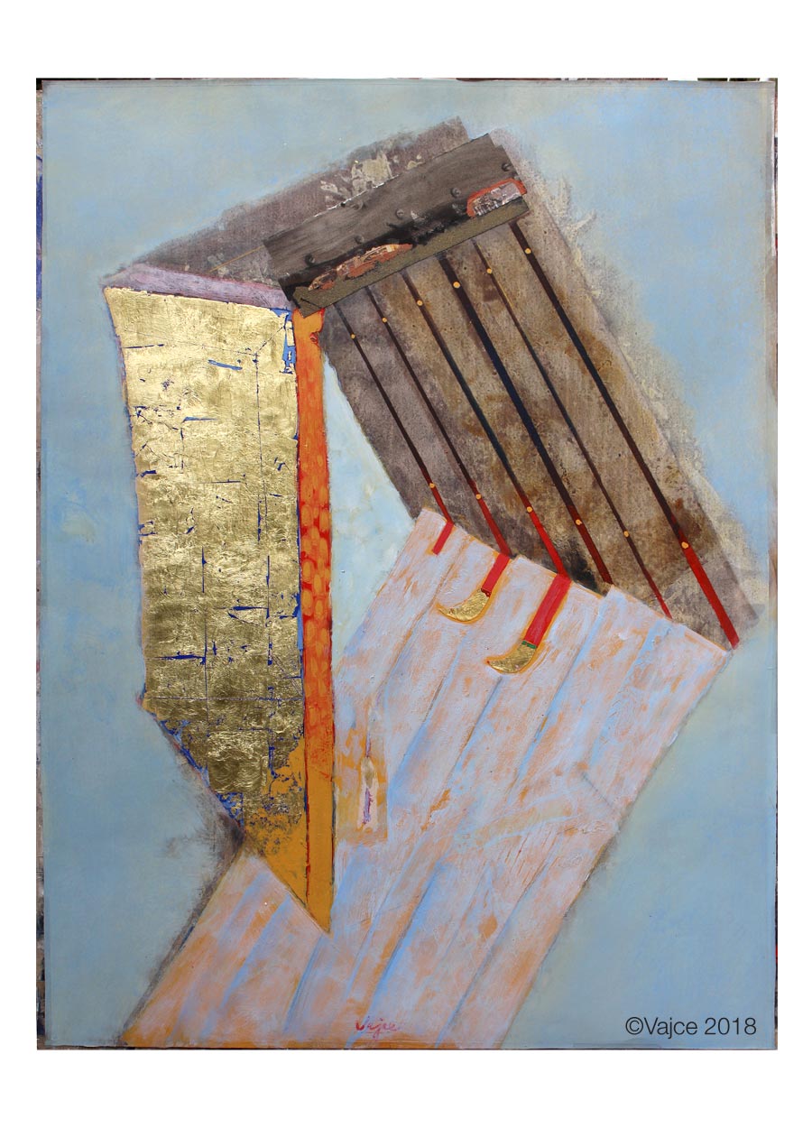
Night Stage, 1991
Stop!, 2001
Voice of the Forest, 2001
Rotation, 2011
It is clear that the main poster commissioner was ÚPF (Ústřední Půjčovna Filmů / Formal state distribution 1957-1991) with its own censoring committee that was deciding which posters could go into distribution. In article with Zdeněk Ziegler we read that some of the poster designers as Karel Vaca, or Dobroslav Foll were also part of such a committee.[^12] Could you describe a little how was approval process working and what were the selection criteria? Or were there any taboos that were not permitted to be shown?
[quote]“As I see it, the main criteria was money distribution.”[/quote]
It’s almost half of the century that you have not been designing film posters, nevertheless they still look very modern and impressive. How do you personally perceive them after such a long distance of time?
[quote]“In my opinion, they appear in such a way, because graphic art was always taking part in Stanislav’s versatile art besides of illustration, landscape painting, portrait, drawing, monumental painting, sculpture.”[/quote]
Meditation, 2001
Many thanks to Eva & Stanislav Vajce for sharing their precious time and knowledge with us.
•••
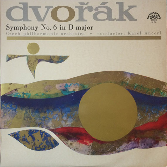
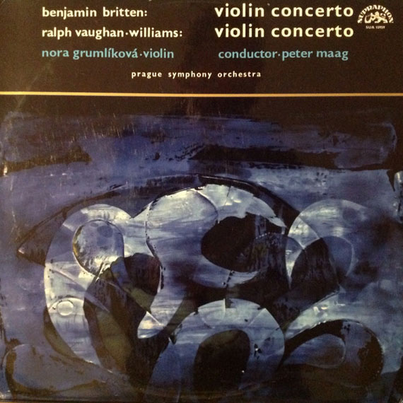
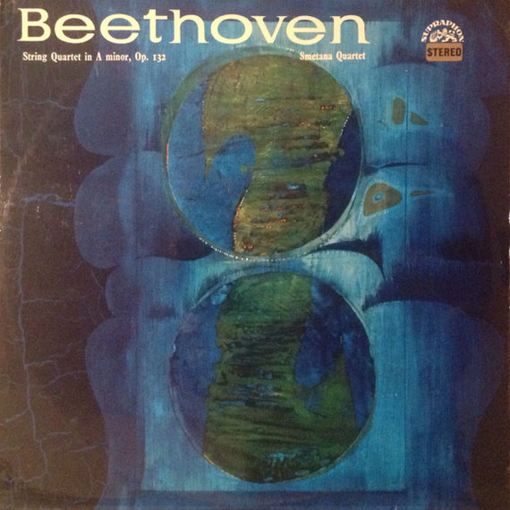
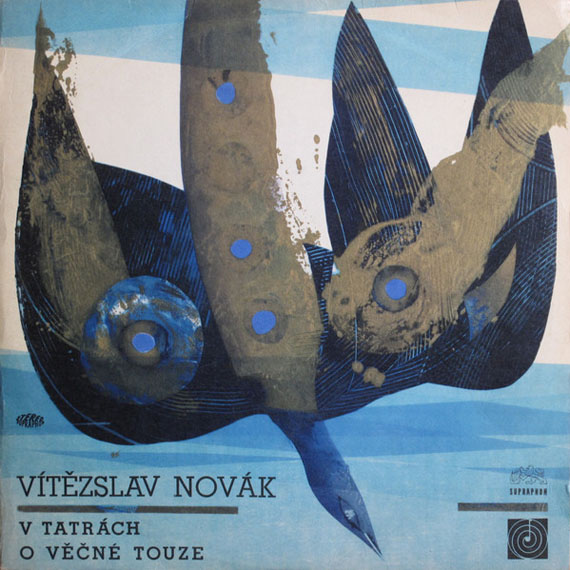
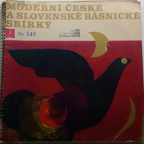
Examples of record sleeves designed by Stanislav Vajce:
Dvořák, Symphony No. 6 In D Major, Supraphon, 1966.
Benjamin Britten, Ralph Vaughan Williams, Violin Concerto, Supraphon, 1968.
Beethoven, String Quartet Opus No. 132, Supraphon, 1968.
Vítězslav Novák, Supraphon, 1967.
Collection of Czech and Slovak Modern Poetry I., Supraphon, 1967.
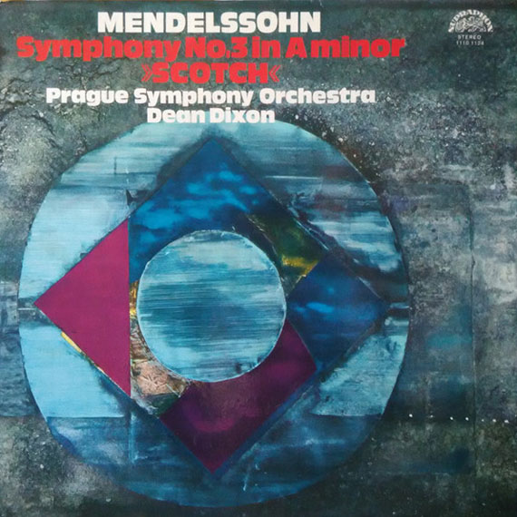
Mendelssohn, Symphony No. 3 In A Minor, Supraphon, 1988.
•••
Please see other fascinating posters designed by Stanislav Vajce.
•••
Resources:
Literature:
[^3]: Milena Klasová: Stanislav Vajce / Galerie Klatovy, 2015 / published for Stanislav Vajce’s retrospective, also printed debut about artist
Collective authors: Czech film posters of 20th century / The Moravian Gallery in Brno, Exlibris Prague, 2004.
[^12]: Flashback / Czech and Slovak Film Posters 1959-1989, ed. Libor Gronský, Marek Perůtka, Michal Soukup, Olomouc Museum of Art, 2004, p.34 (Welcome to hard times… by Zdeněk Ziegler)
Images of Stanislav Vajce’s artwork are property of the artist and are all copyrighted.
•••
Note: this showcase is part of our ongoing article Film posters / Made in Czechoslovakia. The story of film posters, please read Take 1 / Take 2, or see artist’s INDEX for more blog posts.
•••
For shop and blog highlights, please SUBSCRIBE to our weekly newsletter.
Book Illustration / Caricature / Film Animation / Painting
***
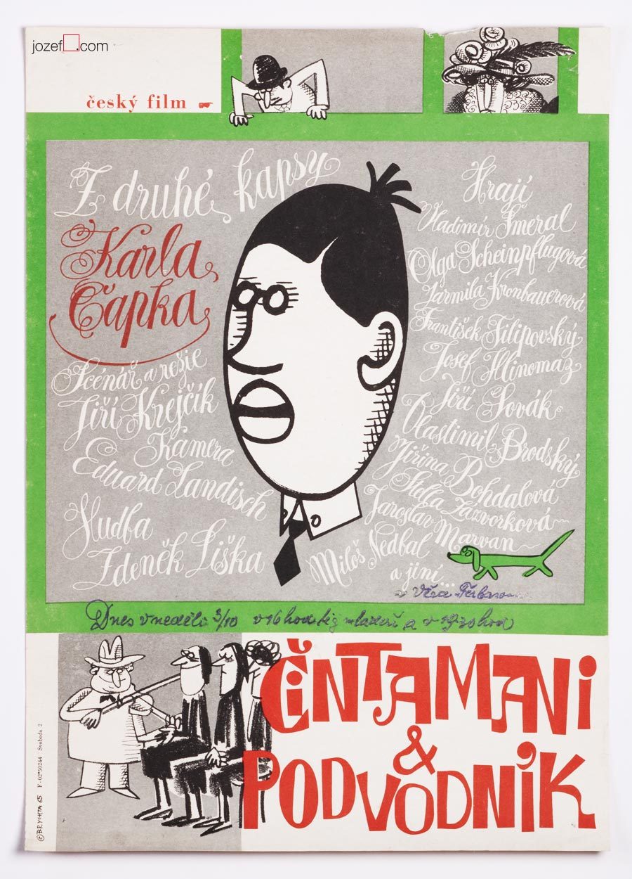
Jan Brychta’s poster design for movie adaptation of Karel Čapek’s novel, 1964.
***
11th of May 1928, Mladá Boleslav, Czech Republic
14th of November 2013, London (?), United Kingdom
lived in London exile since 1968
Education:
State Graphic School, Prague (Zdeněk Balaš, Josef Vodrážka)
1945 – 19.., Academy of Arts, Architecture and Design in Prague (Josef Kaplický, Antonín Pelc)
Exhibitions:
from late 1950s until 1968 mostly Prague exhibitions
Surrealism Unlimited 1968 – 1978, Camden Arts Centre, London 1978
Awards for Film Animation:
The main prize in the category of animated films, Oberhausen 1966
The prize of the union of cinema owners, Oberhausen 1966
Grand Prix “Bronze Caesar”, Tours 1966
***
In 1968 Jan Brychta vanished off the face of the earth and that is the fact. Russian occupation of Czechoslovakia in 1968 brought in many immediate changes within the state. Political trials were about to return back to fashion and not everyone was waiting for the resume. Or at least Jan Brychta did not.
It would be hard to say what made such a successful artist leave his homeland, as Jan Brychta’s art was everywhere and available to everyone in all possible forms. From beautifully illustrated books, film animations to caricatures in daily newspaper and television graphics / adverts. Simply put 1960s daily life was somehow incomplete without Jan Brychta.
***
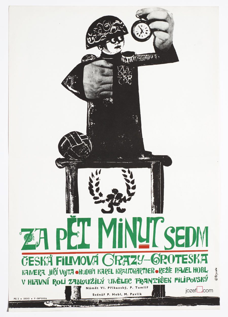
Five Minutes to Seven movie poster by Jan Brychta, 1965.
***
It is fascinating to watch how with short step in time and history someone so publicly pleasing can become persona non grata. Researching many years later it really looks that party members did a great job. There was no Jan Brychta after 1968 in Czechoslovakia and same for his wife Lída Brychtová (artist and book illustrator) as they managed to escape the country together with their children Edita and Aleš.
Through out his Czechoslovak career as a daily caricaturist, film animator and pioneer of television graphics Jan Brychta was never far away from the movie poster. His rapid illustration and excellent story telling could be easily applied to the discipline. As a surreal artist and two dimensional painter use of a collage and illustration was a natural choice. His portfolio ends with his disappearance in late 1960s. Jan Brychta’s posters are absolute pleasure to look at and it is real pity it does not contain more than ten movie posters. The master of many techniques with only one common goal which was to keep everyone amused.
***
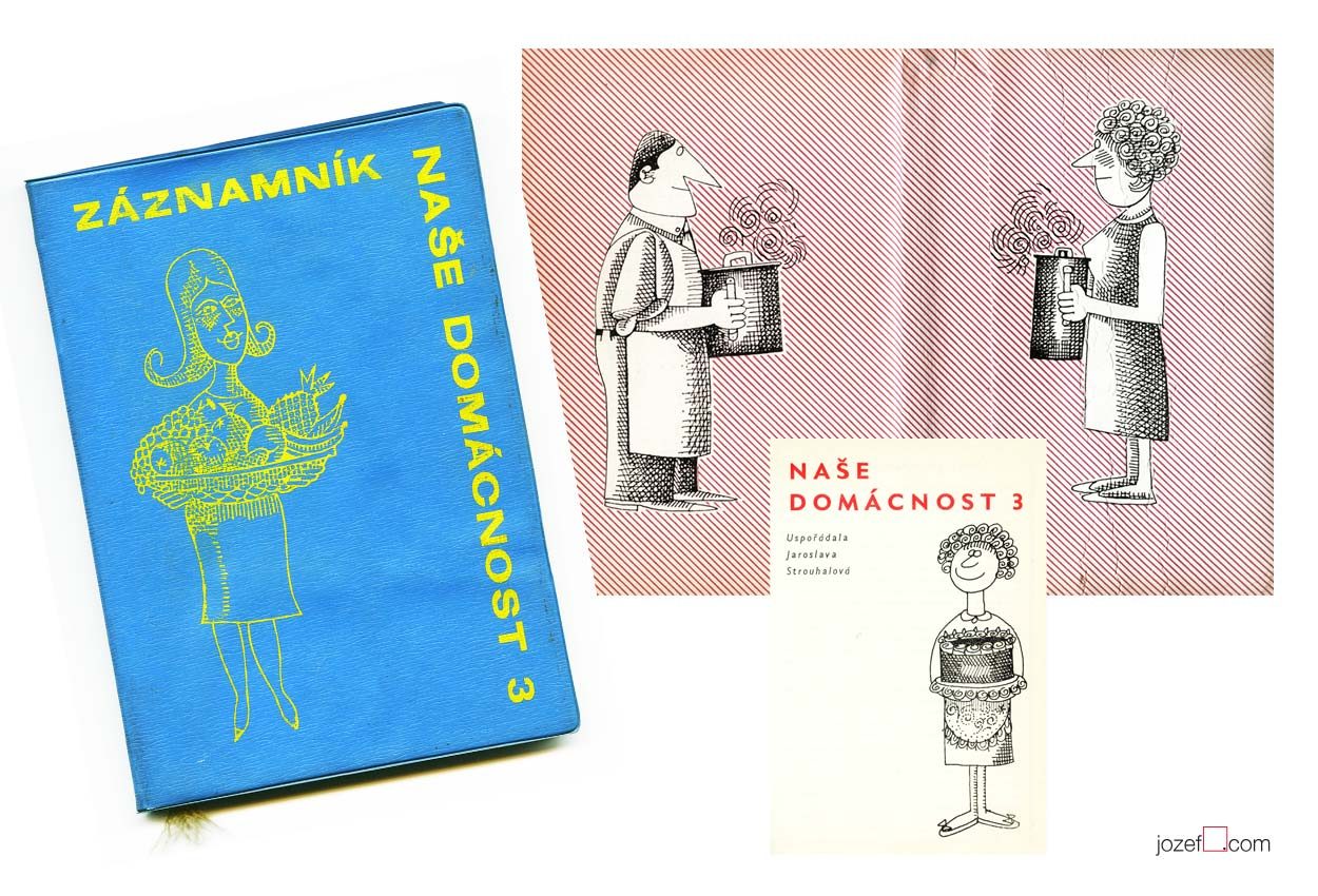
Our Household, third volume of the annual guide for modern family illustrated by Jan Brychta, 1963.
***
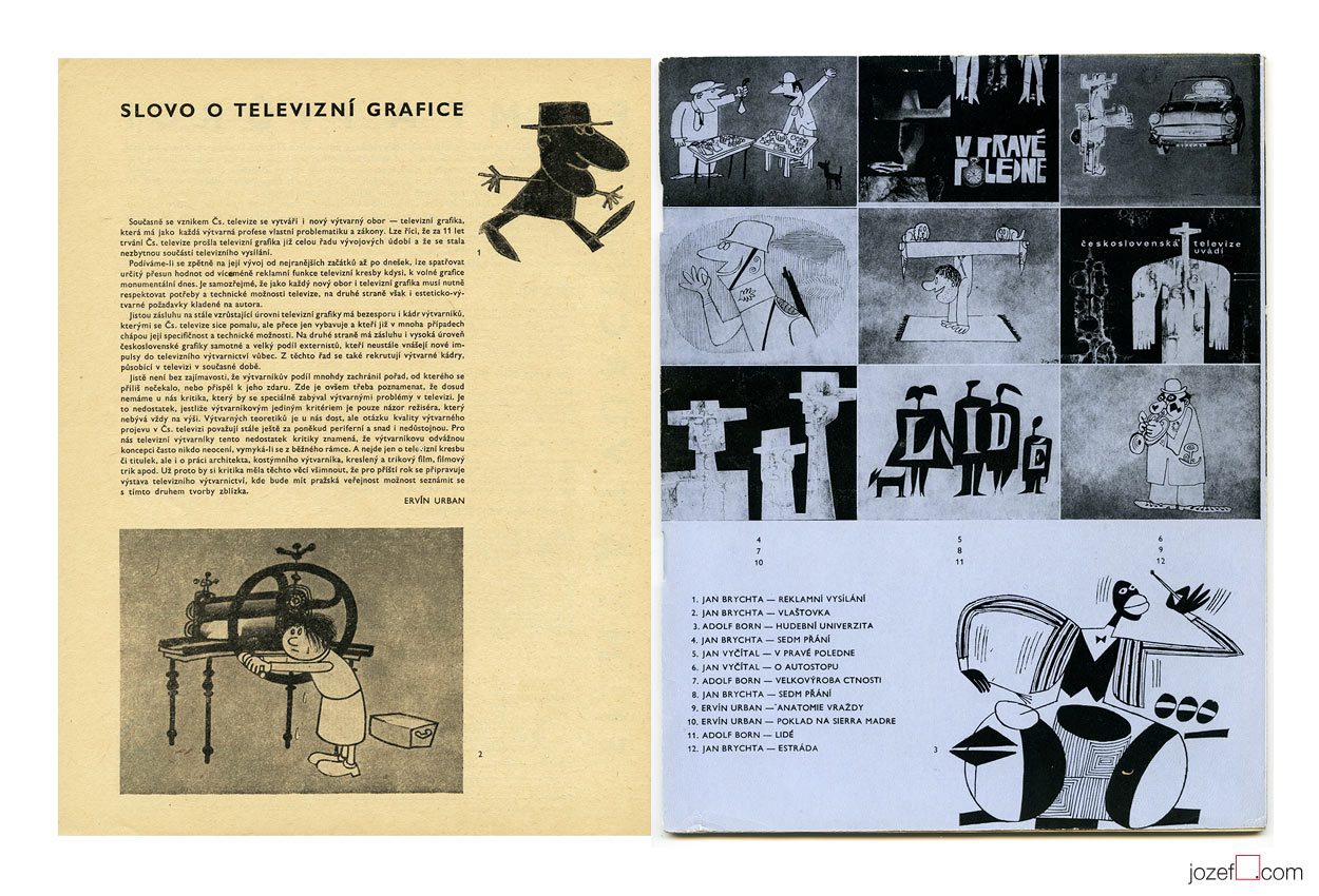
British audience could recognise Jan Brychta’s illustration thanks to BBC children’s television series Jackanory.
***
Television graphics by Jan Brychta, Adolf Born and other pioneers of 1960s TV visuals.
Krátky Film, Praha / Short Film, Prague. Archive of Jan Brychta’s 1960s animated films.
Images used:
Collective authors: Záznamník – Naše Domácnost 3 / Family Guide Jotter – Our Household Vol.3. Obchodní Tiskárny, Praha, 1963. Cover and inner pages of the book.
Film a Doba 1 / Film and Times 1 / Bratislava City Gallery, 1965. Magazine spread out.
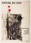
Hiroshima Mon Amour movie poster by Bedřich Dlouhý, 1963.
•••
b. 2nd August 1932, Plzeň (Pilsen), Czech Republic
Education / Pedagogue:
1949 − 1952, Specialised Ceramics school in Prague [^1]
1953 − 1959, Academy of Fine Arts, Prague (Karel Souček, Miroslav Hollý)
1990 – 1995, taught as professor at Academy of Fine Arts, Prague
Exhibitions / Awards:
up to 70s artist exhibited mostly in group shows across the Europe and Czechoslovakia
IV. Biennale de Paris, Musée d’Art Moderne de la Ville de Paris, 1965 (Awarded)
Art Groups:
Palette of Homeland (unofficial trans.) / Paleta vlasti (Hockey team consisting of several of artist’s friends)
Šmídrové (from 1954)
Confrontation / Konfrontace (from 1961, also Jiří Balcar)
Retarded / Zaostalí (from 1987)
Film posters created: 23 (1962-1971) [^2]
•••
[quote]”It may sound slightly disrespectful, but I am aware that I have a huge wide inventiveness and it makes and justifies me to take interest in many sectors of the art form.” [^3][/quote]
We are somewhere in mid fifties, in times of the most absurd terror upon democracy, constant greyness (Stalin’s monument in Prague and similar monsters are being raised across the Czechoslovakia) and bleak vision of existence. At the Academy of Fine Art in Prague the group of three interesting characters are meeting up. In the following words we will try to get closer to one of them.
[quote]”I started out as no one in that field and I was getting jobs for pretty inconsequential films from Romania, Bulgaria and Russia. They were productions of a third or second category. Because of the impressive quality of my work, film poster committee and ÚPF representatives (Formal state film distribution 1957 – 1991) were constantly adding to a momentum. It was reflected in good quality commissions for example for Fellini’s or Visconti’s magnum opus. I had to earn it.” [^4][/quote]
Bedřich Dlouhý was not such a tyro/novice at the beginning of his poster designing career as he explains in the quote above. By the time he started to design movie posters (1962) his portfolio contained already good body of art work, some important exhibitions and possibly something extra to it. To his future colleagues he must have been known as someone incredibly talented, the man without hesitation and very likely also without compromise.
•••
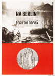
The Fall of Berlin movie poster by Bedřich Dlouhý, 1968.
•••
Neglecting the art
Among Bedřich Dlouhý’s best early pieces was exhibiting with art group Šmídrové. Their first exhibition in 1954 called Malmuzherziáda (varieté of painting, music and act as we understand) was made in the hardest times of Stalinist propaganda and Social Realism. Jan Koblasa (Czech artist and the member of the group) in the documentary made for Czech Television demonstrates the climate of late fifties as “very dark and grey”. Days in art school, as days among communist collaborators (“recommended working class was gaining high school diplomas to get legal access to Universities). Loneliness among them was unbearable.” [^5] No wonder that the three of them had met under such a circumstances. The group itself had very playful character with Neo Dadaist expression, hockey team and brass band.(Traditional folk music was not in favour of communist propaganda either, they had their own songs full of ridiculous slogans.)
[quote]“We loathed to look as an artists. We loathed to do things as an artists. We played hockey as part of our manifest Šmídrové. It may sound unbelievable, but the main thing was not to be an artist.” [^6][/quote]
After their first collaborative exhibition the group was officially established. Show or rather happening in 1957 called “Exhibition for one day” brought in too much controversy. Event had to be cancelled in duration, but it took place elsewhere the following day. On the day one Václav Havel (Czech writer, poet, ex-president) was giving the speech and on the second day he was already taking part with good number of other artists and musicians. Bedřich Dlouhý’s discharge from the Academy followed and lasted for a while.
Poster days and …
As for the film poster Bedřich Dlouhý was testing the new medium so intensely as anything else. His posters might appear visually settled and designed in quite minimalist style. In our examples even his typography might look very basic. Less is more, but not for Bedřich Dlouhý’s movie posters. They are full of hidden symbols and impressions even when they seem so simple.
Please come closer and let’s take a look at his The Fall of Berlin movie poster for instance. Fairly suggestive photograph of burning German capital is taking over the larger part of the poster. Pure catastrophe straight into ones face and quite rightly in monochrome. Message is very simple, anyone could guess what the movie poster offers. Bedřich Dlouhý does not want you to only see the movie but he also wants you to use the rest of your senses.
He takes your attention a bit further by exploring the large circle in the middle of the rich red bottom half of the poster. Red colour could represent the tons of blood and it is possibly also used to say big STOP. Almost like the red colour on traffic light advising one to stop, only the circle here is empty. Negating reality and pointing out that people will never learn. Or take the circle together with rectangularly shaped photograph. Two objects want to look little something like exclamation mark and set the message to following? STOP THIS! ? Similarly to the inner part of the circle that tells how it could all end up if we do not stop the wars. His movie poster for Hiroshima Mon Amour was designed in absolutely different style, but the poster also suggests close catastrophe.
•••
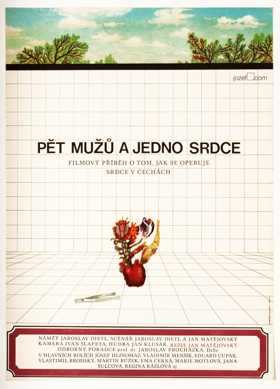
Five Men and One Heart movie poster by Bedřich Dlouhý, 1971.
•••
There are not only serious movie posters author has designed, he does not omit humour and irony (posters designed for The Pink Panther / Blake Edwards in 1966 or In the Woods / Akira Kurosawa in 1970 ) [^8] when necessary. He does not use any particular style either, but instead he approaches each individual poster very differently. The one connecting link we have found is that Bedřich Dlouhý’s curiosity does not like to leave things as they are. He wants to get right into to the core of his subject by bringing out the deepest details and he starts from there. He slips between the most complicated expressive forms (techniques frequently used in his paintings) [^9] to the most simple designs masterly. Visual illusion and yet with fantastically clear almost microscopic explanation.
Even thought Bedřich Dlouhý created some of the most iconic movie posters of the 60s, his unconventional approach to art form did not meet with the official agenda of the following decade. Similarly to many other artists in the beginning of the 70s he was forced to stop exhibiting and discontinued with designing movie posters.
Collective authors: Czech film posters of 20th century / The Moravian Gallery in Brno, Exlibris Prague, 2004.
[^2]: Flashback / Czech and Slovak Film Posters 1959-1989, ed. Libor Gronský, Marek Perůtka, Michal Soukup, Olomouc Museum of Art, 2004. (p.49). 25 movie posters to our knowledge.
Tomáš Vlček: Současný Plakát / Contemporary Poster, Odeon, Prague, 1976.
Československý Plakát / Czechoslovak Poster, exhibition catalogue, Olomouc (Czech Republic), 1967. One of the most important poster exhibition in the history of Czechoslovak poster design. We wish to return back to catalogue and give it a full blog post once we are ready.
Online:
[^1]: abArt / Bedřich Dlouhý / see for the full list of exhibitions. abArt takes always first place and star when it comes to research.
We have prepared another Poster Sale to make our film poster collection accessible to anyone as passionate about the art from Czechoslovakia as we are. Please take advantage of our Poster Sales to get your hands on some of the best designs in the history of poster art. Enter the coupon –
poster art
– into a coupon field when checking out. Sale will run until 7.11.2015. Enjoy!
You can also tell your friends by sharing this link (bellow).
Note: Free shipping on multiple orders. Secure checkout.
Poster Sales. 22% off your basket. Type – poster art – in coupon field when checking out.
Art Editor / Book Illustration / Graphic Art / Typography
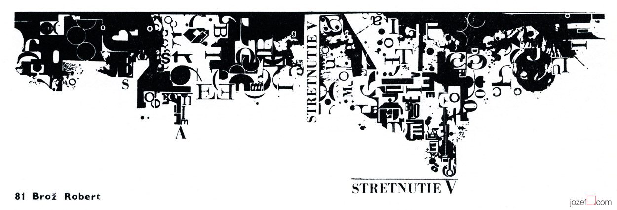
Book cover design, colour letterpress, Robert Brož, 1970 *
***
– b. 10th of August 1939, Prague-Čelákovice, Czech Republic
Education:
– 1954−1958, School of Industrial Art, Bratislava
Exhibitions:
– Biennale Brno 1966, 1970 and later
– Bratislava, Prague, Sofia, 1968
– BIB, Biennale of Book Illustration, Bratislava 1969, 1971 and later
– IBA Leipzig, 1971
– Biennale Warsaw 1971, 1975
– Barcelona, Berlin 1973
Awards:
– Diploma, International exhibition of young poster designers, Sofia, 1968
– Merit Award, IBA Leipzig, 1971
– Merit Award, The most beautiful book of the Year, Bratislava, 1972 and 1977
***
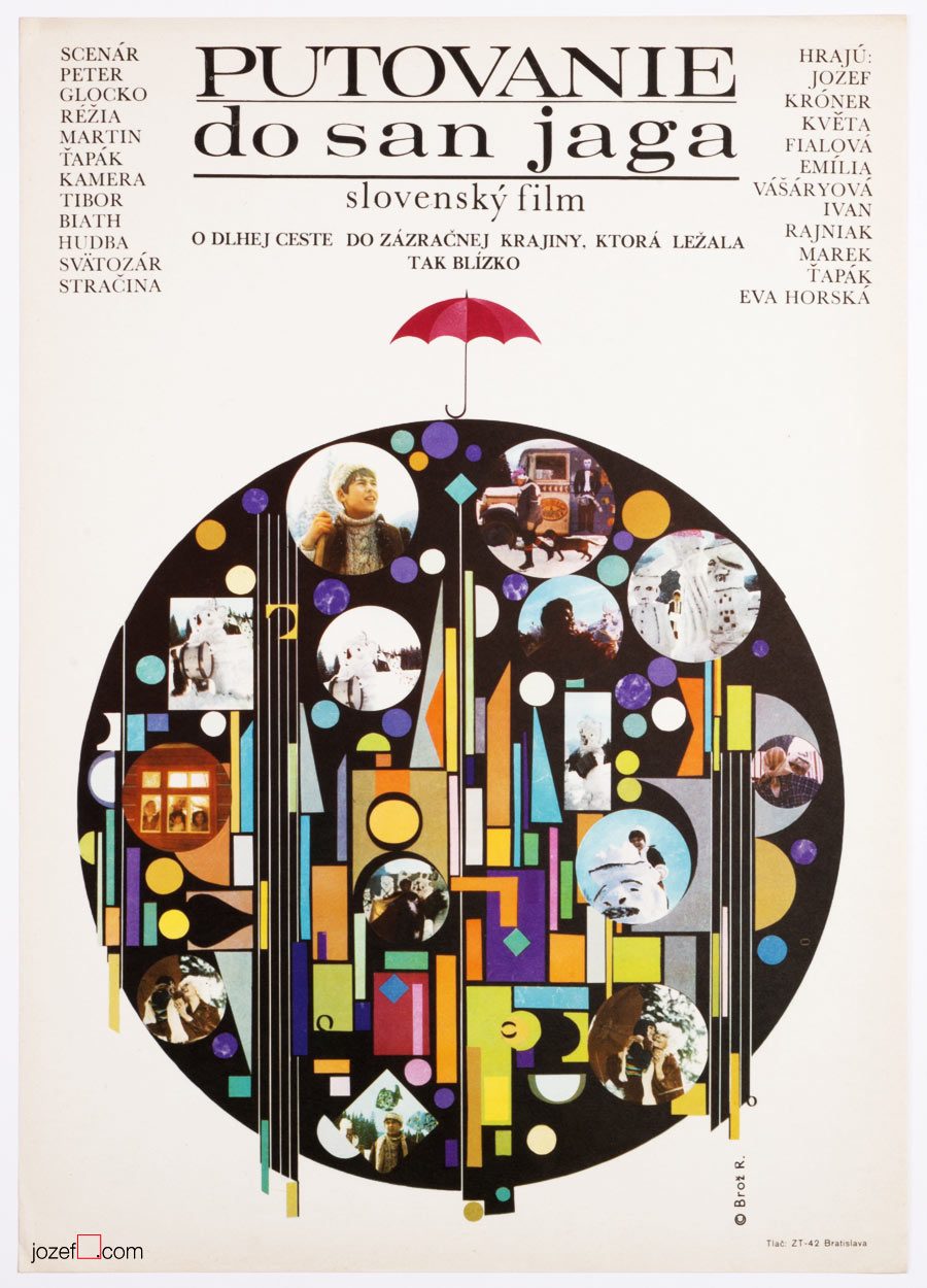
Excellent typography – Pilgrimage to San Jago, Robert Brož, 1973.
***
Robert Brož’s appearance in Czechoslovak film poster archive is rather rarity, even though designing posters was one of his main profession. As a typographer and graphic designer he has created numerous number of book covers (Bronze Medal, IBA Lepzig, 1971), posters and specialised in creating ex libris for collectors. He was also editor and graphic designer of Slovak publishing house Osveta.
We only know of one single film poster Robert Brož has ever designed. It was created for children’s tale Pilgrimage to San Jago (unofficial title) and done very much in what you would call Brussel style. Common design resonating pretty much in everything made in late Sixties Czechoslovakia (precious times swept away by shady 1970’s propaganda).
***
Bratislava City Gallery / Galéria Mesta Bratislavy, logo design, Robert Brož, 1971.**
***
Finding out Robert Brož’s name on majority of books published for Slovak photographer Martin Martinček made us nicely surprised. Martin Martinček’s photography is hugely admired by us and we thought you might like to see more examples of Robert Brož’s design. As he was not exactly movie poster designer, we still believe in his importance in Czechoslovak graphic art and are adding his name to our Sixties designers list.
***
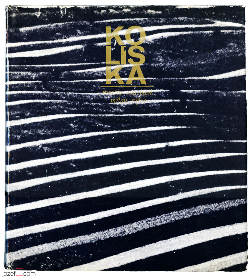
Martin Martinček / Cradle – photography book cover, Robert Brož, 1972.***
***
We will be coming back to Martin Martinček in later individual posts on photography, where we’ll try to show a glimpse of his excellent work and maybe we’ll even reveal some of his unseen prints from our collection of photographs.
***
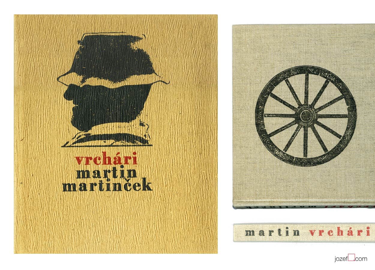
Martin Martinček / Highlanders – photography book design, Robert Brož, 1975.****
***
Note: this showcase is part of our ongoing article Film posters / Made in Czechoslovakia. The story of film posters.
***
Resources:
Literature:
II. Bienále Užité Grafiky Brno ’66, Medzinárodní Výstava Knižní Grafiky a Ilustrace, Moravská Galerie v Brně. / 2nd Biennale of Graphic Design Brno ’66, The International Exhibition of Book Graphics and Illustrations, Moravian Gallery Brno, 1966
IV. Bienále Užité Grafiky Brno 1970, Medzinárodní Přehlídka Plakátu a Propagační Grafiky, Moravská Galerie v Brně. / 4th Biennale of Graphic Design Brno 1970, The International Exhibition of Poster and Promotional Graphics, Moravian Gallery Brno, 1970
V. Bienále Užité Grafiky Brno 1972, Medzinárodní Výstava Ilustrace a Knižní Grafiky, Moravská Galerie v Brně. / 5th Biennale of Graphic Design Brno 1972, The International Exhibition of Illustrations and Book Graphics, Moravian Gallery Brno, 1972
VII. Bienále Užité Grafiky Brno 1976, Mezinárodní výstava ilustrace a knižní grafiky, Moravská Galerie v Brně. / 7th Biennale of Graphic Design Brno 1976, The International Exhibition of Illustrations and Book Graphics, Moravian Gallery Brno, 1976
IX. Bienále Užité Grafiky Brno 1980, Medzinárodní Výstava Ilustrace a Knižní Grafiky, Moravská Galerie v Brně. / 9th Biennale of Graphic Design 1980, The International Exhibition of Illustrations and Book Graphics, Moravian Gallery Brno, 1980
* Collective authors: Stretnutie / Meetings, Martin 1970. Book cover, colour letterpress. V. Bienále Užité Grafiky Brno 1972, Medzinárodní Výstava Ilustrace a Knižní Grafiky, Moravská Galerie v Brně. / 5th Biennale of Graphic Design Brno 1972, The International Exhibition of Illustrations and Book Graphics, Moravian Gallery Brno, 1972 (p.55)
** logo – Martin Martinček – Exhibition Catalogue, Hora a horské bystriny / Mountain and mountain stream (unofficial translation). Galéria Mesta Bratislavy / Bratislava City Gallery, 1971
*** book cover – Martin Martinček – Milan Rúfus, Kolíska / Cradle (unofficial translation). Osveta, Banská Bystrica, 1972.
**** book cover, book design – Martin Martinček, Vrchári / Highlanders (unofficial translation). Osveta, Martin, 1975
***
For shop and blog highlights, please SUBSCRIBE to our newsletter.