Poster art by Jaroslav Fišer for Věra Chytilová’s films.
We can hardly hide our excitement about BFI’s wonderful retrospective of one of the most innovative Czech filmmakers Věra Chytilová. It is also a very good opportunity to introduce the work of Jaroslav Fišer, prolific graphic designer and author of several posters for her films.
Jaroslav Fišer studied at the Technical University in Prague and at the Academy of Arts, Architecture and Design, Prague, former Czechoslovakia. During 1959 – 1987 Jaroslav Fišer designed 104 movie posters and his poster for film The Apple Game won a Silver Hugo at the International Film Festival in Chicago, USA.
BFI’s tribute to the director is organised in collaboration with Czech Centre, London and Czech National Film Archive and is on from 1st March – 17th March 2015.
Movie posters designed for Věra Chytilová’s films:
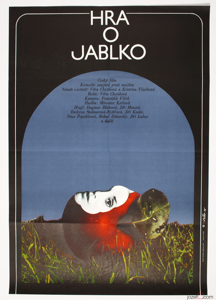
The Apple Game movie poster by Jaroslav Fišer, 1976.
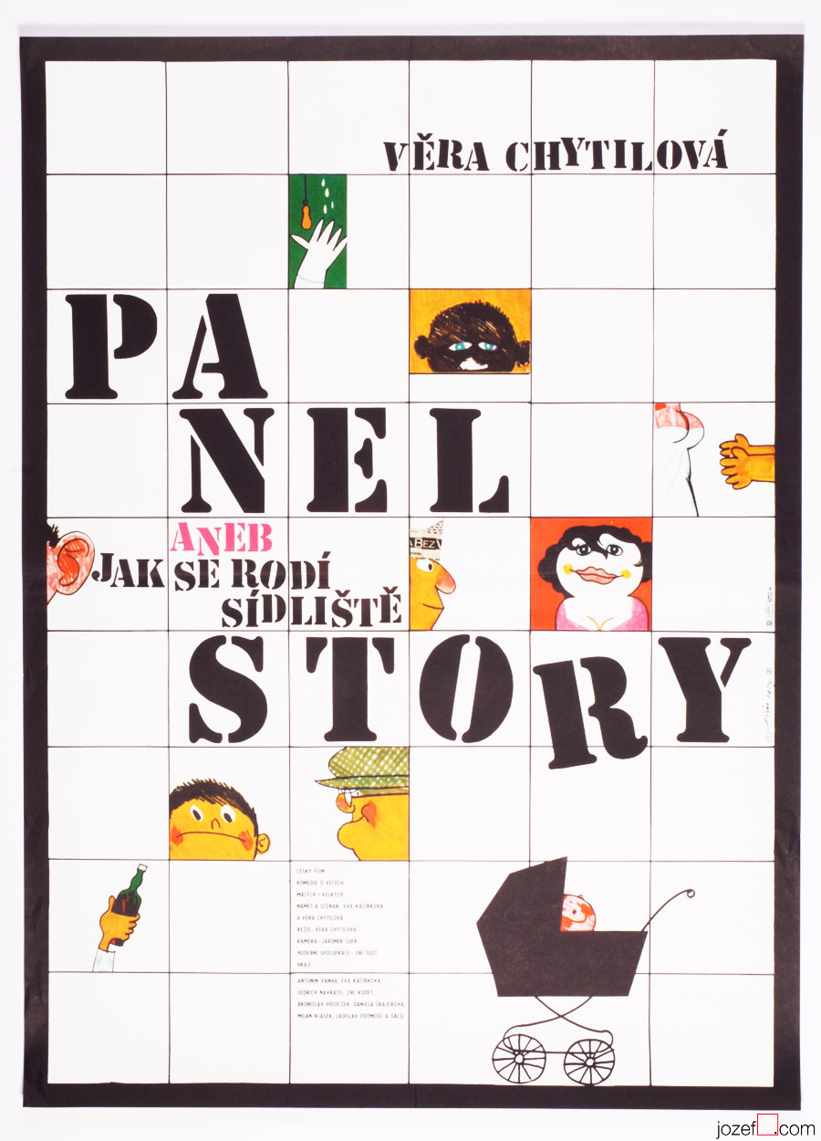
The Panel Story movie poster by Jaroslav Fišer, 1979.
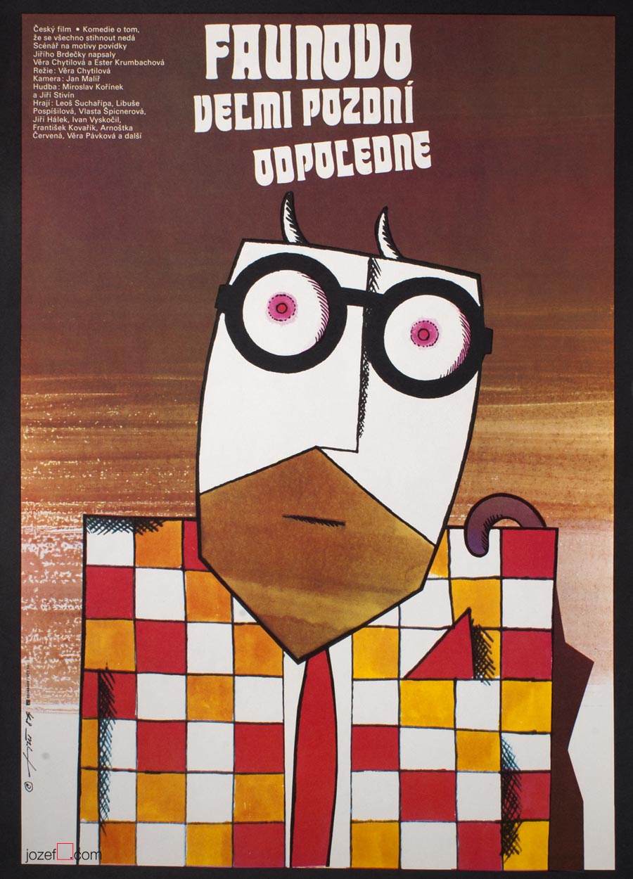
The Very Late Afternoon of a Faun movie poster by Jaroslav Fišer, 1984.
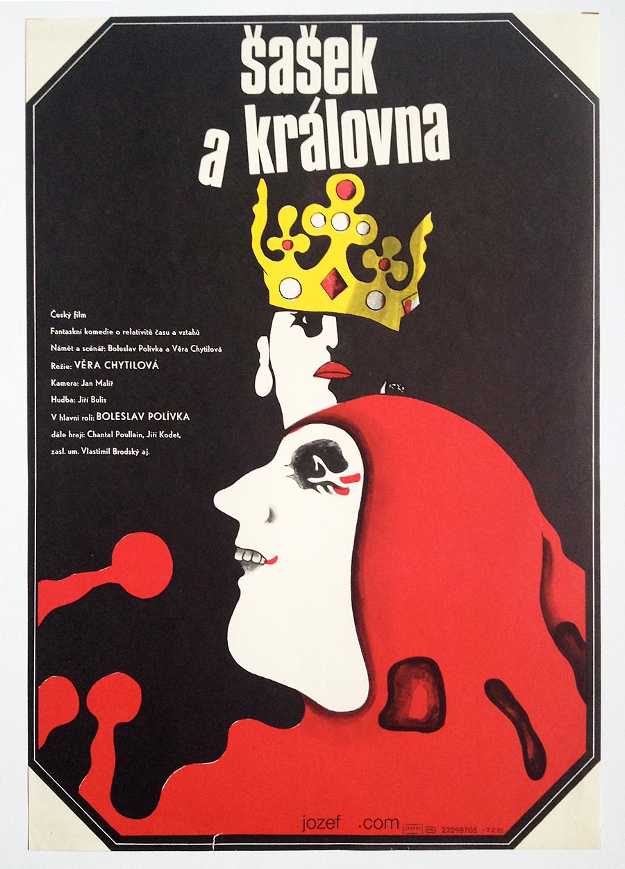
The Jester and The Queen movie poster by Jaroslav Fišer, 1987.
Selection of movie posters by Jaroslav Fišer:
Please don’t wake me up movie poster by Jaroslav Fišer, 1962.
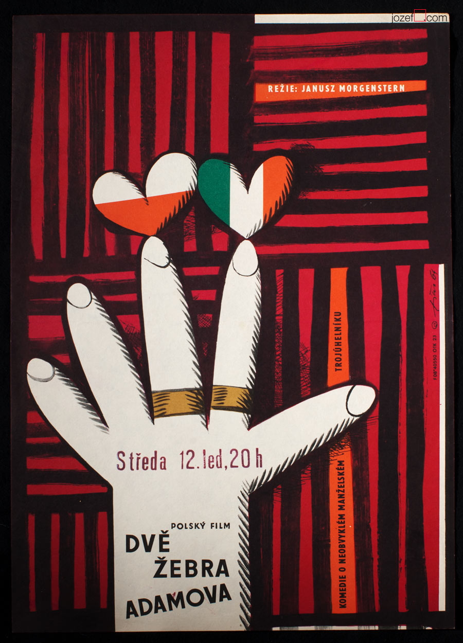
Adam’s Two Ribs movie poster by Jaroslav Fišer, 1964.
Check Passed: No Mines movie poster by Jaroslav Fišer, 1966.
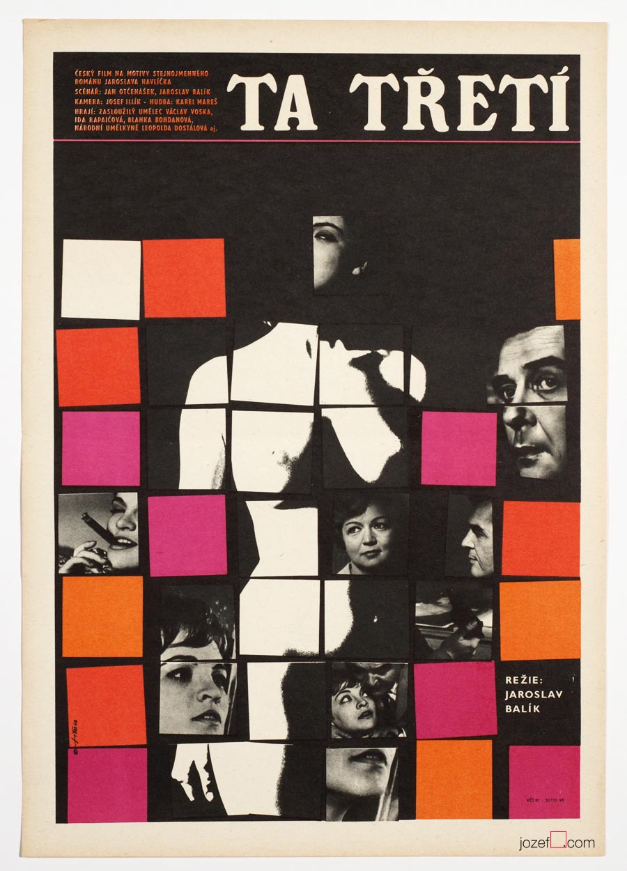
The Third One movie poster by Jaroslav Fišer, 1968.
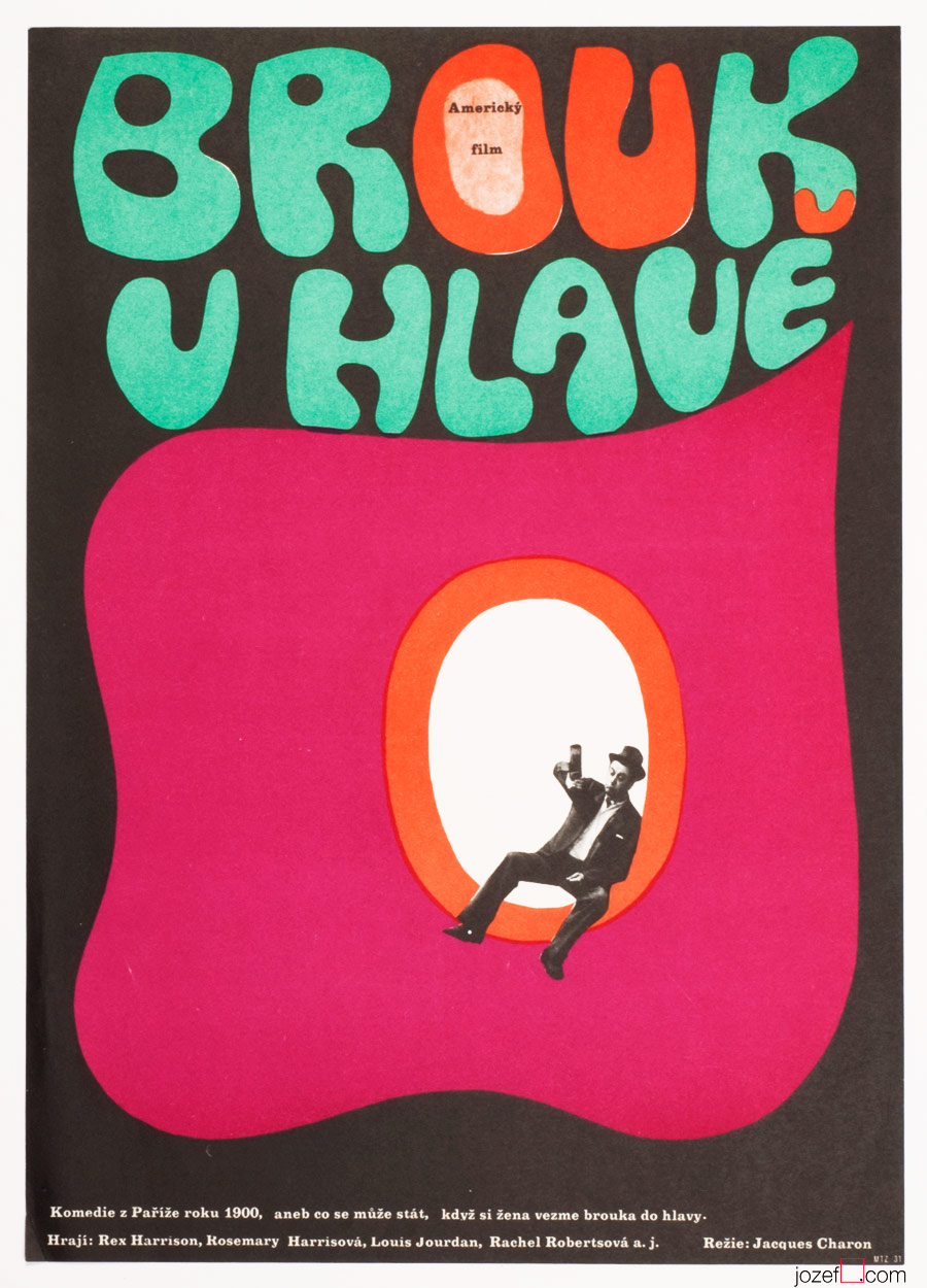
A Flea in Her Ear movie poster by Jaroslav Fišer, 1969.
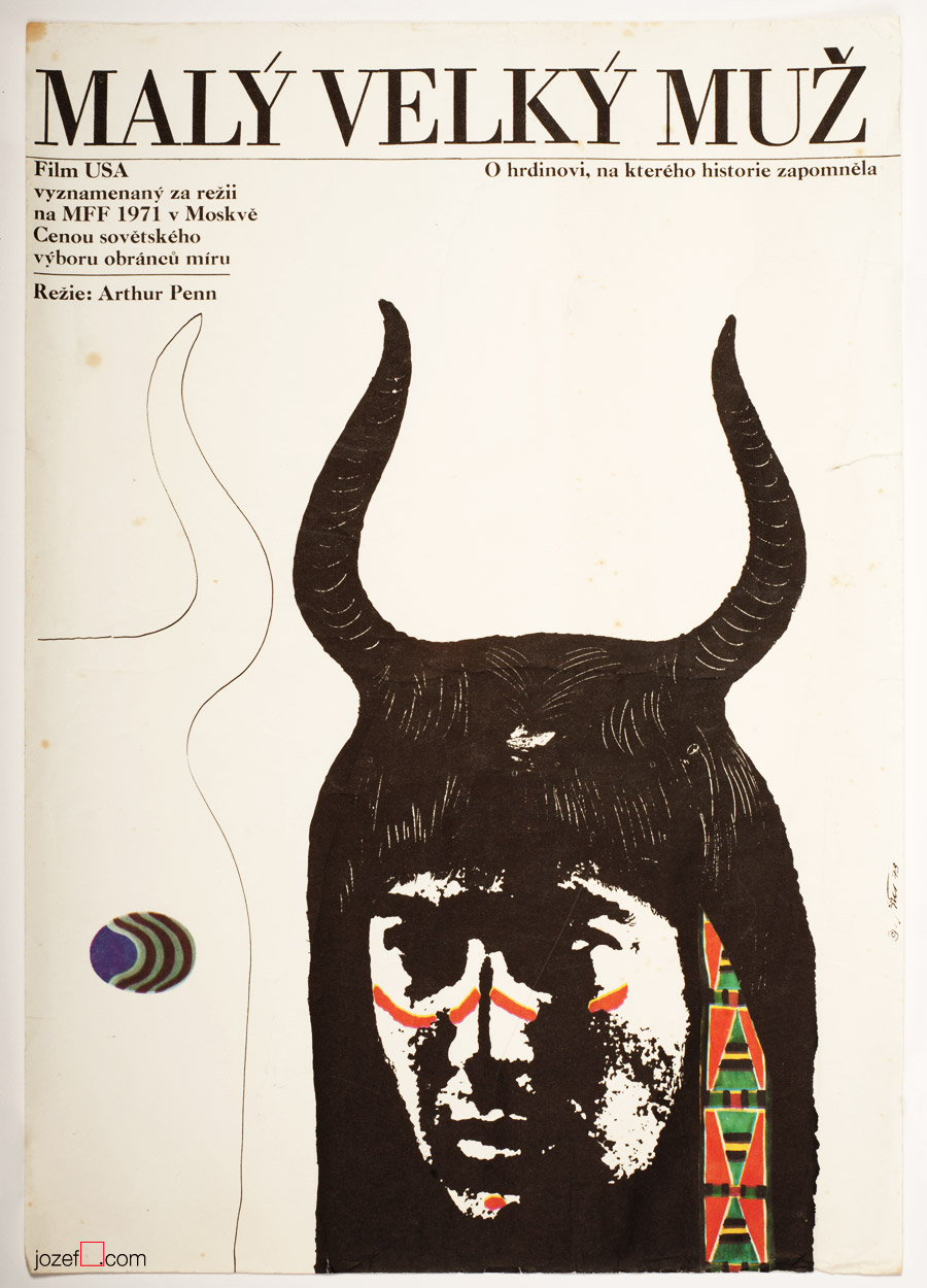
Litle Big Man movie poster by Jaroslav Fišer, 1973.
Book Illustration / Fine Art / Graphic Design / Typography
•••
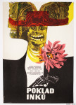
Legacy of the Incas movie poster by Josef Duchoň, 1967.
•••
b. 17th January 1929, Hostěradice (Prague-West), Czech Republic
Education:
1945 − 1949, State Graphic School, Prague (Richard Lander)
1949 − 1955, Academy of Arts, Architecture and Design, Prague (Karel Svolinský)
Art Groups:
Association of Czech Graphic Artists Hollar / Sdružení českých umělců grafiků Hollar (1957)
May 57 / Máj 57 (1964)
•••
Remember the day when we were unfolding our first large size movie poster. There was quite an excitement about the whole thing. Firstly it was about the size of a poster. All of our movie posters were in A3 size until then and we were astonished by the remarkable change in dimensions. Almost three times larger in size, movie poster offered much clearer detail and we had impression that printing was handled with slightly extra care. For common reason as we had later found out, A1 posters were bit more representative, they were used occasionally for poster exhibitions. Our second astonishment was the visual content.
•••
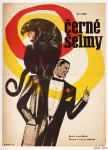
Black Panther movie poster by Josef Duchoň, 1966.
•••
Josef Duchoň’s lovingly puzzled collage for children’s adventurous movie set in the jungle (Black Mountain, 1972) was tenderly looking at us. What a joy! His movie posters have become one of our most favourite ever since. As we are describing the temperature, we could also mention, that we have very similar feelings towards Ever Alexander Půček‘s children’s posters.
Fascination of Josef Duchoň with children’s fantasy is in the right place and it was frequently reflected in his book illustrations. From 1959 he was co-working for the State publisher of children book as an illustrator. Early 1960s brought Josef Duchoň also to movie poster design. He created over two dozens of exceptionally impressive movie posters in period of almost 20 years[^1].
His work is extremely explosive, but not in a destructive way. On the other hand, Josef Duchoň is using the mixture of several artistic methods to reach viewer’s sensation. As a surreal artist his choice of collage technique is natural. Wonderful variation of live pastel colours achieved by the use of elegantly shaped and carefully placed woodcuts and his manipulation with objects is masterful. Thanks to monochrome cut outs and neat typography his movie posters are gaining quite significant depth and very vibrant character.
•••
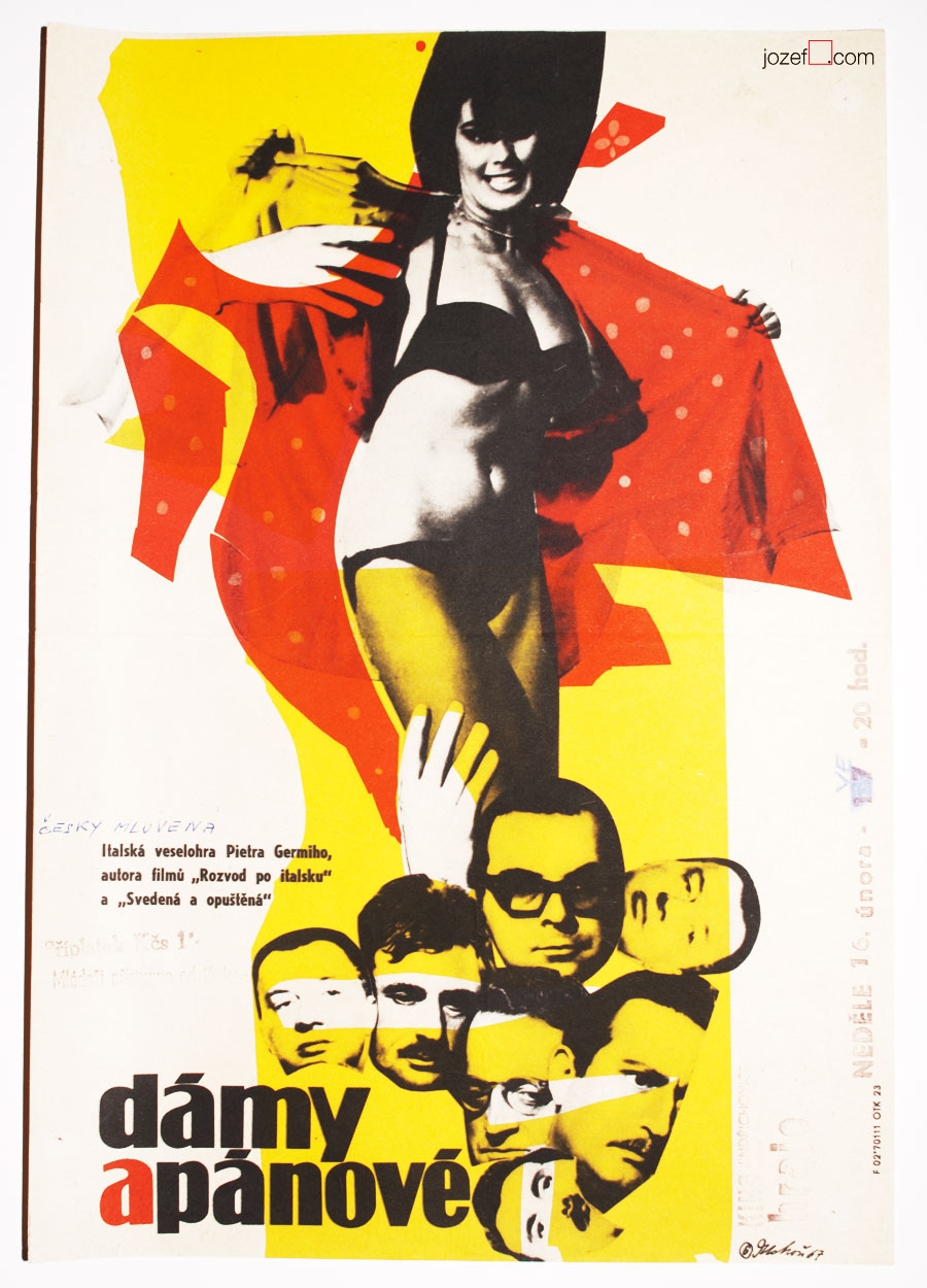
The Birds the Bees and the Italians movie poster by Josef Duchoň, 1967.
•••
Josef Duchoň started exhibiting as a member of Association of Czech Graphic Artists Hollar in mid 1950s[^2]. (Important art group established in Prague, 1917.) Among 161[^3] Czech leading artists and graphic designers one can find other interesting poster artists such as Jiří Balcar, Adolf Born, Jan Kubíček, Jiří Šalamoun or Jaroslav Sůra to name few.
His first solo exhibition is dated to 1960. Liberal Czechoslovakia allowed Josef Duchoň to exhibit work also internationally. He took part in Biennale of Young Artists / Paris (France, 1963), Intergrafik / Berlin (Germany, 1965), Myth of the XXth Century / Coventry (UK, 1967) or in exhibition of Czech graphic artists in Oregon (USA, 1967). It seems that 1970s political changes stopped his exhibition activities for some time. There was no place for surreal, or any sort of abstraction in uniformed Czechoslovakia. However children’s publications were not censored, anything was possible in there and movie posters just very mildly[^4]. Josef Duchoň remained faithful to a fantasy.
Please see other fascinating posters designed by the artist.
•••
Resources:
Literature:
[^1]: Collective authors: Czech film posters of 20th century / The Moravian Gallery in Brno, Exlibris Prague, 2004. Josef Duchoň’s movie poster appears in year 1964 in their chronological catalogue. Our poster archive dates his movie poster activity up to 1981.
Online:
[^2]: abArt / Josef Duchoň / Big thanks to abArt for their research on invisible.
[^3]: cs.Wikipedia.org / Association of Czech Graphic Artists Hollar
Film posters in history. Poster story in few takes.
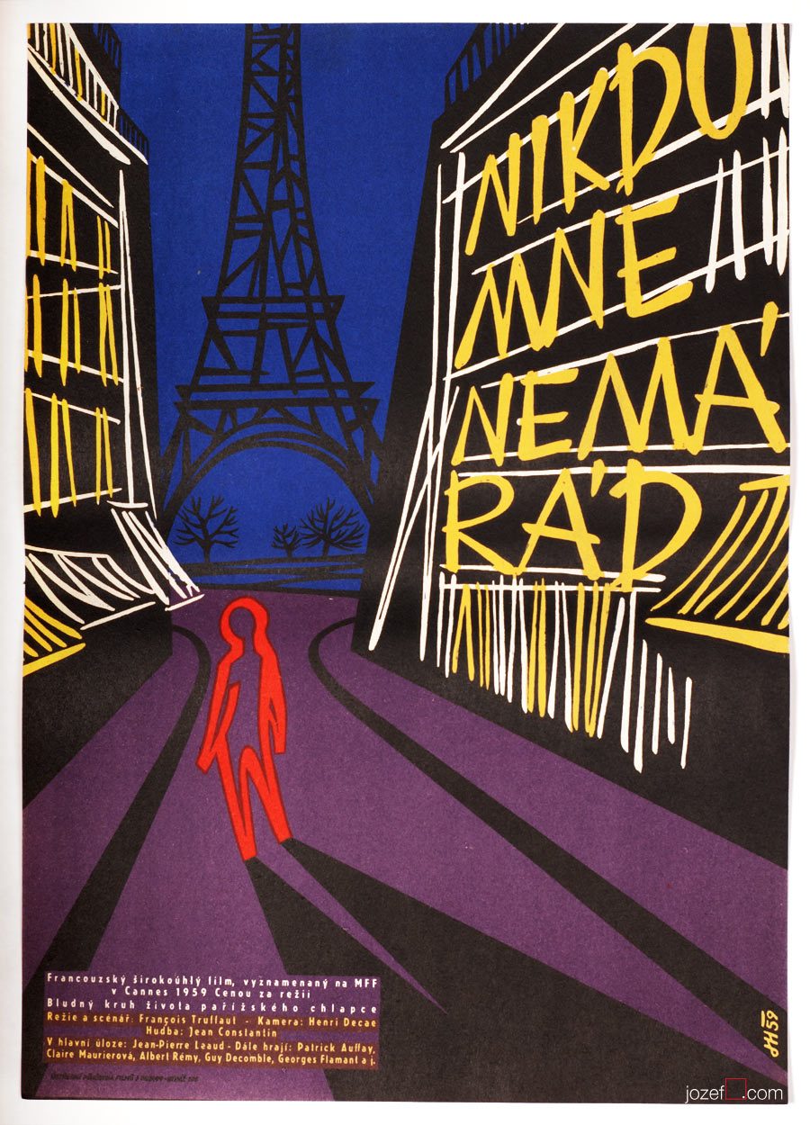
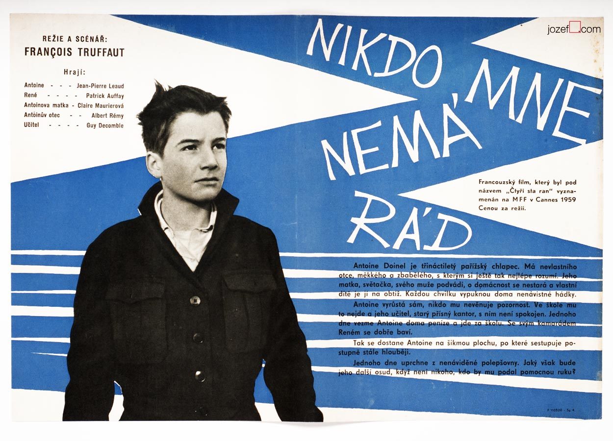
The 400 Blows / Francois Truffaut, movie poster by Josef Hvozdenský, 1959.
EXPO 58 – Brussels and travelling
It was not likely until 1958 EXPO show in Brussels when Czechoslovakia suddenly reappeared in the world wide art discussion. Overleaping thickness of Communist propaganda was overshadowing the cultural existence not only for another side of the Iron curtain. No wonder, as Stanislav Kolibal, one of the most refined Czech artist / sculptor recollects in his interview for Czech radio broadcast:
[quote]”Travelling before 1957 was just not happening.”[/quote]
It was not happening after that either, but things were a bit smoother and significantly moving towards lots of explorations.
The Eleventh Commandment movie poster by Unknown Artist, 1935.
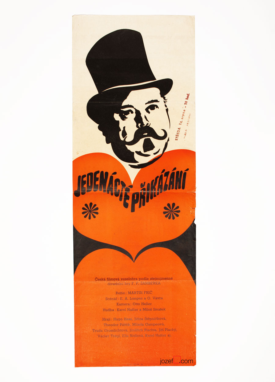
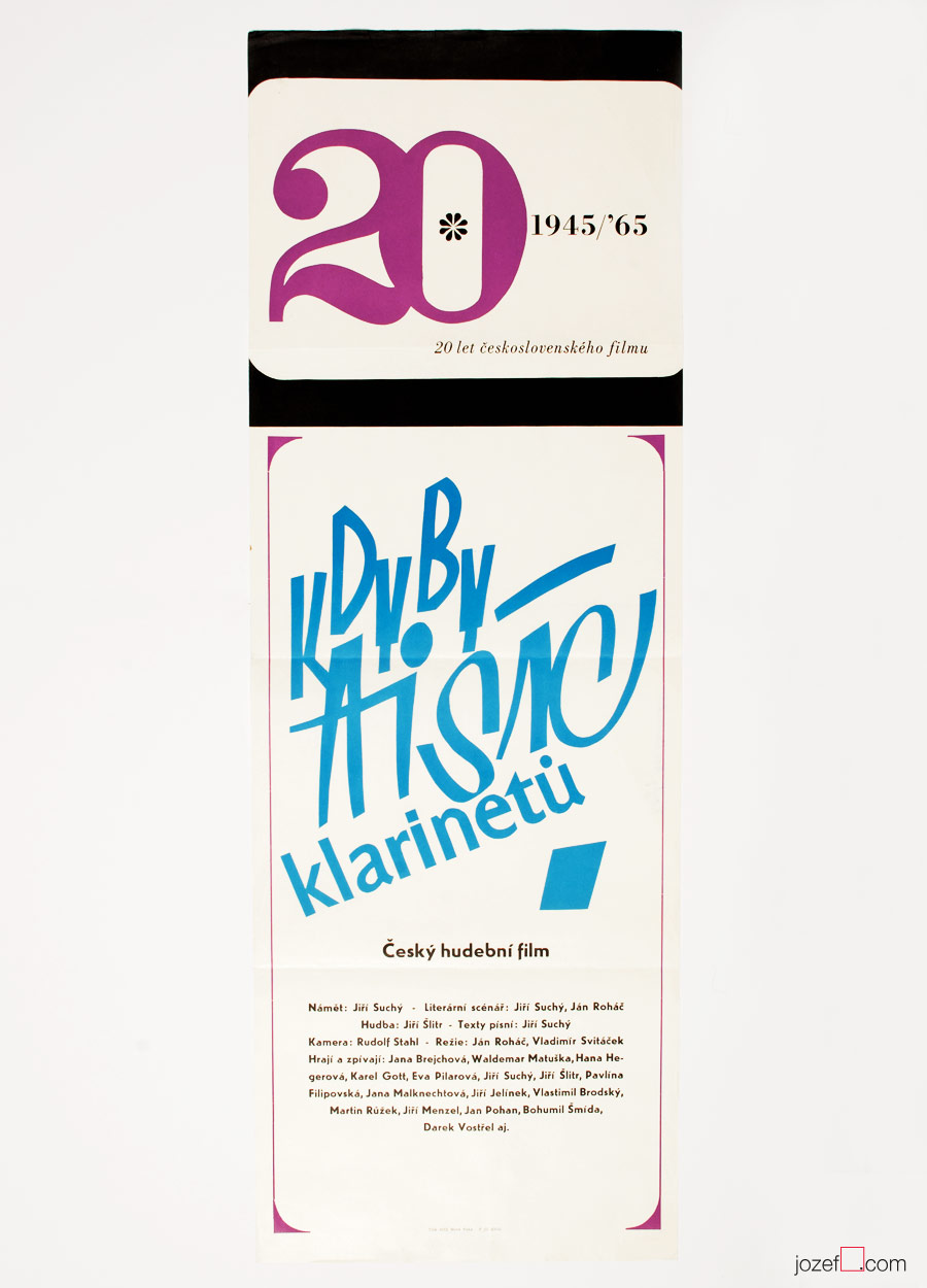
If a Thousand Clarinets movie poster by Unknown Artist, 1964.
• typical early example of the “Noodle” shaped film poster, returning as an idea back in 60s without any further success.
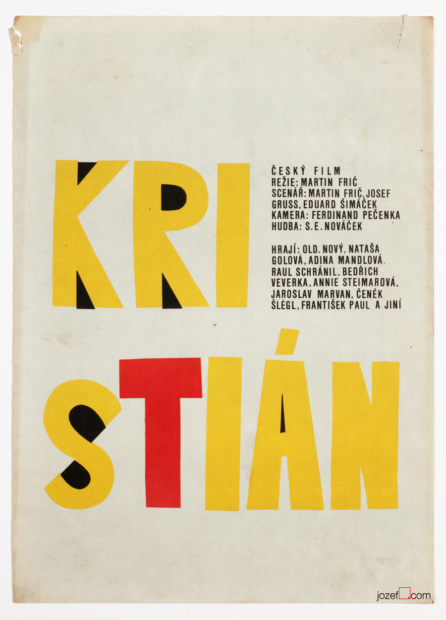
Christian movie poster by Unknown Artist, 1970.
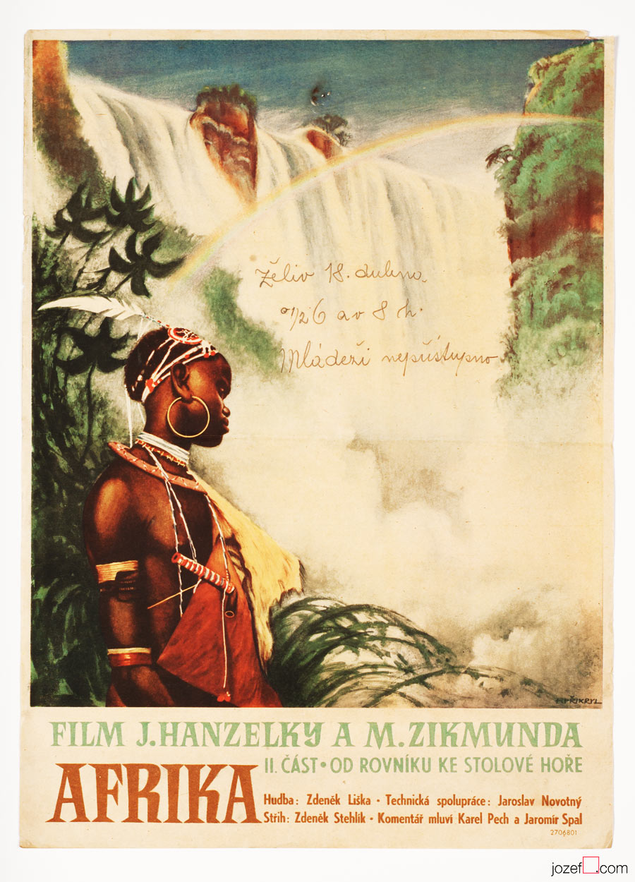
Africa II movie poster by František Přikryl, 1952.
• film posters following old poster traditions.
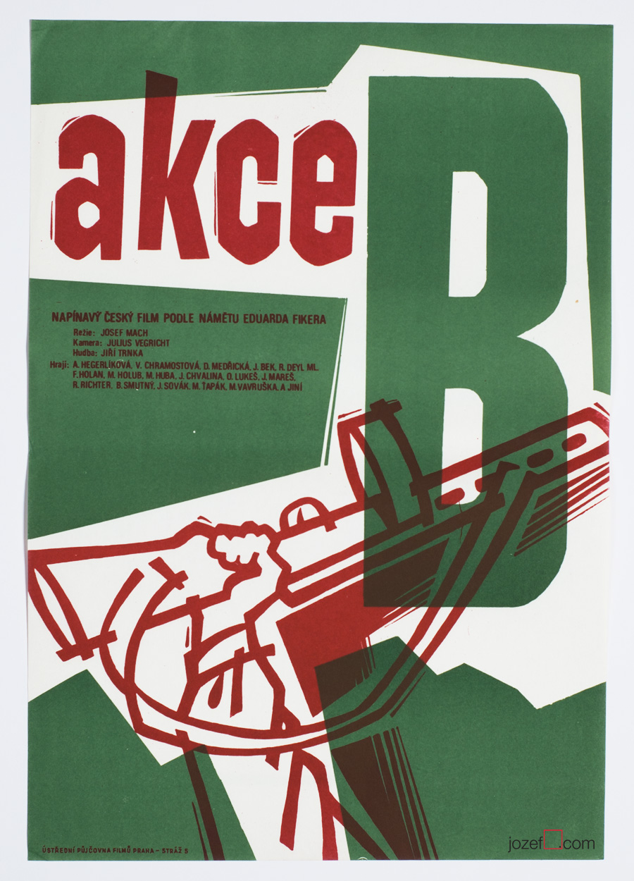
Action B movie poster by Unknown Artist, 1951.
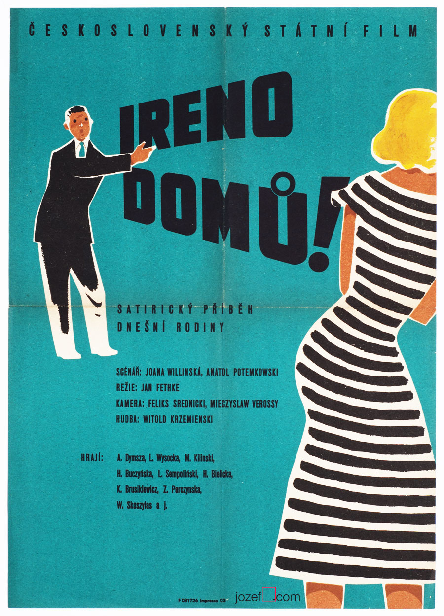
Irene, go home! movie poster by Unknown Artist, 1956.
• 50s film posters came very rarely with the signature.
Early days of film posters.
Unhealthy political regime in Czechoslovakia had very strong impact on cultural distribution within the country. Country was perfectly sealed off. Presence of cold war was also effecting the possibilities of any official cultural exchange. Art making was going through all kinds of metamorphosis, but in reality it only had one face. That face was called Social Realism and it had very clear, strong and long lasting statement. Visual disillusion would chase one everywhere. And if a little flag was’t displayed on the window seal on the 1st of May, one would be chased by someone else, too. Simply put; politicians were using art for their own propaganda and there was no way around it. Or maybe there was?
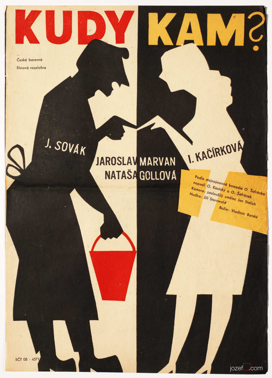
Whence and Where to? movie poster by Unknown Artist, 1956.
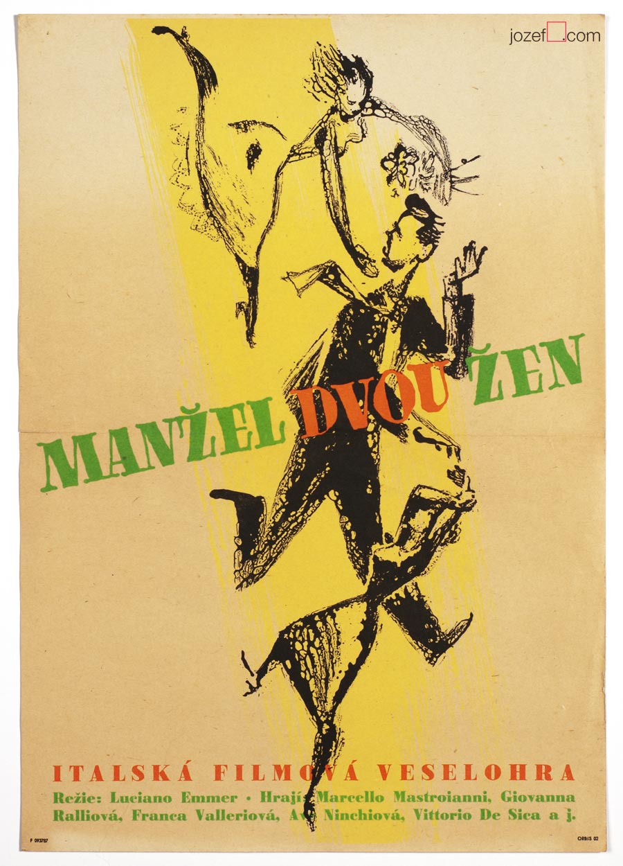
The Bigamist movie poster by Unknown Artist, 1957.
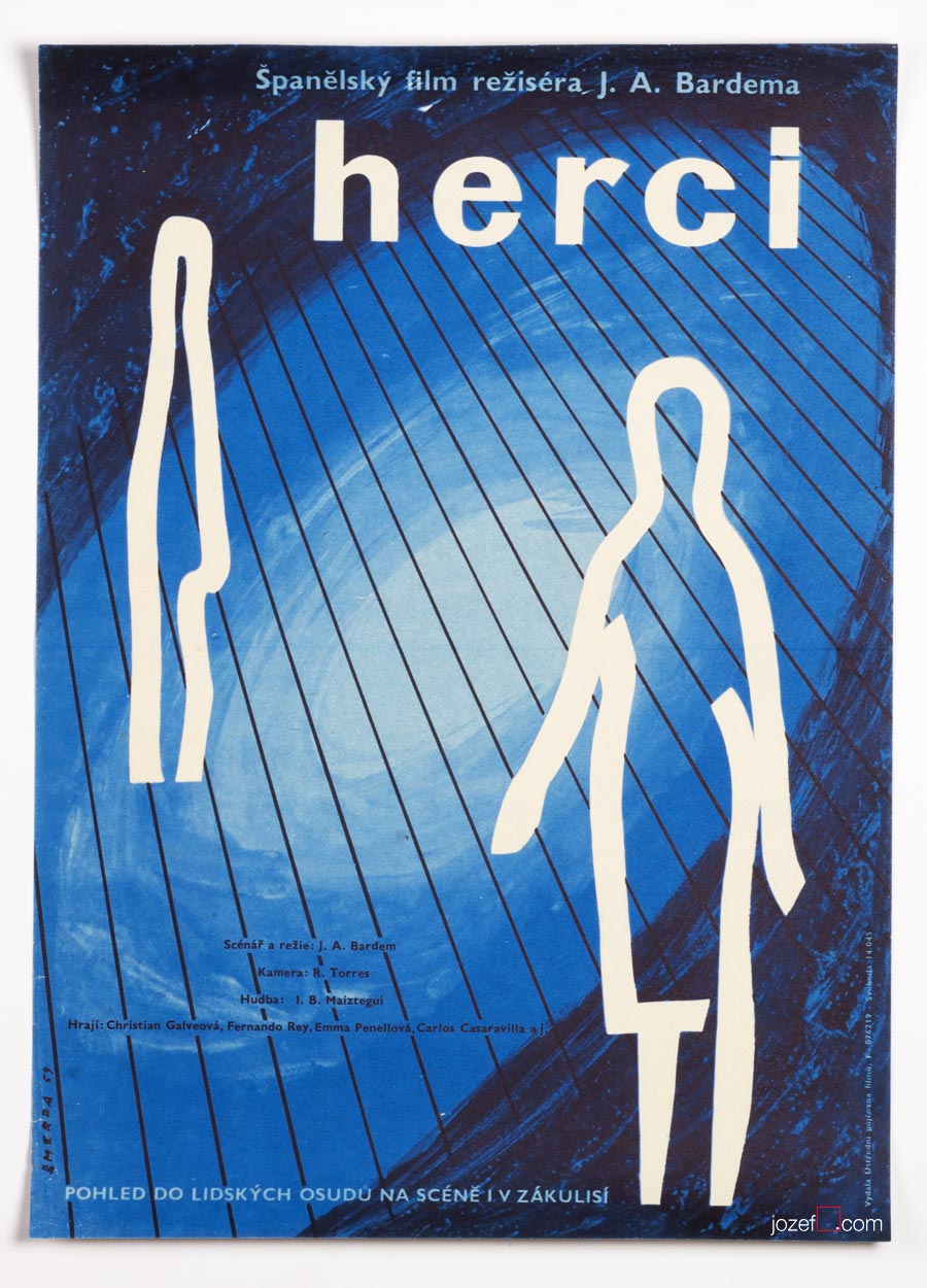
Comedians movie poster by Vladimír Šmerda, 1959.
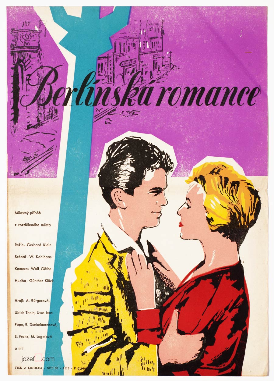
Berlin Romance movie poster by Unknown Artist, 1956.
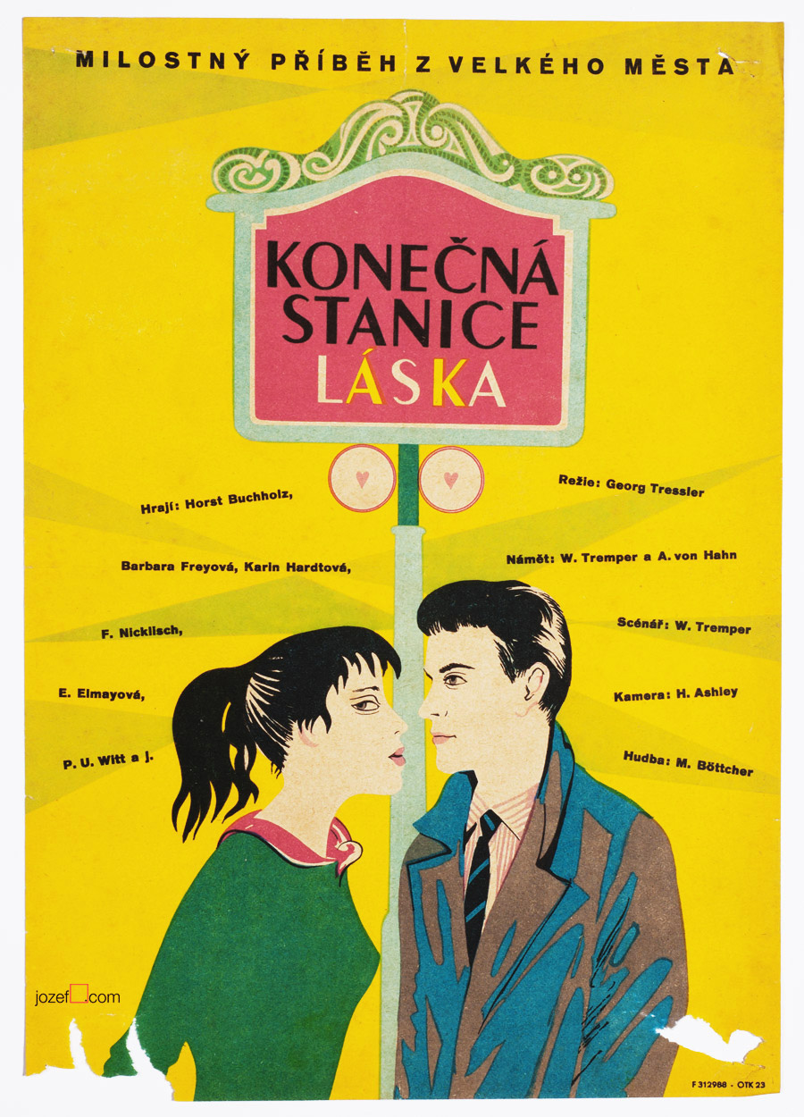
Endstation Liebe movie poster by Unknown Poster Artist, 1959.
Puss in Boots movie poster by Unknown Poster Artist, 1958-68.
• fascinating starts from the “old school” representatives. Many artists were trying to cover the new medium. By the end of 50s poster still did not have that film look.
Film poster in Czechoslovakia was also going through many changes before it meets the doors of collectors and film festivals. All sorts of artists were trying out to fit the new medium, but it was not until early sixties when fresh new ideologies were presented in both films and similarly in film posters design. Poster designers had it very hard to make pleasing posters for bad propaganda or WWI-II films at the beginning. Significance of EXPO 58 and sudden interest of politicians in foreign currency from the fresh source[^1] turned a blind eye on art scene ever since. Censorship however remains necessity.
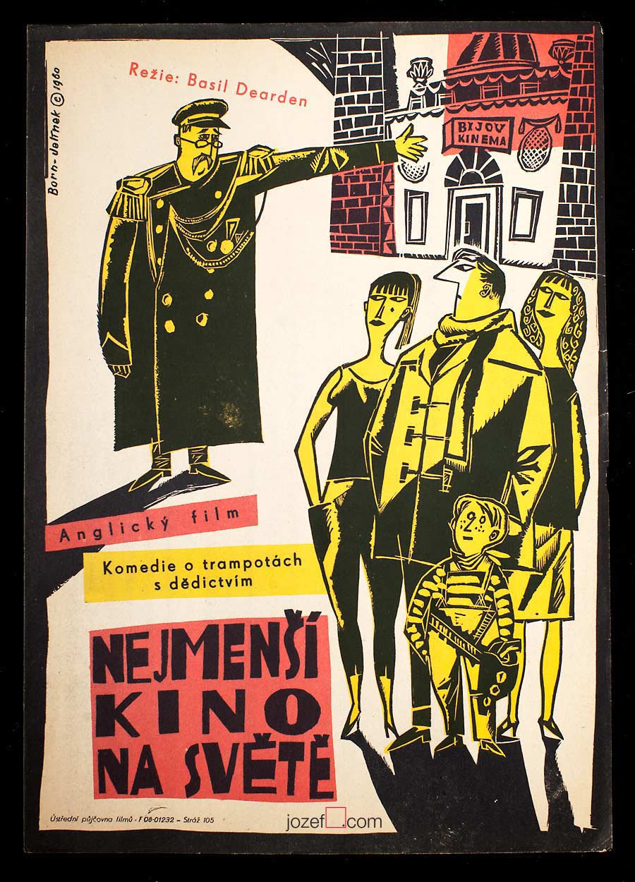
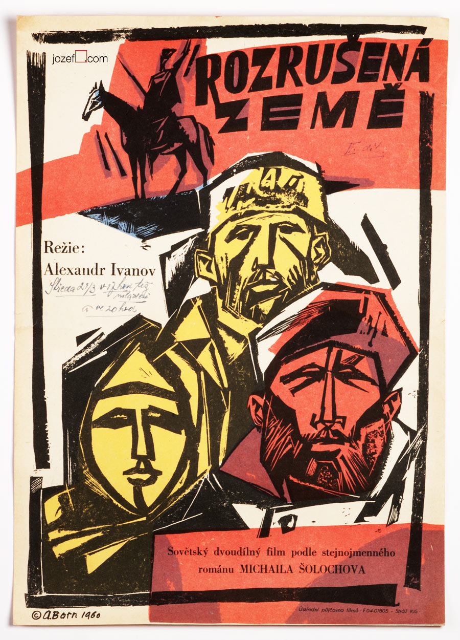
The Smallest Show on Earth movie poster by Adolf Born, 1960.
Virgin Soil Upturned movie poster by Adolf Born, 1960.
• Adolf Born is getting involved in poster making.
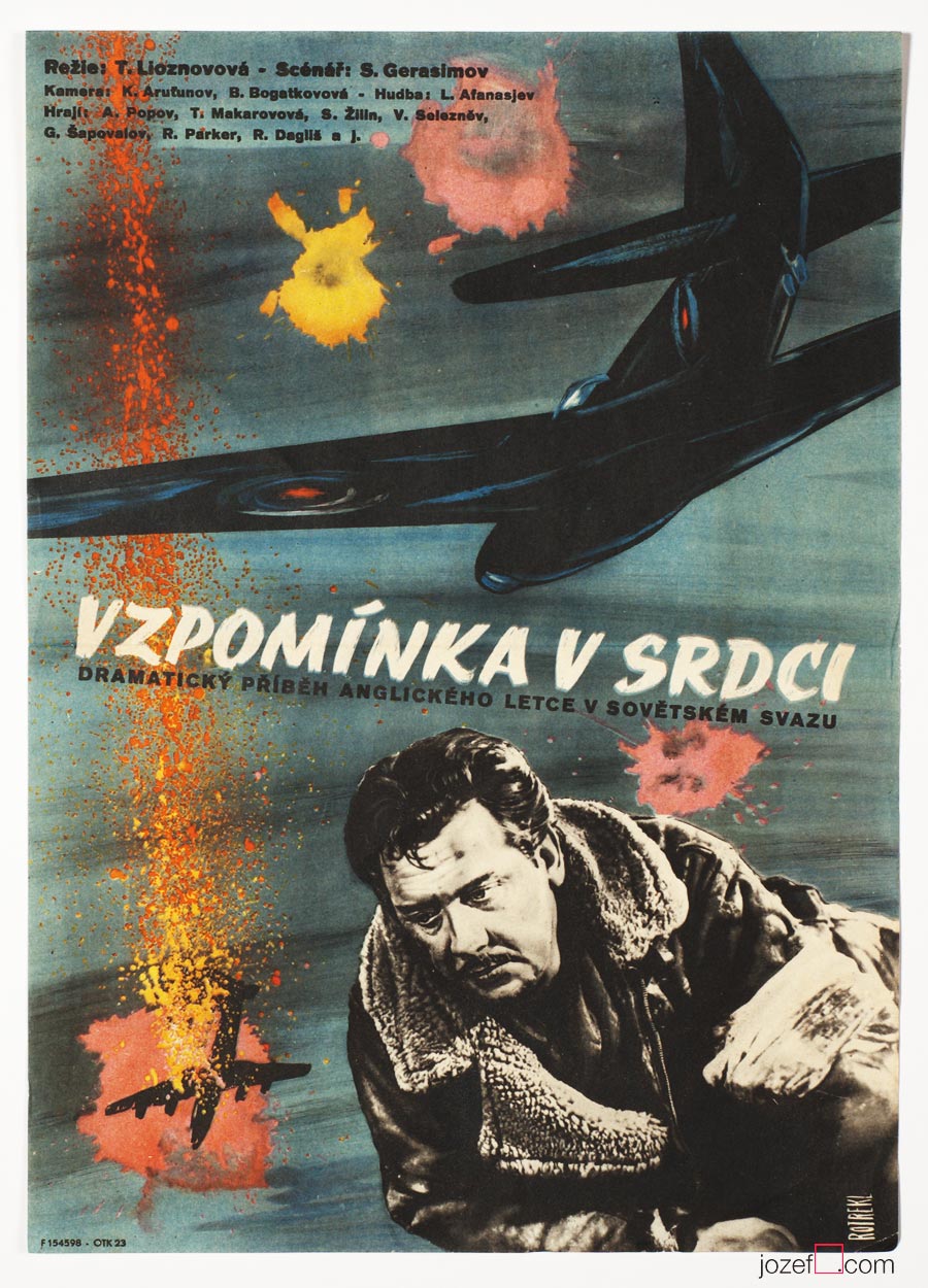
Memory of the Heart movie poster by Teodor Rotrekl, 1959.
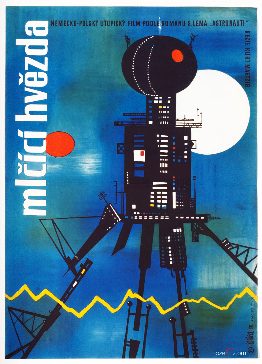
First Spaceship on Venus movie poster by Teodor Rotrekl, 1960.
• another famous Czech sci-fi books illustrator Teodor Rotrekl designs several film posters.
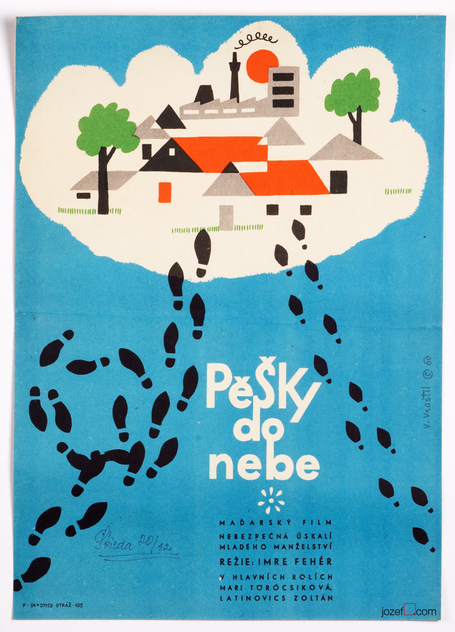
Walking to Heaven movie poster by Vladislav Vraštil, 1960.
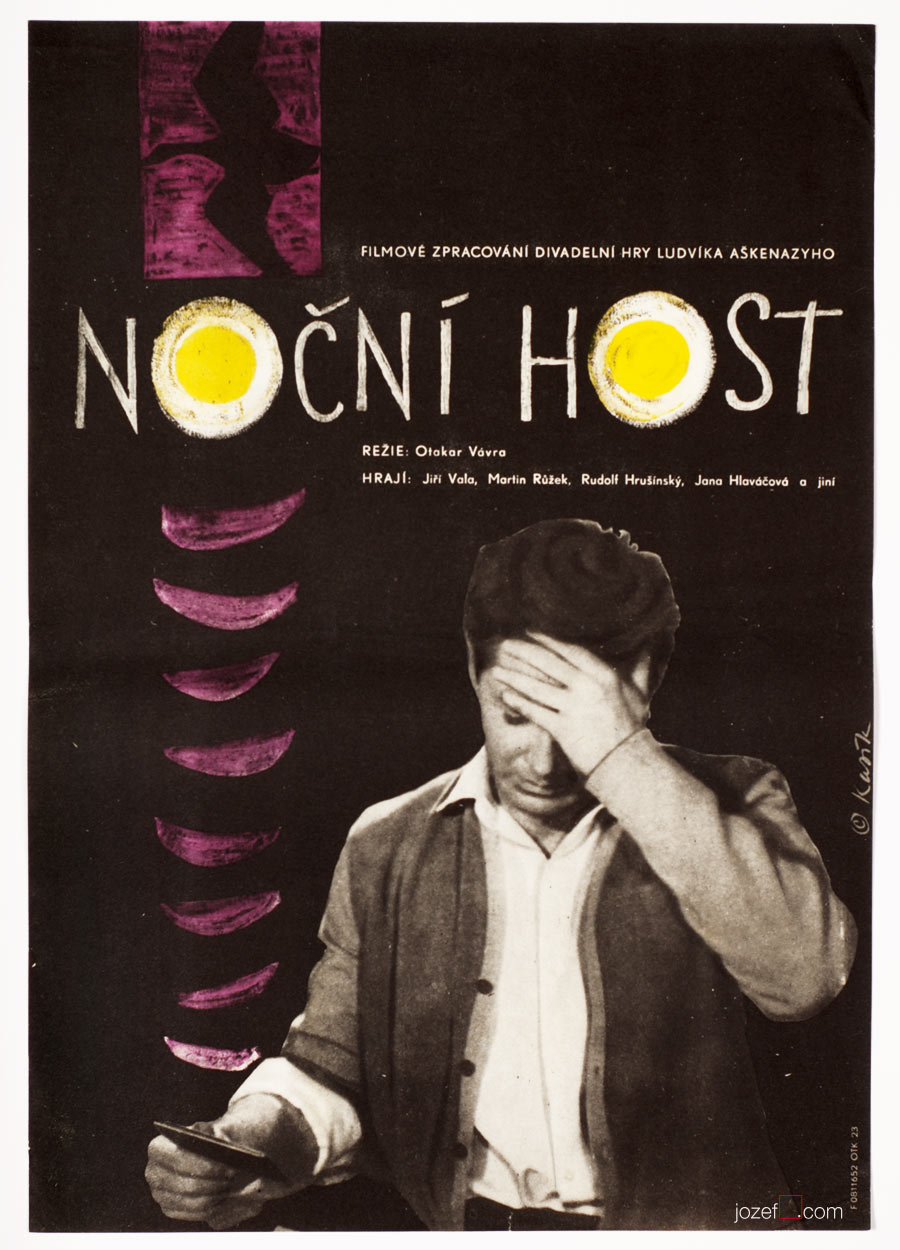
Night Guest movie poster by Václav Kasík, 1961.
Censors in form of critics were very much responsible for the public picture. That could never lack enough sympathy for the comrades from the Soviet union / countries of Warszaw pact and on the other hand it had to be critical enough towards anything coming out from the west.
In visual art weird symbols of the era were the most preferable. Motifs of smiling women standing behind the factory machine pretending they do enjoy the heavy work and at the same time they are equally helping in cultivating the nation. This and similar images, everyone possibly came across when they say Communism, were implied in every possible media and censors had to make sure there was enough of it visible.
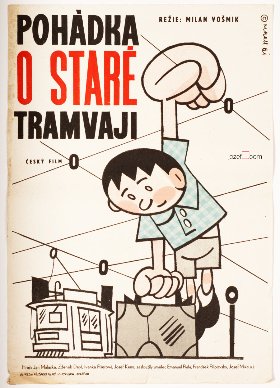
Tale of an Old Tram movie poster by Miloslav Noll, 1961.
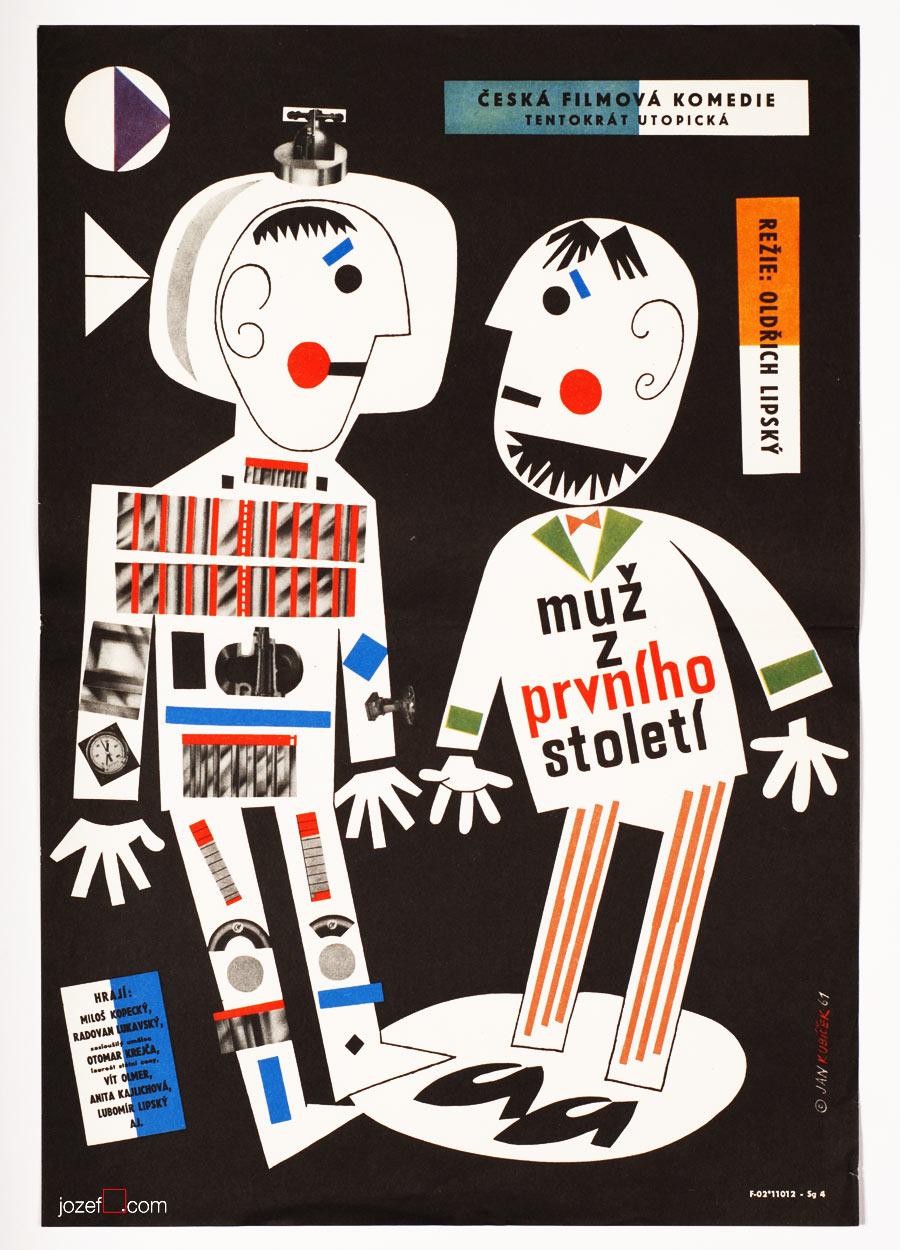
Man in Outer Space movie poster by Jan Kubíček, 1961.
Two Men from Another World movie poster by Jan Kubíček, 1962.
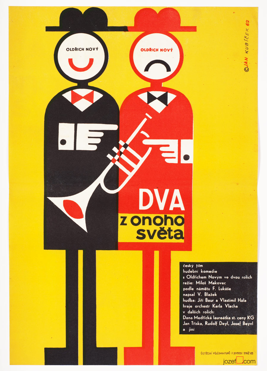
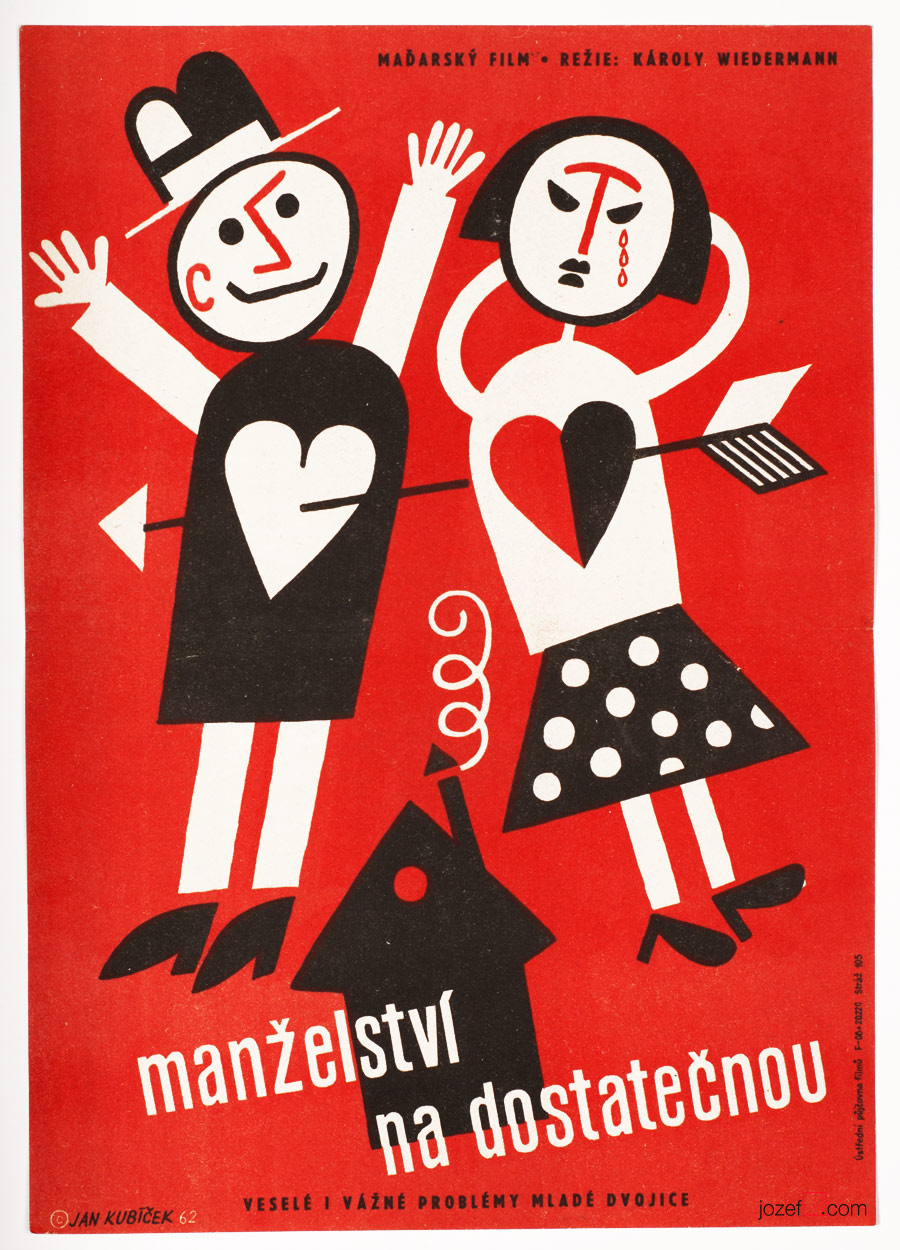
Satisfactory Marriage movie poster by Jan Kubíček, 1962.
• playful illustrations and collages of Jan Kubíček were accompanying Czechoslovak film poster all the way to seventies.
Hungry for Love movie poster by Unknown Artist, 1961.
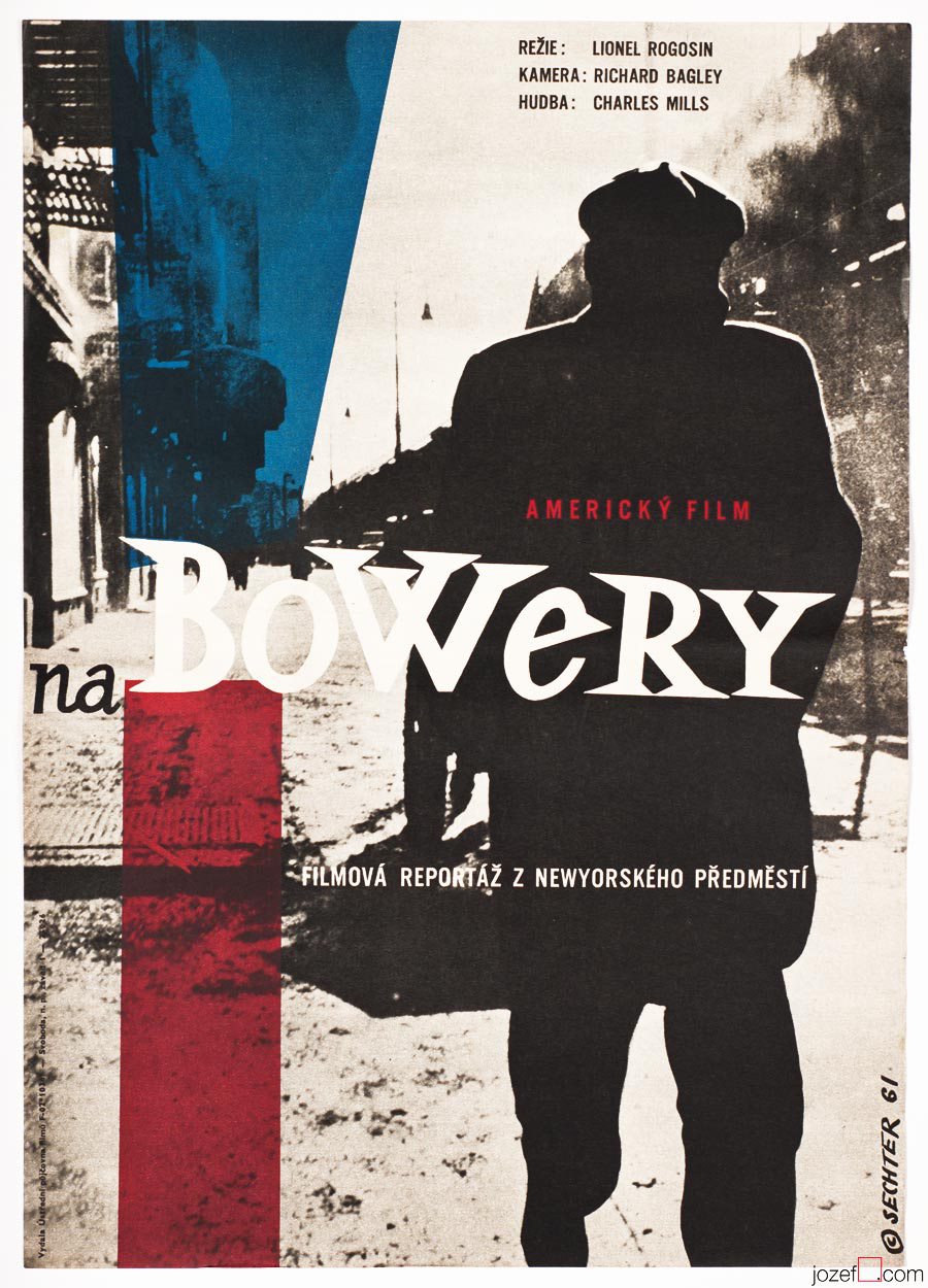
On the Bowery movie poster by Jan Sechter, 1961.
• photograph stretches all across the poster.
Thankfully not all of the art disciplines were destined for an extinction. Illustration, animated films as well as film posters remained intact with only few slight obstacles.[^2] By the beginning of 1960s several renown artists, graphic designers and illustrators such as Bedřich Dlouhý, Miloš Reindl, Richard Fremund, Zdeněk Palcr, Karel Teissig, Jaroslav Fišer were shaping up the future visuals of film posters. When award winning poster and graphic designer Zdeněk Ziegler meets the official film posters committee for the first time, he remembers his feelings were strongly in favour of his critics.
[quote]”There were always two or three graphic designers among commissioners who would defend fellow colleague. It was Karel Vaca and Dobroslav Foll in my case.” [^3][/quote]
The 400 Blows / Francois Truffaut – Promotional film catalogueThe 400 Blows / Francois Truffaut, Catalogue view opposite side.
With increasing attendance at the international film festivals, film poster was also heading towards new directions. International success of movies created by Miloš Forman, Věra Chytilová, Jiří Menzel and other important directors of Czechoslovak New Wave, introduced Czechoslovak poster design to the foreign audience. Film posters designed in 1960s were created by some of the best poster designers of the era and we will be exploring them in more details in our next post.
•••
[^1]: Enough currency was floating in the country. Czechoslovakia was one of the greatest business partners with the death at the time. Military industry was among the most popular and export was doing just fine. / 150 000 Slov – former exile magazine, X/91/27, p.3-5, Morálka musí počkat (Morale must wait), Inge Santnerová.
[^2]: Vratislav Hlavatý for the Czech Radio Interview / 29.3.2013 (Several of his publications were banned throughout Communism).
[^3]: Zdeněk Ziegler for the Czech Radio Interview / 15.5.2013.
Additional research:
Literature:
Flashback / Czech and Slovak Film Posters 1959-1989, ed. Libor Gronský, Marek Perůtka, Michal Soukup, Olomouc Museum of Art, 2004.
Movie posters in history. Showcase of 1960s poster designs.
Poster Designer / Anonymous Artists
It would be very hard to define a common practice or visual language of Anonymous poster designers in Czechoslovakia. Even harder with Sixties, as the period offered so much surprises and unpredictable twists in both politics and culture. It seems like one can never live without the other (somehow never in successful harmony). Specially politicians were always dependant on cultural demagogy, using visual propaganda to their needs.
***
Knights of the Black Cross movie poster by Unknown Artist, 1961.
Knights of the Black Cross II movie poster by Unknown Artist, 1961.
Careful and very modern selection of colours was used for both parts of Knights of the Black Cross, 1961.
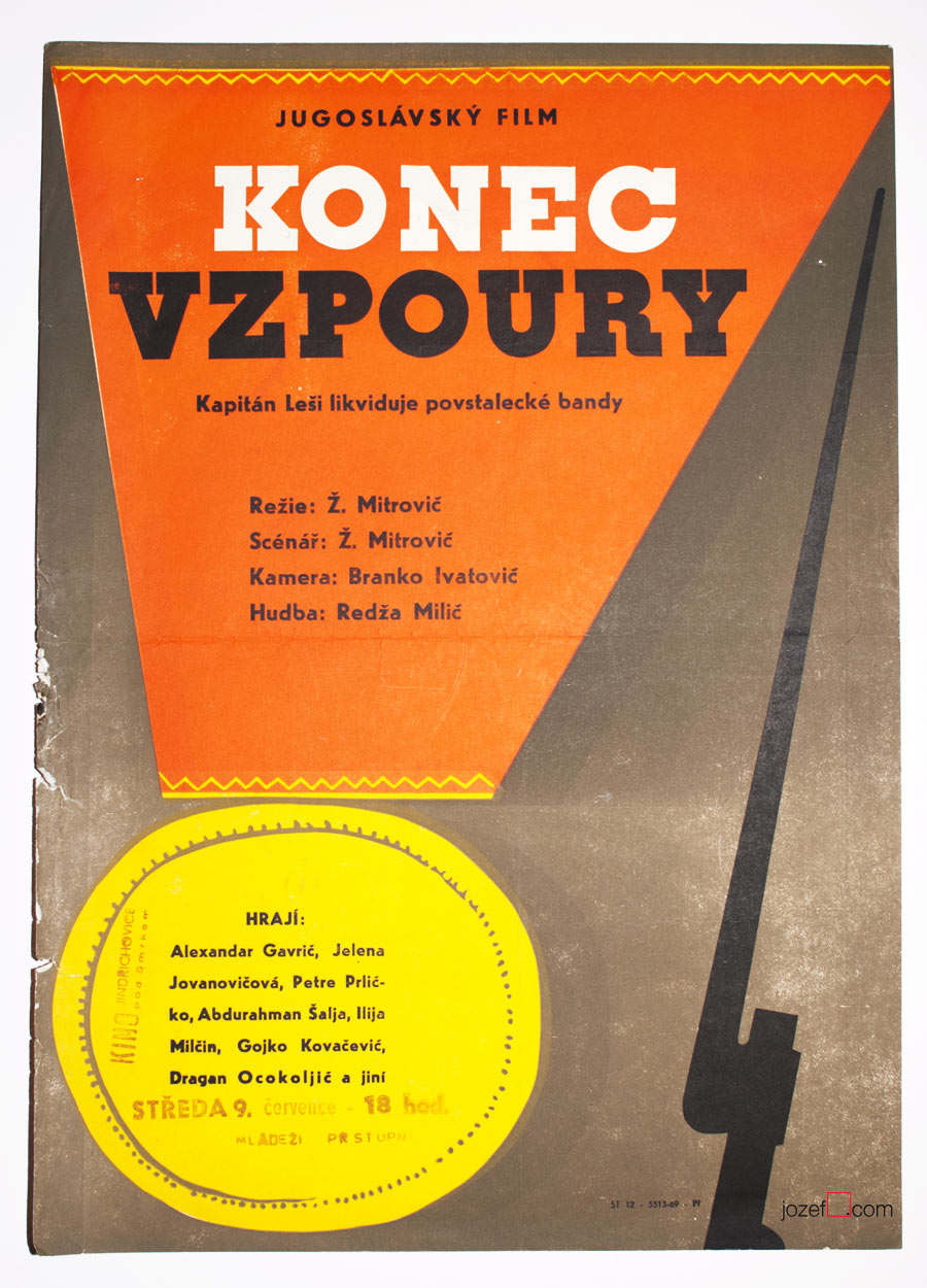
Captain Lechi movie poster by Unknown Artist, 1963.
Captain Lechi 2 movie poster Unknown Artist, 1963.
War movies were always highlights, particularly those showing war heroes in Socialist sort of way. Ongoing currency, no matter what’s the weather.
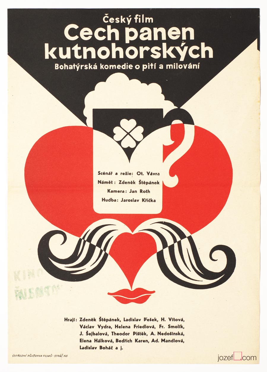
The Guild of the Kutná Hora Virgins movie poster by Unknown Artist, 1964.
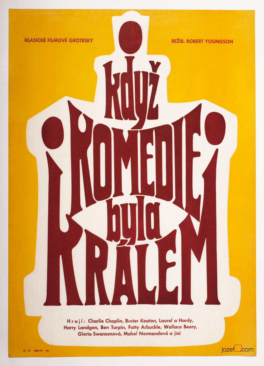
When Comedy Was King movie poster by Unknown Artist, 1965.
Symbols, hints and playful thoughts were always around poster making.
***
There is nothing unusual about Anonymous artists (if own decision), but being unknown artist in the discipline, where displaying signature is relevant/appropriate (n. Karel Vaca, Dobroslav Foll, Karel Teissig and others) raises several questions.
Earlier in the second part of our article on history of poster art in Czechoslovakia we have mentioned censorship as the part / instrument of the Communist doctrine. Communist party was the one and only expert on art, which might sound funny but the reality was not so much, Social Realism did exist, after all. In addition to films ÚPF (Ústřední Půjčovna Filmů/ Formal state distribution 1957 – 1991) was also commissioning movie posters. Both were deciding what could be shown in the cinemas. Were they somehow responsible for hiding artists identity?
***
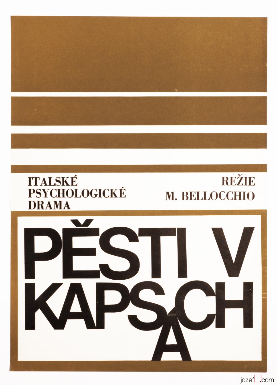
Fists in the Pocket movie poster by Unknown Artist, 1965.
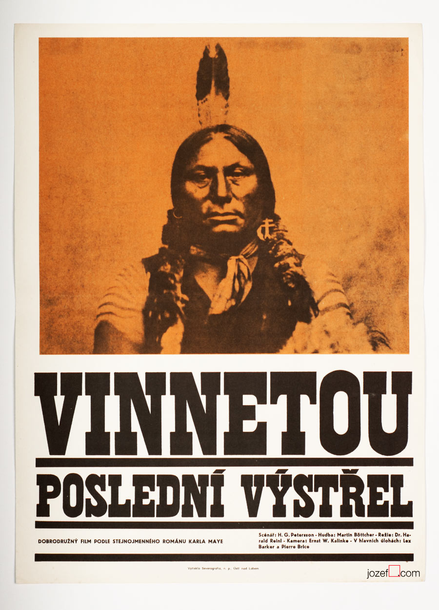
Winnetou, The Last Shot movie poster by Unknown Artist, 1966.
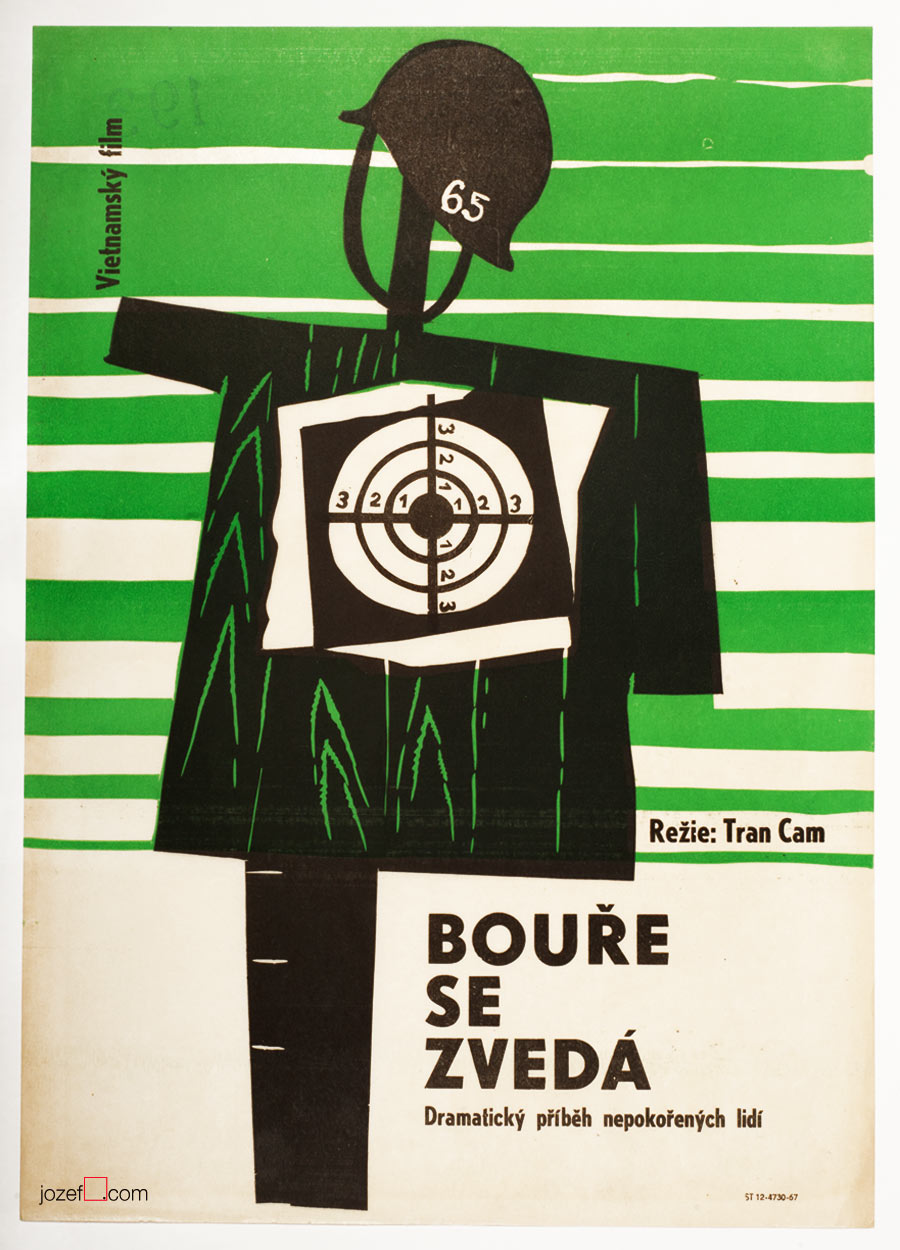
Storm Rises movie poster by Unknown Artist, 1967.
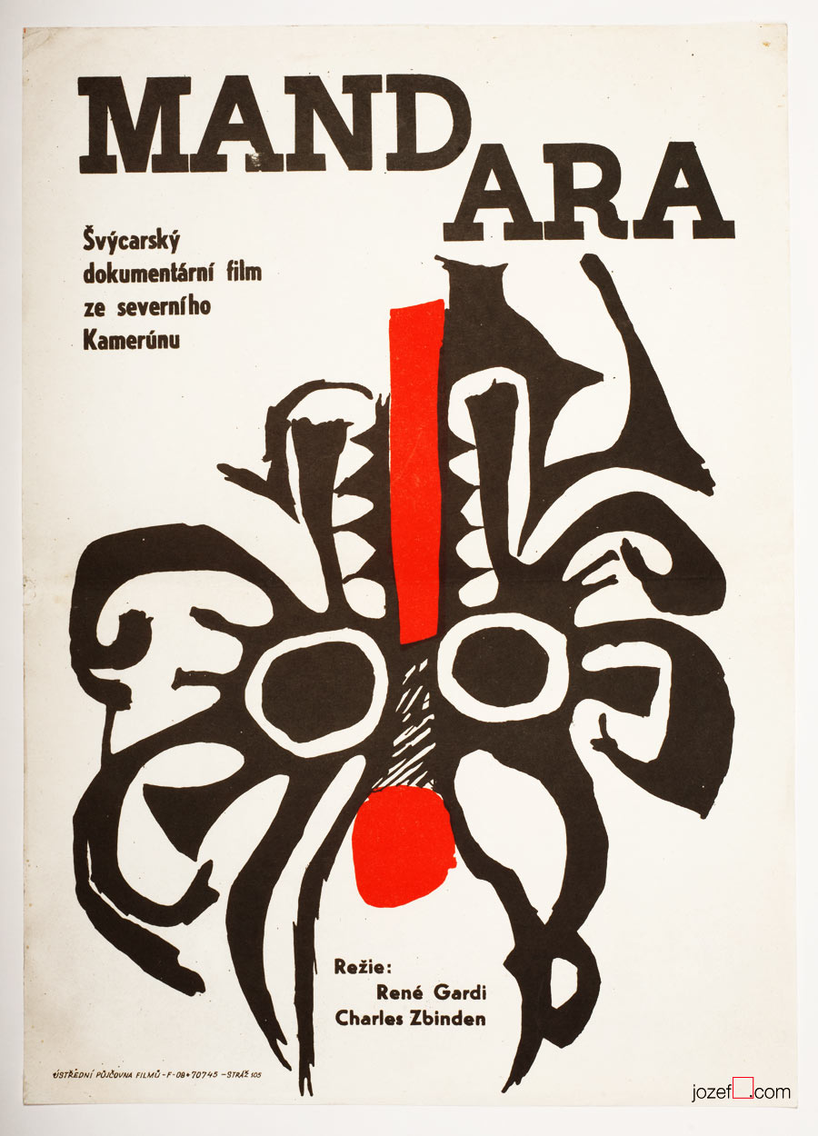
Mandara movie poster by Unknown Artist, 1967.
The Demolition Squad movie poster by Unknown Artist, 1967.
Boarding House for Bachelors movie poster by Unknown Artist, 1968.
From Switzerland to Vietnam, poster designs made by Unknown Artists covered all sorts of spectacular, if not even controversial movies.
***
We know that the film poster committee always consisted of few graphic artists (2-3). They would constantly try to give green light to the proposed poster designs. Were they also turning the blind eye to help fellow artists (obstacle/potential traitors and pests[^1]) in getting at least some sort of a commission? We believe it could be possible as the demand for the movies was quite high and each movie had to have its own poster. Still, for some reasons several artists had to remain unknown.
***
Riders in the Sky movie poster by Unknown Artist, 1968.
Crime in the Night Club movie poster by Unknown Artist, 1968.
By the end of Sixties photography techniques were commonly used in various poster designs. Above another example of photograph overtaking the space.
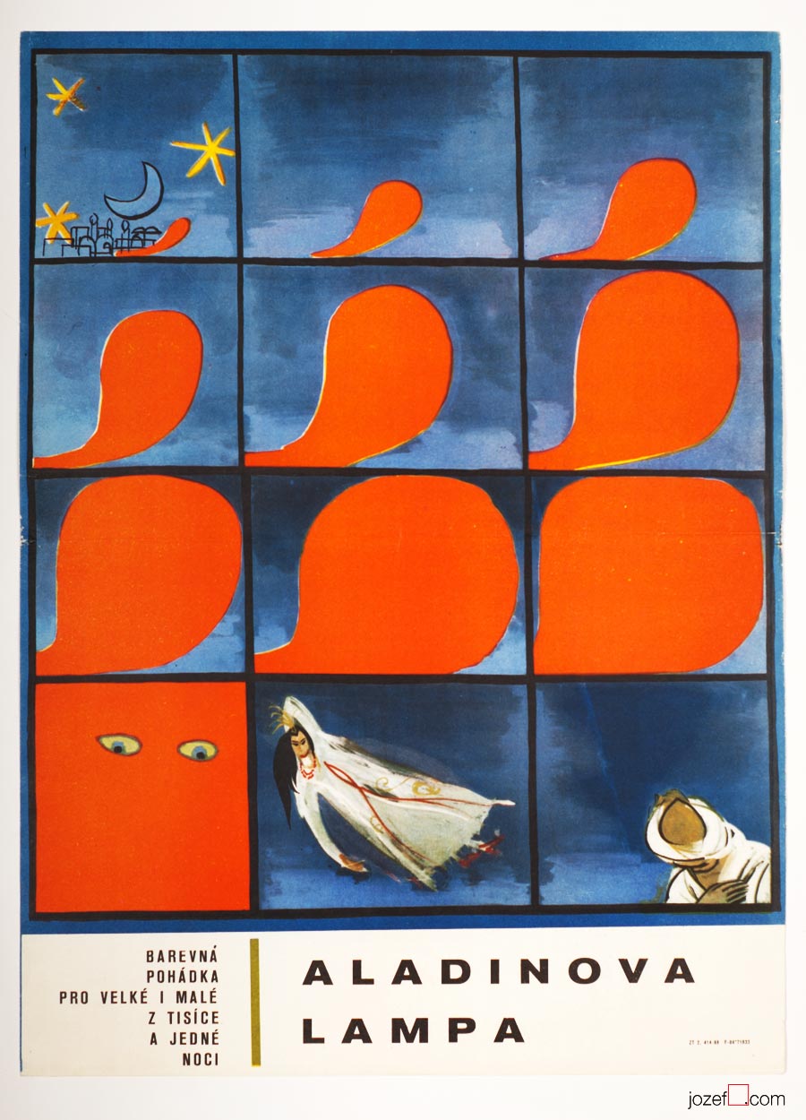
Aladdin and His Magic Lamp movie poster by Unknown Artist, 1968.
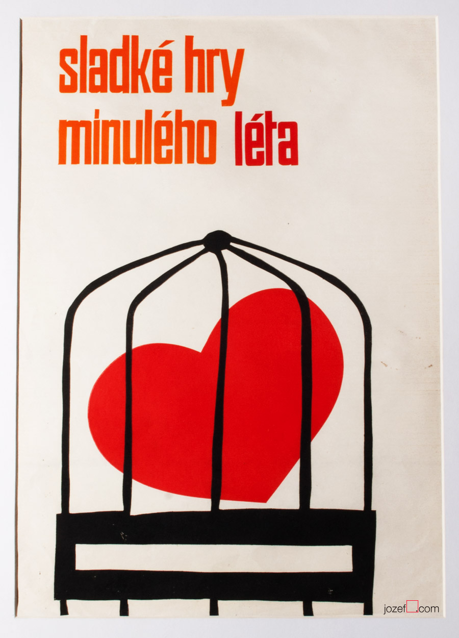
The Sweet Games of Last Summer movie poster by Unknown Artist, 1969.
The Sweet Games of Last Summer (1970), based on Guy de Maupassant’s novel was premiered in Czechoslovakia only once. Film directed by Juraj Herz (The Cremator) came back to distribution again in 1988[^2].
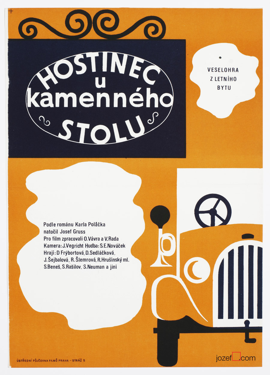
Inn at the Stone Table movie poster by Unknown Artist, 1969.
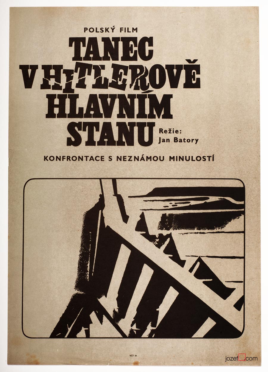
Dancing Party in Hitler’s Headquarters movie poster by Unknown Artist, 1969.
***
Looking at their movie posters many years later, we can observe some fascinating poster designs. They do not lack any of the visual qualities of other Czechoslovak poster artists. The pity is, they could never take part in any of the ongoing poster exhibitions of the time. We will possibly never be able to find out who were the authors of those magnificent movie posters, or how many artists were creating anonymously, but they surely deserve our appreciation. Until 1989 hundreds of poster designs were created by Unknown artists. There was no one to hide from after that.
***
Literature:
[^1]: Toto čudesné 21.Storočie / This peculiar 21st century (unofficial translation), Tomáš Štrauss, Kalligram 2009. (Book is not so much about the movie posters, but Tomáš Štrauss, expert on Totalitarian, art critic/historian, said it to the point)
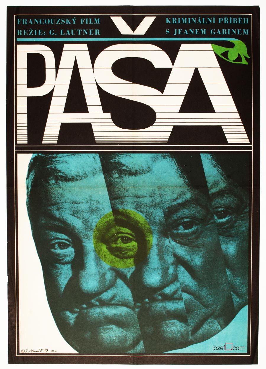
Movie poster shown on the picture above has been seen previously in one of our articles on History of Poster Design in Czechoslovakia. It did not stop us from refreshing the memory as we are strongly effected by its expressiveness. Jean Gabin‘s common impression for every French born was broken into uncertainty. Divided into parallel fields as in the rhythm similar to main theme of that phenomenal soundtrack composed by Serge Gainsbourg. Music moves on as we can see even on the letters, one can hear the most peculiar sounds.
Mysterious poster for Georges Lautner‘s film is hiding one extra mystery and that is the poster designer himself. Jaromír Bradáč remains the one, or at least for now. You can count number of his film posters on your left hand and that’s about everything we could track on this fantastic graphic designer. Hopefully the future will show some more light about him, as we believe five film posters is not everything he did.
***
A Study About Women, film poster by Jaromír Bradáč, 1968.
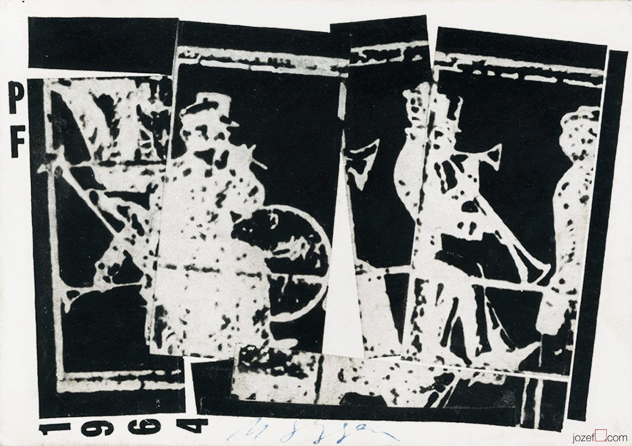
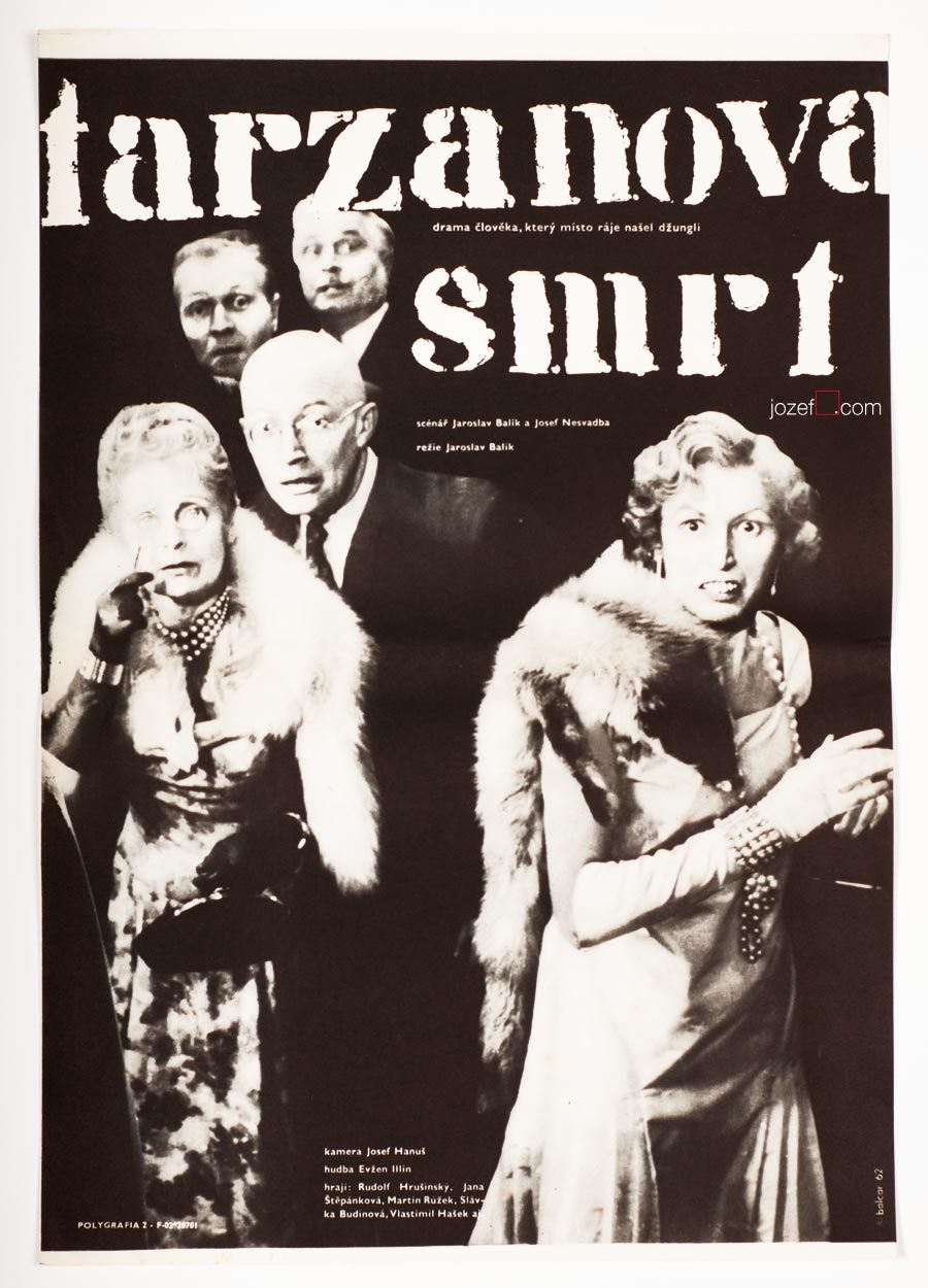
The Death of Tarzan movie poster by Jiří Balcar, 1962.
***
26th of August 1929, Kolín
28th of August 1968, Prague
Education:
1947-1948, Philosophical Faculty of Charles University in Prague
1948-1953, Academy of Arts, Architecture and Design in Prague (prof. F. Tichý, F. Muzika)
Awards:
1960, The most beautiful book of the Year, (Brno ?)
1962, Toulouse-Lautrec Prize, Paris (film poster Moby Dick)
1964, Honorable Mention, First Czechoslovak Showcase of Poster and Promotional Graphic Art, Brno[^1]
Film posters created: 34 (1960-1967)[^2]
***
This Year in September movie poster by Jiří Balcar, 1963.
***
Czech artist Jiří Balcar could easily belong to one of the most fascinating poster designers of the Sixties. It’s hard to judge by the small number of his posters in our collection, but his artwork as we are finding out, spreads all across the globe (short list bellow). Internationally started off at Farleigh Dickinson University in Madison (New Jersey) where he took part in International Invitational Seminar of Art, followed by exhibition in New York in 1964[^3] , Berlin (1965-66) and Wien (1966). Paris exhibition in Musée d’Art Moderne (1969) was held soon after his early death in 1968.
A wide spectrum of his artistic experiments are brought in from the painting and are reflected in his poster designs. Extensive use of letter templates, sometimes broken into separate parts, wise and bright selection of colours (unless Monochromatic, or sensible mix of both), unconventional use of photography and perfect understanding of space. His faceless figures, motif reappearing on several of his paintings, could become alive only on the film poster.