Karel Vaca And Zdeněk Ziegler in Company Together
Many thanks to Harriet,
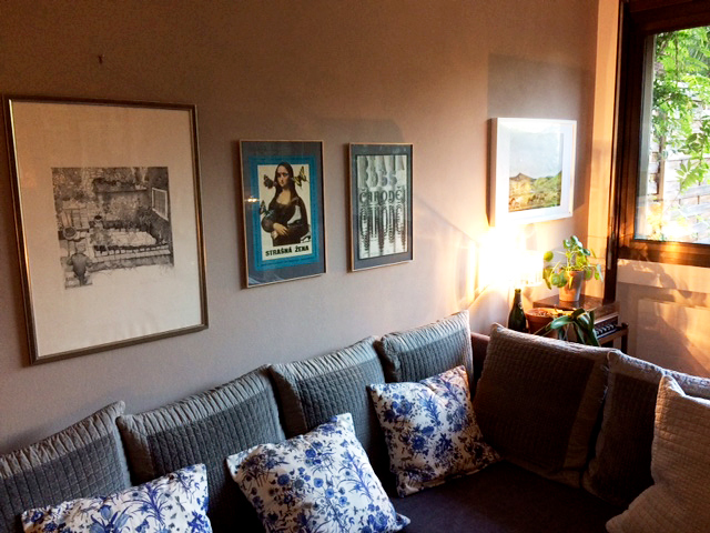
for inviting us to her cosy little “showroom” and for taking such a beautiful care of two lovely movie posters from our archive. They look magnificent in their new surrounding and such a good combination, too. Two phenomenal, possibly most prolific poster designers of the time, both with full bag of poster awards and hundreds of poster designs in portfolio. We can be only astonished by amount/inventivness/variety of their work. While Zdeněk Ziegler was very much attached to graphic design, Karel Vaca was attracted to fine art, specially to abstract painting. Each of them influenced many and helped a lot with introducing Czechoslovak poster design internationally.
Zdeněk Ziegler’s poster design for The Wizz consists of only typeface, combination of Good Vibrations and Manuscript Caps (out of interest please, see also his Flashdance poster). It is excellent example of how far he would go when designing movie posters, truly fascinating. No words to what Karel Vaca did to Mona Lisa either :), such an intriguing, humorous artwork. It was possibly the first 60s Vaca’s poster we were holding in our hands few years back, it is deeply engraved on mind ever since. Karel Vaca was playing all over, nothing was sacred to him and most of the time one just stay speechless observing his art.
Most adorable, thank you so much for showing them to us!
***
Please explore poster artwork of Karel Vaca / Zdeněk Ziegler in chronological order.
For all the information on typeface we thank to FONTS IN USE archive.