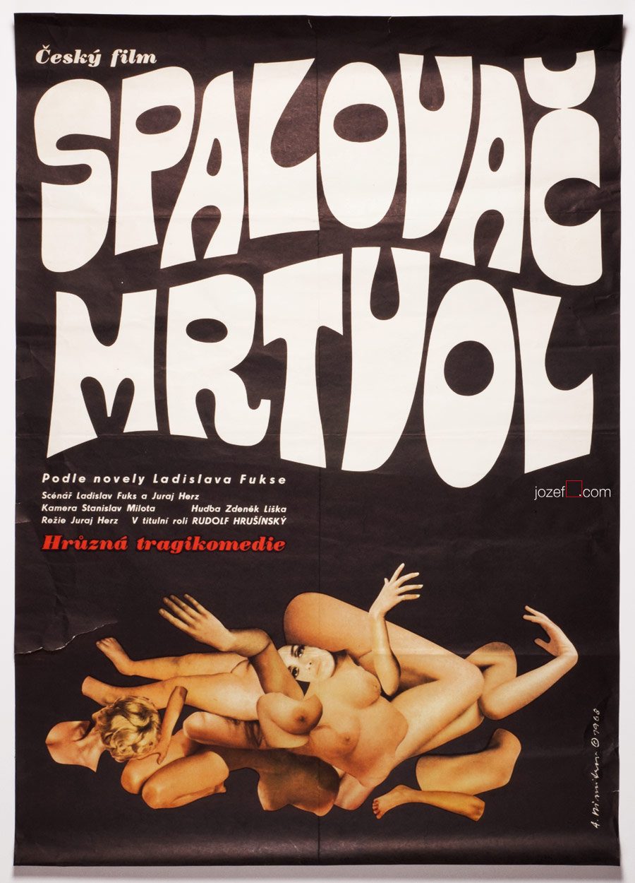
The Cremator movie poster by Antonín Dimitrov, 1968.
***
b. 27th February 1928, Mšecké Žehrovice/Rakovník, Czech Republic
d. 27th December 2014, Bobcaygeon, Canada
lived in Canadian exile from 1968
Education:
1945 – 1953, Academy of Arts, Architecture and Design in Prague (Antonín Strnadel)
Exhibitions:
until 1968 mostly Prague exhibitions
Toronto, Royal Canadian Academy of Arts (member), Canada, 1991
London / United Kingdom
***
In few of our recent articles we have discussed absurdity and inappropriate behaviour of Communist leaders. Terrifying act of those in power and their constant fight towards fictional enemy was very systematical. In country as small as Czechoslovakia it was not impossible to succeed.
***
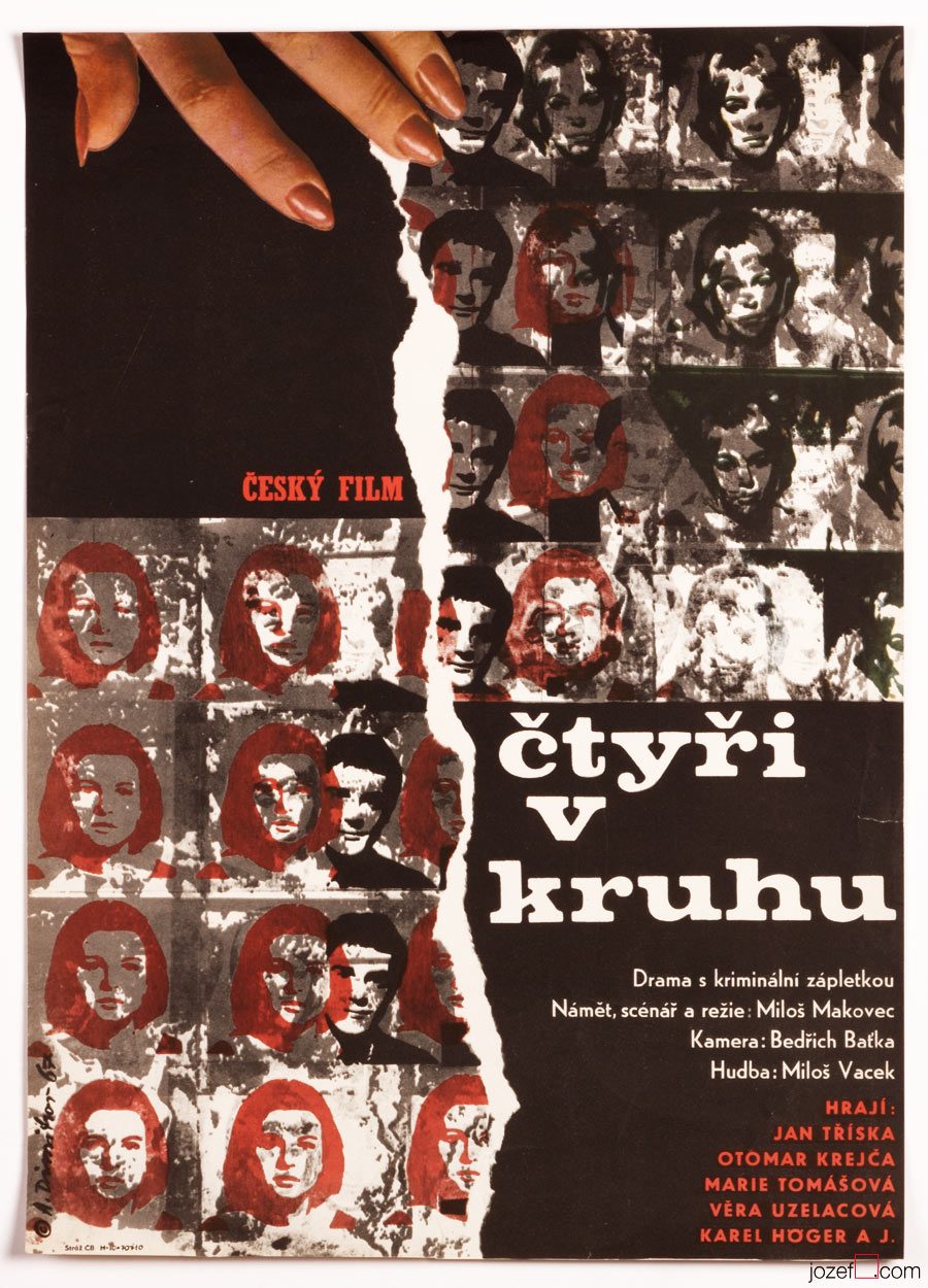
Four in a Circle movie poster by Antonín Dimitrov, 1967.
***
Similarly to Jan Brychta, Antonín Dimitrov’s profile was simply deleted. Second successful attempt of leaving the country in 1968 took Antonín Dimitrov with his wife Olga to Canada. His first try when he and his soul mate swam across the river Danube to neighbouring Austria, just to get caught and handed in to Russian soldiers, cost him several years in prison and forced labor.
Before their disappearance, Antonín Dimitrov and his wife worked professionally as a set and costume designers in various theatres across the country. Antonín’s rebellious nature has been proved several times. Exclusion from the Art Academy for his incorrect political views (note: even the students had to be the members of Communist party. Same applied to parents, if there was a non member in the family, studying at higher education was impossible. Not talking of grand parents.) and his unsuccessful immigration right after that are only few examples of his misbehaviour.
***
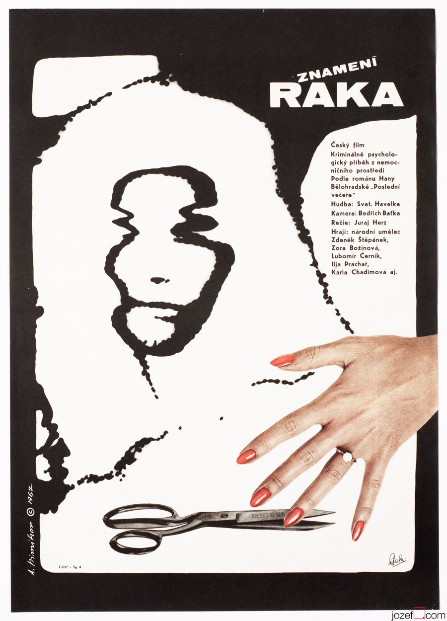
Sign of the Cancer movie poster by Antonín Dimitrov, 1967.
***
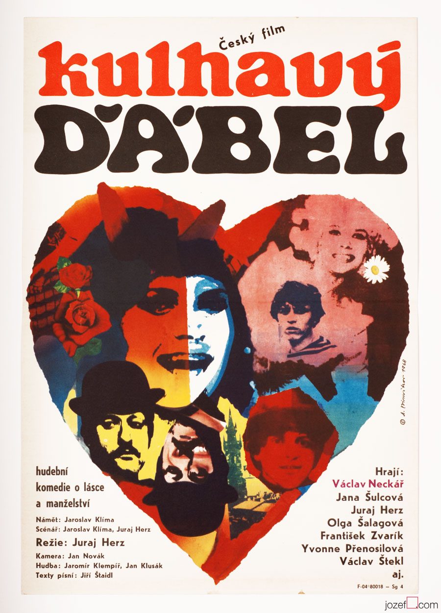
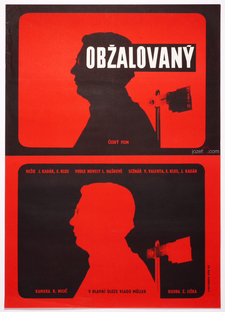
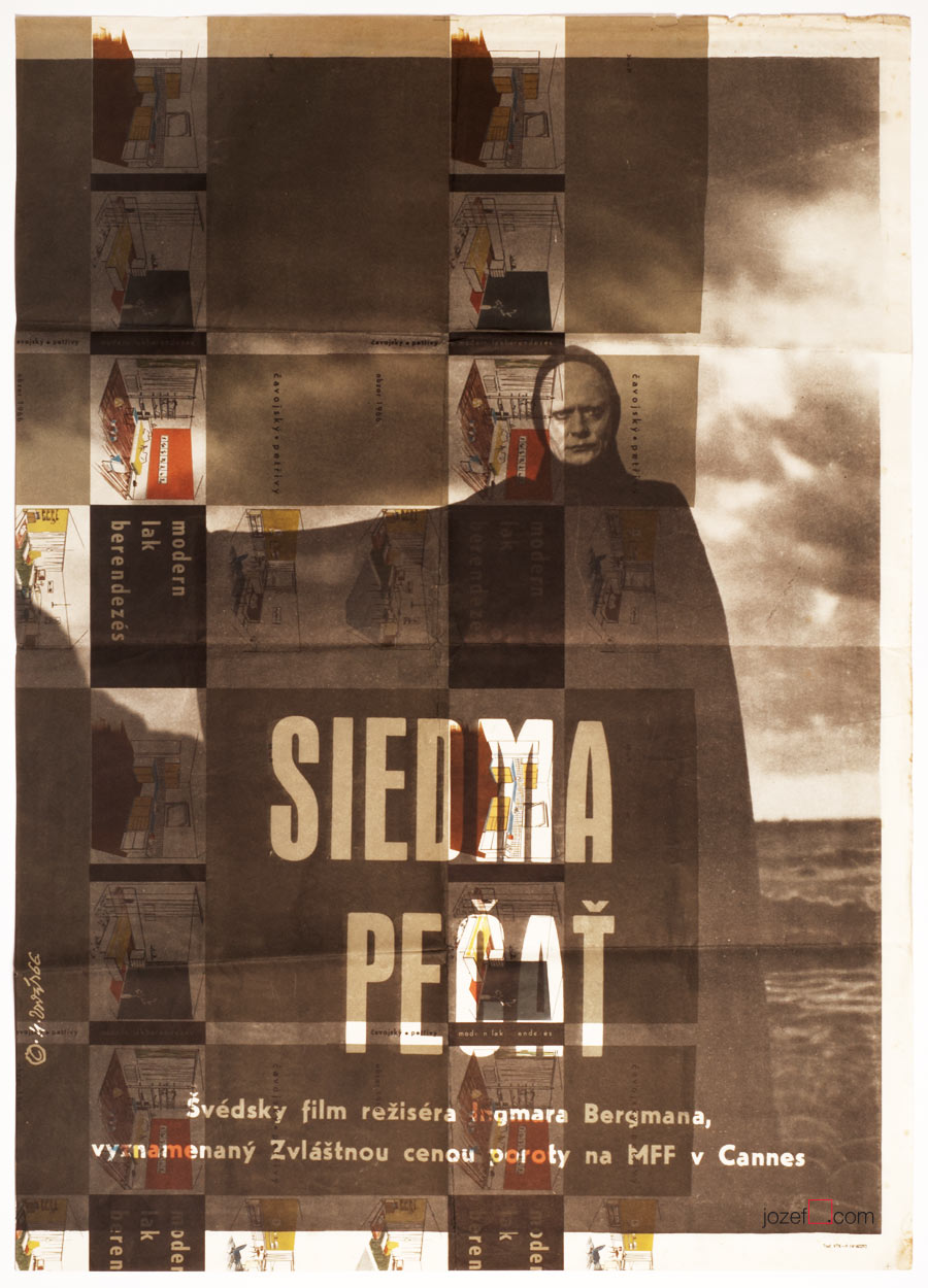
His collaboration with Czechoslovak New Wave directors, specially with Juraj Herz must have also spiced the soup up. Juraj Herz’s Cremator was the movie Communist could not swallow, similarly to other two titles in the showcase. In cases when the Communists decided to ban the movie everything would go off the shelf. Film director, author of the script / writer and the same destiny would meet the film poster.
Movie posters of Antonín Dimitrov are reflecting the times utterly. His posters are incredibly attractive, no matter if he touches the scissors or the paint brush. Excellent typographer and master of the blend, his virtues are sensibly hidden mostly in the collage. His posters are missing on one thing, there are only very few of them. He possibly did not design more than ten movie posters.
***
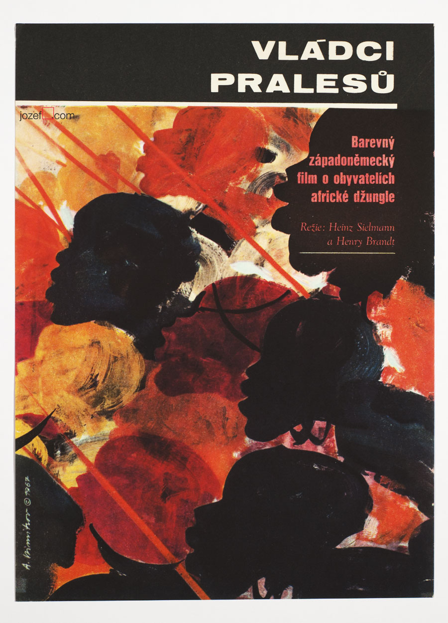
Masters of Congo Jungle movie poster by Antonín Dimitrov, 1967.
***
Even though Antonín Dimitrov luckily led succesful life in the exile. As a set designer he and his wife worked on numerous theatre and opera productions. He was also head of the design programme at the prestigious Indiana University School of Music in Bloomington, Indiana[^1] . But for Czechoslovak film poster his departure was a great loss. Many fascinating artists remained and learn how to overcome the situation, while building one of the most impressive poster archive in design history. It would be truly interesting to see what else could Antonín Dimitrov pull out of that hat.
***
The Limping Devil movie poster by Antonín Dimitrov, 1968.
[^1]: Obituary of Antonin Dimitrov, Hendren Funeral Homes, Norwood and Bobcaygeon, Ontario / it is sad when only biography on artist can be found in his obituary. Beautifully written, one should take a look.
***
For shop and blog highlights, please SUBSCRIBE to our newsletter.
Poster art in the history. Story of the Czechoslovak film poster in few takes.
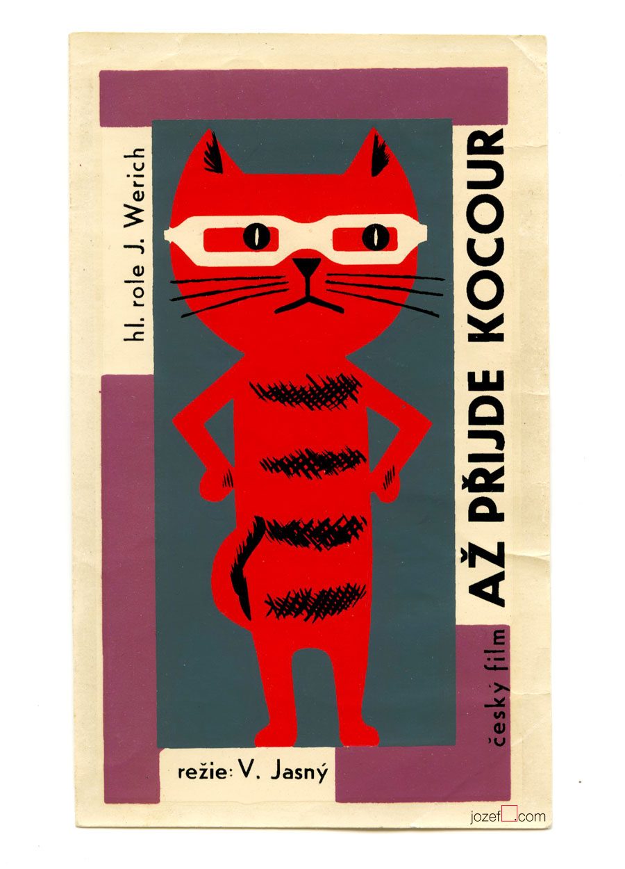
When the Cat Comes, directed by Vojtěch Jasný, 1963
••
The ideas of cultural revolution of the Sixties were gently spreading across the Czechoslovakia. The death of Stalin resulted in major positive cultural and political changes. Revealing political crimes of the 1950s helped many to react. Cultural institutions were breathing in fresh air and for almost whole new decade possibilities were gradually becoming reality. Country was getting back in bloom and ready for the new era that would bring many significant names in literature, film and art in general.
••
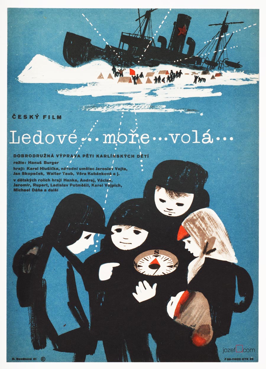
Northern Sea is Calling movie poster by Dora Nováková, 1961.
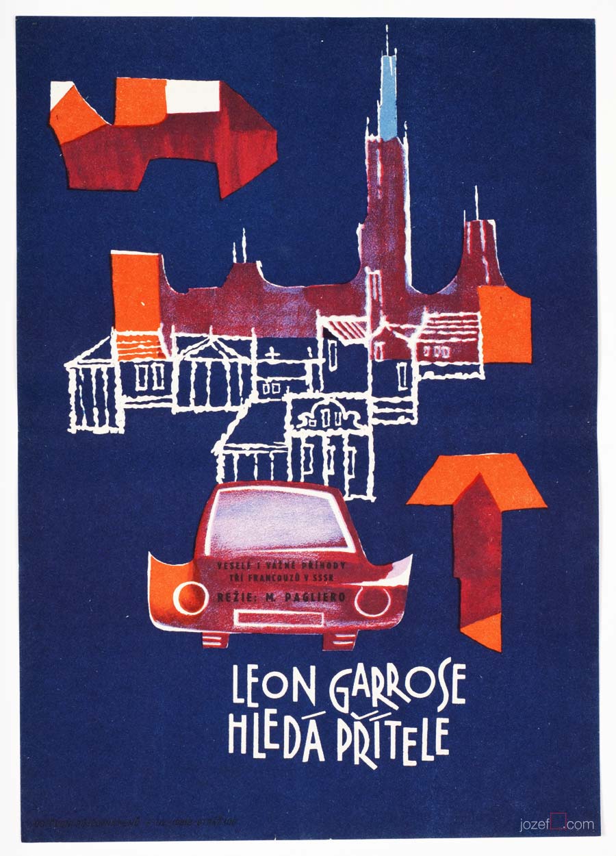
Léon Garros Is Looking for His Friend movie poster by Unknown Poster Artist, 1962.
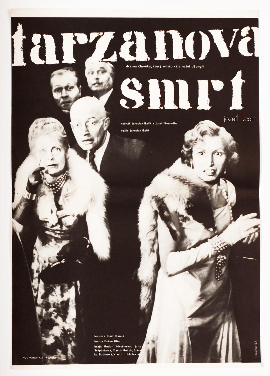
The Death of Tarzan movie poster by Jiří Balcar, 1962.
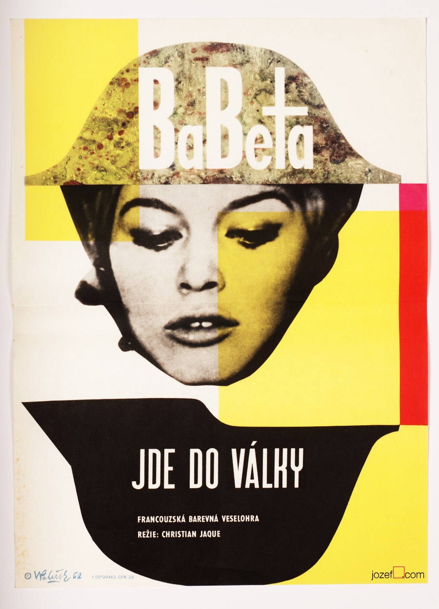
Babette Goes to War movie poster by Vladimír Václav Paleček, 1962.
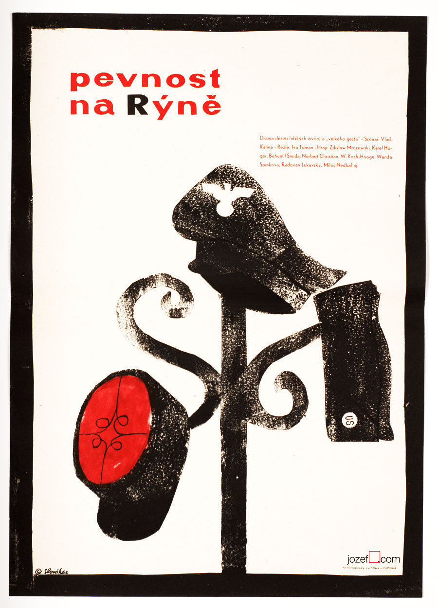
Fortress on the Rhine movie poster by Jaroslav Slovák, 1962.
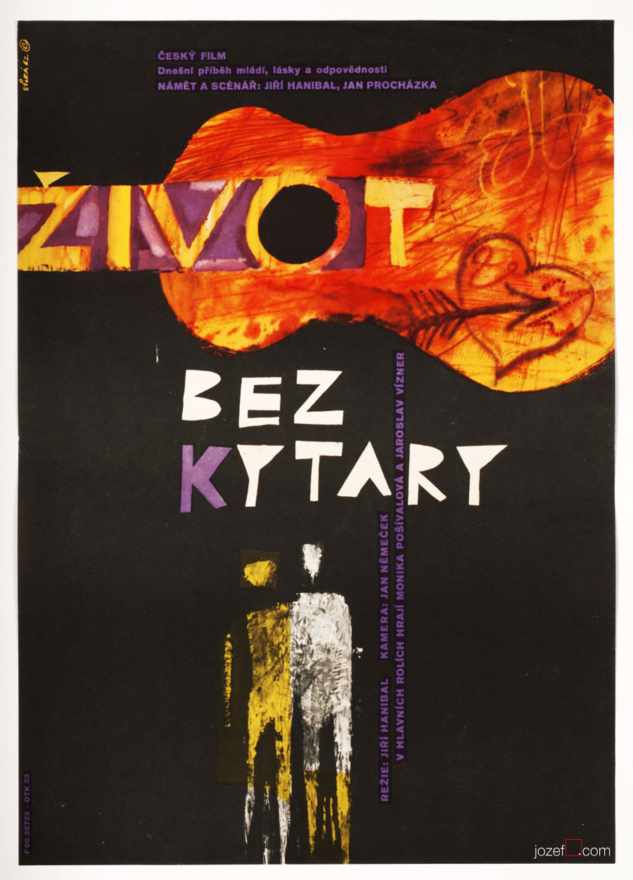
Life Without a Guitar movie poster by Jaroslav Sůra, 1962.
••
Film poster and its visual quality was always present, however “Brussels style” brought in some vitality to poster art. Bright pastel colours and curvy shapes were welcoming cinema enthusiasts on the way to see the films. There was a special platform dedicated to film posters with 6 posters always on display.[^1] Poster art gallery on the street, if one wants to think. Understanding of newly approaching contemporary cinema also made huge impact on the look of the future poster art. After all photography and film were both sharing so much, not to mention the film frame. Photography was drastically changing its status in poster art and was very often becoming part of the collages, or similar innovative techniques developed by new thinkers.
••
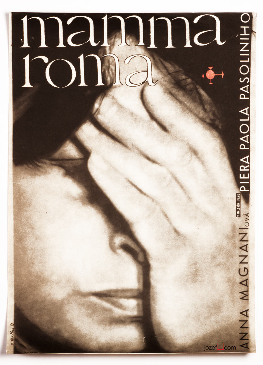
Mamma Roma movie poster by Vladimír Tesař, 1963.
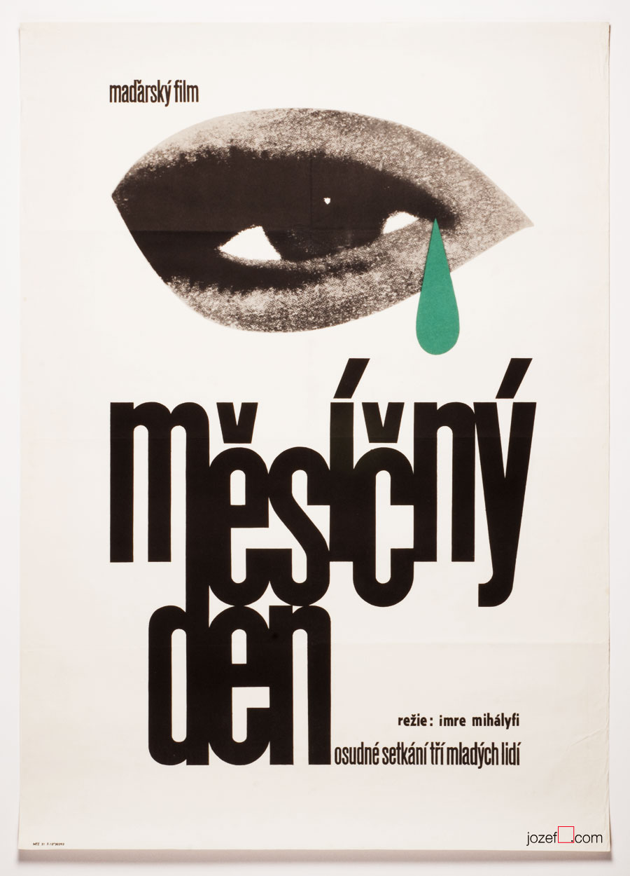
Roads movie poster by Václav Zeman, 1964.
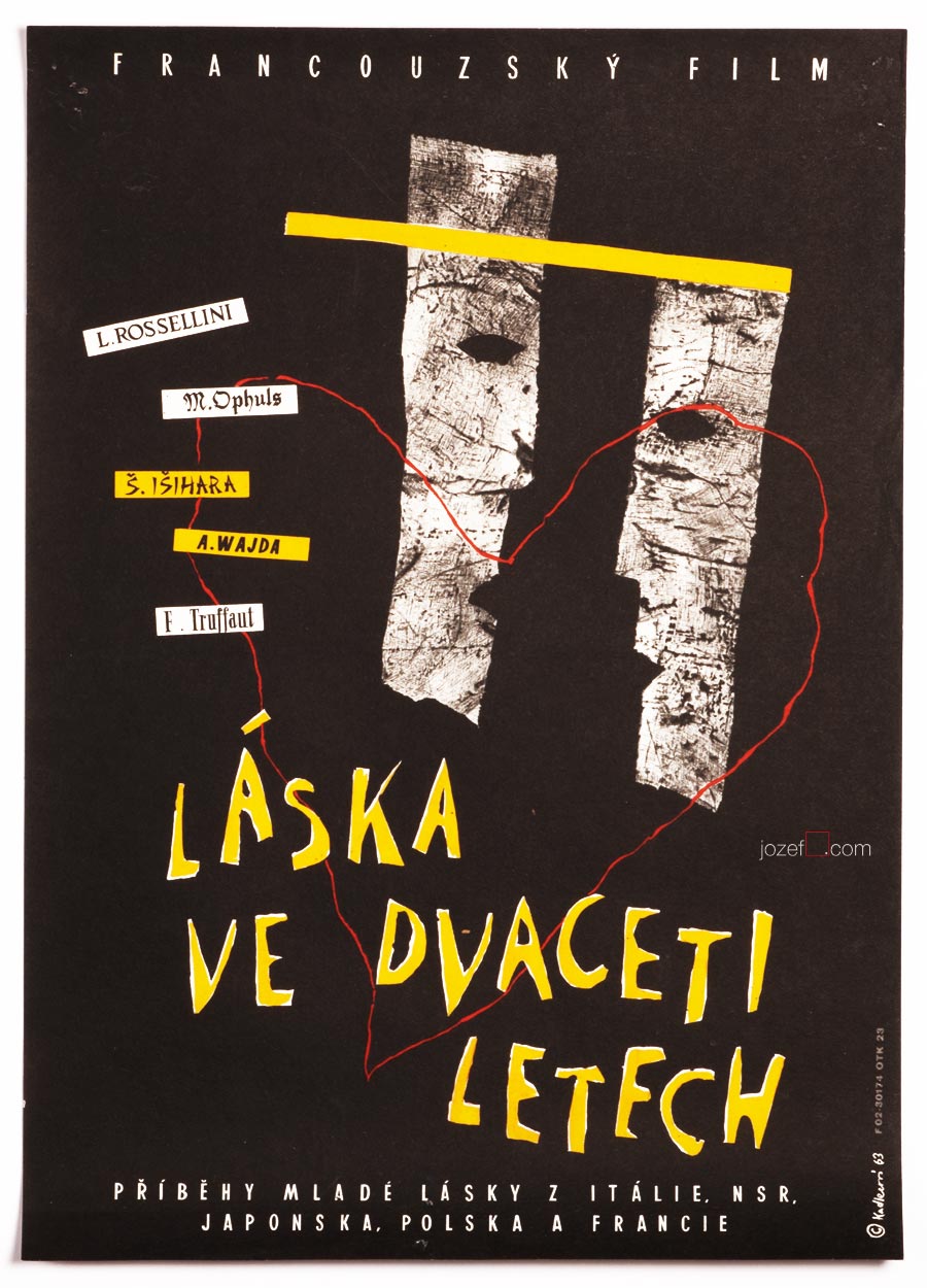
Love at Twenty movie poster by Milena Kadlecová, 1963.
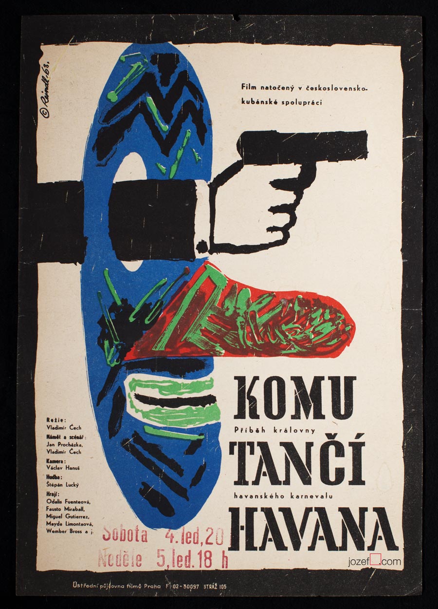
For Whom Havana Dances movie poster by Miloš Reindl, 1963.
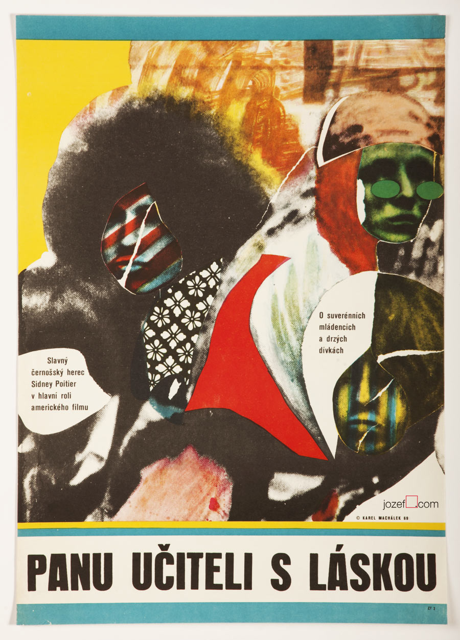
To Sir, with Love movie poster by Karel Machálek, 1969.
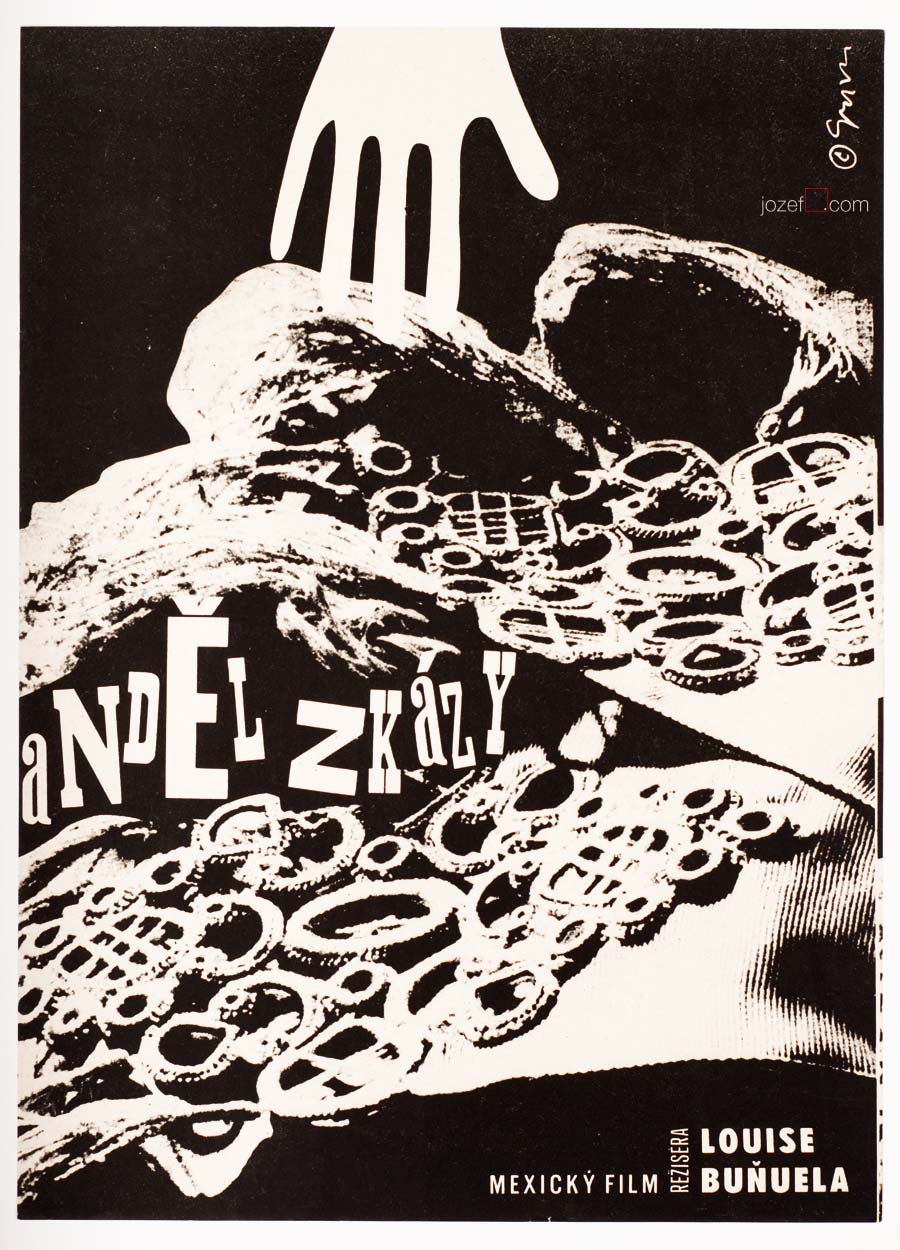
The Exterminating Angel movie poster by Milan Grygar, 1963.
• Foreign films were filling up the cinemas, however the choice was very limited. Films criticising western society made by the controversial film directors were the most preferable.
••
Film festivals, International reputation, Good bye Stalin!
Sixties brought in various alternative films from behind the Iron Curtain. Visually diverse films were screened in the cinemas across the country and have been admired by many. Culture was adopting new ways of expression and started to imply them further more in daily practise. Names such as Jean Luc-Godard, Luis Bunuel, Michelangelo Antonioni or Federico Fellini were resonating in freshly introduced film magazines, that were not lacking the visual quality of those printed in the West. Rich content was provided by healthy criticism, something unheard of in the past.
••
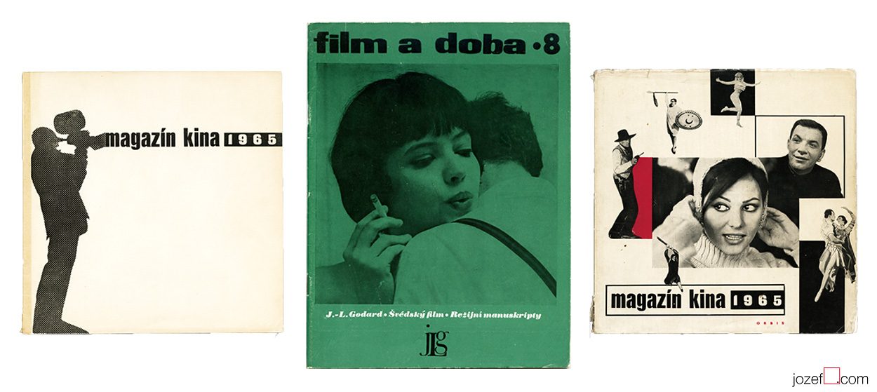
Good looking magazines with great content appeared in 1960s.
••
Appearance of the Czechoslovak films on International film festivals didn’t wait for long. In 1961 first Slovak film A Song About the Grey Pigeon / Stanislav Barabáš enters the Cannes Film Festival.[^2] Followed by the colourful award winning musical When the Cat Comes / Vojtěch Jasný (Cannes, 1963) and The Shop on Main Street / Ján Kadár and Elmar Klos (Academy Award for Best Foreign Language Film, 1965). Together with directors as Otakar Vávra or Evald Schorm they were paving up beautiful path for forthcoming generation.
••
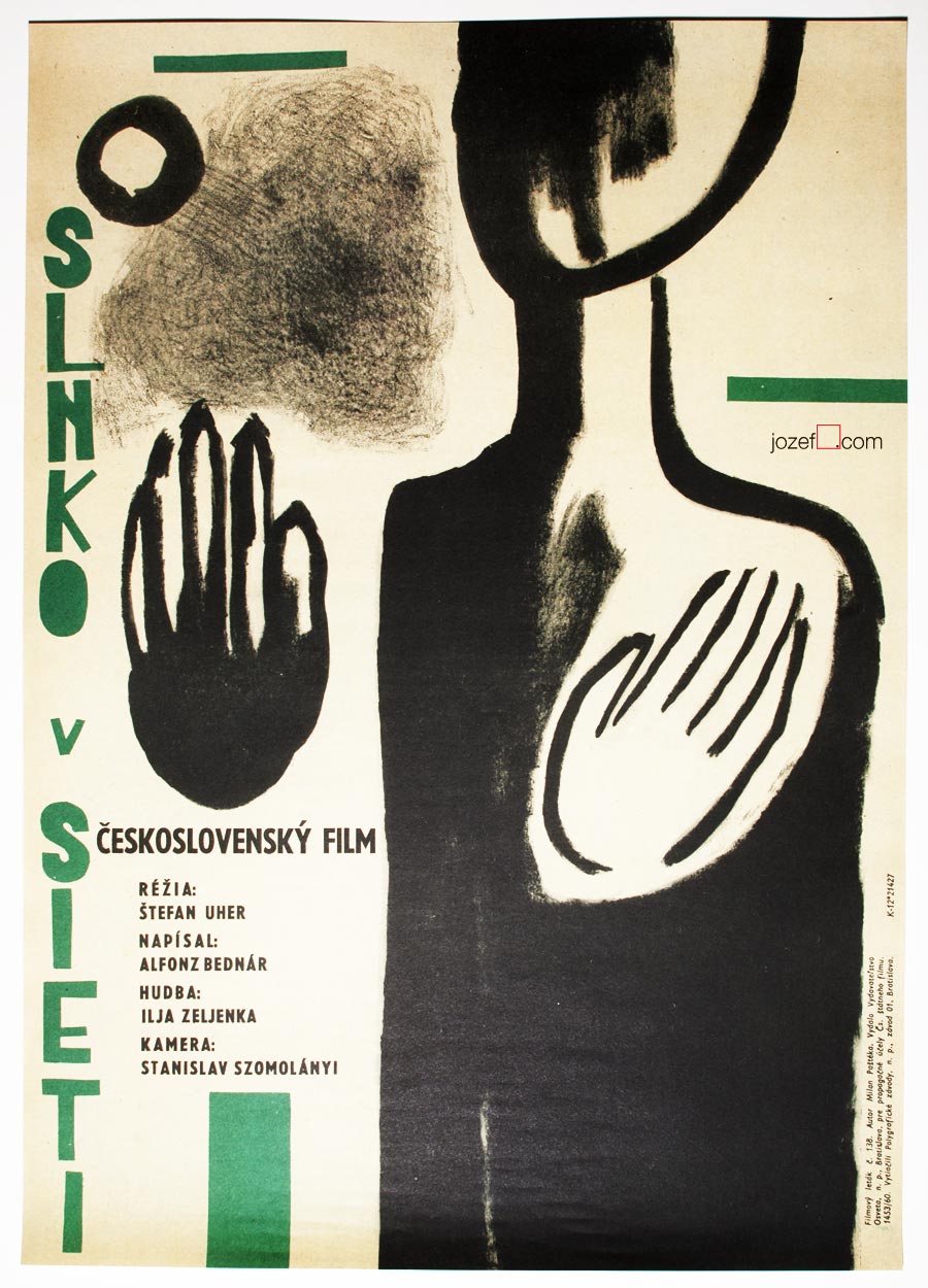
The Sun in a Net movie poster by Milan Paštéka, 1962.
Accused movie poster by Karel Vaca, 1963.
Audition movie poster by Jiří Jan Trnka, 1963.
Black Peter movie poster by Zdeněk Palcr, 1963.
Closely Watched Trains movie poster by František Zálešák, 1966.
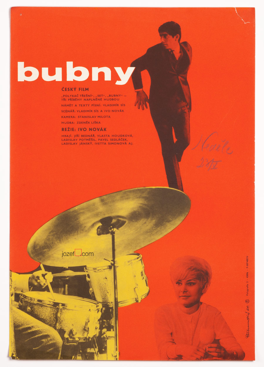
Drums movie poster by Jaroslav Příbramský, 1964.
••
Czechoslovak New Wave. Sun in the net.
[quote]”We had a feeling that literature is far ahead of the film, mean Slovak film, you know. That it is necessary to find the contact with writers and involve them in Slovak film production. Albert Marenčín”[^3][/quote]
Light was getting green also for the young film graduates at FAMU (Film faculty, Prague). Immense visual response to the current state of the country was phenomenal. In some cases maybe mere innocent poetic experiments, but the “real film” could not overlook the situation and reality seemed pure irony at the time. Great source of motivation was coming from the literature, many “lost authors” like Alfonz Bednár, Bohumil Hrabal, Jan Johanides, Milan Kundera, Dominik Tatarka and others were giving young film makers valuable hints. By the mid sixties Czechoslovak New Wave was already established. Young directors were influenced by everything worth of observation and wanted to add it to their art. Although the work of Czechoslovak New Wave was praised by international critics, at home with Communist power and their “relevant values” behind the back they were finding great difficulties. Majority of their films were banned right after the premiere and most of those films would not see the screening room until 1989. In many cases their activity was completely stopped, some of them emigrated (Miloš Forman, Jan Němec). Very similar destiny was following the poster art and its creators. Among few of many representatives of New Wave Cinema in Czechoslovakia belongs Věra Chytilová, Dušan Hanák, Elo Havetta, Juraj Herz, Juraj Jakubisko, Jaromil Jireš, Pavel Juráček, Jiří Menzel, Ivan Passer, Štefan Uher, Věra Vihanová, František Vláčil.
••
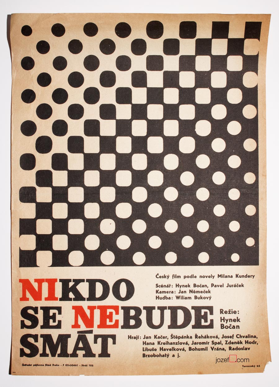
Nobody Will Laugh movie poster by Jan Turnovský, 1965.
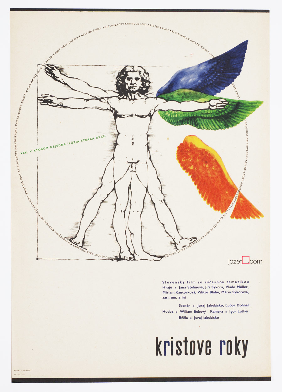
Crucial Years movie poster by Juraj Jakubisko, 1967.
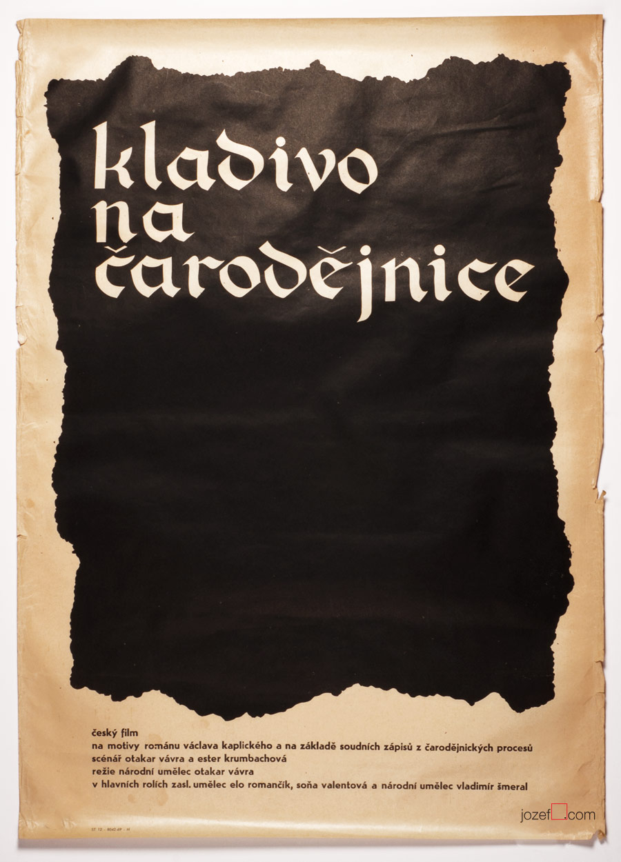
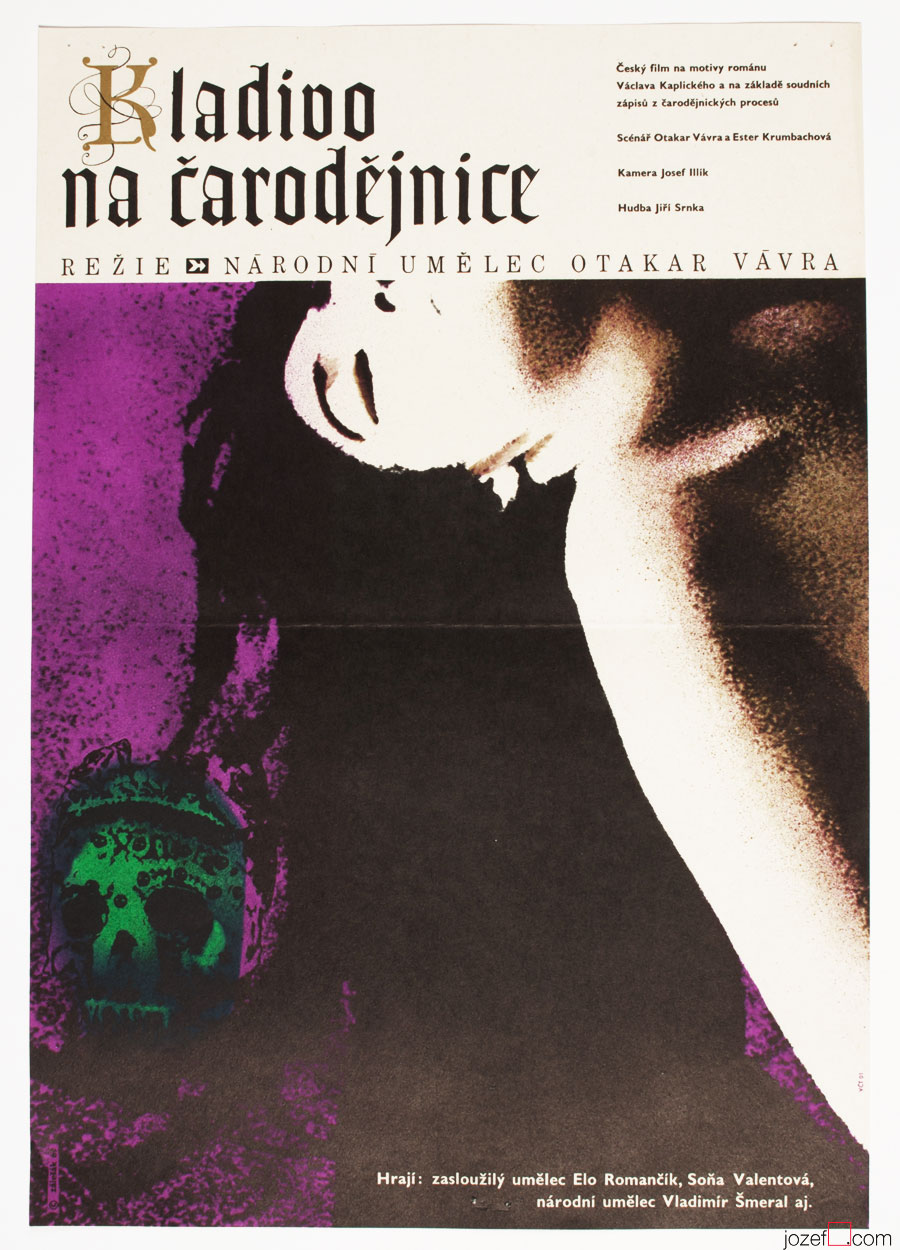
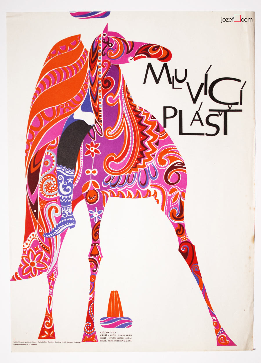
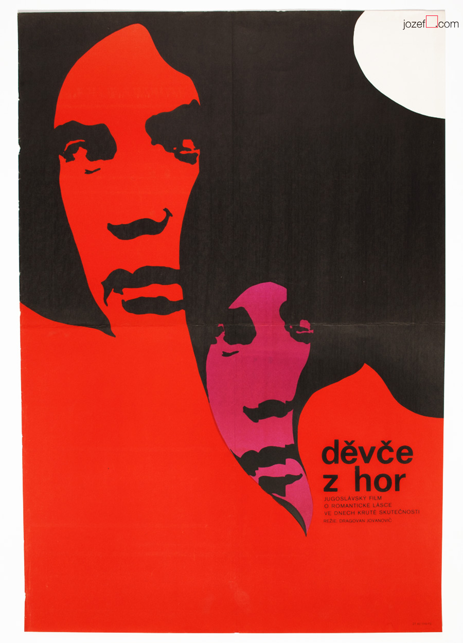
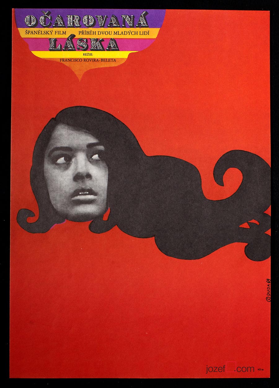
The Cremator movie poster by Antonín Dimitrov, 1968.
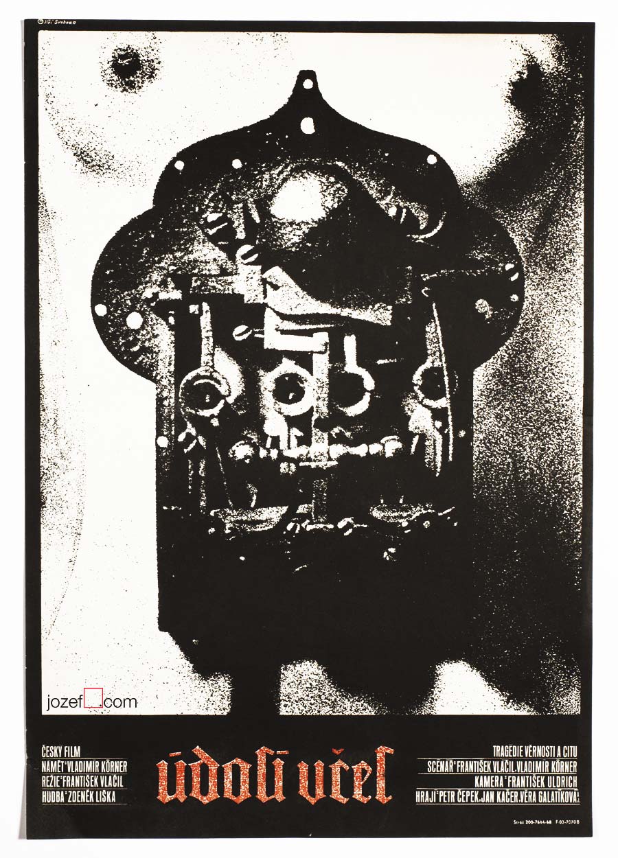
The Valley of the Bees movie poster by Jiří Svoboda, 1968.
• Surreal nudity. Very few film posters involved images of naked body.
Witchhammer movie poster by Unknown Poster Artist, 1969.
Witchhammer movie poster by František Zálešák, 1969.
• Witchhammer / dir. Otakar Vávra. Different poster designs for the same film.
••
No matter how miraculous they were, pretty much all of the above Czechoslovak films were banned in the late 1960s and onwards. Communists made the shame out of them and they would soon moved all of them to the special archive named “TREZOR” (Communist party safe-deposit box for disturbing material, in this case it was film deposit).
••
Film poster and poster artists. Variety in poster art.
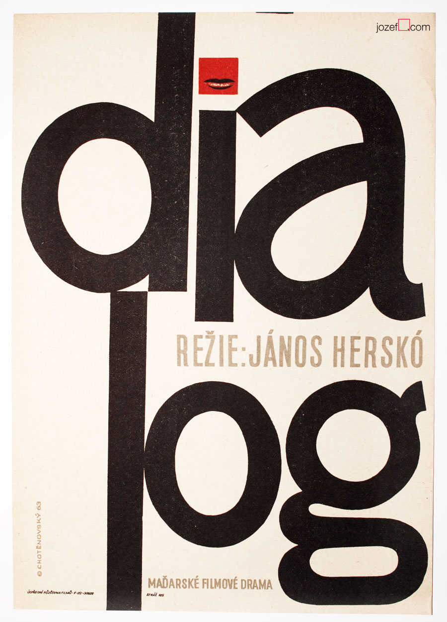
One of the main reason why Czechoslovak film poster art became so noticeable was the fact that the surrounding of poster making was made up of rich resource. The sixties has given away the opportunity to try out more courageous and innovative forms. Those were adopted by the groups of painters, sculptors, illustrators and graphic designers who used and mixed them in their own fashion. With strong individual approach rather than uniformed style or tendency, poster design became the playground for all. Extensive use of collage, illustration, photography or typography was applied. They all played important role in poster art and would often encounter on the same film poster. The playful and courageous approach was used by many significant poster designers such as Rudolf Altrichter, Zdeněk Chotěnovský, Zdeněk Kaplan, Zdeněk Palcr, Karel Teissig, Karel Vaca or Zdeněk Ziegler. Having been schooled as sculptors, painters, book illustrators, architects or sometimes self-taughts, poster designs were handled in all possible manners. From the dominating titles set across the poster to decomposing the subject into reduced forms.
••
Dialogue movie poster by Zdeněk Chotěnovký, 1963.
For Boys Only is for Girls Too movie poster by Libor Fára, 1963.
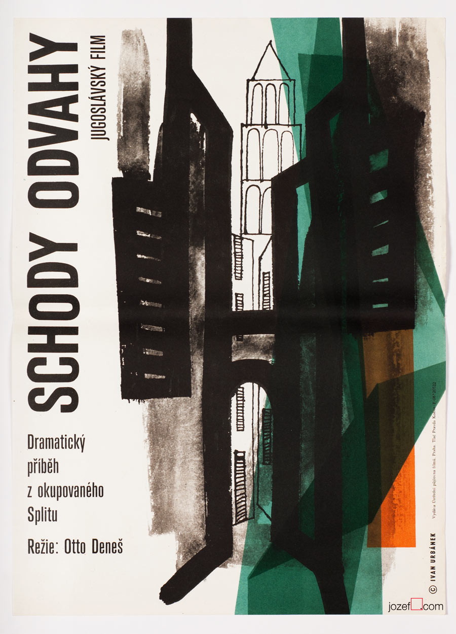
Stairs of Courage movie poster by Ivan Urbánek, 1963.
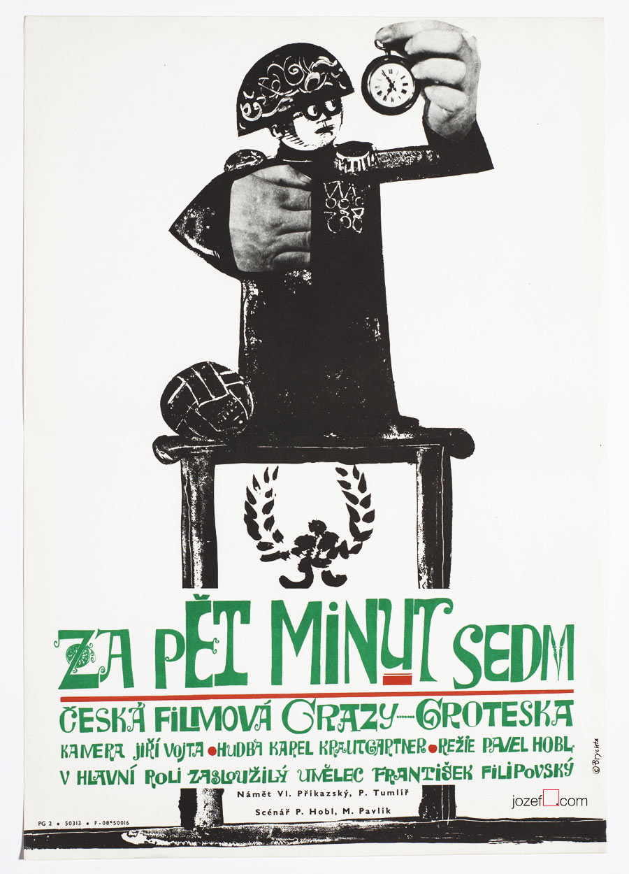
Five Minutes to Seven movie poster by Jan Brychta, 1965.
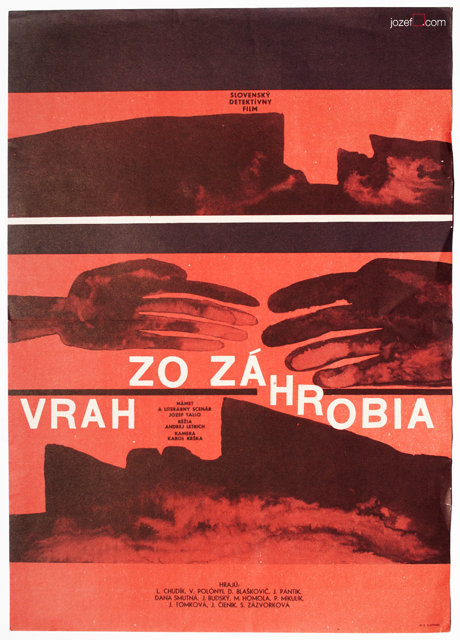
Murderer from Beyond the Grave movie poster by Milan Paštéka, 1967.
The Republic SHKID movie poster by Unknown Poster Artist, 1968.
The strongest and the most critical films of Czechoslovak cinema emerged in the second half of the sixties. As we know there is no place for criticism in any political regime. Sixties remained a myth for next twenty years and were systematically erased by Socialist invention called “Normalization”. That did not however stop poster designers from carrying on, as Zdeněk Ziegler puts it “all of us had the same enemy, after all”. [^4]
Before we enter poster art of 1970s, we thought that you might enjoy a little visual intermezzo. Sixties poster artists and detailed description about their studies, exhibitions and related informations are getting together for the next part.
••
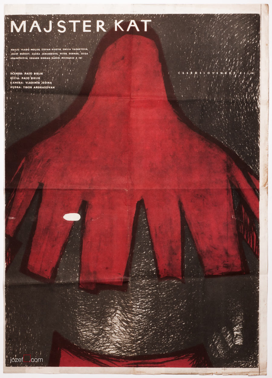
Master Executioner, Čestmír Pechr, 1966.
The Seventh Seal, Karel Vodák, 1966.
• Master Executioner / dir. Paľo Bielik, test print of unrealised version of the 1966 film, with Slovak version of The Seventh Seal / dir. Ingmar Bergman that have possible never seen the light either, printed at the back.
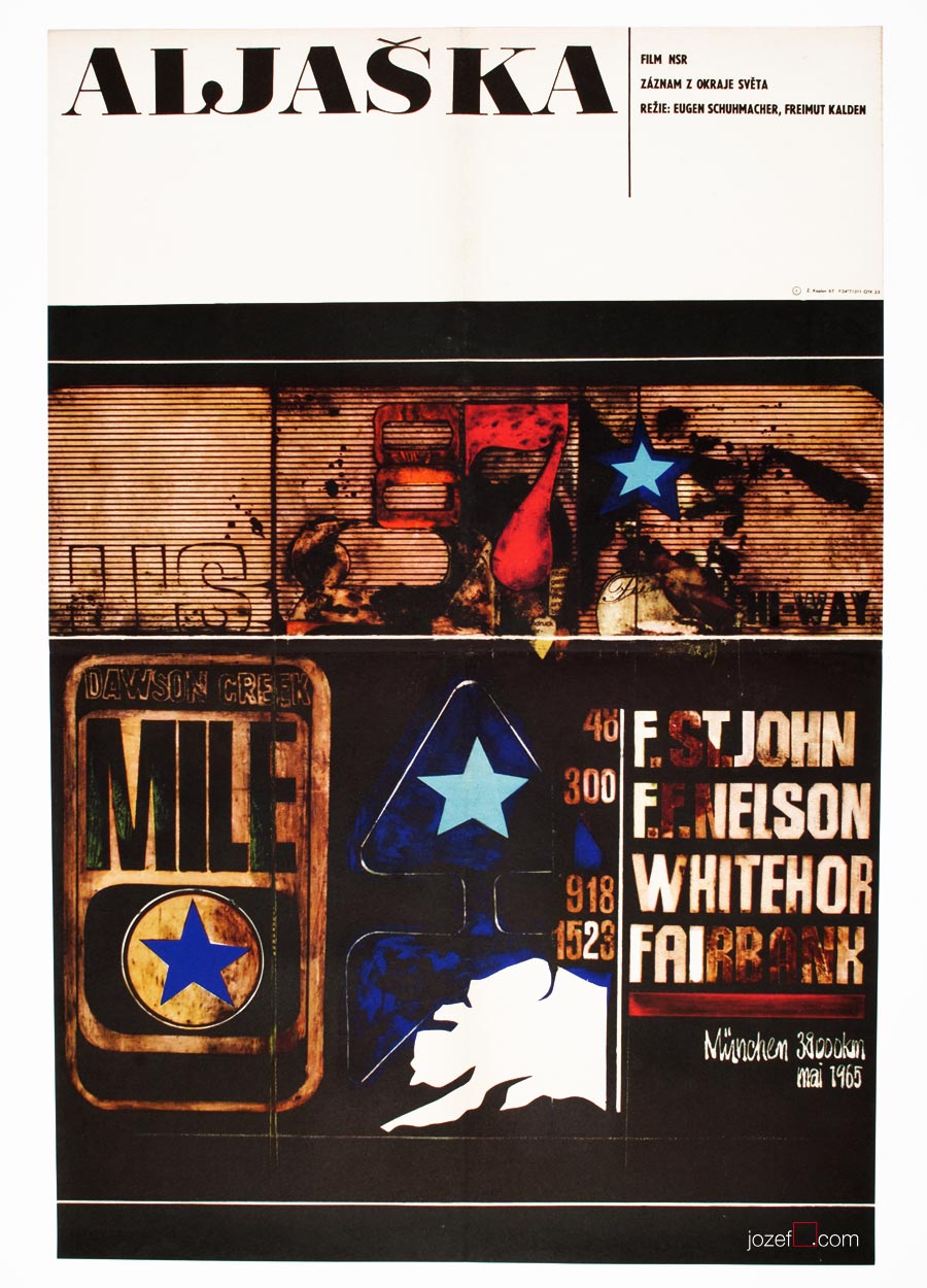
Alaska movie poster by Zdeněk Kaplan, 1967.
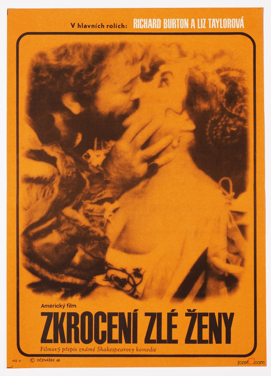
Taming of the Shrew movie poster by Radek Očenášek, 1968.
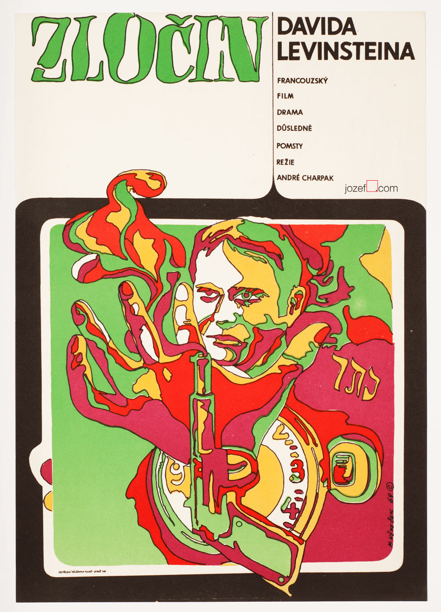
The Crime of David Levinstein movie poster by Milan Němeček, 1969.
••
[quote]”It is getting even worst. It’s hard to say, where is the end of the road we have not chosen. Somewhere has been decided, that this generation must remain forgotten. Whole army of chief executives and referees gathered together and they all came up with strictly planned programme. Instead of Poledňák there came Purš, instead of Harnach – Šťastný, instead of Kunc – Toman. Common sense refuses to believe it, but for several months, these three gentlemen have been working hard on the disposal of Czechoslovak film. 19.2.1971 / Pavel Juráček”[^5][/quote]
••
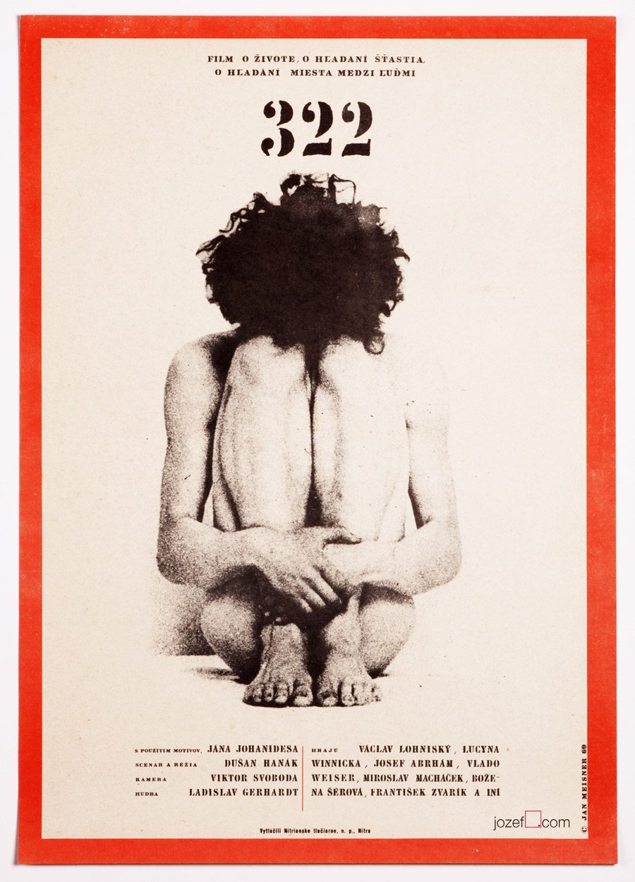
322 / Dušan Hanák, Jan Meisner, 1969.
•••
[^1]:Vratislav Hlavatý for the Czech Radio Interview / 29.3.2013
[^2]: https://en.wikipedia.org/wiki/Cannes_Film_Festival
[^3]:Albert Marenčín / Golden Sixties, TV document, dir. Martin Šulík, 2009. (Albert Marenčín / artist, writer, surrealist and former director of one of the artistic group of film producers in Slovakia (Produced also Sun in the Net). He was very much responsible for pulling Slovak young film directors to studios in Bratislava)
[^4]:Zdeněk Ziegler for the Czech Radio Interview / 15.5.2013.
[^5]:The Key for Determining Dwarfs or The Last Travel of Lemuel Gulliver, dir. Martin Šulík, 2002.
••
Additional research:
Literature:
Flashback / Czech and Slovak Film Posters 1959-1989, ed. Libor Gronský, Marek Perůtka, Michal Soukup, Olomouc Museum of Art, 2004.
Elo Havetta (1938-1975) / Václav Macek, SFÚ, 1990.
b. 14th of November 1926, Prague-Hostivice, Czech Republic
Education:
1942−1945, State Graphic School, Prague (Karel Muller)
1945−1950, Academy of Arts, Architecture and Design in Prague (Karel Svolinský)
Awards, Exhibitions:
Exhibition of Czechoslovak Graphic Art, Poland & Soviet Union, 1955
2nd International Exhibition of Film Posters, Versailles, 1961
Honorary Artist, ÚPF (Ústřední Půjčovna Filmů / State Film distribution), 1961
Czechoslovak Poster, Havana, 1962
Biennale Brno 1964, 1966, 1970, 1972 (dated only until 1972)
***
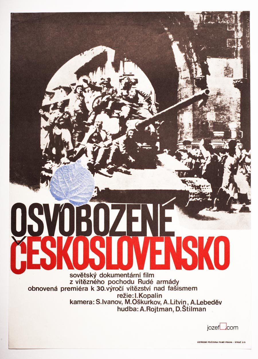
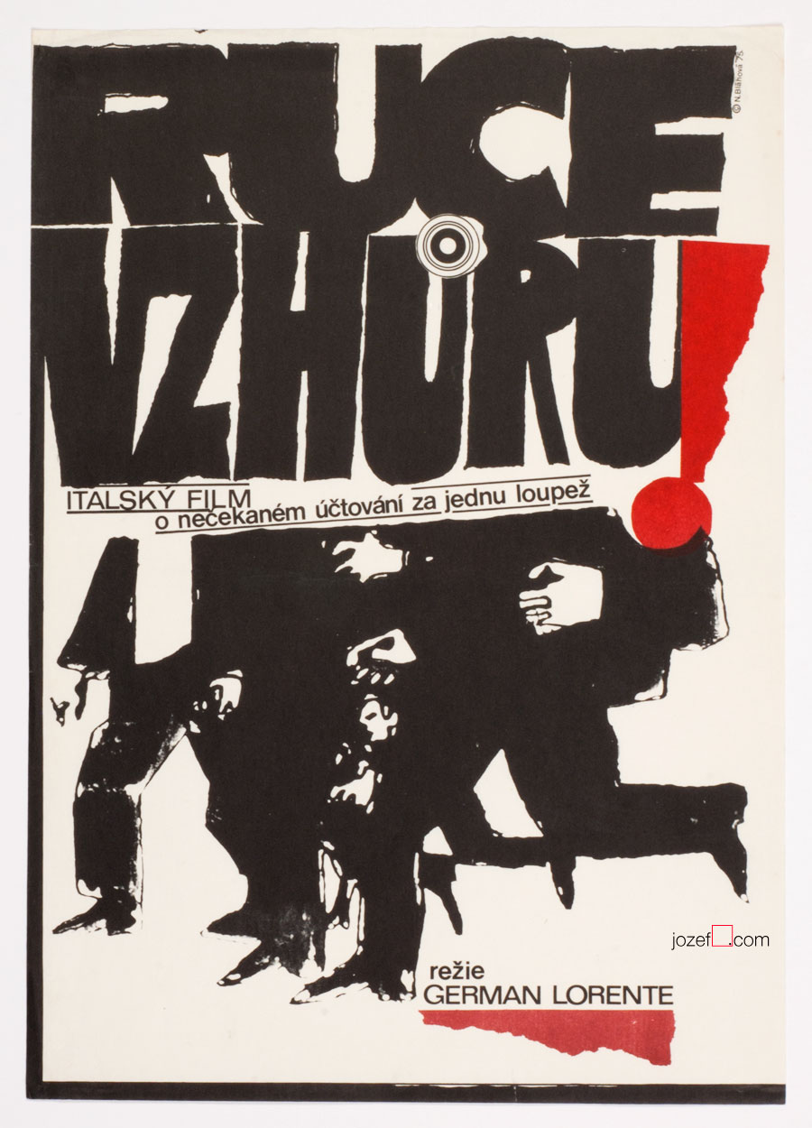
Czechoslovakia Liberated movie poster by Naděžda Bláhová, 1975.
***
Moving ahead in alphabet we would almost missed on one of the very important Czech women graphic artist of the Sixties poster design. Incident could occur easily, there is no evidence of movie poster of Naděžda Bláhová in our poster archive that would point to Sixties. On our research through the history of Czechoslovak film poster we are finding out that we should stop and do a little rewind. Naděžda Bláhová has exhibited since the Fifties!
***
Hold-up movie poster by Naděžda Bláhová, 1975.
***
Small appearance of Naděžda Bláhová’s movie posters in our collection is not accidental. She created possibly not more than thirty movie posters and some of them are real rarities. Editor for publishers of children books for some time, paradoxically to the movie posters shown in this article Naděžda Bláhová was mostly illustrating books for kids.
Her poster designs as can be seen on the images still owe some to illustration, but are evolved into rapid graphics and strong typography. Total opposite to that kid’s story. Minimalist movie posters with excellent lettering overtaking almost one third of the poster. Her beautiful typography layout is also worth noting.
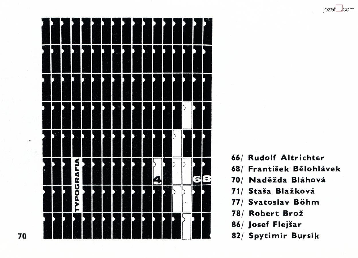
On the image above we can see Naděžda Bláhová talked graphics respectively. It is the snippet of her work from The International Exhibition of Poster and Promotional Graphics 1970’s catalogue[^1] . It shows the cover of the magazine called Typografia published in 1960’s Czechoslovakia. (You can also see some other Biennale participants from the movie poster section – Rudolf Altrichter, Robert Brož or Josef Flejšar) Cover did not need to be necessarily in black and white, catalogue photographs were usually printed as such. We will leave filling the colours to you.
***
Note: this showcase is part of our ongoing article Film posters / Made in Czechoslovakia. The story of film posters.
II. Bienále Užité Grafiky Brno ’66, Medzinárodní Výstava Knižní Grafiky a Ilustrace, Moravská Galerie v Brně. / 2nd Biennale of Graphic Design Brno ’66, The International Exhibition of Book Graphics and Illustrations, Moravian Gallery Brno, 1966
IV. Bienále Užité Grafiky Brno 1970, Medzinárodní Přehlídka Plakátu a Propagační Grafiky, Moravská Galerie v Brně. / 4th Biennale of Graphic Design Brno 1970, The International Exhibition of Poster and Promotianal Graphics, Moravian Gallery Brno, 1970
V. Bienále Užité Grafiky Brno 1972, Medzinárodní Výstava Ilustrace a Knižní Grafiky, Moravská Galerie v Brně. / 5th Biennale of Graphic Design Brno 1972, The International Exhibition of Illustrations and Book Graphics, Moravian Gallery Brno, 1972
[^1]: Typography, magazine cover, pen drawing, 31 x 23.4, 1969 – IV. Bienále Užité Grafiky Brno 1970, Medzinárodní Přehlídka Plakátu a Propagační Grafiky, Moravská Galerie v Brně. / 4th Biennale of Graphic Design Brno 1970, The International Exhibition of Poster and Promotional Graphics, Moravian Gallery Brno, 1970 (p.138)
***
For shop and blog highlights, please SUBSCRIBE to our newsletter.
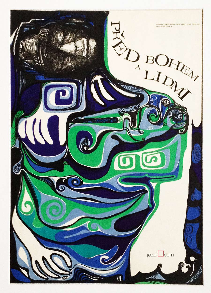
Before God and Man movie poster by Rudolf Altrichter, 1968.
10th of June 1916, Vienna
8th of September 1978, Bratislava
Education:
1938, Business High School, Trenčín
University of Economy, Bratislava
Awards:
1966, Prize for the most beautiful poster of the year.
Film posters created: 32 (1959-1972)[^1]
***
It is fairly interesting when thinking of Rudolf Altrichter’s designs for film posters, that behind all this visual trickery is hidden self-taught artist. Originally trained as a sales man (worked also for Bata / shoemaker company) he became one of the most influential Slovak graphic artist. In his thirties he became one of the establishing members of newly reopen Slovak Art Society (1946) and year later co-founder of Association of Slovak Graphic Artists (1947).
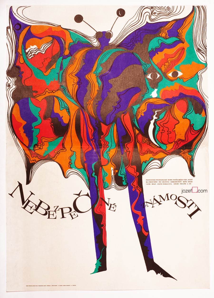
Rudolf Altrichter’s film posters are full of visual harmony, unusually blended by pure abstraction and the hints of reality. Human element appears to be one of his strongest standing point, no matter if it is design for art exhibition, film or political poster. Visual harmony is also represented by the use of elegant thin lines and curvy almost psychedelic shapes. Absurdity of the war, another of his characteristic motifs, can be also seen on several of his film posters. Film poster designed for French drama Dangerous Love Affairs / Dangerous Liaisons (shown bellow, designed in 1969), belongs to the selection of the most significant acquisitions of the Poster and Graphic Design Collection of Slovak National Gallery.
***
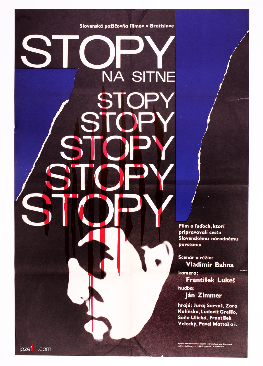
Dangerous Love Affairs movie poster by Rudolf Altrichter, 1969.
Talking Caftan movie poster by Rudolf Altrichter, 1969.
Traces on the Sitno movie poster by Rudolf Altrichter, 1968.
What a Lovely War movie poster by Rudolf Altrichter, 1972.
The Upthrown Stone movie poster by Rudolf Altrichter, 1970.
Girl from the Mountains movie poster by Altrichter, 1972.
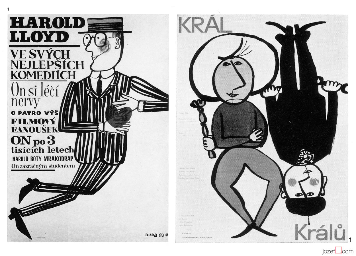
Harold Lloyd in His Best Comedies, 1963 / The King of Kings, 1963. Exhibition catalogue excerpt, Munich, 1965.
Welcome to the humorous world of Stanislav Duda, possibly one of the longest lasting poster designer Czechoslovakia had on offer. His poster activities are dating to late 40s, where he gained several awards for his commercial poster designs. [^7] Stanislav Duda begins to work professionally right after his graduation as graphic designer in Centrotex company (import / export of mostly textile products) where he stayed until 1953. From then onwards he works on his own as freelancer. He takes part in several group exhibitions representing graphic art from Czechoslovakia and also participates on International Exposition in Brussels (EXPO 58), where Czechoslovakia won prize for the best pavilion.
By the beginning of 1960s when Stanislav Duda started designing movie posters he was already well established graphic artist. Not sure if it was just by mere coincidence or because of his personal character, but it seems that majority of his 1960s movie posters were designed mostly for grotesque comedy (most of the posters shown in the article). Parallel to his illustrated caricatures that could be seen in several popular periodicals or art magazines, one can suggest that circumstances were working in his favour.
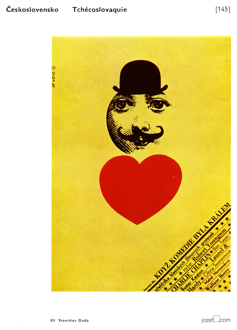
When Comedy Was King / Stanislav Duda, 1965. Brno Biennials catalogue excerpt, 1970.
It is interesting to observe artist’s development through out his career. Stanislav Duda remained faithful to drawing all the way to mid 1980s. Apart of occasional use of very simple collage (Bewitched Love, 1969 (bellow) / Dead Men Don’t Wear Plaid, 1985) or his phenomenal movie poster for Francois Truffaut’s Day for Night (great example of his graphical abilities) he was focused mainly on illustration and experimented a lot with fonts and colour. Eventually he also takes control over typography and masters everything in very unique almost childish quality of naive artist as can be seen in his later poster designs.
Movie poster Bewitched Love / Stanislav Duda, 1969.
Stanislav Duda was author of several animated films and illustrated a good number of books for both children and adults. His work brought him a world recognition in pretty much everything he has touched. He has designed around thirty movie posters all with genuine signature and obtained some important movie poster awards.
Many other magnificent posters by Stanislav Duda can be observed in our movie poster archive.
***
The Haunted Castle movie poster designed by Stanislav Duda, 1961.
***
Resources:
Literature:
II. Bienále Užité Grafiky Brno ’66, Medzinárodní Výstava Knižní Grafiky a Ilustrace, Moravská Galerie v Brně. / 2nd Biennale of Graphic Design Brno ’66, The International Exhibition of Book Graphics and Illustrations, Moravian Gallery Brno, 1966
[^3]:[^5]: IV. Bienále Užité Grafiky Brno 1970, Medzinárodní Přehlídka Plakátu a Propagační Grafiky, Moravská Galerie v Brně. / 4th Biennale of Graphic Design Brno 1970, The International Exhibition of Poster and Promotional Graphics, Moravian Gallery Brno, 1970 (p.41)
V. Bienále Užité Grafiky Brno 1972, Medzinárodní Výstava Ilustrace a Knižní Grafiky, Moravská Galerie v Brně. / 5th Biennale of Graphic Design Brno 1972, The International Exhibition of Illustrations and Book Graphics, Moravian Gallery Brno, 1972
VII. Bienále Užité Grafiky Brno 1976, Mezinárodní výstava ilustrace a knižní grafiky, Moravská Galerie v Brně. / 7th Biennale of Graphic Design Brno 1976, The International Exhibition of Illustrations and Book Graphics, Moravian Gallery Brno, 1976
IX. Bienále Užité Grafiky Brno 1980, Medzinárodní Výstava Ilustrace a Knižní Grafiky, Moravská Galerie v Brně. / 9th Biennale of Graphic Design 1980, The International Exhibition of Illustrations and Book Graphics, Moravian Gallery Brno, 1980
[^6]:Současná světová grafika, Deset brněnských bienále / The World Graphic Design at the Ten Brno Biennials, Jiří Hlušička. Odeon, Praha, 1985 (p.272)
[^7]: 1948, 1949, 1955 – 1st, 2nd & 3rd Prize for commercial poster design. IV. Bienále Užité Grafiky Brno 1970, Medzinárodní Přehlídka Plakátu a Propagační Grafiky, Moravská Galerie v Brně. / 4th Biennale of Graphic Design Brno 1970, The International Exhibition of Poster and Promotional Graphics, Moravian Gallery Brno, 1970 (p.41)
[^4]: Exhibition Catalogue: Plakate aus der Tschechoslowakei / Posters from the Czechoslovakia. Münchner Stadstmuseum, Munich, West Germany, 16.2 − 20.3. 1965. Texts: Alena Adlerová & Johanna von Herzogenberg.
Online:
[^1]: abArt / Stanislav Duda / Most of the biographical details are coming from AbArt’s archive unless otherwise referred.
[^2]: AbArt / Group of Artists and Graphic Designers established in Prague between 1957 − 1968. Main activities were exhibitions of group members in Czechoslovakia and abroad.
Article about exhibition Plakate aus der Tschechoslowakei / Posters from the Czechoslovakia, Munich, West Germany (1965) was printed in Gebrauchsgraphik Magazine, January/1965 and is available thanks to International Advertising & Design DataBase (pages 46-60).
Harold Lloyd in His Best Comedies, 1963 / The King of Kings, 1963. Exhibition Catalogue: Plakate aus der Tschechoslowakei / Posters from the Czechoslovakia. Münchner Stadstmuseum, Munich, West Germany, 16.2 − 20.3. 1965. Texts: Alena Adlerová & Johanna von Herzogenberg
When Comedy Was King / Stanislav Duda, 1965.Exhibition Catalogue: IV. Bienále Užité Grafiky Brno 1970, Medzinárodní Přehlídka Plakátu a Propagační Grafiky, Moravská Galerie v Brně. / 4th Biennale of Graphic Design Brno 1970, The International Exhibition of Poster and Promotional Graphics, Moravian Gallery Brno, 1970 (p. 145)
***
For shop and blog highlights, please SUBSCRIBE to our weekly newsletter.
b. 12th of June 1930, České Velenice, Czech Republic
lives and works in Prague, Czech Republic
Education:
1949−1950, Charles University, Prague (Faculty of Pedagogy / Art?)
1950−1953, Academy of Arts, Architecture and Design in Prague (Pelc Antonín)
1953−1955, Academy of Fine Arts, Prague (Pelc Antonín)
Awards:
many, mostly for his animated films and book illustration (few shown bellow)
1974, caricaturist of the year, Montreal
1979, Golden Apple, Book Illustration Biennials, Bratislava
1985(?), Gold Medal, IBA, Leipzig
1988, Honorary Artist
Film posters designed: 19 (1959-1989)[^1]
***
The Smallest Show on Earth – Adolf Born / Oldřich Jelínek, 1960.
***
To meet with the fantastic world of Czech artist Adolf Born in former Czechoslovakia was not as complicated. One only had to get born there and the ticket for his show was lying in front of you. His visual presence was absolutely everywhere. Book illustrations and television programme was provided for the smallest audience and for those older ones there were magazines covered with his caricatures. He has also made the older population interested into watching animated films for the children.
Adolf Born’s work is well known also to international spectator. His book illustrations (over 400 books) and animated films (by the 1980 he produced 45 of them)[^2] visited many countries and have taken part in many exhibitions. Humorous depiction is very characteristic in his work. Adolf Born is here to make you smile.
His film poster portfolio extends from early 1960s all the way to mid 1990s, with limited number designed. Adolf Born was preoccupied with other things. Film posters were possibly only other commission he was getting from the art union, where every illustrator/graphic had to be a member. Very few, but all very impressive. If the film poster was not made for the World War II film, it would definitely leave one with the grin on the face.
***
Front cover for the Burning Daylight / Jack London, illustrated by Adolf Born, 1970.